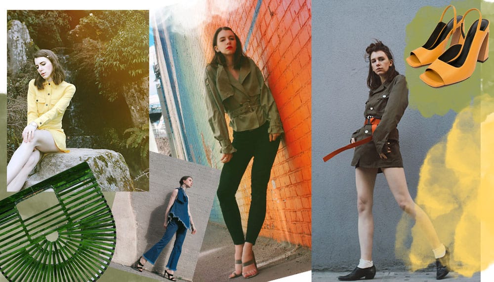
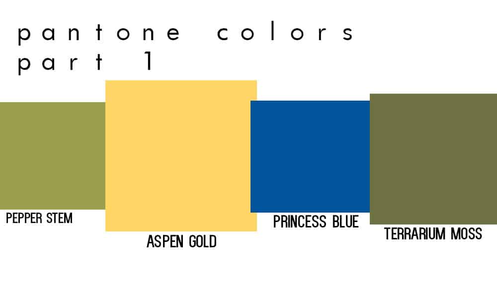
Let’s talk about the Pantone Color Trends. For this post, I’m discussing Apsen Gold, Pepper Stem, Princess Blue, and Terrarium Moss
So, I recognize some of you may not know the beautiful world of Pantone. In fact, I was sitting with my significant other and I brought up my idea for this post and he blankly had no idea what the concept was as to why Pantone exists.
So let me break it down. Pantone is like the god of colors. They were the first people to organize a system of colors to match. An incredibly important element to any designer or creative’s life, but others may go their entire life without knowing they exist.
The concept behind it is if you find a color that is absolutely perfect for your project while you are digitally creating it, and then you go to make your big beautiful billboard with this color, how can you be SURE it will look the way you think. Pantone fixed this by creating color charts, numbers, and samples all to accurately color match.
Since then they have expanded to marketing endeavors like The color of the year- which this is year is Living Coral.
But, that is not exactly the focus of this post, although it’s a great choice of color.
Pantone also does a roundup of colors prominent on each major fashion runway season. They compile their research and land on approximately 12 colors that are all the rage that season and year, and then 3-4 neutrals that have also been a consistent theme.
So this post is focusing on the spring summer colors of 2019. If you guys like this post, I will work my way through all the spring and summer colors (comment below if you’re in favor of this ).
So the first 4 colors I’m showing you how to wear for spring summer are –
Pepper Stem, Aspen Gold, Princess Blue, and Terrarium Moss.
So lets dive in.
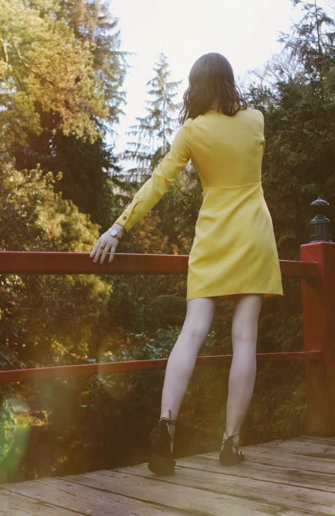
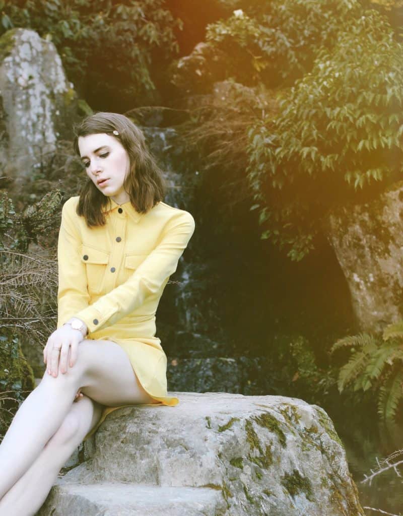
Pantone ASPEN GOLD
I am really starting to love yellow. Being a New York gal I would sometimes sway from color but this most recent dance with color has left me extremely happy.
Apsen yellow is bright but muted, if that makes sense? No? Ok, well the color has a lot of pigment behind it, but it not neon or highlighter in nature. It still has a subtly about it, that I love.
I opted for an all yellow dress that is perfect for spring and so easy to wear. When you wear such a bright color, you don’t need to add too much more with accessories. Let the color be loud, and the accessories just support the shining star.
** we may earn a commission from you clinking the links in this post at no additional cost to you, for the full affiliate policy, click here.
______________________________________________________________________
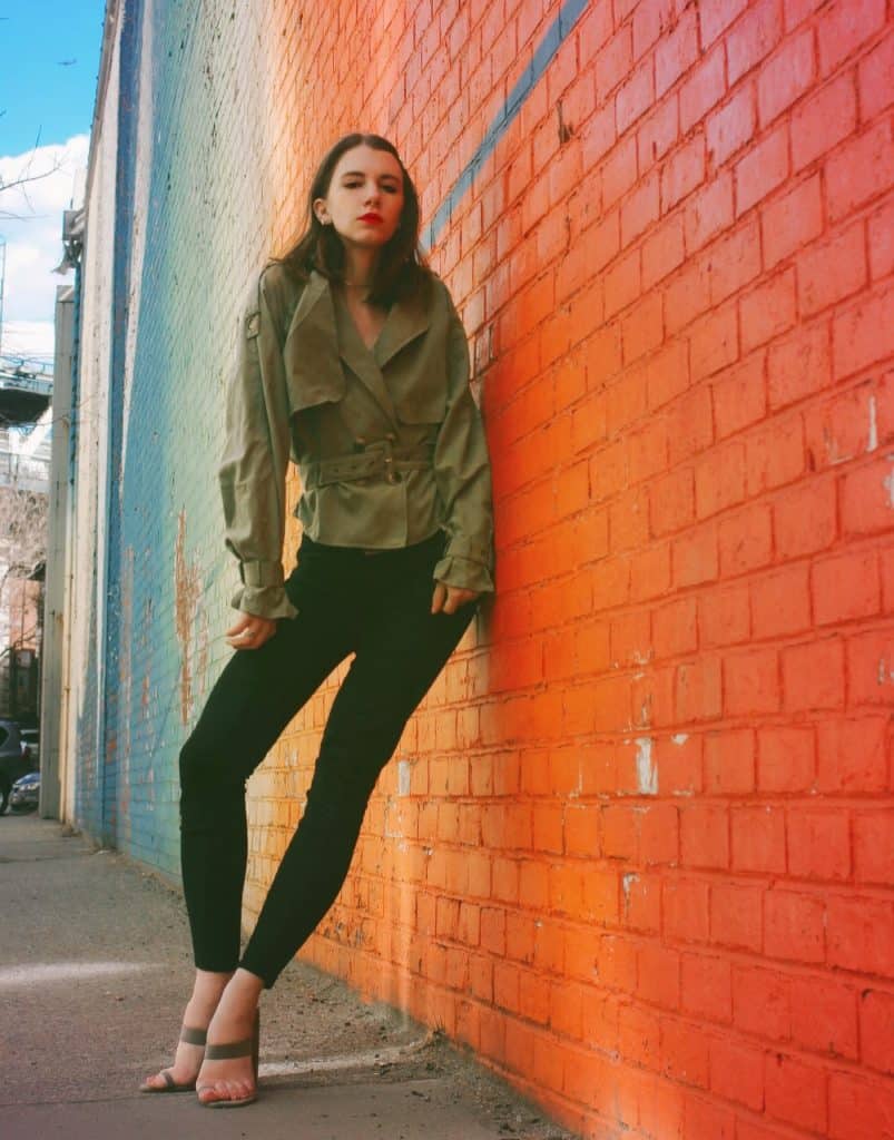
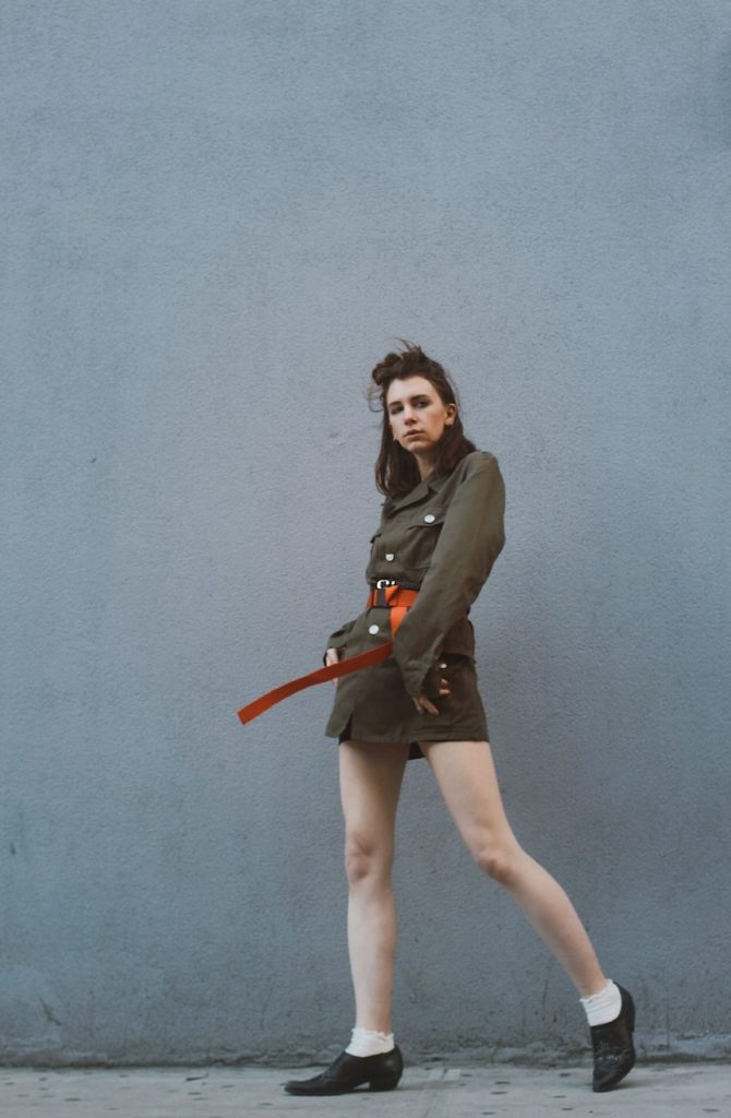
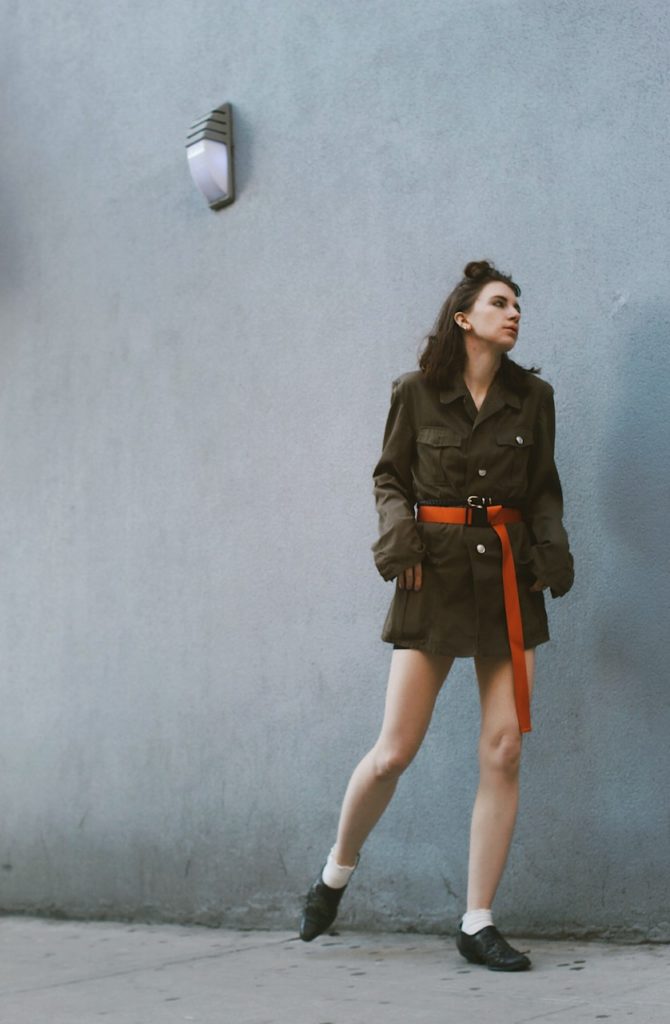
Pantone PEPPER STEM
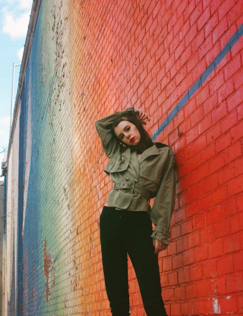
This would not have been a color I thought I would gravitate to when first seeing it within the color block. . BUT! Then I realized it’s actually the perfect spring military green color. Military is another one of those spring trends that is everywhere. But, I don’t always want to wear a darker army green. This is a great option to wear for a lighter, more spring friendly green.
It also pairs really well as a subtle accessory color. Add a pepper stem accessory to a neutral outfit and it will add so much depth.
Pepper stem is actually a beautiful color for spring, you can use it through a military inspired piece, as a subtle accessory, or a simple color outfit choice. All work.
___________________________________________________________________
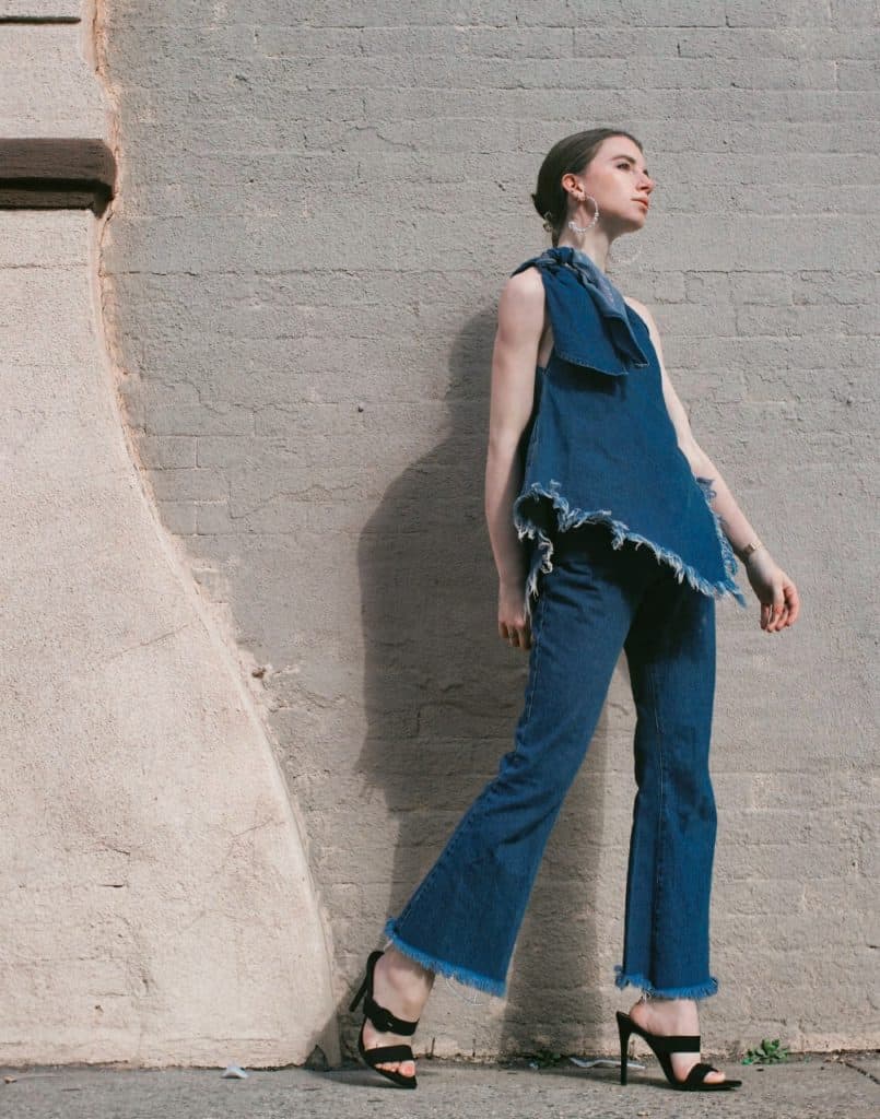
Pantone PRINCESS BLUE
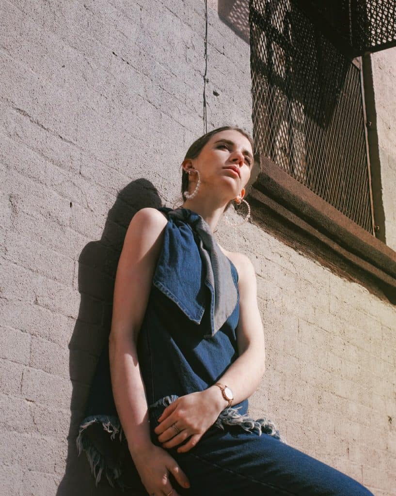
So, this blue is a lot! That was my first thought. And then I realized, well actually it’s very close to a true blue denim. And- I love a good Canadian Tuxedo.
So I think a fun way to use princess blue is through your denim, or denim on denim like this look.
It’s something you’ll always wear, and it still gets the spirit of the blue out there. It’s bold yet manageable.
Just how I Like my colors.
Pantone TERRARIUM MOSS
OK, this is that darker shade of army green I was referencing before. It doesn’t scream spring per se, but it does scream sophistication. It is a beautiful, and chic color. I liked to consider this a colored neutral. It goes with about anything and it’s a lovely base for other pops of color shown here.
Don’t be afraid to rock a military jumpsuit in this color or a full dress. If it feels to heavy just add a pop of color (like orange) to bolden it up.
So what colors should I do next? Comment below and let me know what you think of this style post. Maybe I’m the only nerd who loves a good Pantone breakdown.

alexia balden
Tuesday 26th of March 2019
part 2 please 👏
admin
Tuesday 26th of March 2019
you got it!
eleanor derben
Monday 25th of March 2019
omg those orange heels, i need them! and you look so hot 🔥
admin
Monday 25th of March 2019
I know! i love them too, such a cool shape ❤️
liv
Monday 25th of March 2019
yes to post part 2, i need soybean and sweet corn! 👏
admin
Monday 25th of March 2019
I'm so glad you like it, and yes i think i will do a part 2! and those are two of my fav colors on this list!
nikki doerest
Monday 25th of March 2019
Um, gorgeous. definitely do a part two. I want to see mango mojito and tumeric!
admin
Monday 25th of March 2019
OH good call, love those both. 🥰
sonia
Monday 25th of March 2019
Kiling it babe, absolutely wonderful. sorry to hear about all the site craziness, but it looks amazing ❤️
admin
Monday 25th of March 2019
aw thank you so much for the support, it means the world to me 😍