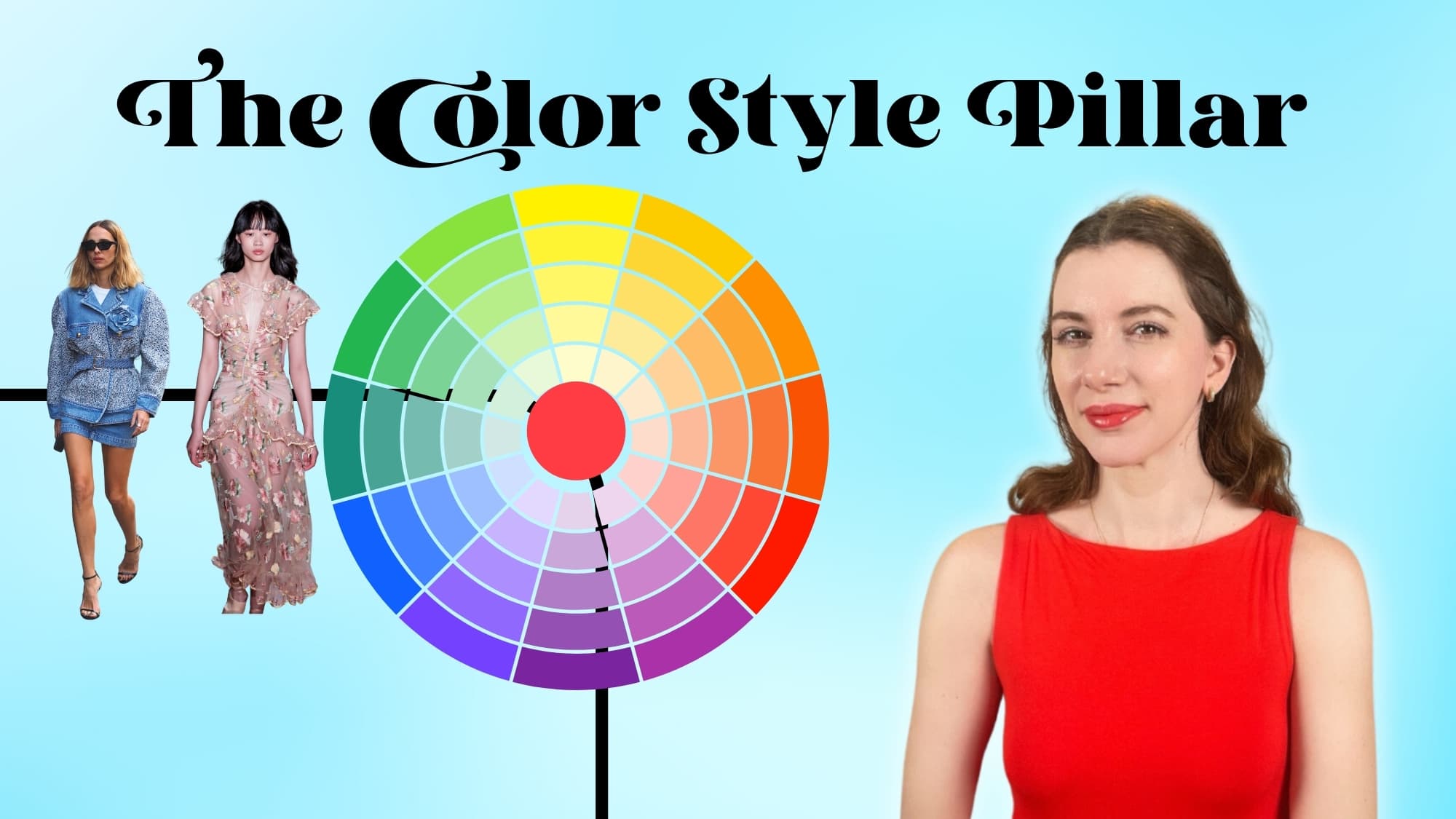
The Color Style Pillar: Developing Your Color Approach
In this episode of the Style POV podcast, host Gabriella Arruda explores the importance and impact of color in personal style and how it relates to your four style pillars. She discusses how the right colors can transform an individual’s appearance, focusing on key concepts such as color harmony, seasonal color analysis, and the Sci/Art color system. Gabrielle emphasizes the importance of observation and daily outfit photos to understand one’s color preferences and how they work together. She also provides practical advice for integrating preferred colors into wardrobes, including tips on color theory, value range, and complementing features.
Transcript
You’ve probably seen the glow-up videos when someone wears their right colors. They are really kind of addicting to watch. We watch this woman transform from a tired mom in a harvest orange to a sparkling goddess in warm coral. Like a literal switch has been turned on, her eyes are brighter, her skin seems to glow, and her hair looks lustrous.
And then you think, well maybe that one was a fluke, so you quickly tap “next video” to see… Does this..actually…work?
Color is powerful. It’s one of my style pillars, let’s dig into how it creates an effect.
Hi, I’m Gabrielle Arruda your host for the Style POV podcast and I’m here to help you learn to trust your fashion instincts, hone your authentic style pov, and find strength through style.
It was so amazing to have Rita from Style Thoughts By Rita on the podcast last week, and I’m also excited to have some more guests joining coming up, but today it’s just me.
So, I thought it was a great time to get some basics in. More specifically, basics around color.
As many of you know I’ve trained in the Sci/Art color system and am I opening up in-person color analysis in Brooklyn and Seattle. You can find more information about in the show notes.
But, color is a style pillar. In my 4 style pillars episode, an entire leg of your outfits is devoted to color. This isn’t limited to seasonal color analysis, but overall color science, use of color, color techniques, effects, and overall how you’re using this style principle in real life.
So first we will go over approaching your color style pillar, and then some basic concepts of color and color harmony to help you grasp the possibilities.
Now, I know at times, people think we are overcomplicating color. Get back to the basics- you don’t need to have a masters degree in color theory to pick nice clothes.
Or $100 lightbulbs to properly analyze a client’s color placement.
But.. more often than not, both sides of the fence have valid points. It’s not as basic as hair, eye, skin = seasonal color.
Because then all people of color would be lumped into winter or autumn, and that’s just not accurate. And, then I’d probably end up in a cool season, also not right.
Here’s the thing. If seasonal color is an important element for your color style pillar, then yes, you will begin to understand the basics of color theory. Just by the simple fact that you will be using your fan and understanding how colors relate to one another, and how they work on you.
My son (who is 6) and I play a game called “car rainbow” where we try to find all the cars in all the hues of the rainbow.
But being the color nerd that I am, we upped the ante and now need to also define “how that color was made”. If it’s a leaf green, is it muted with gray or is it brightened with yellow.
Don’t worry, he actually enjoys this, I promise.
So, my first point about understanding color is observation. You don’t need to know everything under the sun about the Munsell color theory. But, start observing the world, your closet, and how you use colors naturally.
I’ll say it again, those daily outfit photos will be the key to doing this.
But the world is your color oyster. I encourage people to find a color compass or image that really encapsulates the vibes and colors they enjoy. And compare your daily outfit photos to this image. Your outfits don’t need to have all the same colors, but you can immediately see if they are harmonizing or not. Are the vibes matching, are the color qualities feeling similar, do they feel related in a deeper meaning?
So that’s the broad picture. Observe where your color style pillar is at currently. This can also help you set goals.
For instance, you might realize your closet is largely black, and you don’t feel it is serving your style goals as well as it could, so then you decide to explore seasonal color analysis to find your best version of “black”.
And if you’re looking for a great resource, my teacher in Sci/Art the incredible Christine Scaman has a video on exactly this, which is linked in the show notes.
Now, you may think I’m crazy to do a podcast episode all about color harmony. Surely Gaby, you need visuals to convey this. But, I actually think when we use our brains to imagine these elements, we can take away so much more.
There are times for visuals, and there are times for brain power and imagination.
Let’s get our brains going and discuss the laws of attraction.

You’ve probably seen the glow-up videos when someone wears their right colors. They are really kind of addicting to watch. We watch this woman transform from a tired mom in a harvest orange to a sparkling goddess in warm coral. Like a literal switch has been turned on, her eyes are brighter, her skin seems to glow, and her hair looks lustrous.
Colors have an effect. When we wear colors in our palette they accentuate and hold up the “like” colors naturally found in our faces.
Instead of those colors battling with one another and dulling each other out. They energize with one another and create a lifting effect.
Our eyes take these “like’ colors in at the same time and it allows the wearer to come into focus. We don’t just “see the person first” we see the lines and shapes of the person as if the painting or drawing has been finished.
It’s crisp and visible. So when people say “We want to see you first” we aren’t saying notice your face first… Because heck, in summer colors I looked like a floating head, so of course you saw my face first. But, those colors made my face blurry and soft, and flat.
In bright spring colors, my features come into focus, the color supports my face because of the law of attraction. These colors work in harmony, they aren’t fighting it out to the death.
And if you didn’t know, colors can actually fight to the death and annihilate one another. Complimentary colors, which are colors opposite on the color wheel, like green and red, purple and yellow, or blue and orange can have this happen.
When they are paired next to one another, Red and Green, it creates a maximum vividness effect. However, when you mix them together, they create gray. They literally cancel each other out.
But I may be jumping ahead.
So, let’s get a few basic color concepts sorted so that we are all on the same page.
All colors are created from the primary colors- Red, Yellow, and Blue. When you warm up a color you are typically adding more yellow to it, and when you cool down a color you are typically adding blue to it.
But, all colors are relative to one another. That’s why understanding color basics is helpful when actually shopping. Because then you can see, ok this is a green color (created by mixing blue and yellow), but it feels like it’s leaning closer to teal, so we know that more yellow has been added and that is skewing it warmer. And we see that when we compare it to a true blue.
Complementary colors as I just mentioned are opposite on the color wheels and they are complimentary because they “complete” each other, meaning they include all three of the primary colors.
So yellow and blue equals green.
Green and red are complimentary so that color pairing contains {yellow blue} + red
And the same is true for all the other complimentary colors.
Does it feel like first-grade art class yet? Stick with me, I promise this will be helpful.
So where does red fit into colors, if we have yellow warming colors up, and blue cooling colors down?
Adding red, from a color theory, can sometimes warm a color up, but it more often balances a color out.
For instance, we have purple, true purple, which is red and blue.
An even amount of red and blue creates a balanced purple, it’s neutral. Add in blue, we get cooler purple, add in yellow and we get a warmer purple.
OK, I hope that wasn’t too confusing, but we just want to start learning about how colors are made, so that when we are out shopping for items or online scrolling we can have a bit of gut instincts, that nope that color isn’t in my palette.
Now, there are many ways to use color, and while I really enjoy seasonal color analysis and believe it to be a major style glow-up, you may find yourself using other systems and trying to combine them effectively.
So if you like to use a system like Kibbe or Kitchener and you are recommended stark color blocking, elements of red, but you fall in the summer season, how would these elements combine?
This is where outfit emphasis points are going to come into play, and finding the likeness between these seemingly disparate elements.
So first you would want to identify your best red within your palette and decide where you like to use that color. Is it in a lipstick? Is it a purse? Or maybe it’s a full dress?
Reviewing your daily outfit photos can be like mining for data, where does this color typically show up in my best outfits? in my meh outfits?
Ok, so you’ve got your best red lipstick. Now you’re supposed to use color blocking, but you enjoy wearing jeans, but they don’t quite fit your palette.
What are we doing about that? Well, we are taking let’s say a crisp blouse in our color palette and pairing it with a similar color value in our jeans.
Most likely, you may not get to 100% perfect in-season outfits. The most important places to put “your colors” is closer to your face, so makeup, tops, scarves, coats- all great pieces to focus on for in-season colors.
With something like a pair of jeans, I would opt for them to be “not distracting”, no fighting to the death.
So If our theoretical person is a true summer and she’s wearing a beautiful cranberry lip and has a nice French blue blouse on… We wouldn’t want to add in jeans that are a muted, warm vintage blue. Those colors will fight with one another, they won’t feel like they are friends.
Whereas a medium bright denim might steal a little focus for this outfit it’s not creating a reaction of “hmm something is off here”.
We aren’t shooting for color perfection, especially not at first. We are searching for color friends.
Now besides reviewing your daily outfit photos you can also just do a quick closet review.
Start looking at your closet and trying to see the similarities between the colors. Start examining how would this color be made, is it a similar process to this other color I wear?
When I did this for my own closet I realized how many pieces I had that were softened by gray, or shaded with black. Not colors that will match the buoyancy of the bright spring palette.
With this observation, I did a closet audit and created a wardrobe gap list of pieces that will “move the color pillar needle” forward. These were mostly tops, dresses, or outwear pieces. I want to focus on those high-emphasis pieces first.
I’m not trying to flip my entire wardrobe in a week and buy all new pieces. But rather slowly find pieces that match my entire style toolbox and can be leveled up with this new bright spring data.
It starts with swapping out a go-to piece for a similar go-to piece in my colors. Making that new piece an easy yes each morning.
If you go out and buy a whole new wardrobe you haven’t built a solid relationship with these new colors yet, or how you might like to use them differently.
Or explore how you might make “out of season” color work with makeup, styling, or accessory tweaks.
There is so much possibility, that one must traverse these new lands slowly.
Now, color analysis is not the only option for your style color pillar. There are many styling techniques and color effects that can be used.
I have a video all about outfit rhythm linked in the show notes, which essentially talks about repetition of elements.
Colors repeated through an outfit can help create this. A harmonious outfit often draws the eye easily from one point downward. Or from a central point outward.
An intentional contrast outfit is slightly different, and I have an episode on harmony and contrast if you want to dig into that more.
But, for now, we are focusing on harmony. So when we have color repetition our eyes connect like with like and they follow the style thread.
Seasonal color can also create this effect because our eyes are naturally registering that this blue scarf is the same visual family as this lavender dress.
Our brains like things that make sense to us, we find this calming and attractive. Whether it’s the golden ratio or like color with like color, we find harmony in these underlying connections.
Now where does value come into play?
So value is how light or dark a color is. When we add white to a color it becomes a tint, which is light. When we add black to a color it becomes a shade, which is dark.
Every color has light and dark values.
For seasonal color analysis we are trying to find your ideal range of values, and how you pair those values togethers.
A winter will have a broad value range- from pure white to pure black.
Whereas a summer will likely have a smaller value range of soft dahlia white to pewter.
There will be an evolution in your style journey, about where you learn how to use value in your clothes and what effects they have.
Similar value colors create a tonal effect or monochrome look that has easy outfit rhythm. It create a more sleek effect, and the can look very polished.
Multiple values in an outfit, even when they are within the palette, can create a bouncier effect, where the eye bounces from lights to darks to lights to medium.
This keeps the eye jumping around, and can create a very interesting outfit rhythm, but we also want to be aware when it gets too busy we lose focus, or our rhythm feels out of sync.
So, I dont want you to think well I’m a light summer and I like the grunge aesthetic so my color pillar is out the window.
Because you’ll find that the a medium gray pewter has that same effect for you. To create an aesthetic does not mean you have to choose a color that is opposite of your color palette, but rather you find your best version of that color.
Or you can borrow from your sister seasons.
You may find you base this on your contrast levels. Lower contrast individuals with softer value ranges between their eye, hair, and skin might prefer more blended color combinations (like the delicateness of the summer seasons).
Whereas a winter might prefer bolder contrast color combinations to match their high contrast features.
Each of us our unique individuals, so there will be some customization needed with any style tool.
What about black and white? They look good on everyone.
I will say that this is kinda half true. But, it’s not because black and white are in everyone’s palette, far from it.
Our minds are adaptable and they create a baseline for what they expect to see.
You wake up in the morning, you expect to see your bed, your room, your phone. This is all habitual information our brains begin to expect after many years of reliable data.
But, you’ve probably experienced this, when you’re on vacation and you wake up in your hotel room, your brain usually has a split second reaction of “Wait, where am I?”.. And then it remembers, ahh yes, I’m on my well-deserved vacation in Europe.
Relief sigh ensues, vacation bliss can proceed.
Black and white colors are what our brains learn to expect. We see them so much in fashion that out brains don’t immediately register them as wrong. Especially when we haven’t dove headfirst into our color style pillar.
But, here’s the rub.. because once you start paying attention to color and learning these color basics or what season you are, your brain has new information.
It’s leveled up. All of sudden, your brain does start to see hmm.. that white is looking a little harsh on her.
Or well, black isn’t doing them any favors, but woah they would look smashing in navy.
So, this process of developing your style color pillar. Is recognizing where you are at in your color journey.
Maybe you only know you like blended colors and soft contrast. That’s great!
Maybe you’ve determined your seasonal color, know where you like to use each part of your palette, and have honed down every outfit emphasis point, and you’re like great, color pillar has been perfected (for now).
Remember that outfits are a holistic endeavor. And fairly low stakes on a day-to-day basis. So don’t be afraid to experiment with how you put together these like-meet-like elements.
Maybe it’s through similar textures, similar family colors, or repetition in outfit rhythm.
We want to create beautiful works of art that feel interesting and similar. Sometimes it with a small connection point with a stripe in a sweater matching your natural hair. Other times it’s with a soft gradient dress matching a similar soft weave outerpiece.
Color is one pillar, let’s not forget about the rest. If you’ve been struggling to implement your colors, I have one or two tips I’ll briefly discuss.
- Find an easy yes piece and buy it in your colors. You need to build a relationship with this new palette and this should be done slowly. Swapping out an old “easy yes piece” to a similar “easy yes” piece in season will have you slowly getting a new baseline. we aren’t jumping off cliffs here.
- Understanding the context of your environment and how it relates to your palette. Your palette might seem intimidating because you live in a place that doesn’t often use those types of colors. There is always a part of your palette that will work, everyone gets their own version of neutrals, etc… But just slowly start experimenting and building up a comfort level with your palette. You used to love black, start getting used to navy and see if these slow pivots can help you feel better with the other elements of your style. Find yourself in a tropical location but if you’re a dark autumn, try the teal blues, dark turquoise, or greens first.
- Collect the data. Seeing yourself in a new color can be a bit shocking, it’s not how you are used to seeing yourself. This is especially true if your season ended up being vastly different than you thought… So, taking those daily outfit photos and being able to review them later, allows you a little space and hindsight to say “ok, I can see how this color is illuminating me and making me shine”. Instead of the immediate reaction of “What, that’s not me, nope!”. Time and patience are your friends.
- And lastly, if you’re truly struggling, evaluate the veracity of your results. DIYing your colors is not impossible, but it is very nuanced. If the colors really aren’t working, I hope that you’ve built a relationship with the person who did your colors so that you can reach out to them for assistance. Or that you’ve realized if it’s truly essential for you to know your season, that maybe investing in the process will be worthwhile.
Everyone will find their own path for their color pillar. And how much they want to deep dive into it.
I’m very excited for our next podcast guest, which should be released next week. Be sure to subscribe so you don’t miss it!
Until next time.