Bright Winter: Complete Guide
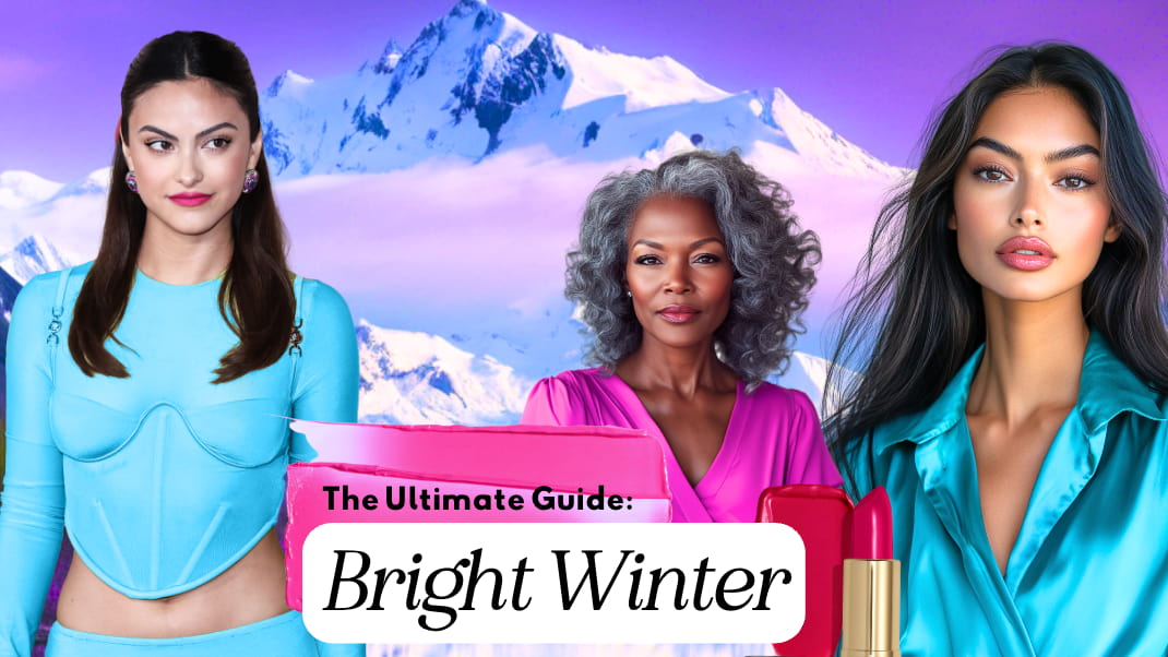
Imagine stepping into a winter landscape just as the sun breaks through the clouds, illuminating the snow with an intense, almost electrifying brightness. That is the world of Bright Winter: bold, vibrant, and sharply defined. This season combines the cool depths of Winter with a touch of Spring’s brilliance, creating a palette of high-contrast colors that feel both striking and refreshing.

Perhaps you’ve always gravitated toward bold colors but struggled with finding the right balance. Bright Winter offers a framework that brings out your natural features while introducing you to a world of vivid, cool tones that enhance your inherent beauty. If you’ve ever questioned why some outfits make you glow while others leave you feeling flat, understanding your Bright Winter palette and how to use it could be the answer.
Let’s dive into all this season has to offer and the many ways to translate it to your personal style expression. Spoiler alert: it’s not NEONS!
Don’t know anything about seasonal color analysis or not sure you’re a Bright Winter? Check out this post first.
We may earn a commission from you clicking a link below. And as an amazon associate, we earn on qualifying purchases. Full affiliate policy, here.
Bright Winter Color Palette
The Bright Winter color palette radiates with high-energy colors that hold Winter’s cool undertones and Spring’s added touch of warmth. This palette is filled with saturated colors that appear pure and bright, from icy blues and vivid magentas to rich emerald greens and maraschino reds.
Each hue in the palette feels alive, bursting with energy and sharpness. Picture the gleam of freshly fallen snow under a clear blue sky, the sparkle of a jewel-toned sapphire, or the pop of electric pink against a black backdrop. These colors create a palette that feels dynamic, unapologetic, and unmistakably sophisticated.
Bright Winter is part of the Winter family. The Winter family is made up of 3 subseasons including Dark Winter, True Winter, and Bright Winter. In different systems you may also have heard them referred to as Deep Winter, Cool Winter, and Clear Winter.
Dark Winter prioritizes depth and has an influence of Autumn. True Winter prioritizes coolness. And Bright Winter prioritizes high chroma or brightness and has a spring influence.
Here’s a larger perspective of the seasonal color analysis wheel:
Think you’re a Winter, but not sure on your subtype? Try my Winter Season Overview article, here.
Bright Winter Color Fan
Using a color fan is one of the most practical tools for bringing your seasonal palette to life. It’s not about finding an exact match for every item, but about learning to recognize which colors belong to your season’s family. We want the colors to fee familial and like they are on the same visual plane.
Check out my playlist below to see how to use the fan to determine if it’s in your season.
I provide all my clients with high-quality NDU color fans in their precise season to make shopping and wardrobe-building more intuitive. These fans are samples, not limitations—they represent a curated range within your palette, but they’re not your only options. If you’d like to explore one yourself, you can get a free color card with any NDU color fan using my code ARRUDA at checkout!
Bright Winter Neutrals
Bright Winter neutrals are essential for grounding the high-energy, cool-toned colors in this palette. You get a lot of flexibility with your neutrals and do, of course, have black and white to fall back on.
- Black and White: True black and stark white are indispensable for Bright Winter. Black adds depth and intensity, while white brings a freshness that perfectly complements the palette’s brightness.
- Gray: Cool grays, from silver to deep charcoal, offer a versatile and polished alternative to black.
- Navy and Charcoal: Dark navy and charcoal grays provide sophisticated options for suiting or formal attire, maintaining the high-contrast look while being slightly softer than true black.
Avoid warm-toned neutrals, such as beige or tan, as they clash with the palette’s cool, vibrant aesthetic. Even light grays with yellow undertones can diminish the clarity Bright Winter thrives on.
Distinguishing Bright Winter Grays From Summer
Bright Winter grays are crisp, cool, and luminous—like silver under direct light. They hold clarity and brightness, never veering into dustiness. In contrast, Summer grays are more muted, gentle, and powdery, often resembling powder or mist. Where Summer grays blur softly into the skin, Bright Winter grays create clean edges and contrast, maintaining the season’s signature sharpness.
Bright Winter grays are like the surface of chrome or the icy face of a mountain just struck by sunlight—sleek, cold, and reflective with a sense of energy and edge. These grays aren’t soft or hazy; they have a polished, almost metallic quality that feels alive and assertive.
Summer grays, by contrast, resemble a quiet fog rolling over soft hills—diffused, muted, and blended into the atmosphere. One sparkles with clarity, the other softens with subtlety. Both are beautiful, but only one cuts through with the brilliance Bright Winter demands.
The Worst Colors for a Bright Winter
Muted, warm, or dusty colors do not complement Bright Winter’s sharp, vivid palette. Colors like peach, olive green, or warm brown can create a dull effect, making the skin appear sallow or tired. Earthy tones, in particular, are at odds with the Bright Winter energy, as they lack the crispness and vibrancy this palette demands. Instead, high-saturation cool colors bring out the best in you!
If we look at suspected Bright Winter Camila Mendes in the two photos, we can see she comes alive in the BW blue. The pale, muted green makes her face look heavier, and the muted lipstick gives her complexion a muddier quality.
Bright Winter Color Qualities
Bright Winter colors are defined by their cool, vivid nature. Here’s a closer look at their key qualities:
- Hue: Neutral Cool. This means you are predominatly cool-toned with a touch of Spring’s warmth coming in.
- Value: Medium
- Chroma: Bright Winters dominant trait is a high chroma. Above all things, this is what should be prioritized.
Common Hair, Skin Tones, and Eye Colors for Bright Winter
I want to emphasize that no one’s seasons can be “guessed” with hair, eye, and skin tone color alone. It takes a methodical draping process to determine one’s season. So, do not use this section as an eliminating factor; rather, use it as a typical presentation of Bright Winters. The following colorings are common, but not the only options! They often feature a high-contrast combination of skin, hair, and eye colors.
Skin Tones: Fair to dark skintones are possibilities. They tend to have a brightness to their skin texture and a slightly glow from within characteristic.
Hair: Typically ash-toned, dark brown, or black with cool undertones. It is possible to have red hair and be a Bright Winter, as well as the occasional blonde. Hair Color is not a determining characteristic and is not as “stereotypically” dark as we might have been led to believe!
Eyes: Bright blue, green, or dark brown, often strikingly clear and defined. Can have a translucent quality to them and can have a darker outer ring. Black and brown colors are commonly found in this season.
I want to note that it does not mean that only people with blue eyes and black hair can be Bright Winter. In my experience, brightness is narrowly construed within online forums and groups, and a lot of Bright individuals (myself included) thought they were muted before seeing themselves in this new light.
Also remember that the Bright seasons typically have a very wide range of presentations in hair, eye, and skin tone, so they won’t be uniformly evident!
Take a look at two suspected Bright Winters, Megan Fox and Alexis Bledel. You can see below that their natural hair colors are much closer to a medium brown.
Bright Winter Gray Hair
When Bright Winters transition to gray, their hair often retains a cool, silvery quality that aligns with their bright, crisp coloring. Unlike warmer seasons, Bright Winter’s gray does not dull or soften the overall look. Instead, it adds a reflective clarity that enhances the season’s vibrant, crisp tones.
They look stunning with their natural grays! It’s a perfect complement to their palette.
Bright Winter Compared to Other Seasons
I want you to pay attention to subtle differences in the palettes. Often times, we stereotype seasons to be the most extreme interaction of the season (Bright winter is NEON and Light Summer is PASTEL), but when we compare the comparable colors, they are actually very close in some portions of the palette.
Bright Winter vs. Bright Spring
Both seasons embrace brightness, but Bright Winter is primarily cool with a touch of warmth in undertone, and Bright Spring is primarily warm with a touch of cool in undertone ( Cool/Neutral and Warm/Neutral, respectively). Bright Winter’s colors are sharper and cooler, while Bright Spring features more juiciness.
Bright Winter vs. True Winter
True Winter shares Bright Winter’s coolness and high contrast but lacks its added vibrancy and touches of spring. Bright Winter’s palette is more dynamic, influenced by Spring’s energy, with clearer and more saturated accent colors. True Winter will often turn a bit sallow in Bright Winter shades, or the color will feel too bouncy for them. This is because they don’t benefit from that spring influence that Bright Winter does.
But they are sister seasons, so some True Winters may be able to borrow a few Bright Winter colors as long as they aren’t heavily influenced with warmth. This will be something each person needs to customize!
Bright Winter vs. Light Summer
Light Summer is characterized by softer contrasts and pastel-like tones, whereas Bright Winter thrives on bold, saturated hues. Bright Winter’s icy blue, for example, would appear more vibrant and electric compared to the same shade in Light Summer. Light Summer has a more cotton candy, ethereal vibe that will feel childish on a Bright Winter and not give us the fully finished painting we are looking for.
But I do want you to notice how nuanced the difference is in their coloring and the palette shifts. They are not as dramatic as one might assume!
Bright Winter Celebrities
Many celebrities are frequently suggested as possible Bright Winters, but it’s important to approach these assumptions cautiously. Edited photos, professional lighting, filters, makeup, and hair color can all dramatically shift how a person appears—making it nearly impossible to determine their true season from images alone. While celebrity examples can be fun and inspiring, they’re best viewed as style references rather than confirmed seasonal identities. Accurate seasonal color analysis requires seeing the skin respond to calibrated color drapes in consistent, neutral lighting.
If you’d like more information on my in-person color analysis, check out my services page, here.
- Lupita Nyong’o
- Megan Fox
- Camila Mendes
- Dua Lipa
- Elizabeth Taylor (sometimes considered True Winter; it’s hard to tell with the images available)
- Olivia Munn
- Alexis Bledel
- Awkwafina
- Fan Bingbing
- Danai Gurira
- Krysten Ritter
- Zhang Ziyi
- Elizabeth Mcgovern
- Sophie Ellis Bextor
Bright Winter Color Palette Style Aesthetic
Bright Winter style is all about clean lines, bold contrasts, and vibrant hues. Think of pairing stark neutrals like black or white with vivid pops of color, such as electric blue, deep magenta, or emerald green. Outfits should feel modern and streamlined, with each piece enhancing the clarity and intensity of the overall look. Bright Winter style doesn’t shy away from making a statement, using color to create a look that feels both striking and sophisticated.
Here are some adjectives that describe the energy of this palette and style:
- Bold
- Vivid
- Cool
- Crisp
- Intense
- High-contrast
- Striking
- Dramatic
- Polished
- Clear
- Fresh
- Energetic
- Electric
- Icy
- Saturated
- Refined
- Sharp
- Elegant
- Sophisticated
- Powerful
- Bright
- Distinct
- Dynamic
- Sleek
- Modern
- Confident
- Charismatic
- Assertive
- Magnetic
- Focused
- Expressive
- Decisive
- Inspiring
- Innovative
- Visionary
- Intense
- Captivating
- Playful Modernity
- Avante Garde
Bright Winter: Styling Color Use
Bright Winter styling revolves around sharp contrasts and vibrant accents that highlight the season’s bold energy.
Higher Contrast Pairings
Bright Winter thrives on pairing stark neutrals like black or white with vibrant accents such as electric blue, fuchsia, or emerald green. For example, a black coat paired with a bright teal scarf makes for a sharp, dynamic look.
Monochromatic Looks
For a sleek, unified style, try monochromatic outfits in striking hues like cobalt blue or bright red. Layering shades of the same color creates an impactful yet polished effect. If you go with a neutral monochrome look, try to keep a variety of textures or style lines to create a vibrant outfit rhythm.
Color Blocking
Bright Winter can use color blocking to create bold, fresh looks. Pair intense colors like magenta and icy turquoise or emerald and violet for a modern, energetic style that feels striking without overwhelming.
It might feel like a lot at first, but you can handle it!
Bright Winter Minimalist Style
Every Bright Winter individual will have their own favorite section of their palette and how they’d like to use the palette. While brightness is your dominant characteristic, it is still possible to have a minimalist style. Consider the neutrals and navys in your palette to achieve this.
Bright Winter Yellows
Yellow can be a difficult color for people to explore and find in real life. But when you find your yellow, it can be a game changer! Bright Winter yellows are bold, cool, and intense—more like neon, lemon or icy chartreuse than buttercream or gold. These yellows carry a jolt of brightness and clarity that matches the season’s high-energy palette, often bordering on sharp or electric.
The lighter yellows in your palette are icy, not pastels. This means they have white added to their main hue (yellow) instead of gray!
Jeans for Bright Winter
When you’re first starting on your seasonal color journey, generally, analysts will say to focus on the tops/jackets/makeup or anything that is close to your face. As you advance in your color journey (or depending on how you approach your wardrobe palette), you may want to start to integrate it into your bottoms and jeans as well.
Jeans are an area where you don’t need to be a perfectionist. As long as you are avoiding warm and faded jeans that will look out of place next to your BW tops, generally, you’ll look great.
If you want to know some ideal jean colors for Bright Winter, you could explore:
- Dark Wash Denim: Dark indigo or nearly black jeans provide a sleek, polished base, perfect for Bright Winter’s high-contrast look. These are versatile options that can be dressed up or down.
- Cool Medium Wash: Medium denim with cool undertones works beautifully for casual outfits, avoiding any warmth or faded tones that might dilute the palette’s clarity.
- Gray Denim: Pigmented Charcoal gray jeans add a modern, sophisticated twist, pairing well with Bright Winter tops for clean contrast. Avoid heavy wear marks or fading that will dull the perception of the color.
- Icy Blue: You could also try a whitened light blue denim that is similar to your “icy blue” colors. But keep the contrast between the denim and top high so the outfit still packs a punch.
Avoid distressed or overly faded denim, as it lacks the structure and definition that aligns with Bright Winter’s sharp aesthetic.
Bright Winter Prints
Prints for Bright Winter should reflect the season’s high contrast, bold energy, and clear tones. They are an excellent way to incorporate the vibrant and dynamic aspects of the Bright Winter palette into outfits. The right print can make an outfit feel cohesive and polished while maintaining the crisp, striking aesthetic that defines this season.
Key Characteristics of Bright Winter Prints
- High Contrast: Opt for prints that feature stark contrasts, such as black and white, or combinations of bright colors like magenta, cobalt blue, and emerald green paired with cool neutrals.
- Graphic and Bold: Geometric shapes, clean stripes, and large, structured patterns are ideal. Avoid overly delicate or intricate designs, as they may feel too soft for Bright Winter’s sharp energy. ( But, there is always a way to make this work if you are drawn to those types of prints- remember this is your own style toolbox!)
- Dynamic Color Combinations: Use prints that mix bright hues from the palette, like fuchsia and teal, or incorporate icy tones with darker accents for a vibrant yet cohesive look. Overly tonal prints can feel a bit dull.
Types of Prints to Embrace
- Stripes: Crisp, high-contrast stripes in black and white or bright colors like electric blue and icy pink.
- Abstract Patterns: Bold abstract designs with clean edges and cool, saturated tones from the palette.
- Floral Motifs: Large-scale florals with vivid, cool colors, avoiding muted or earthy undertones.
- Graphic Designs: Prints featuring modern, geometric shapes like chevrons, polka dots, or bold color blocking.
- Animal Prints: Cool-toned versions of classic patterns, such as black-and-white leopard or zebra prints, with clean and crisp contrasts.
BUT! I also want to stress that the ways you take your color palette and apply them to your unique style preferences is how you develop a style you love. Every palette has lights, brights, neutrals, and darks, so if you love more cottagecore prints or ethereal prints, there is always a way to adjust!
Guidance on Picking Prints 70% in Palette
While finding a print that is entirely in the Bright Winter palette might feel challenging, aiming for 70% in-palette colors is a realistic and effective strategy. This approach allows for flexibility while ensuring the overall print harmonizes with your Bright Winter features.
Tips for Choosing 70% Palette Prints
- Start with a Dominant Palette Color
Look for prints where the main color is a Bright Winter shade, such as black, stark white, or a bright hue like cobalt blue or emerald green. This ensures the print’s foundation aligns with your season. - Ensure Secondary Colors Complement the Palette
The supporting colors in the print should either belong to the Bright Winter palette or to a closely related season, like True Winter or Bright Spring. For example, a print combining magenta and icy turquoise (Bright Winter) with a hint of vibrant yellow-green (Bright Spring) can still feel cohesive. - Handle Out-of-Palette Colors Strategically
If a print contains an out-of-palette color, ensure it doesn’t dominate the design or sit too close to your face. For example:- A scarf with a bold magenta and teal pattern that also includes small accents of a muted gray-blue might still work as long as the Bright Winter colors are dominant.
- A dress with a primary Bright Winter floral design with a slightly warm beige accent leaf can work.
- Keep the Palette Colors Near Your Face
For accessories like scarves or tops, prioritize prints where the in-palette shades are closer to your face. Out-of-palette accents in shoes, belts, or skirts will have less impact on overall harmony.
Bright Winter Makeup
Bright Winter makeup thrives on high contrast and vibrant tones that align with the palette’s clarity and brightness. ( Have I said high contrast and vibrant enough yet? 😉 )
Remember that makeup is highly personal, and you probably have a “baseline” for how much makeup you use currently. If you’ve never been a bright lipstick person, don’t feel pressure to all of a sudden buy allll the fuschia and cherry lipsticks. Start slowly with your main makeup items swapped into your palette, and the more you adjust to seeing yourself in your palette, the more comfortable you will be exploring the limits of the palette itself.
Foundation
Bright Winter individuals benefit from foundations with cool-neutral or cool undertones that provide a smooth, even canvas. Choose lightweight to medium coverage for a polished look that doesn’t mask natural contrast. This is best found by swatching colors on your chin in person with natural light. Makeup companies do not apply “neutral”, “cool”, and “warm” with the same strigent meaning as we do in color analysis. So don’t pay attention to those labels!
Blush
Blush for Bright Winter should reflect the vivid nature of the palette. Recommended colors include red violet (sugarplum), maraschino cherry, and strawberry red. Cream blushes can blend seamlessly for a natural flush, while satin powders can add a soft radiance without overpowering.
I KNOW these blush colors might seem insane to you. In fact, my mouth fell open when I was presented with my Bright Spring blush option. My mind immediately said, Noooo! But, after applying a LIGHT dusting and blending it in, the proof was in the pudding. So put your skepticism aside and try it 😉
Lipstick
Lipstick is key for Bright Winter, with colors like true red, hot pink, and fuchsia red providing bold, impactful accents. Satin, matte, or cream finishes are ideal for strong, clean lines. Sheer colors often don’t pack enough punch for a typical Bright Winter, but remember this advice is “your mileage may vary”. High shine glosses can work well if you’re just starting your bright journey.
Bright Winter Eye Makeup: A Clear and Clean Approach
For Bright Winters, eye makeup should enhance your natural clarity and contrast without becoming heavy or overly styled. The overall effect should feel fresh, defined, and vibrant, allowing your naturally striking features to shine. Think crisp lines, cool tones, and a polished presence.
Suggested Techniques:
Keep the eye area clean and bright – Avoid smoky or heavily blended shadows that can cloud your natural definition. Harsh or diffused looks detract from the season’s natural precision.
Avoid too much darkness – While Bright Winter can handle contrast, layering on too much dark shadow or liner can overwhelm the eye area. Instead, focus on definition with lightness, using contrasting lines rather than depth to bring attention to the eyes.
Line the eye with intention – Eyeliner should be precise and crisp, not smudgy. You can use black, navy, or charcoal, depending on your coloring. Avoid overly warm browns or hazy grays.
Use cool-toned colors – Eye shadows should stay in the cool or neutral-cool family, with options like icy taupe, soft charcoal, navy, icy lavender, silver-gray, or white. These colors reflect light and echo the brightness in the eyes rather than dulling them.
Highlight, don’t hollow – Instead of contouring with shadow to create depth, highlight the brow bone or inner corners with something light and cool-toned, like icy white or pearl. This keeps the eyes open and sparkling.
Brow definition matters – Keep brows shaped and defined, but don’t over-darken them. The structure should support the brightness of the eyes, not compete with it.
Avoid warm or muted tones – Terracotta, camel, peach, bronze, and warm browns can flatten the eye area and fight against your natural contrast. These tones belong to warmer seasons and tend to dull a Bright Winter face.
Best Color Families for Eye Makeup
Black, charcoal, navy – for clean liners
Icy taupe, steel gray, icy pink, lavender, silver – for eyeshadows and highlights
White or pearl – for inner corner and brow bone highlights
Cool espresso or black-brown – for softer definition where needed
Bright Winter Nail Polish
Bright Winter nails come to life in crisp, high-contrast shades that mirror the season’s cool vibrancy. Think bold fuchsia, icy lavender, bright cherry red, or jewel-toned purples. Silver, cool charcoal, and even black can look striking when worn.
Avoid earthy, warm, or muted tones like peachy nudes, dusty roses, and warm reds, which can dull the natural brightness of your coloring. Clean, vibrant application is key—sheer or beige tones only work if they’re brightened and cool.
Hair Dyeing for Bright Winters: What Works and What to Avoid
If you’re a Bright Winter considering a hair color change, the key is enhancement, not transformation. Your natural hair already holds the clarity and contrast that makes this season so striking. Overly artificial dyes or muted shades can dull that vibrancy, while the right techniques will keep your hair looking fresh, bright, and in harmony with your natural coloring.
What to “Avoid“
🚫 Heavy, opaque dyes – Bright Winter hair has a natural clarity, often described as “glassy” or reflective. Box dyes that deposit thick, flat color can make the hair look dense and unnatural. Instead, opt for techniques that maintain dimension.
🚫 Warm, golden, or brassy tones – Even if you have some warmth in your natural hair, going too warm (golden blondes, auburns, or caramel browns) can clash with your cool-leaning skin tone and eye color. If you’re lightening, a cool ash or neutral blonde is a better fit.
🚫 Over-lightening – While some Bright Winters naturally have blonde hair, forcing the hair too light can wash out your contrast. If you’re lifting color, aim for controlled highlights rather than all-over bleaching.
🚫 Muted or earthy colors – Anything too dusty, matte, or ashy-gray can dull your features. Bright Winters thrive on crisp, clean tones, so hair color should reflect that.
What Works Best
- Glazes and clear toners – If your natural hair color already fits the Bright Winter range, a clear or cool-toned gloss can enhance its vibrancy without altering its depth. This keeps the natural “sheen” of Bright Winter hair intact.
- Cool or neutral brunettes – Medium to dark neutral brown shades work beautifully, especially with a subtle violet or espresso undertone. If you’re covering grays, aim for a soft, dimensional approach rather than a flat solid color.
- Silvery gray transition – Bright Winter gray hair has a luminous, almost “tinsel” effect ( as described by Christine Scaman) . Letting silver grow in naturally, or blending it with a cool ash toner, will look more harmonious than trying to force flat pigment back into the hair.
- Refined highlights – Bright Winters can benefit from fine, cool-toned highlights, but chunky or overly warm streaks should be avoided.
Here are some colors you might try if you’d like to experiment with hair dye. However, you do not need to have jet black hair to be a bright winter, so try out your natural hair with your palette before making this jump!
For Bright Winters, less is often more when it comes to hair dye. A subtle refresh that keeps the natural clarity intact will always be more flattering than a drastic overhaul. Instead of working against your coloring, lean into the brightness that makes Bright Winter so unique.
Bright Winter Fabrics and Textures
Bright Winter fabrics and textures reflect the season’s cool, crisp, and high-contrast nature. Shiny Textiles like satin, polished cotton, silk, and leather work beautifully for Bright Winter, adding a subtle reflection that complements the season’s brightness. Crisp Materials like cottons, fine wool, and tailored fabrics create clean lines that align perfectly.
Fabrics
- Satin – Smooth and reflective, ideal for eveningwear and accents.
- Silk (Charmeuse, Mikado, Twill) – Sleek and luminous, adding depth without overwhelming the look.
- Velvet – Deep and luxurious, especially in jewel tones or black. A low-pile finish works best to avoid excessive heaviness.
- Leather and Patent Leather – Polished, structured, and striking. Patent finishes enhance the high-shine element of the palette.
- Taffeta – Crisp and luminous, excellent for dramatic silhouettes.
- Cashmere and High-Density Wool – Smooth and refined, providing warmth without a fuzzy or blended effect.
- Sharp Cotton and Poplin – Clean and structured, great for shirting and tailored pieces.
- Denim (Dark or Colored) – Deeply saturated washes or bright, bold hues rather than faded or distressed finishes.
- Organza and Chiffon – Light and airy but with a crisp, glassy quality rather than softness. Should ideally hold its shape rather than billow/collapse.
- Lacquered or High-Gloss Finishes – Found in coated fabrics or metallic elements, reinforcing brightness and contrast.
Textures
- Smooth and Sleek: Smooth fabrics with minimal texture emphasize the clarity and boldness of Bright Winter colors.
- Subtle Shine: Incorporate materials with slight luster or sheen, like silk or satin, to enhance the polished aesthetic without overwhelming
Bright Winter Jewelry
Jewelry for Bright Winter plays a critical role in enhancing the season’s sharp contrast and vibrant energy. The right pieces not only complement Bright Winter’s cool, crisp palette but also add polish and sophistication to any outfit. Bright Winter jewelry should feel clean, modern, and refined, steering clear of overly earthy or rustic designs that can detract from the palette’s clarity. The focus is on metals and stones that reflect light and maintain the high-chroma brilliance that defines this season. Whether it’s a statement piece or a delicate accessory, Bright Winter jewelry ties the look together with its sleek, bright, and cool aesthetic.
- Metals: Platinum, silver, and white gold are ideal for Bright Winter, offering a reflective coolness that aligns perfectly with the palette. These metals emphasize the clean, modern aesthetic of this season.
- Gemstones: Clear, high-saturation stones like diamonds, sapphires, emeralds, and amethysts harmonize beautifully with Bright Winter’s vibrant colors. These stones add brilliance and depth, elevating the overall look.
- Designs: Jewelry should feature sleek, modern lines or geometric patterns. Avoid intricate, overly delicate, or ornate styles that feel vintage or bohemian, as they may clash with the palette’s clean aesthetic.
For day-to-day styling, focus on understated elegance—perhaps a pair of sapphire stud earrings or a delicate silver chain. For evening looks, embrace bold statement pieces like a diamond-encrusted bracelet or a striking emerald pendant. With Bright Winter, jewelry becomes more than just an accessory—it’s a reflection of the season’s radiant, refined energy.
Adapting to the Brightness of the Palette
For those new to Bright Winter, the high contrast and saturation can feel overwhelming at first. Adapting to this bold palette can be a gradual process that allows you to build confidence in wearing strong, striking colors.
- Start Small: If the brightness feels too intense, begin by introducing Bright Winter colors in accessories like scarves, shoes, or handbags. This allows you to adjust to the vibrancy without feeling overpowered. Or try swapping out one item you regularly wear to a Bright Winter option. Over time, you’ll likely start to see the impact your colors can have!
- Anchor with Neutrals: Pair bold colors with Bright Winter neutrals like black, navy, charcoal, and white to create balance. A structured black blazer or crisp white top can help tone down the intensity of vivid hues.
- Adjust Proportions: Use bright colors in areas where you feel most comfortable. If wearing a bold magenta dress feels too much, try a deep sapphire or emerald top with a more neutral base.
- Experiment with Textures: Matte or structured fabrics can soften the impact of Bright Winter’s colors. Velvet, crisp cotton, or structured knits can make bright colors feel more wearable compared to high-shine materials.
- Find Your Personal Bright Winter Spectrum: Not all Bright Winter colors need to be neon-bright. Explore the deeper jewel tones like burgundy, deep teal, or navy before gradually introducing fuchsia, bright red, or electric blue.
Adapting to Bright Winter is about embracing contrast and clarity in a way that feels authentic to you. Over time, you may find that these colors don’t feel as bold as they once did—they simply feel right.
I Hate the Colors—What Should I Do?
Discovering that you’re a Bright Winter but feeling disconnected from the colors can be frustrating. Maybe they feel too intense, too artificial, or just not you. That’s completely valid. The goal of color analysis isn’t to force you into something that feels wrong—it’s to help you find a version of it that works for you. Here’s how to navigate your palette if you dislike it.
1. Identify What Specifically Feels Off
Before abandoning the palette entirely, pinpoint what about Bright Winter feels uncomfortable:
- Is it the brightness? → You might be more comfortable with deeper or slightly toned-down versions of your colors. It’s ok to start here, and then adjust!
- Is it the coolness? → If warmth feels missing, you may need to explore the warmer edge of Bright Winter, like brighter reds, warmer magentas, or yellows (without slipping into Bright Spring). Also ask your analyst where you fall within the spectrum of your Bright Winter season, you may be able to borrow from Bright Spring more easily than True Winter!
- Is it the contrast? → You don’t have to wear stark black and white—dark navy or charcoal with icy pastels can soften the effect.
- Is it certain shades? → You don’t have to wear every color in the palette. Focus on ones that feel the most approachable.
2. Find Colors That Bridge the Gap
If Bright Winter’s colors feel like too much of a jump from what you’re used to, transition gradually.
- Try the most wearable, neutral colors first (charcoal, deep navy, crisp white).
- Use a deep version of a bright—like sapphire instead of electric blue, cranberry instead of fuchsia.
- If Bright Winter feels too intense, look at True Winter as a softer alternative while still staying cool and high contrast.
3. Style It Your Way
Bright Winter doesn’t have to mean flashy, avant-garde, or theatrical—you can interpret it through your personal style.
- If you like minimalism, wear a sleek black outfit with a single sapphire or magenta accent.
- If you prefer classic styling, stick to navy, crisp white, and deep reds.
- If you love romantic or softer aesthetics, choose smooth fabrics, monochrome looks, and jewel-toned florals over harsh contrasts.
4. Adjust Fabric & Finish
Sometimes, the issue isn’t the color itself—it’s how it’s presented.
- If bright colors feel too overwhelming, avoid shiny fabrics like satin or silk that make them pop even more.
- Instead, choose matte or structured fabrics like wool, fine knits, and smooth cotton to tone down the intensity.
- Soft textures like velvet in deep Bright Winter shades (burgundy, navy, emerald) can feel more approachable.
5. Use Your Colors in Small Doses
You don’t need to wear a head-to-toe Bright Winter outfit to stay in harmony with your palette.
- Accessories (earrings, shoes, scarves) let you incorporate color without feeling overwhelmed.
- Layering—pair a Bright Winter-colored top under a black blazer instead of wearing it on its own.
- Makeup—sometimes, a Bright Winter lipstick or nail color is a good place to start
6. If You Still Hate It, Own What Feels Right
At the end of the day, your wardrobe should reflect you, not just a color theory.
- If you still dislike Bright Winter colors, you can bend the rules while keeping some harmony (e.g., sticking to cooler tones but muting them slightly).
- Some people also adjust within the broader Winter family—leaning into True Winter’s depth or Bright Spring’s warmth if they feel like a better fit.
- The goal is not perfection—it’s to help you feel your best, and that means wearing what makes you feel confident.
Bright Winter Capsule Wardrobes
Each season I put together sample capsule wardrobes and outfits that work for each of the 12 seasonal color palettes. Check them all out here.
Discovering your best colors through seasonal color analysis isn’t just about style—it’s about clarity, confidence, and self-expression. When you step into the shades that truly align with you, everything sharpens: your features come alive, your wardrobe clicks into place, and getting dressed becomes energizing instead of overwhelming. It’s like flipping on the lights in a room you didn’t realize was dim.
Whether you’re a confirmed Bright Winter or just beginning your journey, exploring your palette is an invitation to see yourself more vividly—and to show up in the world with unapologetic brilliance.
Enthusiastic Bright Winter here – I’m so happy you finally published this, you really went all out! I relate so much to what you said about the way searching for color analysis info online can lead you to believe you can’t possibly be bright. I also want to add that in my own experience, if your fashion taste tended towards muted or monochrome dark colors before your analysis, the effect on your skin might have made your idea of yourself more muted/dulled down than you actually are. I have light green/grey eyes, dark brown hair, and fair olive skin and saw a lot of people who looked like me being put into True Summer in the comments on forums. But anything too pale pastel or greyed makes me look rubbish compared to brighter shades, which made a lot of sense once I had my professional analysis done.
I find also that wearing an all black outfit is fine for me but also somewhat boring, like I’m not making the most of my color potential, if that makes sense? Even just adding a bright red lipstick seems to help a lot.
Thanks so much again for all your hard work on this!
Totally relate and endorse all your points! If you believed you were soft and you were dulling your complexion and graying out your features, it’s like going from looking through a foggy window to high def 4k! And I feel like online forums looovve to type everyone as soft 🙃 The fact you find an all black boring outfit too safe probably indicates you’ve really adjusted your eye to the new palette and what it can bring, so you crave those brights. I’ve felt similarly with my Bright Spring palette. What used to intimidate me, now gets me excited! I’m so glad you liked the article!!
Yes! Totally agree about craving brights! I am closer to True Winter than I am to Bright Spring, so I still have to be a little careful with my undertones. I recently purchased a bright coral top that looked fine with my silver jewelry, so I thought it was closer to BW, but throughout the day I could really see the difference on my skin compared to magenta or bright blue. I love the Bright Spring palette too and wish I could get away with stealing from more of it haha.
Hopefully helpful to newly minted Bright Winters who prefer not to spend loads of time on makeup, but want to keep what they do use in harmony with their palette – I find Clinique’s Chubby Stick line of lipsticks really convenient for lazier days and their more intense shades are wonderful for high chroma folks. I would recommend Roomiest Rose (a bright raspberry-ish shade) for everyday and Mightiest Maraschino (a punchy, cool red) for a little something extra!
Yes, your eye just becomes more attuned the longer you are on this color journey (imo). And I believe Christine Scaman recommends the Clinique Chubby sticks as well! Great call!
I’m also an enthusiastic bright winter and I’ve been waiting for this article. Completely agree with everything you said. Everyone online said I was a soft summer, or a true summer, but I just knew that wasn’t right. I’ve always naturally been drawn to cool, bright colours. When I was draped in person as a bright winter, everything fell into place. I should have never doubted myself, since I’ve always been able to pull of brightly coloured hair. (Love the inclusion of the blue, purple, pink and green hair colours Gabby!)
And yes, all black is so boring. All fuchsia pink = much better.
You are so Bright Winter! The way you handle all those beautiful bright hair colors!!
Another bright winter here! I pop with fuchsia and hot pink! It really helps when shopping to weed out immediately all the things that would wash me out. I just devour all of your content. So much good information!
I do struggle a little because I am also a kibbe Soft Natural. I find a lot of the recommended suggestions for SN seem very earthy(warm), natural, and relaxed which conflict with the geometrics and bold colors I love. I wish the world would recognize that colors and shape/size are two completely different things. It’s frustrating.
Thanks for all the work you put into helping us all out!
Oh they are definitely two different elements, and can combine beautifully! I used to do videos where I mix people’s style parameters together, maybe I’ll try to bring that back soon! Fuschia and pink are so so stunning on Bright Winters
I love your content you do such great work!
I am a bright winter and do enjoy being so.
I lean a little on the warmer side more to a bright spring, still cool”but with lipsticks I go a little more coral pink. Don’t love the really blue on me again keep up the great work so inspiring
Cat.
I’m happy to hear yo liked it! Seasonal color is a spectrum so it’s helpful to know where you lean, and I find nailing your lipsticks to be such a great step in the journey! It makes shopping for them so much easier
Maybe a bright winter here! I have pretty dark brown skin, hair, eyes, but extremely pronounced white sclera and high contrast on desaturated photos. I’ve always gravitated toward these cool highly saturated jewel tones and have a rainbow closet. Hot pink, cobalt blue, and emerald green are my jam. I lean toward very high contrast patterns and color blocking (I’m also a flamboyant gamine) and just feel very at home in a lot of juxtaposition.
I’ve been told so many times that I must be dark winter or dark autumn even, but I look pretty flat and lifeless when very deep colors and it doesn’t feel me!
trust your gut! sounds like bright winter is your home!