
Spring Capsule Wardrobe: 12 Seasonal Color Palettes {2025}
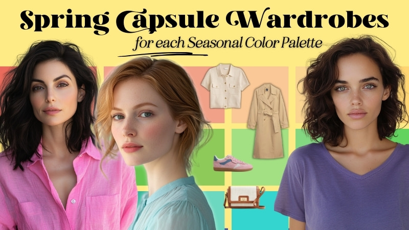
Spring 2025 Capsule Wardrobe: Embracing the Season of Renewal
The arrival of spring is like a breath of fresh air—a soft breeze carrying the scent of new blooms, the first golden rays of warmth after winter’s chill. It’s a season of movement, where the world shakes off its muted tones and bursts into life. Light dances across fresh petals and bright skies, reminding us that color isn’t just something we wear—it’s something we feel.
For many, discovering their seasonal palette feels like unlocking a secret. Maybe you’ve spent hours studying color theory, or perhaps you’ve had a professional analysis that pinpointed your perfect hues. But while knowing your season is a milestone, the real magic happens when you start incorporating your colors into everyday life.

A capsule wardrobe is an excellent way to begin. By curating a small collection of seasonally appropriate pieces in your best colors, you can experience how they interact, layer, and evolve with your personal style. Spring is a time for embracing movement, warmth, and clarity—qualities that each seasonal palette expresses in its own way.
We may earn a commission from you clicking a link below. And as an amazon associate, we earn on qualifying purchases. Full affiliate policy, here.
Seasonal Color Capsules for Spring Weather
Every seasonal palette has colors that transition beautifully into spring. Lighter fabrics, fresh color combinations, and thoughtful layering allow each season to shine in this season of renewal.
The capsules I’ve created for each season are meant as inspiration rather than rigid formulas. Each one highlights 1-2 core neutrals and 2-3 accent colors that mix effortlessly, helping you see how your palette comes to life in real outfits. If a combination doesn’t resonate with you, use your color fan to explore alternatives that suit your unique style.
Remember, your seasonal colors are a guide, not a rulebook. Over time, you’ll develop an intuitive sense of what works best for you, and shopping will feel effortless. If you’d like an NDU color fan—the same ones I use in my Sci\Art-based consultations—you can get a free color card with code ARRUDA.
Small Sample Palettes: The Expanse of Your Season
Before each capsule, I include an overview of each season’s color characteristics. If you are unfamiliar with the seasons or what these terms mean, check out this seasonal color 101 article here.
I also include a curated color palette for spring taken directly from your season’s palette. It is important to remember that every season has a full, well-rounded expression for spring. While some of these colors may be harder to find in real-life shopping, every season has stunning colors that fit beautifully into spring fashion.
It’s important not to stereotype any season—no season is limited to only pastels, only darks, or only brights. Each palette holds its own version of spring-appropriate colors, whether that means glowing golden tones for True Spring, clear sky blues for True Winter, or softened floral pinks for Soft Autumn. These small palettes are designed to show how every season, no matter how light, dark, bright, or muted, has a beautiful way to embrace spring.
{Obsessed with seasonal color? Check out my Color Chat with analyst Cate Linden}
A Quick Note About Online Selections
The pieces featured in these capsules are curated from online retailers and have not been physically tested for color accuracy. While they have been selected to align with seasonal palettes, colors may vary based on lighting, screen settings, and fabric composition. Before making purchases, I recommend checking return policies and using your color fan to assess whether an item truly aligns with your palette once it arrives.
The 12 Spring Seasonal Color Capsules
Dark Autumn
Hue: Neutral/Warm
Value: Low. Deep. Your colors have black added to them, but are still strong
Chroma: Medium/High.
Sister Seasons: Dark Winter and True Autumn.
Dark Autumn moves into spring like the transition from twilight to golden hour—deep, earthy tones are still present, but they meet the glow of the returning sun. Picture the richness of an old-world garden waking up from slumber—burnished gold, deep moss, and the warm brown of fresh earth. Your colors evoke a sense of depth and quiet strength, perfect for structured layers and organic textures.
As the weather warms, textures lighten without losing depth. Instead of winter’s heavier wools and leathers, opt for suede, raw silk, and lightweight wool knits in deep olive, rich cinnamon, and golden amber. These colors feel naturally at home in a wardrobe that blends structure with the warmth of nature.
For neutrals, dark chocolate, espresso brown, and deep teal serve as grounding elements, while golden ochre, warm rust, and peacock blue add vibrancy without feeling overly bright. A deep green trench over a warm rust blouse, paired with dark brown trousers and antique gold jewelry, embodies your palette’s refined yet earthy energy.
Spring is about transition—for Dark Autumn, that means retaining depth while embracing the lighter touch of warmth and movement.
True Autumn
Hue: Warm
Value: Medium. Your palette leans into balanced, earthy tones.
Chroma: Medium
Sister Seasons: Dark Autumn and Soft Autumn.
For True Autumn, spring is simply a shift in the warmth you already embody—from the deep glow of embers to the golden warmth of afternoon light. Imagine a field of wildflowers glowing under an early sunset, with rust, camel, and warm ochre blending effortlessly into the landscape.
Your wardrobe embraces sun-kissed natural tones with a focus on rich neutrals and softened, warm brights. Instead of winter’s heavier textures, move toward lightweight knits, soft suedes, and breathable woven fabrics that reflect the inviting, cozy energy of your palette.
Camel, terracotta, and deep nutmeg ground your looks, while marigold, warm coral, and moss green bring a lively but natural brightness. A golden beige linen blazer over a leaf green colored dress, paired with leather sandals and amber jewelry, is a perfect way to transition into the warmer days ahead.
Spring for True Autumn is about effortless warmth, blending natural textures with a palette that glows from within.
Soft Autumn
Hue: Neutral/Warm
Value: Medium
Chroma: Low/Soft. Your colors are muted and understated.
Sister Seasons: True Autumn and Soft Summer.
Soft Autumn embraces the quiet side of spring, where golden light filters through misty mornings, and the world slowly wakes in soft, muted tones. Imagine the warmth of sandstone, the hazy glow of a sunrise, and the gentle green of leaves just beginning to bud.
Your wardrobe should feel calm, effortless, and gently blended, with soft, textured fabrics that drape rather than cling. Warm grays, dusty rose, and sun-faded teal create a natural, harmonious palette that mirrors the hazy warmth of spring’s early days.
Instead of strong contrasts, layer colors that melt into one another—a warm taupe trench over a soft sage blouse, paired with muted rose trousers and brushed gold accessories, for example. Linen, tencel, and lightweight cashmere work beautifully for this season, adding a feeling of quiet sophistication.
For Soft Autumn, spring is a gentle unfolding rather than an explosion of color—your palette thrives in subtle shifts of warmth, softness, and depth.
Soft Summer
Hue: Neutral/Cool
Value: Medium.
Chroma: Low/Soft. Subdued, blended colors define this palette.
Sister Seasons: Soft Autumn and True Summer.
Spring’s soft, diffused light is perfect for Soft Summer’s understated elegance. Imagine a watercolor landscape—misty blues, lavender fields in early bloom, and soft gray clouds drifting across a pale sky. Your palette is about harmony, fluidity, and gentle contrast, embracing cool neutrals and muted pastels that feel quiet yet intentional.
Your wardrobe should be softly layered and lightly structured, using brushed cottons, heathered knits, and fluid draping fabrics that create movement without sharp edges. Dusty rose, muted periwinkle, and slate blue add dimension without overpowering, while neutrals like cool taupe, smoky gray, and soft navy ground the palette.
A slate blue trench over a blush-toned top, paired with soft gray trousers and silver accessories, is an ideal spring transition outfit—polished, elegant, and effortlessly blended.
Soft Summer isn’t about stark contrasts or bold statements, but rather a seamless flow of color that mirrors the quiet beauty of spring mornings. You are an enchanted rose!
True Summer
Hue: Cool.
Value: Medium. Your colors are softened with cool gray undertones.
Chroma: Medium leaning slightly towards Soft.
Sister Seasons: Soft Summer and Light Summer.
True Summer thrives in the serene beauty of a cool, misty spring morning. Imagine hydrangeas soft with dew, delicate lavender stems dusted with frost, and the pale blue reflection of a sky just after rain. Your palette is cool, calm, and effortlessly elegant, embracing light airy fabrics with gentle drape.
Spring for True Summer is about embracing softness without losing structure. Lightweight layers in cool grays, soft rose, and soft teals create an ethereal but refined aesthetic, perfect for the season’s changing temperatures. A silvery gray trench, layered over a soft navy blouse and misty lilac skirt, finished with pearl accessories, captures your season’s delicate yet polished nature.
Your colors don’t shout—they serenade and enchant. Avoid anything overly crisp or heavily saturated; instead, let your palette flow like a quiet stream, steady and serene. This season is about graceful transitions, where softness meets sophistication.
Light Summer
Hue: Neutral/Cool
Value: High/Light. Your palette is light, fresh, and airy.
Chroma: Medium.
Sister Seasons: True Summer and Light Spring.
Light Summer’s delicate beauty shines in spring’s fresh, crisp light. Picture a morning sky washed in pastel hues, the soft shimmer of ocean foam, and the airy elegance of a breeze through linen curtains. Your palette is light, cool, and subtly energized, embracing frosted pastels and soft, feathery neutrals.
Your wardrobe should feel weightless and effortless, focusing on soft cottons, lightweight knits, and breathable linens. Soft lavender, misty aqua, and cool blush pink bring a whisper of color, while light porcini, soft navy, and cool taupe provide a refined base.
A light periwinkle sweater paired with a pale gray skirt, topped with a soft white trench and delicate silver jewelry, is the perfect airy, effortless look for spring.
Light Summer isn’t about harsh contrast—it’s about luminous softness, a dreamlike glow that carries through every outfit.
Light Spring
Hue: Neutral/Warm
Value: Light/High. Your palette is light and bright, full of fresh, airy tints.
Chroma: Medium. Your colors are clear but not as bold as Bright Spring.
Sister Seasons: Light Summer and True Spring.
Light Spring feels like the very first blush of warmth after winter—a season where color emerges in delicate, glowing waves. Imagine the soft gold of early morning light, the first hints of green on budding trees, and the pale pink of blossoming cherry trees against a crisp blue sky. Your colors bring a sense of freshness, like a gentle breeze carrying the scent of new blooms.
Your spring wardrobe thrives on creamy neutrals, soft peaches, and warm aqua tones, creating an effortless harmony that feels light yet radiant. Think buttery ivory knits, fresh aqua blouses, and fresh melon-toned accents—all in breathable fabrics that reflect the soft, glowing nature of your palette. Where winter was about layering for warmth, your focus now shifts to fluidity and movement, allowing light fabrics and delicate hues to mirror the natural softness of your season.
Instead of heavy, dark tones, your neutrals take on a luminous quality, like warm sand, pale taupe, and misty champagne. Pair them with light coral, periwinkle, or seafoam green for an effortlessly fresh spring wardrobe.
This season is your time to shine—softly, like the first morning light over a meadow.
True Spring
Hue: Warm. Golden undertones define every color in your palette.
Value: Medium. Your colors are bright but don’t lean too dark or too light.
Chroma: Medium-High. Your palette is vibrant, clear, and full of life.
Sister Seasons: Light Spring and Bright Spring.
True Spring is the pure joy of warmth returning, bursting forth in colors that feel as alive as the season itself. Think of golden sunlight spilling over green hills, fields of wildflowers in full bloom, and the lively energy of a fresh spring breeze. Your palette is clear, fresh, and full of vitality, embracing the golden hues of new growth.
Your spring wardrobe should feel energized but effortless—imagine the warmth of buttercup yellow, the vibrance of coral, and the lushness of fresh green woven into playful yet polished outfits. Camel, warm beige, and honeyed ivory serve as your grounding neutrals, creating a backdrop for your sunlit brights.
Soft layers in lightweight knits, linen, and breezy cottons allow for a feeling of movement—your palette isn’t about heavy structure, but rather an effortless, sun-kissed radiance. A fresh green blouse paired with a golden-tan trench and coral flats is a perfect way to transition into spring while staying true to your playful, warm, and inviting essence.
Spring is your season in full bloom—embrace it with joyful, glowing colors that reflect the lively warmth of your palette.
Bright Spring
Hue: Neutral/Warm
Value: Medium.
Chroma: High. Clarity and vibrancy are your defining features.
Sister Seasons: True Spring and Bright Winter.
Bright Spring bursts onto the scene like the first explosion of color after winter’s monotony. Think of a garden in full bloom, bold tulips against fresh green grass, electric blue skies after a storm, and golden rays reflecting off tropical water. Your palette is all about contrast, energy, and unexpected clarity.
Your spring wardrobe thrives on dynamic pairings—sharp sunny yellow with charcoal, bright coral with soft ivory, vivid turquoise against warm beige. Your neutrals—warm gray, taupe, and clear ecru white—keep your look balanced, but your accents are where the magic happens. Bright Spring is not about fading into the background; it’s about making a crisp, clear impact. And you can tell I went all out with this capsule.
I’ve found the more I’ve adjusted to my Bright Spring palette, the more I crave color in all aspects of my outfit. But if you’re hesitant or new to Bright Spring, don’t feel pressure to go to this level of extreme color throughout your capsule. Take it slow and adjust your color wardrobe baseline.
Opt for structured yet playful pieces, like a tailored blazer in warm beach gray with a punchy yellow top and cobalt flats, or a bold coral dress with an ivory trench and a splash of turquoise jewelry. Your palette doesn’t do dull—embrace colorblocking, clean cuts, and fresh, high-energy looks.
Spring is your season of contrast and excitement—lean into the bold clarity that makes Bright Spring unmistakably juicy.
Bright Winter
Hue: Neutral/Cool
Value: Medium.
Chroma: High/Bright. Dominant characteristic
Sister Seasons: Bright Spring and True Winter.
Bright Winter enters spring like a bolt of lightning against a clear sky—electric, high-energy, and full of contrast. Imagine the dazzling reflection of sunlight on ice, bold tulips standing tall in fresh green fields, or the crisp vibrance of city lights after a rainstorm. Your colors are pure, intense, and unmistakably crisp.
Spring for Bright Winter is about striking contrast with high-impact accents. Sharp white, pure black, and dark charcoal ground your outfits, allowing your brighter hues—vivid fuchsia, electric blue, and bold yellow—to pop with maximum intensity.
Opt for structured yet modern pieces, like a bright pink sweater paired with a fun white mini skirt or a striking electric blue spring dress. Bright Winter’s energy is fast, dynamic, and magnetic—lean into it by embracing bold combinations and crisp, high-definition styling.
This is not a season to fade into the background—spring is your moment to shine.
True Winter
Hue: Cool. Pure coolness is your defining characteristic.
Value: Medium. Your colors are crisp and bold.
Chroma: Medium/High
Sister Seasons: Bright Winter and Dark Winter.
True Winter in spring is like the last ice before it melts, the moment before dawn breaks, the contrast of shadows and light. Picture a snow-covered landscape under a steel-gray sky, or the sharp elegance of black-and-white photography. Your palette is dramatic, clear, and effortlessly striking.
Spring does not mean softening your palette—it means refining it. Stick to clean, structured layers in pure black, true white, and icy grays, adding strategic pops of cobalt, true pink, or rich emerald to keep your look sharp.
A sleek white trench over a black blouse, paired with sapphire-blue trousers and silver accessories, embodies True Winter’s polished sophistication. Your contrast is your power—don’t dilute it with warm or muted shades.
Spring weather is about sharp elegance, refinement, and high-impact simplicity—for True Winter, it’s all about keeping things crisp, cool, and commanding.
Dark Winter
Hue: Neutral/Cool
Value: Dark. Depth defines your palette
Chroma: Medium-High. Your colors balance richness with clarity.
Sister Seasons: True Winter and Dark Autumn.
Dark Winter enters spring with power and vibrance, embracing bold yet crisp colors that feel fresh without losing depth. Imagine deep teal waters under bright sunlight, radiant fuchsia blossoms against dark green leaves, and the refined elegance of sapphire and icy aqua under clear skies. Your palette is rich but never heavy, making it perfect for transitioning into the season.
Spring for Dark Winter isn’t about soft pastels or muted earthiness—it’s about leaning into the most striking and fresh aspects of your palette. Intense berries, deep teals, and rich blues create a sense of contrast and energy, while your cool neutrals like deep espresso, vintage black, and dark green ground your look.
Instead of layering for warmth, focus on structured yet fluid pieces—a teal blouse paired with jeans, a berry colored spring dress, or indigo tailored pants with a crisp softened white top. Luxurious fabrics like smooth cotton, lightweight wool, and fine knits keep your look refined yet seasonally appropriate.
Spring for Dark Winter is not about softening or fading—it’s about refining and sharpening your contrasts while embracing those beautiful berries, blues, and greens with your more calming neutrals.
Two Approaches to Seasonal Shifts in Your Wardrobe
As the seasons change, so do the ways we interact with our color palettes. Spring, in particular, brings a sense of renewal—longer days, warmer breezes, and a shift in the way light interacts with our clothing.
But how you transition into spring doesn’t have to follow a single formula. There are two main approaches to adapting your wardrobe for seasonal weather shifts, and both are equally valid depending on your personal style philosophy.
1. Choosing Colors That Represent Spring Within Your Palette
For some, dressing for spring is about embracing the feeling of the season—lightness, energy, and renewal—within the framework of their own color palette. This approach doesn’t mean stepping outside of your season but rather selecting the shades that feel most aligned with spring’s atmosphere.
Each seasonal palette contains a range of colors that naturally fit different moods and times of year. For example:
- A Dark Autumn might lean into deep rose, moss, and golden honey to echo the sunlit warmth of new growth and abandon their burnt terracotta and deep espresso colors.
- A True Summer could embrace powdery blues, soft rose, and misty lilac to reflect spring’s gentle, breezy essence while abandoning their heathered charcoals and navys.
- A Bright Winter might highlight electric turquoise, crisp white, and light greens to capture the fresh contrast of bright blooms against melting snow.
This method allows for seasonal expression within your natural color harmony, making spring feel like a fresh chapter while still staying true to what works best for you.
2. Keeping Your Year-Round Palette with Fabric and Style Shifts
Others prefer a consistent color approach throughout the year, relying instead on fabric weight, styling, and outfit structure to reflect the changing season. I find this to be a more common approach overall, even if we think we want to wear pastels and light colors for spring. If your colors work for you in winter, they’ll work for you in spring—you just adjust the way they’re worn. This approach adjusts the fabrics and outfit building.
- Instead of heavy wool coats, opt for lightweight trench coats or structured blazers in your usual neutrals.
- Swap out thick knits for breathable cottons, silks, or linens in the same colors you love.
- Adjust outfit proportions—darker colors might be paired with lighter ones, long sleeves replaced with ¾ or short sleeves, and heavier textures balanced with flowing fabrics.
This approach is ideal for those who feel most authentic sticking to their signature color combinations year-round, regardless of the season’s trends or traditional color associations.
Which Approach is Right for You?
The beauty of seasonal color analysis is that it’s a tool for self-expression, not a rigid rulebook. Some people enjoy the psychological shift of leaning into seasonal color moods, while others feel best when their wardrobe stays consistent and cohesive all year long.
No matter which path you take, the key is to choose colors and styling details that make you feel confident, comfortable, and aligned with your personal aesthetic. Whether you refresh your look with lighter, airier colors from your palette or simply adjust fabric and layering choices, your wardrobe should always reflect you—in every season.
For me personally, I’ve found I really resonate with a section of my palette and I keep those bright colors consistent throughout the year. I’ve found switching my neutrals (darker neutrals within bright spring for winter etc..) to be the only adjustment I really need. Otherwise, the watermelon pinks, bright poppy reds, and warm emeralds carry through each season for my style toolbox.
Spring is a season of transformation, and your wardrobe should reflect that evolution. Whether you’re layering soft pastels, grounding bold brights, or weaving neutrals into your outfits, this season is about embracing movement and renewal.
Your journey with seasonal color is always evolving. If you find certain colors or combinations that inspire you, lean into them! Color is a tool for self-expression, and these capsules are just a starting point.
I’d love to hear how you’re bringing your seasonal palette to life this spring. If there’s a particular color you’d like me to explore next season, let me know.
Stay fresh, stay vibrant, and make spring your runway.
Hi Gabrielle! Thanks for your work, these capsules look very nice!
If it’s possible though, could you include more examples of darker colors for Soft Summer next time? And also maybe not the stereotypical blues and grays, like you discussed in the recent podcast with Cate. I’m a Soft Summer, but it’s often hard to relate to capsules when my favorites are soft burgundy, cool browns and violets. Sending love!
Happy to! I really appreciate requests like this so I can tailor the capsules to what helps. My winter capsule might be better inspiration for you for soft summer, I did a lot of the navys and pomegranate colors in that one
Hi Gabrielle,
Thank you for all your hard work that goes into these capsules. It’s so nice to be able to do comparisons of the seasons. I also find that if I see a shape I like I can click on it and often it’s available in my season also.
I, for one, look forward to these almost as much as anything else you share. I would be really bummed if you retired these capsules.
Thanks again!
I don’t plan to retired these seasonal color ones! I usually also do a general (non color season specific) capsule and I don’t plan to that one for now. I’m so glad you like them!
Hi Gabrielle! Thanks so much for putting this guide together. As a Bright Winter, I find that spring is pretty easy for me (violet purple, hot pink, bright floral prints on black backgrounds). When you do the summer capsule guide eventually, I was hoping you might include a tip about the Bright Winter acid lime green. I sometimes think I’ve found a piece in this color, but on a closer look it’s obviously too warm for me — more of a Spring palette color. I really appreciate what you do & am excited to see the Bright Winter full guide when it’s finished. Thanks again!
I will try to address this potentially in the Bright Winter Guide I’m creating (and almost finished with!) now
So inspirational! I’m eagerly awaiting the summer capsule, when can we expect it? 🤩
Thank you! Working on it now, so hopefully next week!