
True Autumn: The Ultimate Guide
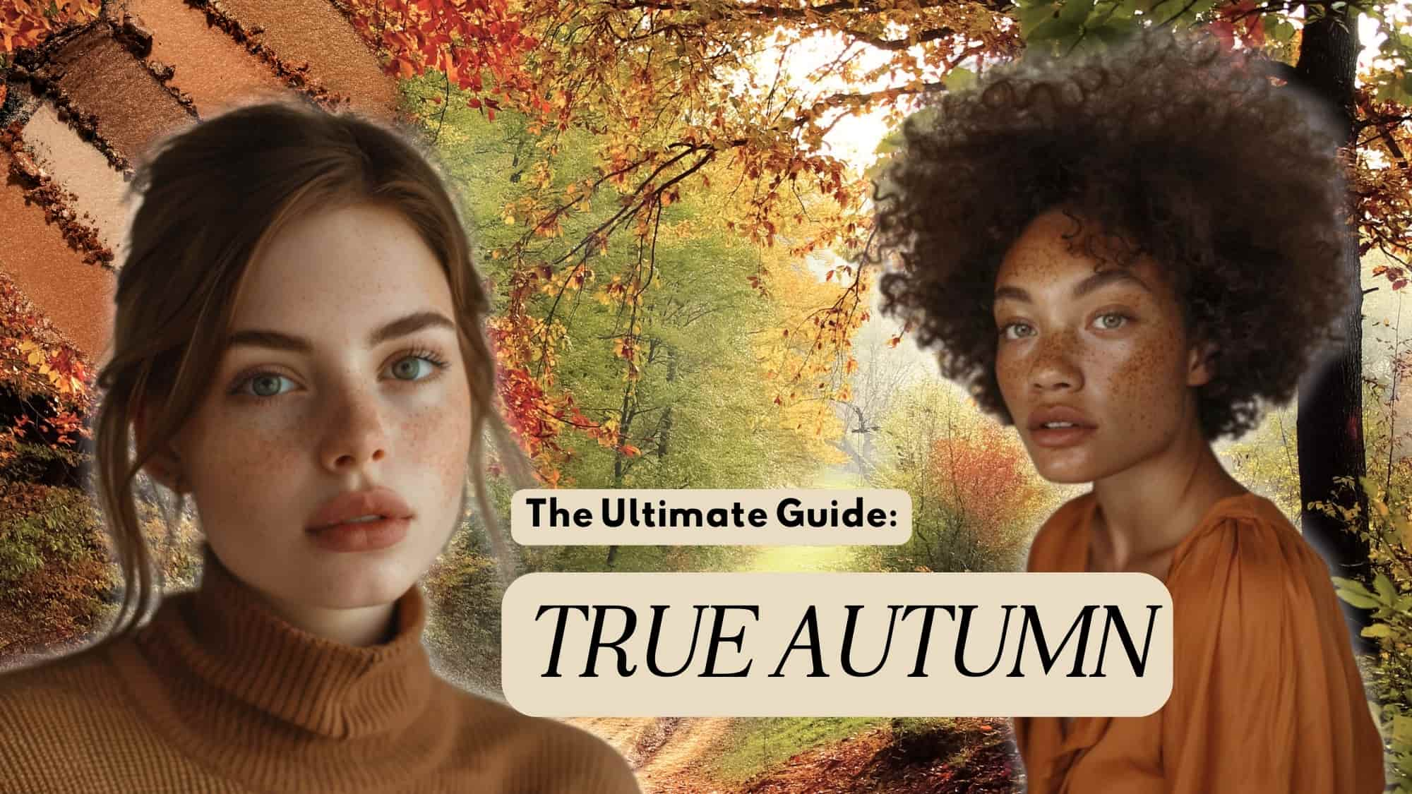
You are a golden goddess! True Autumn is filled with warmth, with a rich palette, moderate saturation, and a medium overall value range. Warmth is the defining characteristic of this season. So let’s get in to what that actually means and how it can truly transform your style.
True Autumn, also known as warm autumn, is considered the original autumn category and is associated with the autumnal fall colors we know and love.

It sits between the Dark Autumn (or deep autumn) and Soft Autumn (muted autumn) on the seasonal flow chart. If we are looking at the entire flow chart it is opposite True Spring. Whereas True Spring is bright and fresh colors, True Autumn is warm, rich, and muted more grounded, deeper, and softer. Both seasons are fully warm, but True Autumn’s warmth has a golden quality, while True Spring’s is clearer and more yellow.
Are you a True Autumn?
True Autumn is a fully warm season, but that doesn’t necessarily mean you’ll look obviously warm. Some True Autumns have visible copper or gold in their coloring, while others may have beige skin and appear relatively “neutral”.
What matters is how your coloring responds to warm colors during draping, not whether you can see warmth by looking at your skin, hair, or eyes.
So, unfortunately, the only way to accurately find your season is to do an at-home draping, or book a personal color analysis with a professional.
How does True Autumn Compare
Let’s see how True Autumn relates to some neighboring seasons, because the differences are subtle and may take some time to truly understand.
True Autumn vs. Soft Autumn
The difference between True Autumn and Soft Autumn can be subtle, which is why draping fabrics is key to determining whether you need the fully warm colors of True Autumn or whether you can handle the touch of coolness that comes into Soft Autumn through its Summer influence.
The Soft Autumn palette has lower chroma than True Autumn. This essentially means they have softer colors (more gray added). True Autumn’s primary characteristic is warmth. Soft Autumn, on the other hand, is neutral-warm in undertone so it can handle a bit of coolness. Soft Autumn also has a primary characteristic of softness rather than hue in its palette.
True Autumn colors are also somewhat brighter than Soft Autumn colors. During draping, Soft Autumn may look agreeable on a True Autumn, but ultimately the skin tone will appear faded or diluted in comparison.
We may earn a commission from you clicking a link below. And as an amazon associate, we earn on qualifying purchases. Full affiliate policy, here.
True Autumn vs. True Spring
True Autumn and True Spring are both fully warm seasons, but their warmth has a different quality. True Spring is lighter, clearer, and more yellow, while True Autumn is richer, deeper, and more golden, with greater red and brown influence. Think high spring sunlight versus the deeper golden light of late afternoon.
The other major differences are value and chroma. True Autumn sits more in the medium to medium-dark value range with moderate saturation, while True Spring is lighter and brighter. This gives True Autumn colors more depth and substance, with shades like ochre, copper, rust, olive, and rich teal rather than Spring’s clearer, lighter versions of warm colors.
During draping, both seasons may respond beautifully to warmth, so warmth alone doesn’t separate them. If Spring colors become too light or bright while the richer, more grounded Autumn colors create better harmony, True Autumn is the stronger fit. When True Spring creates patchiness in the skin, or we get a “sunscreen” effect, True Autumn will be the better fit. If you have a truly warm undertone, you should note that true warm colors will not turn you sallow!
Having trouble understanding contrast? Soft-muted versus clear-bright?
Here’s a video to explain it more simply:
Color Qualities of a True Autumn
Before we dive into True Autumn’s color qualities, it helps to understand the three dimensions we’re looking at. The Munsell color system describes color through Hue, Value, and Chroma:
- Hue = the color family and where it sits between warm and cool.
- Value = how light or dark the color is.
- Chroma = how strong, saturated, or muted the color appears.
Every seasonal palette has its own relationship between these three dimensions. For True Autumn, warmth is the dominant quality, while value and chroma sit closer to the middle ranges, creating its warm, rich, and dimensional effect.
A true autumn has the following color qualities:
Hue:
Hue refers to the underlying color characteristic of a specific color. True Autumns will have warm hues. Golden warmth is the predominant dimension of this palette. True Autumn is fully warm rather than neutral-warm.
Value: Value refers to the ratio of lightness or darkness within a color. It aims to distinguish color in terms of how close it is to white or black
True Autumn sits within the middle portion of the value scale. The palette still offers a useful range from lighter creams and beiges through rich darker browns, but it doesn’t reach the extremes of pure white or black. When building an entire outfit, a medium to medium-dark overall impression tends to work particularly well.
Chroma: Chroma defines the intensity of the color- whether it is soft/muted or clear/bright.
True Autumn sits around the middle of the saturation scale leaning ever so slightly soft. Its colors are moderately bright rather than extremely muted or extremely clear. There is softness here, but the golden warmth can give these colors more apparent vibrancy than you might expect from a muted season.
True Autumn Attributes
Before we get into specific hair, eye, and skin colors, remember that these are possible characteristics, not requirements for the season. Seasonal color analysis is ultimately based on how your coloring reacts to drapes. You cannot reliably determine someone’s season from their visible coloring alone.
True Autumn Eye Colors
The most common eye shades for the True Autumn are:
- true golden brown
- light brown / amber shades
- olive green
- dark hazel
- medium brown
- green
- blue-green or muted blue-turquoise can also occur
True Autumn eyes are not required to be brown or obviously golden. Sometimes eyes can appear more yellow, moss green, brown, muted blue-turquoise, and occasionally deeper orange within the eyes.
All of these are possible expressions of True Autumn coloring. Remember that there can be significant variation, and these are just guidelines.
True Autumn Hair Colors
Natural True Autumn hair is often medium to medium-dark warm brown and may have bronze or russet tones. However, hair color alone cannot determine whether someone is True Autumn.
The most common hair colors for True Autumns are:
- chestnut brown
- caramel colored
- can include dark golden blonde
- auburn/russet
- medium to medium-dark warm brown
- bronzed brown
True Autumn Skin Colors
True Autumn belongs to a fully warm color harmony and can have skin anywhere from fair to medium to dark in depth.
But warm skin doesn’t necessarily look warm. A True Autumn may have visibly golden or copper coloring, or the skin may appear beige and comparatively neutral. This is one reason draping is more reliable than trying to identify undertone from surface coloring alone.
When draping, we’re looking at what the color actually does to the complexion. Harmonious colors should help the skin appear clearer, smoother, and more even, while supporting natural facial definition and dimension. We also watch for negative reactions such as grayness, sallowness, increased redness, unevenness, heaviness through the jaw or under-eye area, or a loss of facial definition. The goal isn’t to find a fabric that simply matches the apparent color of your skin, but the colors that make the complexion itself look its healthiest and most balanced. We do not want you fading into the color of the drape!
You can appear pale and not tan and still be a True Autumn. What matters is how your coloring reacts to the fabric during draping..
But please remember that the only way to determine your color palette is to drape fabric and see how your undertone reacts to it. I have a DIY seasonal color guide here if you’d like to learn how to drape yourself. I really can’t state this enough, so sorry if you get tired of reading it.
True Autumn Celebrities with Palettes
Here are some celebrities that are likely True Autumn. But given how edited celebrity photoshoots and that I haven’t personally draped any of these celebrities, they should be used as a fun reference and not a hard data point.
- Jennifer Lopez
- Julianne Moore
- Christina Milian
- Isla Fisher
- Ana de Armas
- Jane Seymour
- Shalene Woodley
- Beyonce (there is some debate on this)
- Debra Messing
- Bernadette Peters
- Jenna Fisher
- Dana Delany
True Autumn Color Palette
The true autumn is a warm, rich season. It is not drab or colorless! Saturation is moderate, so these colors aren’t as soft as Soft Autumn or as clear and bright as Spring. They often have a rich, substantial quality while still retaining plenty of visible color.
The most common True Autumn shades include:
- warm, rich reds
- autumnal oranges and yellows (not bright lemon shades)
- coral, from pinker canyon rose through darker salmon
- dusty rose / rosewood tones
- red-brown & burgundy colors
- soft copper
- mustard and ochre
- olive, moss and golden greens
- amber and golden shades
- turquoise and dark teal
- warm periwinkle
- bronzed purple and burgundy in place of cooler traditional purples
Don’t mistake True Autumn for a palette consisting only of brown, rust, mustard, and olive. Green, blue, and purple are all present; they’re simply adjusted to harmonize with the palette’s golden warmth.
For more of your best colors check out my Best Color Series here.
Colors to Avoid as a True Autumn
True Autumns have a lot of colors to choose from, but the worst colors for them are neons, bright colors, cool pastels and true black.
Blue undertone colors, pastel tones, and anything with an “icy” feel to it should be avoided as this will wash out your beautiful golden undertones. Black is also a color that appears very heavy on a True Autumn. Below we can see how much more harmonious Shailene Woodley is in the True Autumn blue instead of the black. She looks more tired and her face is heavier in the black.
While it is ultimately up to you how you use your palette, keeping your palette near your face can be a great way to get the benefits without being overly rigid. Scarves, makeups, outerwear, and tops are really the key pieces that should be in palette.
True Autumn Aesthetic
There is a rich softness to the True Autumn aesthetic. You are enchanting!
You have a zest for life and an invigorating quality. Think of the leaves changing colors, warm cinnamon, soft wool fabrics, and pumpkins to get a sense of the richness of this palette.
Here are some adjectives that can describe the overall essence of the True Autumn season:
- Warm
- Robust
- Spicy
- Daring
- Lush
- Flamboyant
- Earthy
- Grounded
- Natural
- Spiced
- Radiant
- Textured
- Rustic
- Golden
- Rooted
- Rich
- Organic
- Inviting
- Mature
- Burnished
- Balanced
- Lived-in
- Honest
- Anchored
- Harvested
- Sunset-toned
- Layered
- Glowing
- Comfortable (in the best, settled-in sense)
- Subtle (but never dull)
- Confident
- Seasoned (like a well-loved recipe or worn-in leather)
- Casually Elegant
- Easy Romance
If we think of True Autumn as a landscape it would be a forest at the height of the season—when the leaves have turned to deep gold, copper, russet, and olive. The sun hangs lower in the sky, casting amber light that makes everything glow with warmth. The ground is layered with fallen leaves in shades of burnt orange, mustard, and saddle brown. Bark is dark and textured, rich like mahogany and chestnut.
You might see fields of sunflowers gone golden, dry grasses swaying in warm wind, and clay-rich soil deepened by late-day shadows.
Texture is especially useful for True Autumn because it creates natural highlights and shadows. Wool, linen, cotton, crepe, flannel, twill, suede, leather, velvet, raw silk, brocade, and textured knits can all work beautifully. Mixing textures or layering pieces can add even more dimension.
And muted does not automatically mean matte. True Autumn can wear surfaces ranging from matte to shiny. Metallic or textured shine in gold, copper and bronze can be especially harmonious.
For more information on picking the right textures check out this article.
True Autumn Makeup Palette
True Autumn makeup can have more presence and dimension than you might expect. The goal isn’t necessarily a soft, barely-there look, but makeup that echoes the palette’s rich warmth and has enough color and depth to define the features.
True Autumn also has plenty of flexibility with finish. Cosmetics can range from sheer to opaque and matte to shiny, with warm metallic effects like gold and copper being especially beautiful. Because makeup sits directly on the skin, however, individual testing is important. A color that works beautifully in your clothing palette may need to be adjusted in depth or finish to work just as well on the face.
Eyeshadows for True Autumns
For neutral eyeshadow, look for warm, earthy shades.
Here are som examples:
- golden beige
- warm beige
- khaki
- olive green
- camel
- chestnut brown
- warm medium browns
- antique gold
- copper
For more color, experiment with forest and moss greens, deeper antique golds, and other warm shades pulled directly from your True Autumn palette. A visibly dark green with a metallic finish can be especially effective as an accent color.
True Autumn also wears shimmer particularly well, so you don’t need to limit yourself to matte eyeshadow. Antique gold or copper shimmer can add dimension to the eyes, while a matte warm beige or brown can help ground the look. The key is maintaining the palette’s warmth and depth rather than automatically avoiding shine.
Mascara and Eyeliners for True Autumn
It is important to recognize that true black and charcoal shades are going to overpower your coloring as a True Autumn.
Mascaras in the deep brown, coffee-shades, and ginger browns or auburn shades work best. You could also try a deep olive if you want something a little closer to black without the contrast.
The best eyeliners for the true autumn are the dark coffee colors or dark forest greens. You could also experiment with dark burgundy or dark cabernet. If you want a colorful eyeliner try referring to the shades in the general True Autumn palette and matching from there. There will be trial and error needed with this, though.
Lip colors for True Autumns
True Autumn can wear matte, shimmer, and gloss. Rather than avoiding shine entirely, think burnished or metallic instead of extremely cool, glassy shine.
Useful color directions include:
- brick red
- terracotta
- deep salmon
- chestnut
- dark copper
- bronzed berry red
- warm burgundy
- coral-brown
- russet
Blushes and Bronzers for the True Autumn
True Autumn can wear blush and bronzer beautifully, especially in shades that reinforce the palette’s warmth and depth. For blush, look for warm or burnt coral, golden cinnamon, and brick red. Lighter coral and salmon shades may also work, but they can sometimes lack enough depth to properly define the face, so your ideal shade will depend on your individual coloring.
Bronzer is particularly useful for True Autumn because it can create the depth and contour that harmonize so well with this season. Look for medium golden-brown or earthy tan shades. A matte bronzer works especially well for contouring, helping to create natural definition and dimension through the face.
Highlighter isn’t off-limits for True Autumn either. A rich golden highlight used selectively on the high points of the face can complement the palette beautifully. The key is placement: large areas of shimmer can flatten the natural contours of the face, while smaller touches of warm golden reflectivity add dimension without competing with it.
True Autumn Makeup Look Examples
Natural
Dramatic
Daytime Formal
Building a Wardrobe: True Autumn
True Autumn has considerable freedom with color combinations. The palette supports moderate value contrast and color contrast, and several colors can be worn together successfully. An overall medium to medium-dark impression helps keep the look grounded.
True Autumns can wear tonal outfits and analogous colors.
Monochromatic looks become especially effective when you create movement from light to dark and introduce texture to distinguish the layers. Analogous combinations such as orange/red or forest green/teal are also easy choices.
Complementary colors can actually be particularly effective for True Autumn. Copper-orange with a warm blue is one example. Because both colors have already been adjusted to True Autumn’s palette, the contrast can feel substantial and energetic without becoming disconnected from the person.
Don’t be afraid of adding a pop color into your outfit. And it doesn’t necessarily have to be tiny. When the accent belongs to your palette, you have more flexibility with its size.
Denim for True Autumn
Denim is a staple in most wardrobes, and it works beautifully for True Autumn when the wash leans warm and slightly aged. Medium to medium-dark washes are best, especially those with a golden or tobacco undertone rather than a cool, inky one. Look for:
- Medium-warm washes with a slightly weathered or vintage finish
- Dark denim with copper stitching or warm fade patterns
- Mid-blue, aged denim
For a full guide on denim for each season, check out this article.
Business Casual or Office True Autumn Color Palettes
Building a wardrobe will usually include some office wear, which may not be quite as exciting, but is definitely necessary. Remember this advice is general, and you need to tweak it to your office or business’s expectations. Some offices may be more casual and will embrace louder colors and shades. And some offices may be extremely conservative.
If you want to learn more about building a chic and functional business casual wardrobe, I have a guide for you here.
You don’t necessarily need to tone down your palette for professional clothing. True Autumn’s warm neutrals, deeper greens, burgundies, browns, and teals can create a polished professional effect while still allowing you to use color.
Because True Autumns lack the blacks, navy, and true charcoals that are so common in office clothing, we have to get a bit more creative.
For more information on your neutrals, check out my guide here.
Prints and Patterns for the True Autumn
The most attractive designs are those that exclusively use autumn hues, such as the first one shown below. True autumn colors, such as in the first example, are ideal. If a pattern contains some but not enough color from an unbalanced palette – like in the second scenario – you may wear it. The last image has way too much of an unbalanced color (a cool summer green, which is bright and overwhelming), so avoid it.
Keep in mind, if the “wrong color” is:
- a neutral
- a very small design feature
- from the same over-arching season
- or has a watercolor, blended effect
It will be less likely to affect your entire outfit.
As a general guideline, look for prints in which roughly 70% or more of the colors belong to your season. A small amount of an imperfect color is much less disruptive than a large area of white, black, icy color, or something substantially brighter than the palette.
True Autumn doesn’t require a low-contrast print. Moderate separation between colors can actually help create the grounded, dimensional quality of the season. Both value contrast and color contrast can work well when the colors themselves harmonize with the palette.
Here are some other print ideas that work for the True Autumn :
- botanical, leaves and autumnal-influenced prints
- retro prints
- florals
- larger-scale prints
- giraffe and other animal prints
- plaid
- paisley
- tapestry/brocade-inspired patterns
- geometric or irregular stripes
- patterns that imply texture, such as bark, stone, woven surfaces or leather
- geometric and linear designs can also work; the resources specifically mention diamonds, rows, columns and other structured motifs
Jewelry and Metals for the True Autumn
True Autumn is especially at home in warm metals. Gold is an excellent choice, particularly in medium-light to medium-dark golden tones. Copper and bronze are also beautiful, while the deeper orange and earthy pink-brown tones of natural copper can function almost like a True Autumn version of rose gold.
You don’t need to limit yourself to matte or antiqued finishes. Brushed, hammered, oxidized, and textured metals work beautifully, but so can a rich, deep shine. The bigger concern is metal that becomes too light or bright. Very pale yellow gold or highly polished new-penny copper can reflect a lighter yellow rather than the rich golden quality that harmonizes with this palette.
Silver isn’t necessarily off-limits either. Warm or softened silver, pewter, and brushed or textured silver can work, particularly when paired with warm stones or other True Autumn colors. Very light, cool, highly reflective silver is generally less harmonious with the palette.
For stones and natural materials, look for colors and textures that echo the richness of the palette. Great options include:
- amber
- tiger eye
- turquoise
- coral
- jade
- red jasper
- brown agate
- wood
True Autumn can also handle jewelry with plenty of substance and texture. Layered pieces, heavier pendants, linked chains, stacked rings or bracelets, textured medallions, and antique-inspired jewelry can all complement the depth and richness of the palette.
True Autumn Hair Dye
If you dye your hair as a True Autumn, the goal is to maintain the warmth, richness, and depth of the palette rather than simply making the hair warmer. Medium to medium-dark warm browns are a natural place to start, including chestnut, warm velvet brown, and coppery brown. When adding warmth, think tawny copper, sienna, and rich gold rather than pale yellow, beige, or very light golden tones.
Highlights can work beautifully, but they should add warmth and dimension without making the overall hair color too light. Depending on your natural base, consider deep gold, warm brown, medium-dark copper, or auburn highlights. The resources describe the ideal effect as similar to warm late-afternoon sunlight hitting the hair: richer and warmer, rather than simply blonder.
And don’t assume that being an Autumn means you need red hair. Red or copper can be beautiful when it harmonizes with your natural coloring, but warm brown may be a better choice for some True Autumns. The goal is to work with the natural base and maintain enough depth, not to force the hair toward an obviously red result.
If your hair naturally turns gray or silver, you don’t need to dye it to remain a True Autumn. Your season doesn’t change as your hair grays. Instead, the gray can function almost like another neutral within your appearance, and you may find yourself preferring different colors from within the same True Autumn palette near your face.
Also, if you are newly draped, try giving your natural hair a chance. I found after I wore my palette that I enjoyed my natural hair color more and it looked more dimensional when wearing my colors.
True Autumn Outfit Ideas
While the best silhouettes you choose will be based on your body type, it doesn’t hurt to get inspired by some general outfits that look fantastic on the True Autumn.
Want to see how true autumn would work for the cottagecore aesthetic, check it out here.
Check out my Seasonal Capsule Wardrobes for all 12 palettes {including true autumn}
Want denim ideas specific to True Autumn? Check out this article on denim here.
Learning that you’re a True Autumn isn’t about memorizing a list of colors or limiting what you can wear. It’s about understanding the qualities that make color work for you: warmth first, supported by the right balance of depth and saturation. Once you understand those qualities, you can start recognizing your version of almost any color rather than feeling restricted to a handful of stereotypical “autumn” shades.
And remember, your seasonal palette is only one part of getting dressed. In my client reports, I always look at how the palette can actually work within your life, personal style, wardrobe needs, and preferences. You don’t need to suddenly build an entirely rust, olive, and camel wardrobe because you’re a True Autumn. The goal is to use your palette as a tool, whether that’s finding better neutrals, choosing denim, experimenting with unexpected color combinations, or simply becoming more confident about why certain colors work.
Most importantly, use your palette as a starting point rather than a set of rigid rules. Pay attention to how colors interact with you, experiment with combinations and textures, and build a wardrobe that still feels distinctly like you. Color should support your personal style, not replace it.
Your true autumn exploration is just beginning! Be sure to pin the below image so you can reference 😉
Thanks so much for these posts on finding your colours! I’m fairly certain I am a Soft Autumn. I couldn’t find one but do you have a post like this for Soft Autumns? Thank-you.
Thanks for this post, Gabrielle! I’m new to this theory and just finding myself a bit overwhelmed between soft and deep autumn. I love your color combinations, textures, contrasts and proportions. These are elegant examples and it’s giving me hope.
I’m so glad! I’ll be coming out with soft and deep autumn guides as well, so maybe that will help you confirm your season!
Hey, is person “c” clear/bright as well or soft?
Yes they would be bright/clear because they have a lot of contrast in their face and the photo when in color shows how pigmented each element is.
I just studied your true autumn palette guide and found it refreshing and helpful. I find it very hard to dress in the summer as an autumn palette! Any ideas? Thank you. Also, I’m trying to gauge what my floral print guide should look like to vest suit my true autumn palette! Dina
Can a true autumn wear clothing in the soft and deep autumn color palettes?
They can borrow from the other autumns because they are all warm colors, but for the most harmonious it’s best to stick to true autumn or keep the other “outside” color away from your face
Why is there some debate about Beyoncé being true autumn?
Your idea that contrast has to do with being able to take on bright/neon shades is interesting. I have high contrast from dark hair to medium skin and I just could never get away with bright or neon clothing , even trousers would be far too bright for my muted skin tone. ?♀️
Brands and colors of lipstick for a true autumn.
Can we get some specific makeup recommendations like with the other guides?
I will try to add this soon!
@Gabrielle Arruda, Yay!
I don’t know if my contrast isn’t a little bit too high for the autumn season, although I’m not deep enough for deep autumn. And I’m almost sure I’m warm. For that reason, I’m hesitating with true spring. I hope there will be a guide for it soon !
Yes I’m going to do true spring shortly!
Hi, Gabriella, this is an excellent overview of what True Autumns need to look their best. Thank you so much for publishing this! I could use some help fine-tuning my wardrobe as I’ve been typed as a True Autumn who is also a Kibbe Soft Classic. It’s not easy if one doesn’t wear traditional navy or black but want a cohesive wardrobe which includes nice blazers/jackets. Do you do private consultations? Thank you!
Lovely article, Gabrielle. Especially appreciated as I am a True Autumn myself 🙂 You cover so many bases in this article and I am keeping it as my go-to 🙂
Hello,
Your insight for true/warm autumn are wonderful. I kindly request a blog for spring and summer outfits for us True Autumn Ladies.
I have some capsule wardrobe with outfits for each of the 12 color palettes here: https://gabriellearruda.com/category/seasonal-color-capsule-wardrobes/ ( spring and summer weather are there!)
This is full of amazing information. It helps fill in some gaps for me that I’ve had since I received my “diagnosis.” Thank you so so much for all your hard work.
I’m loving the updates to these articles! Specific makeup recommendations for True Autumn?
I am curious about how aging affects color analysis. I had my colors done not long after Color Me Beautiful came out. My pallets was done through draping fabrics. and my colors are most consistent with your true autumn. However, my eyes are a dark teal blue with brown spokes around the iris. My mom was a hazel eyes brunette and my dad was blue eyed with sandy brown hair. Both had warm skin tones. My youngest sister is a true redhead. My hair is now a lovely white with more gold undertones. Will this alter my seasonal pallette in any way? Any advise for us older ladies with regard to how aging affects our color choices
From my knowledge and experience your season will not change. However, it is common that people may use their palette differently when they go gray. Our contrast in features tend to fade as we age, so elements like makeup or different sides of ones palette might feel more harmonious.
omg im so so so happyyy!!! ivh been researching about this for months and finally it lead me to this brilliant article. it has every single thing. u missed out absolutely nothing
Thank you!!!
This article is so thorough and informative! I am a little confused though… from all my research I feel like I am a true autumn however I look really good in navy and some slightly muted pastel colors. with that put me in a summer category, or possibly dark autumn?
subscribe
Hi Gabrielle,
Can you recommend a good digital colour fan for true autumn? I love the one you have displayed here, do you think I could print it at a print shop and it would show accurately?
Thanks!
Dora