Discover Your Best Colors: DIY Seasonal Color Analysis Guide
Seasonal color analysis. It’s been trending on TikTok, the Reddit threads are popping off, and your curiosity has been piqued. You have to figure out your season. It’s a relentless mission that you’ve probably become mildly obsessed with and poured through dozens of articles only to become well.. more confused than ever.
So here’s the article that should sort it all out for you.
While some people’s characteristics fit neatly into each season or sub-season’s general parameters, the ultimate test to figuring out your season (or confirming it) is to do color drapes.
I’m going to explain how to systematically do these drapings so you actually start to see the color trends that work for you, how to use this data to hone in on your undertone, your sub-season, and ultimately how to use it to find strength through style.
But first…
Seasonal Color Analysis: Where did it come from?
Albert Henry Munsell who invented the Munsell Color theory had a huge impact on what we know today as Seasonal Color Analysis. His books are still used today to teach color theory and understanding to practically every art student. Ultimately, his system is a three-dimensional model that organizes colors based on hue, value, and chroma. These parameters would eventually be the base of seasonal color placement that we know today.
We may earn a commission from you clicking a link below. And as an amazon associate, we earn on qualifying purchases. Full affiliate policy, here.
If you want to further your knowledge of color theory in general, I highly recommend his book ( it’s essential if you’re any kind of artist or creative!). We will dig into how to use his color wheel shortly, but for now, you can see what it looks like below.

The concept of color analysis was furthered by a Swiss artist and teacher named Johannes Itten, who was a painter and teacher at the Bauhaus School in Germany.
As he observed his student’s work and color choices he came to realize that certain colors complimented the landscapes best. He divided them into categories from this observation: Separating colors by yellow-based or blue-based, and then further dividing them by bright and soft.
Then we have Robert Dorr. He was an artist who started to realize that people could look quite different based on the color they wore and he was prompted to explore the concept of “undertone”. He eventually consulted the medical community to find that we do have a layer under the skin that can either be yellow or blue. He created the concept of “warm” versus “cool using the color draping of skin response to “orange” and “magenta” respectively.
.jpg)
Carole Jackson was a color consultant who popularized the concept of seasonal color analysis with her book “Color Me Beautiful” in the early 1980s. The book categorized individuals into one of four colors “seasons” based on their skin tone, hair color, and eye color. These seasons were Spring, Summer, Autumn, and Winter, and each was associated with a specific color palette.
Jackson’s book was groundbreaking in that it provided an easy-to-use system for individuals to determine which colors worked best for them. The book became a bestseller and sparked a trend in color analysis that has continued to this day.
If you want to read her book, you can find it here. While her approach might seem outdated to many modern color analysts, it’s a nice overview of how color impacts your style and the general traits of each main season.
And in the 1980s we also have Suzanne Caygill with “Color: The Essence of You”. The book offered a more detailed and nuanced approach to color analysis, with a focus on the psychological and spiritual aspects of color.
Her system had sub-seasons (unlike Jackson’s) and she focused on understanding color harmonies.
- the key to Spring is Clarity
- the key to Summer is Mutation
- the key to Autumn is Tonation
- The key to Winter is Contrast
Her system included sub-seasons like Early Spring, Golden Spring, Floral Spring, Vital Spring, Iridescent Summer, Jewel tone and Rose Summer, Twilight and Dusky Summer, Metallic Autumn, Tawny Autumn, Bronze and Mellow Autumn, Classic and Soft Winter, Patrician Winter, Dynamic Winter, and Exotic Winter. Check out her book here, if you want to know more.
And if you’ve ever googled “seasonal color analysis” today, you probably know there are many many updated iterations and systems that you can choose from.
Some people focus on 16 seasons, others on “wow” colors, and some even offer personalized color harmonies.
So, why did I tell you all of this?
Because you probably have acquired bits of information about all these different systems and are trying to piece together different puzzles into one.
I would recommend starting out with one system that you like and trying to learn about that one specifically.
For this exercise, I recommend starting with 12 seasons, they are the most standardized. And you really don’t need to be adding in extra seasons when the options can already be confusing at first.
Should I hire a professional to type me?
I have some thoughts on professional typing, and I think it kind of depends on the person.
I will say, please don’t do “online” color analysis. Virtual color analysis is known to be highly unreliable and honestly, there are a lot of unqualified people offering these services. So don’t go to Fiverr and expect to come out with a correct answer. There are a few very seasoned professionals who can type online accurately, but in-person is always better in my opinion.
Even if you do go to a professional, doing your own drapes and understanding the theory behind seasonal colors (specifically the system you’re interested in) is what will set you up for long-term success. And make sure you understand and agree with the system the professional uses!
It’s a far better experience to have a professional confirm your season, rather than blindside you with terminology and results that you might not understand the reasoning behind. This will also allow you to ask specific, educated questions about their results.
And I will say not every professional is of equal caliber. So if you can get a referral from someone, that will lead to a better experience overall.
Some people like to have a professional’s opinions right off the bat, and they don’t want to take the time to learn all the ins and outs of each color season. Which I can respect! Especially if you’re excited about seasonal color and anxious to learn where you fall.
However, when you go out shopping, you’ll have to decide if a color actually matches your fan or palette, and there can be a lot of “on the border” colors that make this difficult.
Colors that look like matches, but then don’t work for you… So understanding the basics of color and learning what to look for when you drape a color is incredibly helpful in actually putting your seasonal color analysis to work.
Do I Need to Buy Expensive Drapes To Do This?
Most likely, no. You can use your own clothes, towels, sheets, and any fabric you have access to for a DIY color drape.
We will go over the first steps and guidelines shortly. If you don’t have the color at home, then you can either borrow the color from friends or family. Some people also use department store shopping to color drape, but proceed with caution as you cannot control the lighting source and this will likely skew your results.
If your wardrobe seriously lacks any colors you can use, you can consider purchasing this affordable swatch kit. While this isn’t specific seasonal color swatches, it should give you a good amount of colors to try. ( Please note the swatch kit is only 12 by 12 inches and not the “most” ideal for diy drapes, but can give you good place to start if you are really lacking a variety of colors).
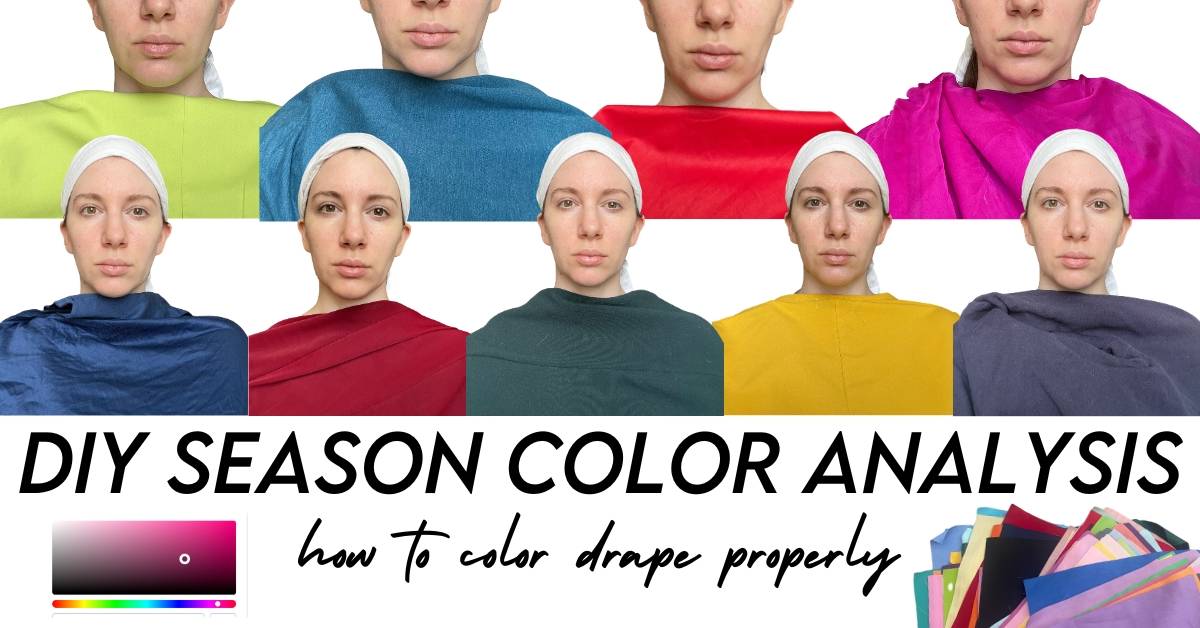
DIY Color Drapes to Determine Your Seasonal Color
I know people get excited to try this, and they start rummaging through their closet and take 25 color drape photos, and then hit a brick wall.
Maybe you can tell what colors look good, but what season are those even from? Or maybe you can’t even see a difference between the burnt orange and the salmon pink.
So I want to give you several steps to take a more systematic approach to color draping. Let’s get into it.
Determine Your Season: Set Up
In order to get accurate results you need the right setup. Lack of preparation will lead to incorrect results overall.
Here’s what you need to consider:
Lighting: Natural daylight is the best lighting source for a color draping test. It provides the most accurate representation of colors without altering their appearance. Avoid fluorescent or yellow-toned lighting, as these can distort the colors and affect the results. Opt for being around 3 ft away from a North Facing window if possible, this creates the most even lighting. Avoid taking photos at “golden hour”, this may convince you that you are an autumn when you are not. You want consistent lighting throughout all your photos- so try to get all your first drapes done in a smaller time frame.
Hair: Tie your hair back and wear a white scarf or headband to keep it away from your face. This will help prevent any influence from your current hair color on the test, especially if it’s dyed or not completely your natural color. If you have very short hair, consider wearing a white or neutral gray hair cap.
In the below photo, you can see how my hair becomes more of a distraction. For this process, we are focusing on how our skin reacts to the color (more on this later), and removing the hair as a focal point can help you pinpoint these nuances.
Makeup: Remove any makeup before the test, as makeup can alter your skin tone and coloration. The goal is to assess your natural coloring without any external influences. And yes- even your tinted moisturizer and mascara need to go.
Remove: No jewelry, glasses, or colored contacts. We want as few distractions as possible!
Clothing: Ultimately your drapes should be covering any clothing you are wearing, but a tube top or skinny strap tank top is easiest. This ensures you don’t have any competing colors in your draping photos.
Draping fabrics: Use a variety of fabric swatches in different colors and don’t just pick from the season you think you might be. We will go over colors to test first, but make sure you try colors from all different seasons. If one color from one season doesn’t work, that doesn’t mean you aren’t that season. Similarly, don’t dismiss a neighboring season if one season doesn’t work. Try to go in with no “preconceived notions”. The photos will give you the answers if you are open to them. Fabrics are much more effective than lipstick or makeup tests. Feel free to use any fabric around the house (sheets, curtains, clothes, towels etc).
Test one color at a time: Hold each fabric swatch close to your face, underneath your chin, and observe the effect it has on your complexion, eyes, and overall appearance. Take note of which colors make your skin look more even and radiant, and which colors make you appear washed out or tired.
Take photos: Capture photos of each color swatch against your face. This can help you review and compare the effects of each color more objectively later. I recommend a tripod or self-timer for this process. Taking a selfie each time will create some distortions and can make the comparisons more difficult (different positions and different angles can produce less accurate results).
White Balance and The Need For Consistency
TIP: As you are setting up and doing your photos, make sure you watch your white balance. We want to make sure you phone is not auto-correcting the white balance like it did in my yellow drape below. So if your backgrounds are changing, and your light source hasn’t changed, examine your camera settings.
White balance can make or break your drape photos and the results. So if you can’t figure out how to make your white balance consistent, you can always just drape using a mirror instead of photos.
You can lock your exposure rate (including general white balance) on an iPhone using the AE lock function. However, you need to then complete your drapes in one session, and this can be tricky to do. You also need to make sure your camera doesn’t reset to auto if you close the app.
One of the best methods to get accurate white balance is a tried and true photography trick- using an 18% neutral gray card. Take all of your photos with this gray card somewhere in the photo. Then go into a free editing software (light Lightroom) and correct the white balance by using the white balance eye dropper on the gray card. This may seem tedious, but if you’re committed to finding your season you want to do it correctly.
Step 1: Access Your Undertone
Once you know your undertone, you have eliminated half the options, so it is a really good place to start.
Now, you probably know there are “warm” and “cool” undertones. But what about neutral?
Well, “neutral” undertones typically lean warm or cool and while there is probably someone out in the world that is a perfect neutral, that’s not going to be critical to determine because we are going to do multiple tests to confirm.
If you have a neutral undertone, you are going to be one of the sub-seasons ( not the “true” seasons). True seasons are not neutral-leaning.
What does “neutral” even mean? It means that you have some warm and some cool undertones together. This means you can probably pull off gold and silver, so that test might not have worked out for you in the past. That is why doing the DIY color drapes will help with your placement and the subtleties of a neutral-leaning season.
Also, please don’t assume “I’m pale” so I’m cool or “I tan” so I’m warm. While that can be a base element, it can lead to inaccuracies.
We are going to move past the Carole Jackson interpretation of hair/skin/eyes for seasons and introduce the flow dimensions.
So here are the first couple of tests you should do to start accessing your undertone. Please do as many of these as you can. The more tests you do the more accurate your results will be. We are not always looking for the “perfect” color in these comparison tests. But rather which one is “slightly better”.
Accessing Undertone
Start with the warm versus cool options, and if you have the neutral option you can add that to your drape pile as you go.
We will be isolating the photos after we are done with the drape and comparing them systematically, so don’t worry about analyzing the color reactions just yet.
Magenta Versus Orange
Robert Dorr created this concept and it’s an easy place to start. Make sure you are using a cool-toned magenta (not salmon pink). While these are both highly saturated, neither may be “great” on you but we should see one as “better”. ( For me, warm is better).
Next try…
Gray (cool) versus Brown (warm) and Cool/Neutral Brown
Pink ( cool) versus Light Orange (warm) versus Neutral Warm Pink
Blue (cool) versus Green (warm) versus Turquoise (neutral)
Blue-Red (cool) versus Orange-Red (warm) versus Neutral-Red/True Red
You can also try:
White (cool) vs Cream (warm) versus Off-white (neutral)
Silver versus Gold
This is best done with fabrics if you have them over jewelry as it provides more obvious reactions. Also if you are neutral-leaning you may find you can “pull off” both gold and silver.
Comparing 2-3 Colors Together
Now, you’ll want to compile the images together. You can use a free app in Canva for this. This is critical to compare each drape to one another. Sliding through them on your phone may help you throw out some truly awful colors on you, but a lot of it is nuanced so comparing 2-3 drapes at a time is key!
Once you’ve organized all your images let’s start accessing them.
We are looking for subtle changes in skin tone and features, so let’s go over some questions to ask. (Remember that the more drapes you do the more accurate your results will be, because not every color in every palette will work seamlessly).
- Does my eye color fade against this color? Or does it look brighter? ( Brighter= right color)
- Does it make my skin look alive and clear? ( Right Color) Or does it make my skin look sallow or gray? (Wrong color)
- Does this color highlight my skin imperfections or make my skin seem more uneven? (wrong color) Or does it make my skin seem more even and clear? (right color)
- Does this color make my under-eyes appear darker or more obvious? (wrong color)
- Now this next question requires a bit more experience so only use this if you feel comfortable with it… Do I notice the color first or the person? We want the colors to be a nice pillar for our natural coloring, so if our eye is being dragged down to the drape, it may not be correct.
Don’t evaluate all the color drapes at once. Go through the sets of colors and see which is better as well. So maybe gray, brown, and neutral brown none of those colors really make you “shine”, you can still determine which one is “best” for the sake of these questions.
Then start marking down where each one falls. After all of those tests, you should start to see where you fall warm, cool, or neutral. And if you’re olive toned you should still do this step because there can be warm or cool olive skin tones as well.
Now, those 2-3 color tests should have helped you narrow things down. But here are a few more examples if you need to do more extensive tests for which of the 4 seasons you might fall.
But be careful with some of the following tests, and don’t use any individual test as full confirmation. Some of these colors can carry over to other seasons. So evaluate the best and worst colors and try to use that data to determine your color qualities.
What if my results are conflicting?
The first thing you will want to check is that you chose the right shades for each of these tests. Because if you have no color knowledge, you might have actually chosen a neutral brown instead of a warm brown.
And if you really can’t “see” the difference, you can buy a set of actual seasonal drapes to help get you started. While they aren’t cheap, and I don’t think you “need” them, they can be helpful. And at that point, you may consider hiring a professional (like me!) if color is an important part of your 4 style pillars.
Next, you could try your fellow seasonal analysis friends. Don’t have anyone? Well, the internet is your friend. Explore Reddit, or Facebook groups (for the system you prefer) and see if they can’t help you pinpoint it.
Ok, so now you at least have an idea if you are warm, cool, or neutral-leaning. Now we need to determine between the seasons.
Remember, if you are neutral-toned you will still lean towards warm or cool. So I encourage you to do as many of the following drapes to help you confirm which way you lean.
Let’s start off with Winter versus Summer
So you are cool-toned! The following drapes will help you determine if you are winter or you are summer. Remember, do as many drapes as you can to ensure you get accurate data to evaluate.
Hot pink (winter) versus Dusty Rose (summer)
Black (winter) versus Cool Taupe (summer)
Royal Blue (winter) versus Gray Blue (summer)
Magenta (winter) versus Soft Plum (summer)
Purple (winter) versus Smokey Purple (summer)
Ice White (winter) versus Soft White ( Summer)
Bright Silver ( winter) versus Antique silver (summer)
Make sure you are choosing the right colors and repeat the process of combining the images and comparing them for the colors that make you shine.
Again, the more tests you do, the more accurate your results will be.
Autumn versus Spring
Now if you are warm-toned and need to test out Autumn versus Spring, let’s explore the color comparisons for that. Autumn colors will be more muted, and Spring colors will be more clear.
Orange (autumn) versus Peach (spring)
Teal blue (autumn) versus Aqua (Spring)
Olive (autumn) versus Leaf (spring)
Mustard or Burnished yellow(autumn) versus Yellow (spring)
Aubergene (autumn) versus Bright Lialc (spring)
Brick Red (autumn) versus Poppy Red (spring)
Antique Gold (autumn) versus Bright Gold (spring)
Neutral Undertone
Hopefully, your tests so far have at least hinted whether you are neutral-warm or neutral-cool. But the next step will be a flow analysis to examine where you might fall next. But I encourage any neutral people to do as many of the above drapes as possible, with enough 2-color comparison data you should see which way you lean.
If you haven’t you could try a couple more drape options to explore:
Neutral Cool versus Neutral Warm
Slate Gray (cool) versus Golden tan ( warm)
Raspberry (cool) versus Deep Coral (warm)
Shocking pink (cool) versus Coral Peach (warm)
Royal Purple (cool) versus Warm Purple (warm)
If you’ve figured out whether you lean warm or cool, that’s great and can eliminate some of the seasons.
But if you haven’t you may want to start exploring the other elements (value and intensity).
Here’s a chart to understand the characteristics.
Now to understand how to test this, you can refer to this image of color properties. Don’t get too hung up on the flows just yet.
So you will want to color drape Deep (shades= black added) versus Light (tints= white added) which would respectively correlate to autumn/winter versus spring/summer.
Remember that some of these colors may overlap with other seasons, so the more drapes you do the better!
Deep (autumn/winter) versus Light (spring/summer)
Dark Chocolate (deep) versus Pearl Gray (light)
Pine Green (deep) versus Pastel Turqouise (light)
Deep Navy (deep) versus Sky Blue (light)
Aubergene (deep) versus Lilac (light)
Deep Teal Blue versus Pastel Aqua (light)
And use the color wheel to examine different levels of deep/light shades you have in your own closet.
Bright (winter/spring) versus Muted (summer/autumn)
Next, you can try to examine if you are bright versus muted. Now we are examining how much gray is added to the color. If it has no gray it is bright, if it has a lot of gray it is muted. But you will find a lot of colors somewhere in the middle.
I still recommend draping bright and muted colors even if they are close together on the color wheel and might even belong to the same palette. That can still be more data to ensure accurate placement.
WAIT!
Don’t go just yet. I know you’re probably like “GIRL! I don’t have alll these colors”.
And that’s ok. I wanted to give you specific tests if you happen to have those colors. And even if you don’t have all those colors, you can still do color drapes of the colors within those tests… This leads me to the next very important step.
Assessing Your Photos
You’ve taken as many color drapes as you possibly can. And your camera album now looks like you’re a narcissist because you have dozens of photos of your face.
But just remember, there is a goal to this. And flipping and comparing photos in your photo album is incredibly difficult to do.
You need to see the OVERALL trends of these photos.
This is why I like using Canva, you can group all your photos together and start seeing the collection of traits.
(Now watch your backgrounds for any changes, because we don’t want our phones auto-correcting anything!)
Accessing the Photos
I put mine into 3 categories, Best, OK (non-offensive but not great), and Worst.
And how did I decide where to place each image? Based on the first set of questions, which you can find again here:
- Does my eye color fade against this color? Or does it look brighter? ( Brighter= right color)
- Does it make my skin look alive and clear? ( Right Color) Or does it make my skin look sallow or gray? (Wrong color)
- Does this color highlight my skin imperfections or make my skin seem more uneven? (wrong color) Or does it make my skin seem more even and clear? (right color)
- Does this color make my under-eyes appear darker or more obvious? (wrong color)
- Now this next question requires a bit more experience so only use this if you feel comfortable with it… Do I notice the color first or the person? If you notice the color first, it is likely not “your” season.
Now, when you examine your own photos see what is popping out. Examine the collection of “Best” colors and see where they fall warm/cool, dark/light, and bright/muted.
This should give you a very good understanding of your season, even if you are neutral!
Neutral people may need to do a few further drapes to confirm let’s say if they are predominantly Neutral/Cool (like Soft Summer) or Neutral/Warm (like Soft Autumn) as they may be able to “pull off” some of the sister seasons shades.
Let’s look at some of the colors from each season:
Here you can see where a lot of these colors fall, and how some colors can be a close match for multiple seasons.
The “best colors” should correlate to one of these palettes. And if you’re really struggling, ask online communities for support or feedback. They might see a pattern you’re missing or can pinpoint if you’re incorrectly placing a color in a season.
But again the more side-by-side comparison drapes you do, the more you will hone down your color qualities.. Comparing two colors at a time can help you narrow down your subseason.
But where does this color even go?
You may run into the problem when you color drape that you identify the “right” colors on you, but you’re not sure where to place them in the seasonal color wheel. I find comparing these color swatches to one another to be a good step in “seeing” the color qualities more clearly.
When we view all the purple swatches below it becomes much more obvious which ones are cool/warm, which are deep/light etc.
Proceeding With Caution
You think you’ve found your season, now start embracing it. I like to take daily outfit photos just to keep a log of my style journey and help me evaluate my style reasoning, goals, and formulas. And these photos can also be helpful to truly flush out if a season is right.
If you’re consistently using your season, it should be adding to your overall appearance. It shouldn’t be a struggle to make it work. And you shouldn’t “need” makeup for the colors to make you shine.
Don’t always trust the photos…
Sometimes, once you take the photos you will be left with colors you thought looked amazing on you, but the photos just aren’t communicating that. Cameras can do a lot of “subtle tweaks” to your photos that can distort your photos.
So if you’re confused on a specific color test, or you don’t quite “believe” this color is wrong, examine it in the mirror instead. Try to keep the same lighting as mentioned above, and evaluate what that color does to your skin while looking in the mirror. This is especially effective to do with any whites in your palette because cameras tend to distort those the most. ( and yellows!)
While this may be a lot of information to digest, I want you to try to trust your gut in this process. If something isn’t clicking, continue to test and explore it.
Will every color in your palette be a slam dunk?
Most likely no. Some colors or combinations may not suit you, so don’t throw out the baby with the bath water.
This color looks like it’s in my palette, but it doesn’t work?
So you found a color and it seems to be a great match to your color fan, but it’s just not working. Color harmonies can be subtle, and color can look like a great match but just be slightly off. It helps to compare the color to all the colors in your fan and see if they all harmonize together.
Primary Focus
By taking daily outfit photos or continuing to do color drapes you may also start to hone in on the order of these traits’ dominance. For some people just sticking to true warm colors will be more important than muted shades. For others, the muted quality will be more important than the exact undertone ( for instance a Soft Summer who has neutral cool might need muted over simply just cool undertones, Jennifer Aniston comes to mind with this as she wears some SA colors nicely).
I hate my season, does this just not work for me?
Ok, there are three main reasons people “hate” their seasonal placement.
- It is incorrect. If you continually try the colors from your palette and they don’t work, and they seem off, and it’s not just one or two outlier colors, re-evaluate. Examine if the colors you are choosing are actually part of the season (it can be hard to match if you don’t understand the basics of color), or if another season might work better… which means… RE-DRAPE.
- You have a distinct personal style that requires a more specific color story. If you’re a bright spring but you dress goth, blacks may inevitably be part of your wardrobe. And if you put together a flattering outfit, the color may be secondary to your overall “vibe/look”.
- Your personal style preference is to have people notice the color first. Sometimes people like when their outfit gets compliments, and that’s ok. Even if you don’t want to always dress in your seasonal color, it is still good information to have. If we look at someone like Emilia Clark in and out of her season they create two different vibes.
We notice her first when she’s her in colors- it’s all harmonious and makes her shine. In the bright red we notice the outfit first.
I’ve honestly dressed both ways. Sometimes, it’s ok to hide behind your clothes. They can be the armor of sorts.
This information isn’t meant to box you, and it doesn’t mean you can’t ever wear a color outside your palette. But what it should do is make you more aware of how colors react on you, and help you improve your shopping strategies. And help you avoid colors that really make you look sick!
Why you shouldn’t use online color sites:
They are not accurate. Whether you are sticking your head in the middle of a color palette, or an app is trying to accurately asses your contrast and undertone, they very rarely lead to repeatable accurate results.
Should I buy a color fan now?
Color fans can be incredibly helpful, but only buy them at this point if you have the money. It’s not necessary to have a fan when you are still testing out the season for confirmation. And you may want to wait a bit to confirm whether or not your drapes lead to the right season (meaning IRL you like these colors and they work).
Learning to Use Your Color Fan and Palette
Check out this video to see how I placed this fabric in a color season using my fan.
As you can see, this is not a 1-2-3 process and you’re done. It can take a bit of time. And because it can be somewhat arduous at first, a lot of people run to a professional.
Just be aware that color professionals are not cheap. So if someone says they can tell you your season for $30, I’d really look at their credentials and reviews carefully.
And if you want to invest in a professional color analyst, then make sure you know what system you like best and find a professional who is certified in that specific system. Not all analysts and systems are created equal!
Furthermore, the more you understand color theory and harmony, the more you will understand the professional’s reasoning and choices.
I hope this has added a slightly more systematic approach to DIY color analysis.
And if you’d like an article on how the basics of color work within seasonal analysis, leave a comment below and I’ll work on that article next.
I’m going to guess you might need to refer back to this article, so pin the image below so you can always have this DIY drape guide at your fingertips.
Hi,
I would like to direct communication without it being on a social media platform. Please contact me, I would love to ask you some more questions.
Thank You, Jennifer H.
You can do so by using the contact form on my site, thanks. However I don’t offer color consultations
Hi Gabrielle,
thank you for this in depth self guide to color analysis. It is incredibly detailed and truly helpful. I did self draping in the past and True Summer looked like the best option. But lighter colors of this season just look bad on me and sometimes I feel they are a bit too muted. And also, some of the True Winter colors look great and make my eyes pop. The confusion! With my just slightly higher medium contrast I couldn’t possibly be a Winter.
Now, you have enlightened me! Following your step by step draping I did the process again and I’m a Dark Summer! It all makes sense now.
Thank you again! ?
Kat
Just a big old THANK YOU for this detailed process!
So glad you found it helpful!!
Thank you so much for this article! The most comprehensive guide I have found so far.
I have been trying to determine my seasonal colors for a while and always fail, as I find the usual tests (especially for cool vs warm undertones) inconclusive. I generally prefer darker colors that are not too muted and not too bright and I have guessd I might be either dark winter or dark autumn, but I don’t know if that is really what looks best on my or just my preference.
After reading this article I spent quite a bit of time going through the closet and draping myself and taking in all sorts of different colors, thinking that finally I had found a good, systematic way to find out my best colors. Yet I am even more confused than I was before!! Do I just not see it? What else can I try?
Hello dear,
I’m extremely grateful for your post. It is really helpful. Thank you for this ??.
I have some doubts. Please help me with them.
Could you please share draping colors using an app would be right or should it be done using fabrics in real life only.
And is doing the second part of assessing our undertone necessary. Can we just do 2-3 drapes from the first part and know our undertone ? Or will it lead to inaccurate results ?
Thanks and regards.
It should really be done using fabrics in real life. Apps don’t give accurate results overall. Figuring out your undertone is only the first step, but it’s a great place to start. If you want to determine your exact season within a 12 or 16 season, you need to continue to drape past just the undertone section.
I really love this. Such good info. Do you have this blog in a printable/downloadable PDF format?
Do you know where I can get a color swatch fan for deep summer? I have been looking for a while but I can only find the more universal 12 season colors which are not accurate for me. This is a really helpful “how to get there” article; like you I was confused for ages as some colors in both summer and winter worked for me, but there was nothing that was an exact fit. I was finally analysed as being a deep summer which has been a total game changer!
Hi, Gabrielle! For some reason I can’t seem to nail the white balance on my phone camera so I think I will use mirror instead. Do i still need to see it from 3ft distance if I use mirror?
Thank you♡
white balance can be tricky! If you’re using a mirror, just make sure you have good lighting, no need to be 3 ft away
The best diy and in depth blog I could find on this topic and process that didn’t focus on a certain ethnicity or hair color!
Thank you!
So I appear to have the same coloring as you – I was initially typed as dark winter, but some of the brights overwhelm me. Then I started looking at soft summer but the light ones just aren’t as good. Is there any system out that that includes “dark summer” or “soft deep winter”? If not, which swatch ring do you use or did you combine 2?
This is great. So easy to understand and finally makes sense to me after a lot of research. Thanks 🙂
So glad to hear this!
Well done! Thank you.
This is the best step by step explanation I’ve read yet! You make it make sense! I’m also a dark summer and loved to see your process. Thanks for writing!
Glad to hear this!!
thank you. this was a well thought out, hand holding step by step guide w/ illustrations. the set up (N window, 3′ away, white backdrop) is so important.
i had my colors done in the 80’s when i was in college, twice (both were recommended to me). only the 4 seasons were talked about (color me beautiful) back then. my 1st one told me emphatically that i was a true winter, which i knew skin tone wise i was not. the 2nd one made swatches of my hair, eyes & skin. then she proceeded to make a fan w/ fabric, which i have used since. she told me i was a winter but more muted, not pure. perhaps the most useful swatch was all the colors she could see in my skin. i can hold that up to a piece of clothing, & it’s hard to get my colors wrong. she told me i could wear my skin colors, but i would fade into them.
i read david zyla’s book last week, & went online to see if i could figure out how to analyze my brown eyes and greying black hair. quickly i saw comments on the 12 seasons & 16 seasons, Kibbe, etc. i could see most of my colors in the dark winter. i am inclined to go one step further like you & will compare it to dark autumn & dark summer.
i still intend to figure out the 6 zyla colors, but your website is so encouraging.
I’m so glad you found it helpful! And good luck with your Zyla palette- its another great system!
Where is this left if you’ve been re-evaluated as a bright spring? 🙂
I plan to update all my color analysis content. But honestly, this is just proof it’s very difficult to DIY and that you need to take your time and not get stuck like I did. I was so sure I was cool that I didn’t really consider spring. And the variables in the photos is not helping me ( I had very few spring colors). Similarly, what I was liking about the more saturated cool colors was that my skin looked very clear… But it almost appears frozen (now that I have the training I can see this is wrong, a color shouldn’t over bleach or over cool you).
Hi,
I’ve been deep diving through your blog and Youtube channel for about a month now and I’ve had a lot of trouble getting through color analysis considering a lot of the original texts have…white models. And I’m not white. That makes it harder to kind of see the principles in action of what the fabric colors look like on skin that isn’t white knowing specific IDs (ie “oh you can see this model really comes to life in this fabric because of the cool undertone with high contrast”).
I was especially disappointed to read Suzanne Caygill’s book only to find there wasn’t a single model that wasn’t white. Do you know any systems that have been updated or expanded upon with an eye toward inclusivity and making an effort to showcase their principles on darker skin colors?
Thank you!
So, after completing certification in color analysis, I honestly think even if you see examples of your coloring they really won’t get you to your exact season. Or even a celebrity with similar coloring, it doesn’t mean that you have the same reaction to drapes as them. If it’s really an important thing for you to determine, I would recommend following and learning the different systems and seeing an analyst in person who uses the system that makes the most sense to you. Once you get draped, the answer is very clear because the fabric automatically reacts. It’s very hard to replicate this on your own, and I’m going to be updating this article to reflect this updated observation. There is a good book with more diverse examples for each of the four main seasons that you can see here: https://amzn.to/4dNUQBb so that might be another place to start. But just know that the systems have progressed a lot since these original books were put out (including caygill) and that draping is truly the most straightforward way to do it.
@Gabrielle Arruda, thank you! I am so excited to give this book a try. You are correct, I shouldn’t have let myself get down by the fact that color draping is just necessary no matter what, I just like getting to the texts and the theoretical reasonings of things before I get down to the actual practice so I haven’t done my draping tests yet. Which is why it was hard for me to find a source in print with diverse models available because unfortunately updating those print sources is not a priority but on the internet, reliable sources can be pretty tricky to nail down.
Thank you very much for this very long, well explained guide but it still remains very complicated to understand which colors could be the best to me. There also seems to be subjectivity, personal preference which can influence judgment a lot, maybe. When I look at all these pictures, I think your skin looks bad, like dirty, in warm colors and I think your skin is beautiful in cool colors, the complexion seems more even, I see less flaws. I find the magenta so amazing on you better than that warm orange that makes you look tired with flaws more visible than in cool colors so I struggle to understand what I should see to understand why you find it better. I understand you explained in this guide that we may look better in front of the mirror than in front of a camera based on how the camera balances the colors but, to me, you look the best in bright cool than bright warm based on these pics, I see something off in spring colors, like grayish, more shadows. And if I can’t see how you look better in spring than winter, I don’t know how I could analyse myself with complete impartiality; I may like a color that actually doesn’t look good on me but not realize it? Sorry for my English. Best regards, Virginie.
SO pictures definitely don’t tell the whole story, and DIYing your season can be very difficult. I used to think I was cool because I was looking at the wrong elements. Once I got trained in Sci/Art color analysis and Christine Scaman did my colors there was no doubt warm was better. Both those magenta and oranges are bright, which is my dominant characeristic. If you look at the cool colors, a lot of my face looks flat. Yes the complexion gets whiter, but in person that ends up looking more drained and flat. We want fully “finished” faces that have definition and lift. In neutral/warm I get a contoured nose, bright whites to my eyes, and you see the depth of my face and eye color. In the cool I get flat, and all my features look softer; we call this a “blanching” effect where it looks paler and like a 2d picture instead of 3d face. Honestly, I doubt I would have landed on Bright Spring without training, but I do know DIY is possible. It can just be very nuanced. THat being said, there are of course ways to wear colors you just like, and this is just a tool not a rule.
Thank you for this guide! Really helpful. But I’m confused on the gray card method because when I tried this in lightroom (just went to WB and put the dropper on the card), everything came out looking yellow and the colors look way off from real life e.g. a very cool green now looks warm after adjusting the WB. If my background looks pretty consistent in my photos is it better just to leave them? Or am I doing something wrong?
If the backgrounds don’t look like they are auto adjusting then it should be fine. The gray card is there for reference if it is correcting
I want to take photos while draping but I don’t have a north facing window. Do you can any suggestions?
Even natural sunlight not at golden hour should work
Hello Gabrielle!
Thank you for such an in-depth and helpful tutorial! I’m struggling to find some of the colors mentioned, like the cool-toned magenta, do you think it would work if I printed these colors and used the A4 papers in “draping”?
Best regards!
I think paper could work, but fabric is a bit better overall.
Thank you!!! I’ve always struggled to figure out my season. I had a binder about the different seasonal colors when I was a kid in the ‘90s (before the internet 😉 ), and I could never figure my season out because I had neutral-warm skin, light blonde hair with very dark brown eyes and that combination was never listed in one season. Now that I’m older my hair has darkened a lot to a very dark blonde on top (more like brown underneath) and from looking at the color ranges I think I’m actually a deep autumn! I’ve debated soft autumn, but I think the deep autumn colors really seem to suit me better. I will continue to pay attention and see if I can make sure though! 🙂 But you’ve helped me see I’m definitely not a warm autumn!
Can you recommend the quilting quarters you bought from Amazon to start this process at home?
This post is so fascinating and helpful!! Just what I need this February to get out of a funk.
Thanks again!!
They are linked the post!