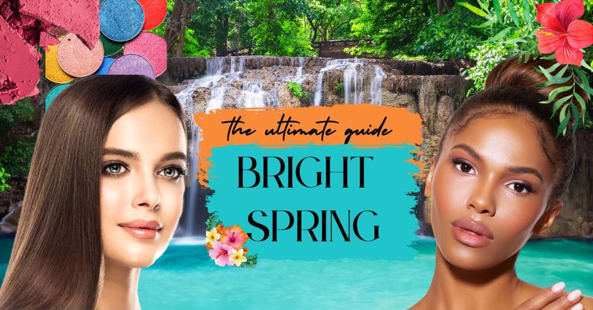
Bright Spring Seasonal Color: The Ultimate Guide
You’ve looked at the palettes, investigated whether you have warm or cool undertones, and watched the videos explaining why this celebrity is definitely a bright spring, only to have the following video confidently say that celebrity is actually a bright winter. And now, I’m here to simplify it all for you ( I hope!).
Bright Spring- a beautiful, captivating palette that everyone loves to gatekeep and is probably deeply misunderstood. So let’s get into it!
And turns out… I am a bright spring! Verified during my Sci-Art Training!

Seasonal Color Analysis: The Basics
Have you ever found yourself staring at your closet, trying to decide what to wear, only to feel like nothing looks quite right on you? That’s where seasonal color analysis comes in. You no longer purchase the pewter gray slip dress because it looked killer in a 90’s street style photo. And instead realize, heck ya, I can actually pull off the bright leaf green slip dress instead.
Seasonal color analysis is the process of identifying your best, most harmonious colors. While there are many theories and evolved processes to determine your seasonal color analysis, the most reliable way is to do at-home color drapes or see a professional.
I have an epic guide on how to DIY your seasonal color analysis here.
And if you opt to see a professional be sure to remember a few things. There are many different seasonal color systems that have evolved over the years. I recommend you study each system and examine which one you resonate with most, and then find a consultant who does that specific system. Furthermore, I do not generally recommend online consultations as they can be highly unreliable and there are a lot of unqualified people offering these services.
Seasonal Color analysis examines three main color qualities and determines the best colors that will create harmony when you wear them.
It is heavily based on the Munsell Color Wheel- and examines your Hue (warm or cool), your chroma (bright versus muted), and Value/Saturation (light versus deep).
Whether you’ve opted for a professional color analyst or are exploring the Bright Spring seasonal color on your own, this guide will help you integrate it into your own personal style and help you find strength through style and confidence in your wardrobe color palette.
We may earn a commission from you clicking a link below. And as an amazon associate, we earn on qualifying purchases. Full affiliate policy, here.
Characteristics of the Bright Spring Season: Defining Bright Spring
Understanding color qualities and where a season falls on the Seasonal Analysis Flow Chart is incredibly important to understand how each color might work for your palette.
Let’s examine where Bright Spring falls. Bright spring in a 12-season color system is between True Spring (also referred to as warm spring) and Bright Winter. It is part of the spring season which includes Bright Springs (Bright + Neutral/Warm), True Springs (Warm + Bright), and Light Springs ( Light + Neutral/Warm).
Note: I recommend when you begin to explore seasonal analysis to start with a 12-option system. Figure out where you fall and try the colors. If you really feel like some of those colors are not working or you’re pulling a lot of colors from a sister season successfully, then graduate to a 16-season system. Having 16 options is usually a bit too overwhelming to parse through when you’re just exploring.
Bright Spring has a neutral undertone that leans warm, which is what places it in this location. Here are their color qualities.
Hue: Bright springs have a neutral-leaning warm undertone. They will not have cool undertones.
Value: Value refers to how light or deep a color is (see image below) Bright Springs are usually more pure but they can lean a bit towards light (tints= color + white). They typically don’t have too many shades (color + black) in their palette and stay with more pure values.
Chroma: Bright springs have bright chroma/intensity. This means these colors do not have any grays mixed into them.
Now, bright springs especially have a wide variety of potential “looks”. And seasonal color analysis is a spectrum. So you will have Bright Springs (BS) that leans more towards the Bright Winter side of the palette with stronger contrast and features, and you will have Bright Springs that have a lighter coloring that leans more towards the True Spring side.
Because of this variety, it becomes a very misunderstood season. And a fruitless experiment to say well I look like X celebrity so we are both Bright Springs.
Common Bright Spring Hair, Eyes, and Skintones
Remember that color draping is really the most effective way to determine your seasonal color. We are examining how your skin reacts to the color so virtual drapings and photoshopping tools will not give you consistent results.
Furthermore, seasonal color analysis has evolved a lot over time and emphasized different elements. So while Carole Jackson of “Color Me Beautiful” focused mostly on hair/skin/eyes to place you, color analysts today really only trust draping.
The following descriptions can* be common in the Bright Spring palette, but be sure to do color drapes to confirm whether or not you are actually a Bright Spring.
Bright Spring Hair: People with a Bright Spring color type may have natural hair colors that range from warm, golden blonde, flaxen blond, strawberry red, red, auburn, or light brown with reddish undertones. But remember I mentioned that it’s a spectrum- you can also find some Bright Springs with red-black or brown-black hair although this is less common.
Are All Redheads Warm?
Nope! While red hair is common in the spring and autumn season, depending on the system you use, you can also find redheads in the bright winter category as well. Draping is the key to figuring this out!
In Sci/Art (the system I am trained in) they believe redheads can be cool-toned. Other systems or analysts like Carol Braily do not agree with this.
This is why it is important to study the different systems and make sure you understand and agree with their interpretation before you get draped.
Bright Spring Eyes: Bright Springs often have bright, clear eyes. Their eyes range from clear green, green with gold, clear blue, aqua, french blue, light blue, olive with orange flecks, and light golden brown.
Bright Spring Skin Tone: The Bright Spring color type is associated with neutral warm undertones to the skin. These individuals may have a peachy or golden glow to their skin, and may also have freckles or rosy cheeks. Their skin often has a luminous quality, as if lit from within. They can also have a dark olive appearance with a yellow base. Or potentially a medium to rich brown with a golden undertone.
Turning Gray: When Bright Springs are gray they tend to get a silvery color with a lot of warmth to it. It has a jewel contrast similar to Bright Winter gray hair but with more warmth overall.
Contrast in Bright Spring
Contrast is absolutely a factor in seasonal color analysis, but it is only one piece of the puzzle. And it can be an especially confusing factor in the Bright Spring type.
Bright Spring, sometimes referred to as Clear Spring, has the most contrast of all the spring types. But compared to winters they are less contrasted.
So while Bright Spring on their own may appear to have very clear features and contrast, if we set them next to a Bright Winter we see that they lean more toward medium-high contrast with Bright Winter having high contrast and a harsher quality to their look.
And there are also some Bright Springs that have a bit more blended quality closer to their True Spring neighbors, typically with medium blonde or brown hair and eyes that are blue or green with a bit more yellow.
This is why color draping is important, to really factor in your own personal color needs. And how you want to use those colors.
Both BS and BW have a dominant trait of being “bright”. This means the colors they choose are purer and don’t have any grays muting their saturation.
Bright Spring is neutral leaning warm and Bright Winter is neutral leaning cool. So while they may share some overlap with saturation, the base hue of their palettes are different.
We can also see again that BS has medium-high contrast whereas Bright Winter has high contrast when side by side.
Bright Spring vs Dark Autumn
So what do these two season types have in common? Well, they are both neutral-leaning warm closer to the Winter side of the spectrum.
Bright Springs are going to have bright chroma, whereas Dark Autumns have muted chroma.
While their characteristics might sound verbally alike when you list out their features, they do not often get mistaken visually for one another.
You can see that Bright Spring is far more saturated and clear than the DA.
If you think you might be a dark autumn, check out my guide on it here.
Bright Spring vs Light Summer
If this seems like a stretch, just give me a minute to explain… So Light Summer is the brightest of the summer palettes. And they are neutral cool leaning warm. And if we went over hair/eyes they could be mistaken for one another (especially when they have gray or white hair).
But when draped, it should become obvious that light summers do not have enough saturation in their palettes.
This leads me to…
How To Determine If You Are A Bright Spring
As mentioned previously, color draping is the only “definitive” way to figure out your seasonal type.
For the full typing process, explore my DIY Color Analysis guide here.
Conducting an At-Home Color Drape
When conducting a color draping test, it’s essential to pay attention to several factors that can influence the results. Here are some guidelines to ensure you get accurate and reliable outcomes:
Lighting: Natural daylight is the best lighting source for a color draping test. It provides the most accurate representation of colors without altering their appearance. Avoid fluorescent or yellow-toned lighting, as these can distort the colors and affect the results. Opt for being around 3 ft away from a North Facing window if possible, this creates the most even lighting. Avoid taking photos at “golden hour”
Hair: Tie your hair back or wear a neutral headband to keep it away from your face. This will help prevent any influence from your current hair color on the test, especially if it’s dyed or not your natural color. If you have very short hair, consider wearing a light gray or white hair cap.
Makeup: Remove any makeup before the test, as makeup can alter your skin tone and coloration. The goal is to assess your natural coloring without any external influences. (Yes, even your mascara and tinted moisturizer need to be removed).
Clothing: Wear a white or light gray top or drape a white cloth around your neck and shoulders. This neutral background will help you focus on the colors you’re testing without interference from your clothing.
Draping fabrics: Use a variety of fabric swatches in different colors, including those from the Soft Summer palette and other seasonal palettes. This will help you compare and contrast how different colors affect your appearance. Fabrics are much more effective than lipstick or makeup tests. Feel free to use any fabric around the house (sheets, curtains, clothes, towels etc).
If you have zero colors at your house, you could try this set of affordable fabric swatches. But they are smaller in size (12 in by 12 in) so you need to hold them closer to your face.
Test one color at a time: Hold each fabric swatch close to your face, underneath your chin, and observe the effect it has on your complexion, eyes, and overall appearance. Take note of which colors make your skin look more even and radiant, and which colors make you appear washed out or tired.
Take photos: Capture photos of each color swatch against your face. This can help you review and compare the effects of each color more objectively later.
Assess The Color:
But the first thing you will want to confirm is your undertone.
The simplest test to see where you fall with your undertone was created by Robert Dorr of the Color Key System, where you test magenta (cool) versus orange (warm).
If you are bright spring, both of these colors will probably look good on you. But orange will look slightly better because of its warmth.
Even if you are “neutral” in undertone you will lean towards cool or warm.
Now if you have confirmed you are warm, continue to color drape to determine whether you need muted colors (autumn) or bright colors (spring).
Autumn vs. Spring Drapings:
(please note, I have cool-toned, so none of these colors look “great” on me).
You’ll want to compare sets of photos and multiple drapes to get the most accurate result. Eventually, if you are a Bright spring you should see that the brighter shades suit you more. Autumns have rich gold added to their colors, whereas Springs have clear yellows added. You’re not going to find muted colors (color + degrees of gray) in the spring palette.
Issues with your white balance or confusion about your draping results? Again check out my guide here.
Is Eye Pattern Typing a real thing?
Most color analysts don’t consider eye typing a verifiable way to determine your season type alone. It can be a factor that provides somewhat repeatable results but is far from 100% accurate. (Meaning if you took 100 Bright Springs, you might find 75 of them have a similar eye pattern, but if you’re one of the 25 that don’t and that’s the only test you do, well oops.)
But, if you’re curious this is what the Spring eye pattern it is typically seen as a sun or sunlight coming from a small area around the pupil. This is different than the “Aztec Sun” of the autumn palette.
This pattern can be seen in blue, green, or brown eyes.
Some analysts also believe Spring can have a cracked glass eye pattern, which is common in Summer seasons. And in this case, it’s best to check undertones and drapes.
Is it fun to see if your eye pattern matches? Definitely. Would I use this as confirmation you need to completely revamp your wardrobe for Bright Spring, no!
Bright Spring Celebrities
Unfortunately, there is no “ultimate, verified” list of celebrities that are bright spring. And there are tons of professional consultants and different color systems that will type the celebrity differently.
And because these celebs are often typed based on photos that have been color-corrected, or edited, or they are wearing a lot of makeup/tanner, it can be hard to decipher their true undertone and placement.
So while I give you some examples of Bright Spring Celebs in my opinion, just know that these shouldn’t be used as correlative data points. Just because you look like Nicole Kidman, doesn’t mean you react the same way to color as her.
Mila Jovovich
Kerry Washington
Jessica Pare
At first glance you might think Jessica Pare is so pale, she must be a Winter. But she looked stunning as Megan Draper in Mad Men in all those warm-toned clothes. So I personally think she is a Bright Spring that leans more toward the winter side of the flow chart.
So Emmy Rossum is used frequently as a Bright Spring celebrity. And I do think some bright colors look fabulous on her, but I also think she can pull off a ton of Bright Winter colors (more than your average Bright Spring). In her case, I would say she is the flow between the two seasons and would benefit from a purely “bright” category in the 16-season system. She’s most like a bright spring that leans closer to the winter side than the true spring side.
So as you can see there is a pretty wide range to Bright Springs, and some appear more related to the True Spring neighbors, and others appear close to their Bright Spring sister season.
But they all flourish in bright, warm colors.
In my opinion, seasonal color analysis is a spectrum. So while most of the colors in this palette will harmonize beautifully with you, there may be a couple of colors you don’t like on yourself. Or there may be a section of colors you gravitate towards or reflect your personal style goals more. So use this guide as inspiration to start understanding the Bright Spring color palette, so that you can then create your uniquely you color palette.
UMM… Aren’t you forgetting Emma Stone?
Ok, controversial opinion coming at you… Emma Stone looks FANTASTIC with red hair and can pull off a lot of Bright Spring Colors. But, I think her red hair dye is compensating for that brightness, possibly. Now, her true hair color seems to be lighter and I have no doubt she’s in the Spring family. But I hesitate to broadcast her as a Bright Spring. I’m not sure she naturally has their contrast levels or needs that added element of coolness.
Celebrity Typing: Word of Caution
Professional analysts rarely believe in online consultations (there are a few very well-seasoned professionals who can accurately type virtually but generally it is not all that accurate).
So, while you’re watching all the wonderful youtube videos out there on seasonal color, just remember that that celebrity has not been “officially” placed. And depending on which picture you choose of a celebrity, can drastically alter the “assessment”. So while I think those videos can be fun and can help you learn about color, please don’t use a celeb as a hard data comparison.
Bright Spring Imagery
Seasonal color analysis does actually have roots in the seasons and landscapes as we know them.
The thought process was developed first by Johannes Itten who started to realize certain people’s colorings fit in nicely with certain landscapes during each season.
But, Bright Springs landscapes can be described as a magical, tropical forest. Full of color and vibrancy and the warmth of nature.
Keywords for Bright Spring
While your color qualities (neutral warm, light, bright) are essential to understand there is also an innate energy that a Bright Spring exudes. Some of the words used to describe BS are:
- Crystalline
- Crisp
- Clean
- Sharp
- Bright
- Sparkly movement
- Energetic
- Magical
- Fun
- Tropical
- High-spirited
- Exuberant
- Warm
Understanding Color Theory, Art, and Seasonal Color Analysis
So as I mentioned, the history of color analysis is in the evolution of how artists used color theory in their works.
It first started with Johaness Itten who began to split colors into yellow/warm and blue/cool and then eventually realized they could be split further into light and dark. And the realization formed that certain painted skin tones looked better in certain landscapes. A light, bright, warm person would look stunning in a saturated rainforest scene with a rich waterfall in the background.
Then we also have the impact of Albert Munsell who created a 3-dimensional color wheel that is the foundation of seasonal color analysis we know today. Evaluating a color based on three properties: hue, chroma, and value.
So while there have many seasonal color analysts and professionals who have furthered the process to be applied to personal style, makeup, and overall daily use, color theory, and art is the root of these processes.
So I always like to look at some actual artwork that applies the same qualities as a Bright Spring.
For instance:
Sunflowers by Vincent Van Gogh
Les Demoiselles d’Avignon by Pablo Picasso
Portrait of Jeanne Samary Renoir
Viva la Vida, Watermelons by Frida Kahlo
All of this is to explain that yes- hair/skin/eyes can give you an inkling of your type but it’s a spectrum. Please don’t agonize for months trying to determine what season you are in. Instead, explore which color qualities harmonize with you, and how you like to use color in your wardrobe and develop the ability to recognize where each color lives so you can build your own unique palette.
Bright Spring Color Palette
Now, if you just skimmed through the entire article until you got to this heading, I won’t judge you. This is probably what you were actually searching for. But, while this is a great Bright Spring palette to get your inspirations going, the color understanding and qualities of Bright Spring are worth learning. They give you the foundational information to build your own unique palette, shop successfully for these colors, and borrow for sister seasons more strategically.
Here’s a general overview of the Bright Spring Color Palette:
The colors are typically neutral/warm, light intensity, and bright overall.
Bright Spring Neutrals
If you’re looking at your palette thinking your phone brightness must be on max because wow, those colors are bright– you’re not wrong. Bright Springs really do thrive in high saturation. It’s one of the rare seasons where wearing coral next to lime zest can feel completely natural. That vibrancy is part of what makes you look so fresh and awake.
But if bold color isn’t always your personal style, or you need something more work-friendly, Bright Spring does have neutrals. They just tend to be a little more alive than what you see in standard retail. This makes them trickier to spot when you are just beginning your bright spring journey. So if you’re struggling with your whites or grays, don’t be too hard on yourself!
Your Core Bright Spring Neutrals
I’ve included the new visual guides below to help lock in what these colors actually look like in real life. The trick with Bright Spring neutrals is that they aren’t soft, earthy, or grayed. They stay clean, crisp, and a bit glossy. Bonus points if the fabric texture has a gloss, sheen, or polish to it!
Your Whites
Think vanilla yogurt, light frozen custard, or banana cheesecake.
This white is warmer than Bright Winter’s paper white, but still clear and bright. Your whites should feel like there is a warm, bright light being lit from behind the fabric. They don’t feel soft or gentle.
Gray + Black
Bright Spring grays are smooth and cool, with a clean metallic quality rather than anything soft or heathered. Think titanium, polished steel, or a seal’s surface – clear and crisp, not dusty or fuzzy. Your lighter grays might be similar to those of pumpkin seeds. Still warm and bright, never foggy.
For dark values, charcoal works as long as it stays cool and defined rather than smoky or brown-leaning.
Bright Springs can use small touches of true black because of their Winter influence, but it’s most effective in accents or details. For larger pieces, coal black or brown-black is usually a better fit – still deep, but not as heavy or flat as pure black.
Bright Spring Navies
This navy is very blue and moderately dark without tipping into inky or blackened territory.
If it looks almost black, it’s too Winter. If it’s dusty or grayish, it’s too Summer/Autumn. When trying to compare a navy, put it next to one of your brights and see if they are on the same “plane”. We don’t want your bright color to be sitting in front of the navy, if that’s the case, your navy is probably not crisp or saturated enough.
Bright Spring Browns
Bright Spring browns live in the syrup–caramel–polished bronze family.
They’re warm, clear, and slightly glossy. They do not feel like cocoa, taupe, or chestnut.
Other possible neutrals
- Dark charcoal (with a clean, cool edge)
- Dark green (only the clear, blue-leaning ones)
- Brown-black or jackdaw-black (for your darkest values)
These should still feel brightened or “awake,” not flat.
How to Use Neutrals Without Dimming Yourself
If you choose a neutral-heavy outfit, pairing it with a bright accent color can instantly revive the clarity you need or crave. Because I’ve found that once people start wearing their brights, they kind of get addicted to the saturation!
(A single bright piece near the face works wonders.)
What about white and black?
Because Bright Springs can handle contrast and they are sister seasons with Bright Winter they can pull off small doses of true black and white. Small blocks of black or white or linear elements of black/white can create a vibrant contrast. Piping, trim, belts, or styling details can help stabilize your overall look.
However, if you are creating a business casual look or an outfit with a significant neutral component, a color within your main sub-season will be more effective. A BS neutral with a brighter color can look incredibly chic.
A more effective color scheme would be a buttermilk white and coal black. These colors may appear like “true black” and “true white” when you wear them, so they create the same effect and it’s only when compared directly to their winter counterparts that the warmness will be more evident.
Worst Colors for Bright Spring
Sometimes learning your seasonal color type is helpful by just eliminating your “worst colors” from your wardrobe and shopping carts.
And when you are color draping, sometimes pooling together your worst colors can give you an inkling of what color qualities are working.
Cool colors: Colors like icy blue, lavender, and cool grays can clash with the warm and vibrant nature of the Bright Spring color palette.
Muted colors: Colors like dusty rose, olive green, and muted gold can make the Bright Spring color type look washed out and dull, detracting from their natural radiance.
Dark/Deep colors: Colors like crow black, dark navy, and deep burgundy can be too heavy for the delicate coloring of the Bright Spring color type, making them look drained of color and vitality.
Earthy colors: Colors like taupe, mustard, and rust can be too muted or murky for the Bright Spring palette, and may make the individual look dull or lifeless.
Bright spring should avoid colors that are muted and cool and colors that are deep and muted. They are bright and warm, so these colors will make them look sallow and dampen their natural clarity.
While Bright Springs focus on “glistening” colors, anything too icy/cool that belongs in a winter palette will not be super harmonious with them.
How Do You Use Color In Your Wardrobe?
Maybe you’re thinking “ I have to be a Bright Spring because everyone always compliments me when I wear a lime zest shirt or an Aegean sea-colored dress”. Well, I hate to break it to you but that is not confirmation.
A lot of times people compliment colors they like and do not consider how it harmonizes with you. And sometimes they are seeing the color before they see you- which is not the goal of seasonal color analysis.
Instead of “that dress is gorgeous”, we are aiming for “YOU look stunning in that dress”. And when a non-BS wears a bright color, the color is almost always the first thing noticed or it draws attention but doesn’t necessarily harmonize.
Color Combinations for Bright Springs
Bright Springs can really handle some contrast in their outfits, and they can also rock innovative uses of color.
If you want to use a neutral be sure to pair it with a bright color to reflect your energized and vibrant look.
Where other seasons might look clown-like in complementary colors or bright color contrasts, you can thrive in that contrast and vibrancy.
However, if you opt for analogous or monochrome outfits, it might take a bit more forethought.
So if you like to dress in monochrome opt for a more colorful column of color. A light gray column of color on you might dim your liveliness. Whereas a brighter blue monochrome could make you shine.
When using analogous colors (colors that are next to each other on the color wheel), make sure you have some “breaks” instead of a blended approach.
You have contrast and linear breaks or energetic individual colors can be stunning. But anything too blended might feel too soft for you.
Clear definitions of color are key.
Similarly, all-over dark or light outfits can feel too serious on you and might wash out your clear coloring a bit.
Bright Spring Jewelry
Because you are a neutral-leaning season you can probably pull off both gold and silver. And because you can handle some contrast, you can even wear them together.
You can wear a wide range of golds- from buttery yellow, slightly orange-tinted, and even a sharp yellow. You can also try white gold. You want to avoid any gold that feels brassy, antique, or burnished.
If you opt for rose gold, go for one that has a peach undertone instead of a rusty one.
Metal textures should be shiny and smooth, and not antique or with a patina.
And remember that you shine in bright, so any bright and shiny stones will look fantastic on you. And don’t be afraid of jewelry that has multiple colors within it, that type of animation and energy looks perfect on a BS.
You can also experiment with diamonds, yellow sapphires, emeralds, clear turquoise, coral, blue topaz, and Swarovski crystals. Be wary of any muted options that have a “Santa Fe” look that might be more at home in the Autumn family.
Clear, shiny, and bright stones are going to be an easy choice for you.
Bright Spring Prints
Bright Springs were made for prints because they reflect your animated vibrancy and create movement within your outfit.
Triangles, zigzags, unique artistic designs, and asymmetrical prints are all fantastic options. Super small-scale or blended color prints are not the best for your vibrant nature.
If you opt for a paisley or plaid it is best when all the colors are within your BS palette.
Because you have such warm and bright colors in your palette it can be more obvious when a shade is outside your palette and throw off your look.
Take the below print examples for instance.
Textures for Bright Spring
Since you have clarity in your features you can really handle some shine when it comes to texture.
When it comes to shine the brightness of winter’s sequins might overshadow you, but patent leather, satin, or shiny stone earrings can be a beautiful compliment to your clarity.
But remember that your style essence or your personal style preferences may trump this texture preference. If you lean more natural with your styling, the shine may seem disharmonious overall and it would be a normal deviation to use more matte fabrics in your color palette instead.
Denim For Bright Spring
A lot of denims are within the Bright Spring palette but you don’t want anything to appear too faded or worn in which can add softness to your look when you really need brightness.
Very blue navy denim is fantastic on you and can pair beautifully with the other bright colors in your palette.
If you opt for a medium or light blue just make sure there is a richness to the shade and it doesn’t veer too muted. You want colors that vibrate against each other, not dull each other out.
Bright Spring Makeup
Your makeup can have a profound impact on your overall vibe and the finishing touches of your personal style. And it’s possible you may not gravitate towards such strong colors on your face, even if you can handle them beautifully.
This section will still have a lot of insights on what type of textures and techniques harmonize with the Bright Spring beauty.
Because you have higher contrast within the Spring family, it is ideal to use both value and color contrast.
Let’s go over some terms that might help you understand the BS makeup a bit better. We are going to use the term “clear” which in this case is a synonym for bright and references a pure color pigment. We don’t want a muted, muddy, or any color that has a lot of gray added to it.
Makeup having transparency is not the same thing as being muted. Glossy finishes or clear finishes work beautifully on a Bright Spring. So just make sure the pigment is in season and vibrant enough for you.
You may struggle to find “sets” of makeup all within the bright spring palette, so individual purchases may be easier for you and lead to less waste.
Bright Spring Foundation
Your foundation should match your skin flawlessly, and it will likely be a neutral/warm shade. However, do not necessarily trust a makeup brand’s interpretation of neutral/warm/cool as they can be highly unreliable. Similarly, a cosmetic counter representative may understand makeup but they may not be familiar with the nuances and subtleties of seasonal color analysis. So it is best to test the color in person and in natural light.
In terms of formulas, try to avoid opaque foundations as they are too heavy on you. A perfect color match is essential though, so if you find a foundation that matches you and is a bit heavier than you’d like you can lighten it with the application. You can add try a primer, sunscreen, or even a moisturizer to thin out the color a bit.
Sheer and dewy are especially great on you if you can find a perfect color match.
Here are some general examples of Bright Spring Foundations:
Pay attention to the name and color if you want to explore any of the selections above, as the link will not always load the exact color I’ve referenced.
Bright Spring Blush
The best colors for your blush are often warm pink, coral red, and bright salmon. And a more opaque blush can sometimes feel heavy on your skin, so be sure to test the density.
You want something that allows your natural, even skin tone to shine through. So light cream or lighter transparency blushes are great. You want the blush to look natural on your face, and not separate.
Bright Spring blushes can feel really intense and you initial reaction (like mine) was “Are you CRAZY?!”. But just try a light dusting and you will be shocked how well you can handle these bright pinks and corals.
Bright Spring Contour: Yay or Nay
So you may be assuming that since the Bright Spring has more contrast to it that it will naturally be able to handle contour. But, heavy contouring rarely works for springs as it tends to mute their natural clearness.
Instead of contouring their faces, Bright Springs can use a highlighter to enhance the vibrancy of their face. A peach gold highlighter can help brighten your face instead of sharpening it.
Bright Spring Bronzer
Caution should be used with bronzer because if it is too heavy or muted it may lean more autumn and dull your face.
And if you lean a bit more towards the winter side of the spectrum, bronzer may not be something you opt for.
A light matte, slightly translucent, light shimmer peach gold bronzer can be a nice accentuating touch for some bright springs.
Personal experimentation is key in these decisions. And I find sometimes photographing a makeup look and reviewing it later can give hindsight clarity.
Because I am a very pale Bright Spring, I find any bronzer makes me look muddy and it dims the luminance in my natural skintone.
Bright Spring Lip Colors
Glossy lip shades with color pigment are fantastic for you. You’ll want to avoid anything too muted, matte, or dry as it will feel separate from your vibrancy.
Please note “saturated” color does not mean a dark color. Instead, it refers to the tone of the color, and a more pure color (no grays added) is ideal.
Juicy lip glosses should be an easy yes for most Bright Springs. Depending on whether you are closer to the bright winter or true spring side of the spectrum may impact which lip colors you choose.
Coral: Coral is a warm and vibrant color that is often found in the Bright Spring palette. It’s a great choice for lip color as it can add a pop of warmth and radiance to the overall look.
Peach: Peach is another warm and bright color that complements the natural warmth in the Bright Spring coloring. It can add a natural and fresh look to the face.
Bright pink: A bright and clear pink lip color can complement the bright and clear nature of the Bright Spring color palette. It can add a fun and playful touch to the overall look.
Tomato Red: A true red lip color can also be a great choice for those with a Bright Spring color type, as long as it’s a warm and bright shade. Red can add a classic and bold touch to the overall look.
Warm Fuschia: A great option for Bright Springs who lean closer to the Bright winter side of their sub season
Bright Spring Eyeshadows
Bright springs often have really striking and captivating eye colors, so you want your eyeshadows to draw emphasis but not overpower.
Generally, bright springs should avoid palettes that are made for “x color eyes” as they have such vibrant and multi-dimensional eyes they rarely harmonize perfectly.
If you want some neutral eyeshadow shades you could try light to medium gray-beige, crisp silver taupe, or a pale beech color. You can opt for a matte texture or shimmery option depending on the overall look you going for. I also like warm shimmery champagne colors, just make sure they aren’t too soft!
If you want a more colorful eyeshadow look you could try melon, apricot, coral, or a clear vibrant gold. You can also pull from the blue side of your palette and try a turquoise, lime green, or even emerald.
Bright Spring Eye Liner
If you want a starker look you can opt for medium-gray or a warm medium-dark charcoal, but you may want to be careful with the application. When you encircle the entire eye it can make them appear smaller and confined. This is a great affordable eyeliner formula for bright springs.
Navy blue eyeliner can be especially effective on Bright Springs who have blue or green eyes.
I love this brown liquid eyeliner as well. It creates a crisp, thin edge and has some warmth to it.
And because you can handle color so seamlessly, Bright Springs can even try turquoise, purple, deep violet, or emerald eyeliners as well.
Bright Spring Mascara
Your best bet for mascara is black/brown, soft black, or dark gray/charcoal. Extreme black mascaras may be too heavy on you.
Despite the color for this mascara being “Long ash“, it’s a perfect bright spring mascara. During my sci-art training, we tested it.
Bright Spring Nail Polishes
You have so much vibrancy in your colors that nail polishes shouldn’t be super hard to find. And if all this color is making you neutral-dressers a little nervous, try starting out with an energetic BS nail polish to get acquainted with your palette.
Here are some ideas:
Bright Spring: Dying Your Hair
A lot of analysts will say that your natural hair color is your best color. And some seasons can get away with slight changes to their hair that complement their harmony nicely. However, for bright springs, the general recommendation is “DON’T mess with your natural color!”.
Your hair typically has a lot of natural dimension to it and dying your hair can give it a heavier, muted quality. And it can be a struggle to get back to your natural color.
If you’re getting the itch to change things up, you could try some gentle highlights or balayage that will add more dimension to your hair color. But be careful not to add too much contrast that it becomes distracting, and be careful of the hue dimension of the highlights themselves. A colorful sunkissed look can work or a honey-bronde color can be effective, but we don’t want tiger stripes, ashy tones, or platinum streaks.
Opt for added dimension to your natural color over any strong color deviation or all-over color. Take it from me, getting back to your natural bright spring color can be very difficult. Bright Spring has a very wide spectrum, so if you are a blonde bright spring you may find warm highlights gives you that beach goddess vibes.
And generally, any darkening of your color should be avoided. You already have the maximum contrast for the Spring family, adding more contrast will be distracting.
Bright Spring Outfit Ideas
So your wardrobe color palette is only one part of your overall personal style goals. It is important to remember your own authentic expression, including how you like to use color and how you like to express yourself.
Remember to use this guide as foundational information and not a rule book. The more you learn about color and your use of it, the more you will know where and when you want to break or bend these guidelines.
Here are some ideas of Bright Spring outfits that you can* take inspiration from. But please don’t get depressed if you look at these outfits and say “Oh my god, I would never wear those, seasonal colors must not be for me”. There are many, many ways to use your palette.
Farm Rio has some especially great pieces for Bright Springs!
Tips for Shopping Bright Spring
Please don’t analyze yourself as a Bright Spring and then decide you need a whole new wardrobe overnight. Color analysis is a journey and should be done with the unique individual in mind.
As you progress you may learn more about your style goals and feel comfortable adding more Bright Spring elements to your wardrobe overall. This is fantastic, but now what?
Here are some tips to help:
Know your color palette: The first step in shopping for Bright Spring colors is to know your color palette. This will help you identify the colors that complement your natural coloring and enhance your overall appearance. Remember when I said you might want to learn the basics of the color theory behind seasonal color analysis? Well, that’s because it will help you tremendously when you are deciding if that color is a match for you or not.
Shop with a color swatch: It can be helpful to carry a color swatch/fan of your Bright Spring palette with you when shopping. This will help you compare the colors of the clothing and accessories to your color swatch, ensuring that you are selecting the right colors for your coloring.
If you’re struggling to see if the color matches your bright spring fan, then try comparing it to other colors in your fan. It should look harmonious will all the other colors as well. And if it looks slightly off when paired next to other BS options, it’s probably not exactly right.
If you don’t have a fan you can try bringing a Bright Spring piece you already know is your palette with you. Comparing a new item to a bright spring scarf for instance should create harmony if they are both BS colors. Or it may highlight that the piece veers a bit more muted or cool when next to your scarf. Comparison is your friend!
Choose bright and clear colors: Bright and clear colors are characteristic of the Bright Spring palette, so it’s important to choose colors that are vivid and vibrant. You may think well this color is in the autumn family, but it’s still warm so I can probably wear it… But honestly, a muted color will dull your vibrancy and can make you look sallow.
Pay attention to fabric and texture: Fabric and texture can also play a role in selecting the right colors for a Bright Spring. Look for fabrics that have clear textures or shine (assuming these work for your personal style). Be mindful of deeper, muted, or muddier textures like flaxen wool or a soft suede
Don’t be afraid of innovative uses of color: A turquoise leather jacket or a coral pair of heels are great choices for you. If it’s a basic staple in a BS color palette, you can pull it off!
Give yourself some adjustment time: You may not be used to seeing yourself in so much color and it may feel or look off to you at first. Start integrating small amounts of colors into your look and over time you will start to see how you flourish in this vibrant, energetic color palette.
Dressing During Colder Months
Since the Bright Spring color palette is characterized by warm, bright, and clear colors, those with a Bright Spring color type should choose clothing colors that complement their natural coloring, even in the colder months. Here are some tips for dressing in autumn or winter as a Bright Spring:
Stick with warm and bright colors: Even in the colder months, it’s important to stick with warm and bright colors that complement the natural warmth in the Bright Spring coloring. Colors like warm red, coral, golden clear yellow, and bright green can be great choices for autumn and winter.
Layer with neutrals: While bright colors should remain the focus, it can be helpful to layer with neutral colors like slate, coal, buttermilk white, and ivory to create balance in the overall look. These neutral colors can also add warmth and coziness to the overall look.
Choose fabrics with texture and warmth: In colder months, it’s important to choose fabrics that provide warmth and texture to the overall look. Wool, cashmere, and shinier leather are great fabric choices for autumn and winter, as they add texture and dimension to the overall look. Avoid “heathered” textures as those appear muddier on you.
Accessorize with warm and bright colors: Accessories can be a great way to add pops of warm and bright colors to the overall look. Scarves, hats, gloves, and even boots in warm and bright colors can add warmth and radiance to the overall look.
I’ve tried the colors and I hate them!?
Sometimes people explore seasonal analysis and they end up with a palette they “hate”. There are a few reasons why this can happen…
- You are not actually a bright spring. In a DIY or even a professional analysis, sometimes you get the wrong type. I would suggest if you’ve given it some time, are sure you are choosing BS colors, and a majority of the palette isn’t working for you, go back to the drawing board and re-drape.
- You have a personal style aesthetic that doesn’t necessarily harmonize with Bright Spring. If you have a very muted, natural personal style that looks beautiful on you, your bright spring palette may not be applied as easily. You could certainly add more clarity to your style over time, but that may not be what you want. I like to approach these style elements as different tools in your style toolbox. You may not “need” this tool for this era in your style.
- You may prefer to use color differently. Sometimes people prefer when people notice the color before they notice them. It creates a kind of “style armor”. If you look at the images of Emilia Clark (Summer) below we can see that both are beautiful outfits but one is in her palette and harmonizes, and the other draws you to the color first. If you prefer this method of dressing, I still encourage you to learn your seasonal color type because it will help you hit some of your color qualities and you can generally avoid colors that truly make you look sickly.
Being a Bright Spring means embracing your warm, vibrant, and radiant natural coloring. Your coloring is captivating and energetic, and when you wear your colors you shine.
Remember to embrace your natural beauty, experiment with different colors and styles, and most importantly, have fun with your fashion choices! I am all about finding strength through style and using your wardrobe as a superpower.
So go out there and shine bright like the sun!
I’m so excited you finally did bright spring! ???? I have struggled for so long looking at other peoples examples & recommendations which are often either very outdated, poorly styled or obnoxiously bright & don’t even look cohesive styled together or on the person they claim is bright spring. They make BS seem like such an unattractive palette. You’re examples made me feel right at home, they are elegant, bold and still fresh. I’m always typed as dark autumn probably because I’m a mixed POC but those colors do nothing for me except make me look old & tired. The brown based lipsticks are horrid lol. Also appreciate the tips for DIY draping! Extremely helpful! Thank you!!! ??????
So glad you found it helpful! I LOVE the bright spring palette,it’s so exciting!
@Lani, omg same!!! This is exactly my situation I thought I was a dark autumn because I’m a mixed POC and i like dark colors, but i looked nothing but tired. I love black especially, but wondered why a lot of them made me look aged. Then I found out that my favorite (and ones that i look amazing in) black outfits are actually all best for BS. People used to ask me if I had been getting enough rest all the time. I found that I have a whole lot of these BS colors in my natural palette, and it’s the only one that made me feel at home. I feel a whole lot more confident and honestly now I can admit that I like to wear the pretty pinks and I actually look amazing in them ??
@Jas, plus the Dark Autumn colors make me look like I’m in my 30s when I’m only 20 ?
This is so great. I always considered myself a winter even though it never quite fit. High contrast but not the highest, dark brown hair, no golden undertones in skin but rosy translucent, green eyes (with the bs eye pattern!). I thought maybe dark winter, but clear winter colors work better. I thought maybe I needed to accept my friend saying autumn, but it’s too warm or low contrast. I considered cool summer, but it’s so very cool. Bright spring fits everything! I was thrown off by the “tanning easily” line, but I do tan lightly eventually. My colors have always been everything here. It was great to see your comparisons of bright spring with other seasons. Last week I thought I just didn’t fit any season, but maybe this is it!
Thank you so much for your wonderfully detailed guides. I think I’m somewhere between a true spring and bright spring. Will you be doing a true spring guide?
Yes, I plan to!
This is so thorough and helpful!! You do such amazing work. Light spring guide soon, please! Also, I’d love recommendations for how to find wardrobe pieces during your “off seasons” (such as, you’re a Spring but it’s November so all the colors sold in stores are deep, dark, or cool toned).
Thank you so much for this guide! I am definitely a bright spring with high contrast, warm skin tone. But… I was a natural warm med brunette and now I am growing out my grey hair which is virtually all grey now, and wondering how if at all I should adapt my makeup and colors in my wardrobe. Do you have any recommendations on how to adjust to the reduced hair-skin contrast? I have very dark eyes, dark brows still, med-fair warm skin. I always get compliments with kelly green, brighter purples, orangey-reds, corals.
Hi, thank you for such an informative article. Easy to follow too. I do have one question please. If BS hair comes in silvery as they age how can this have quite a lot of warmth in it? Silver is acknowledged to be a cool colour so how can it have warmth in it? I’m a bit confused! Hope you can help.
Glad you found it helpful! Based on the sci-art system, BS does tend to turn silvery. They are neutral leaning warm, so they do tend to have some hints of coolness present. Also, hair color is not really a deciding factor anymore for color analysis. It’s mostly how color interacts with your skin undertone. While hair color can be a slight factor, many seasons with the seasonal analysis color wheel will have tonal hair. For instance, deep winters can have reddish tones to their hair as well despite having cool leaning undertones. Overall, yes silver as a color leans cool, but dont focus too much on hair color, it’s not a determining factor.
What about warm spring ???
I’m working on this one currently!
Hi,
This guide is perfect. How much does it cost to download it?? it would be great to have it.
Thanks a lot.
Sandra
Ah, I’m sorry. I don’t have it available to download currently. But, I will consider this for the future. I’m glad you liked it!
What a fantastic post, thank you! I have recently typed myself as a bright spring and have always known that corals and hot pinks suit me, and I find it easier to dress with these colours in the spring and summer but I am finding it so hard to imagine dressing this way in the cooler months. So hard to find outfit inspo. Especially as I am also a Kibbe Dramatic Classic so my wardrobe seems to be all black and white! Argh!
It’s a journey to get all your “style elements” in line, but I’m so happy you’ve found yourself in bright spring! It’s a beautiful palette
Exellent
thank you!
This is so helpful, thank you! However, I lean towards light spring so I was wondering whether you will also do that soon? Many thanks for your work!!
yes, I’m working on them all, not sure when I will finish light spring though!
These in-depth articles are actually amazing. Can’t wait for the bright winter article
thank you!
This was actually helpful and I saw examples of brown skin tones which I don’t see in other bright spring guides. Thank you! Would you classify these as jewel tones? What should one shop for as a color palette name?
Jewel tones in their traditional sense are more “winter” colors. I would call these warm brights, as if a light is being shown through. They are electric, energetic and exciting.
I may have found my home in Bright Spring. I was draped as a deep autumn by colour me beautiful a few decades ago and lived in some of those colours for years – the analyst said I was warm neutral, and very pale ivory, so the deepest, darkest brown and sludge shades did not suit, I was very close to bright spring, so I lived in brighter olive greens, terracottas, rusts and lightish oranges. My eyes have gone brighter over the years, the brown has faded from them completely and they are now bright green, and my hair a lighter gold brown. The brighter shades suit me even better, but strangely, I can wear bright fuchia as well as orange and gold and silver jewellery. I have since gone for several drapings, and been diagnosed a warm spring, a bright spring and a soft autumn, but all three said I was probably between seasons, a bit confusing, since they were all professionals, trained by big well known companies. I tend to stick to some bright spring colours now, but warm anyway.
What a wonderful article!! I was typed Summer in the Color Me Beautiful system in the late 80’s believe it or not and at the time, ranted a bit about wearing pastel colors stating quite adamantly that I could dress in full black and look amazing not to mention all the glorious neons we used to wear back then. The analyst looked troubled by my outburst and tried draping me in the Winter colors and eventually told me that my hair and eyes said I was Summer but I could wear Winter colors just fine …. sigh. I wore all black for years and loads of jewel tones and neons when I could find them and chucked some pastels in now and again. Come to the pandemic and, like everyone else, I got very bored and started looking into color analysis and body typing again (rewatched all the Trinny and Susannah stuff as a refresher). Then I stumbled on essences and John Kitchener and found that he will do a color analysis for you as well as essence analysis. Imagine my astonishment when the brightest most beautiful palette arrived (you probably know he does personal palettes not seasonal) and he said that I would have been called a jewel tone Spring in the old days. Black was included in large amounts in that palette as well as the fact I can wear gold or silver but always bright. I have always adored “sparkly” and velvet and satin, none of which are very Summery but now, finally, VALIDATION. I look to Bright Spring because my contrast is not high enough for BW but I can move between both season effortlessly so consider myself in the “flow” season namely, True Bright. Not only do I look amazing now that I have turfed all the summer grays and am combining instead of blending color but I really feel amazing too. When you start dressing not only the way you look but really, the way you ARE, it is incredibly empowering and it came at just the right time for me as I slip into menopause and need to reinvent myself. Love you work Gabrielle 🙂
Thank you so much!
This the most comprehensive, insightful article I have found!! I was recently typed as a bright spring and I love it! I’m getting my hair “fixed” soon and was told to take out my highlights (too warm and washing me out with my natural medium/light brown roots). I’m struggling to figure out what to ask for – like you say here, you don’t want to do all over color to just “get rid” of the highlights (and when I’ve had all-over color before, I really miss that dimension), so do you have recommendations on how to make that transition? Thank you!!
Thank you so much for this priceless information! As a kid in the 80’s I was typed as a Spring, even though my mom and the analyst were clearly skeptical as so many of the drape colors were meh. Ultimately I was called spring because of my auburn hair. The next few decades I hid any natural glow I had by wearing autumn colors, cause at least they were warm. It’s been a gradual downward spiral for 40 years. If you don’t look good in your clothes, and you look worse after putting on makeup, you don’t really want to stand out in a crowd. About 10 years ago my MIL wanted to learn how to do color analysis so she asked if she could do mine. It was not fun. The lady instructing her kept commenting about how the right colors would diminish my crooked “Pop-eye” face (and actually half winked one eye to demonstrate what she meant). Anyway, they decided that since I looked bad in lime green I must be a winter. Once again, I was told to wear colors that didn’t necessarily make me shine, but that made me look less sickly. After trying to rock winter clothes for a few years and even coloring my hair to try to cover the “orange” that clashed, I concluded that I was not a winter. I did, however, finally understand that clear colors were a priority and clear warm ones were the holy grail. Unfortunately I am absolutely not ready to stand out. When I stand in front of a mirror wearing parrot green, I think it is so so beautiful. But if I am out in public I don’t see my own face. I only see how bright my clothes are compared to everything else around me and I want to hide!
I really appreciate that you acknowledged just how hard it can be for people to start wearing their bs colors. It is also hard to find bs neutrals when shopping so even gradually transforming your closet is a rough road! But seriously, everything you’ve written here has given me confidence that maybe I really can do this! And the palette that you’ve presented here is beautiful! You know what? I think maybe I will hang up some of that BS artwork around my house, so I am not the brightest thing in the room 😉
Your work is always excellent. I’ve been reading your content for years, starting with the Kibbe stuff, but this article is the best yet! Your comparing colors where subtlety is missed in dots on a screen to things, like a seal, or specifically stating that the colors often seem lit from within is really helpful.
Thank you SO MUCH for the mascara recommendation! It’s exactly what I’ve been searching for – for years. I read all the reviews until I found one for how to remove it (because everyone commented on how well it stays on/how difficult it is to remove.) Cetaphil gentle makeup remover on a microfiber pad works perfectly.
This is so helpful! Thank you for sharing this tip!! Glad you found it helpful overall