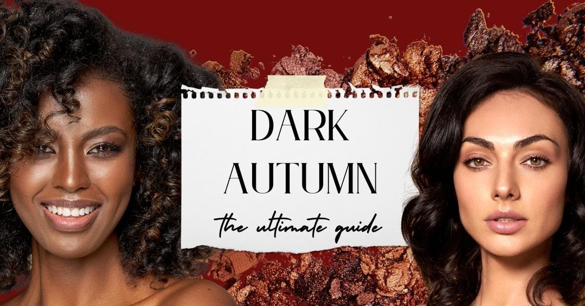
Dark Autumn: The Ultimate Guide
That package arrives in the mail, you pull it on, and it fits! But.. after a few twirls, you start to realize it just looks off. Is it the sleeve? Nope. It’s the color. It’s actually making you look ill.
And don’t get me started on following makeup tutorials or buying the same shade of concealer as your best friend. Time and money will tell you that just doesn’t work.
Seasonal color analysis can be your best friend when it comes to building a wardrobe, finding makeup that suits you, and just embracing your best self.
And, it can really help you save money. If we look at the photo below, the cool gray makes my jawline look heavy, and it ages my face. My eyes look more tired and less vibrant in color. The warm brown gives my face a more “3D” look, and much more defined. My eye color also looks vibrant and more sparkly.

I don’t buy those colors anymore… Phew!
Let’s be real, fashion and style and your overall visual representation matter to the world. It’s not shallow to want to craft and control these highly impactful elements. And color can be especially essential.
Now, it looks like you’ve landed on Dark Autumn, also known as Deep Autumn. Or maybe you’ve just stumbled down the rabbit hole of all 12 color seasons… But here is your ultimate guide to the Dark Autumn Color palette.
Please be aware: There are many different iterations of the seasonal color theory, and some systems have different names, options, and processes. Dark Autumn is also known as Deep Autumn and has been referred to as Blue Autumn in some systems. I am basing this article on the 12 color seasons (not 16), and will be referring to it as Dark Autumn.
Let’s go over some general guidelines for seasonal color analysis to make sure you are in the right place.
Are you warm or cool?
Seasonal color analysis is all about training your eye and being able to understand the base tones of color.
For a more obvious depiction, let’s look at the two images below.
The desert looks warm, and the Arctic image looks cool.
Now, it is not quite that easy when we are looking at our faces, but I want to be sure you understand the general concept.
The only way to determine your seasonal color is through fabric draping. When doing a draping, we are looking at how your skin reacts to the color. Does it make you look sickly? Tired? Like a floating head? We don’t want that!
If you’d like to try your own DIY draping, I have a guide to help you here. But be warned it is a fairly lengthy process and can be hard to determine.
Does the Gold vs. Silver Test Work?
So gold vs. silver can be a helpful test, but a small piece of jewelry really won’t cut it. A small delicate bracelet or ring is not going to have enough of an obvious reaction.
If you have large pieces of metallic fabric in gold and silver you could try that. But, you must also keep in mind that certain seasons will have variations of gold vs. silver. For instance, autumn does better with more antiqued gold or hammered gold, so neither traditional gold or silver may be obviously right or wrong.
You can see in the above metallic draping that the golds are much better for me than the silvers (I’m a verified sci-art Bright Spring). You can see that the hair cap stays the same color in each photo so the white balance is consistent, and yet in the pure silver, I look very sallow and flat. Bright Springs like Dark Autumns have neutral/warm undertones.
What about vein colors or the tan/burn test?
No, both of these have been largely debunked. Veins do not give you any meaningful data. And warm-toned people can burn, and cool-toned people can tan. Don’t waste your time.
The most effective test in my opinion is the MAGENTA/ORANGE Test:
Drape fabric (next to your face) that is true orange and cool magenta pink. You’ll want to do this in indirect sunlight, ideally in front of a north-facing window. This will give you softer more even light. And do not take these photos at “golden hour”. Now, these two colors are strong, so take that into consideration. But generally, there should be an overall winner in terms of which color works. If the orange suits you, you are warm. If the pink looks better you are cool and should go back to this article.
We are looking at how the color reacts to the skin. If it makes you look like you have bags under your eyes, makes your blemishes or skin texture look more “rough”, or makes your skin more pink, sallow, gray, or yellow it is not the right color for you. It can be subtle, so make sure you invest in taking these drape photos properly so you get the correct data to assess.
Dark autumns will most likely look best in the orange. And if you have done a metallic fabric drape, you’ll likely look slightly better in gold but can pull off some silver.
The most comprehensive way to determine your season is to drape fabric near your face and examine how the color affects your undertone. Depending on how serious you are about color as part of your style pillars, you may consider opting for an in-person color analysis. When done by a trained professional they can give you peace of mind and allow confidence in future shopping choices.
If you’d like more information on my in-person color services, trained in the 12 Blue Prints Sci-Art system, sign up here.
We may earn a commission from you clicking a link below. And as an amazon associate, we earn on qualifying purchases. Full affiliate policy, here.
What is a Dark Autumn?
Dark Autumn is obviously part of the Autumn season, and it happens to be the darkest sub-season. It sits between True Autumn and Dark Winter. Dark autumn is neutral-warm-toned, which is why we went over undertones in the previous section. And they have higher contrast, which is why they can sometimes be confused for a winter season if their undertone is more subtle.
Your palette will be composed of warm-toned colors that have deep value and can include an array of vivid warm tones as well.
The richness of the Dark Autumn palette is rooted in its depth and vibrancy. Signature colors include the spicy tones of nutmeg, paprika, and cinnabar, as well as the metallic hues of gold, copper, and bronze. These are joined by striking shades like deep teal, avocado, and cadet blue.
Dark Autumn’s contrast level is medium to high, allowing for dramatic yet cohesive color combinations. The palette creates a sense of balance by pairing rich neutrals such as espresso, aubergine, and charcoal with livelier tones like tomato red, marigold, or hyacinth.
In terms of visual contrast level, you have higher contrast. This can be seen in two different ways. You can have lighter warm skin paired with darker features or all dark features. Seasonal color analysis works for every skin tone. While many examples on the internet focus on caucasian skin tone examples, please note that just because you have darker skin does not make you an autumn or a winter.
Also, contrast isn’t really a metric we can see just by looking at you. A lot of online groups will only type you as a winter if you have jet black hair and snow white skin with jewel tone eyes. This is incorrect! Don’t worry too much about your actual visual contrast, and focus more on what the Dark Autumn drapes do to your face (both lines and colors!).
Dark Autumn Characteristics
Hue: Neutral/Warm
Value: Dark ( also called low value)
Chroma: Medium High (you are still muted!)
If you’re confused by these terms, check out this main seasonal color guide to get a better understanding of these terms. Essentially, we are trying to find the placement of all of these “levers” (hue, value, chroma) in our natural coloring and match them with our clothes and makeup. This creates beautiful harmony and allows the colors we wear to support us and let us glow!
Dark Autumn Comparisons
Dark Autumn Versus Dark Winer
Because Dark Autumns have high contrast at times they can be mistaken for Dark Winters. Especially if the DA has a neutral-leaning skin tone. But the Dark Autumn will have a more “harvest” quality to their overall vibe. They are like a volcano in the trees!
While they are both higher contrast and have deep/dark as their primary color palette, the hue or undertone is what will separate them apart.
Dark autumns are WARM and dark. Dark winters are COOL and dark. Dark Autumn’s palette is softer, warmer, and contains less coolness (blue added to a color).
Dark Autumn versus True Autumn
While they are both warm and in the autumn family, Dark Autumn has more contrast and more deepness. The color palette will reflect this by being slightly more saturated and deep in value. They can also handle more contrast in their outfits than the True Autumn. True autumn is pure warm-toned skin, and Dark autumns are neutral-warm. For Dark autumns their primary color characteristic is Value, ie “Dark”. And for True Autumn their primary focus will be Hue (warmth), ie “True”.
Dark Autumn versus Soft Autumn
They are both neutral/warm and in the autumn family but the contrast is much different. DAs have high contrast, and Soft Autumns have muted colors and moderate to low contrast. DA’s color palette shifts to be more saturated and deep because of this. Where Dark autumns feel like molasses and brandy, soft autumns feel like oatmeal cookies.
Dark Autumn Features
Here is a general overview of the Dark Autumn features. Please note that one trait deviating from these guidelines will not eliminate Dark Autumn as your season. It is more about how your skin reacts to the colors and a holistic view of these traits.
Dark Autumn Skin Tone
The Dark Autumn has neutral-warm skin. So if you can pull off both gold and silver jewelry, don’t eliminate the Deep autumn. Your skin’s undertones will be warm, which means it may come off as golden or slightly bronze. The skin colors range from light to deep but they will always have a warm-neutral quality to them. Freckles are possible, but they are never a defining factor.
Skin tones for Dark Autumn often possess a golden warmth or bronze undertone, with a richness that pairs well with deeper colors. But this doesn’t mean you just look “tan”, but rather that you skin glows with the dark autumn colors underneath you.
Dark Autumn Eye Colors
The eye colors that are most common for the deep autumn include rich olive, rich hazel, golden brown, rich brown, and black-brown. There will usually be a discernible richness to the eye color and not a de-saturated tone.
While eye color is only one factor in determining your season and sub-season, some analysts also believe that the shapes within your eye can help you determine your season. (But don’t use this as a sole determining factor, because some people think it’s hogwash).
Autumns in general tend to have a warm or woodsy quality to their eyes. And they often have speckled or starburst shapes.
Dark Autumn Hair Colors
Dark autumn hair colors will consist of… you guessed it- warm, deep, and muted-rich colors! This will include a warm rich medium-brown, deep brown, chestnut, auburn, dark auburn, and a warmer brown-black.
You’ll want to look for warmer bronze or golden highlights. I’m referring to natural highlights and not any dyed, bleached, or bayalaged sections of your hair.
Please note that hair color is one of the more unreliable aspects of determining your seasonal color. There are winters that have red-toned highlights to their hair or summers that have some golden tones.
If you are struggling with this, tie your hair back as you do physical fabric drapes to examine how your skin reacts to the colors (which is our primary goal).
Dark Autumn Celebrities
I do not recommend you simply compare yourself to a celebrity and go “yup, that’s me” because there are a lot of factors at play with seasonal color analysis.
However, if you’ve properly determined yourself as dark autumn, getting inspiration from other Dark Autumns and seeing how they react to shades both within and outside their color palettes can be helpful.
- Eva Longoria
- Rashida Jones
- Eva Mendez (sometimes referenced as True Autumn, but could be on the cusp)
- Cindy Crawford (David Zyla has her as bronze autumn)
- Natalie Portman
- Amber Riley
- Brenda Song
- Chandra Wilson
- Jennifer Hudson
- Penelope Cruz
- Olivia Culpo
- Eliza Gonzalez
I want to also note that a lot of seasonal analysis celebrities are mistyped. It becomes increasingly difficult to discern a season when hair colors are dyed, photos are edited and filtered, and lighting is manipulated. So take celebrity examples with a grain of salt.
The Dark Autumn Color Palette
The dark autumn palette is going to be composed of warm, deep shades, that are rich but not necessarily “bright” in the way we use that term in seasonal analysis.
Because of the higher contrast levels in the Dark Autumn, they do well with contrast combinations in their palette as well.
When we look at someone like Eva Longoria, who is a classic Dark Autumn, she shines in the deep, warm-leaning navy. But when she wears the bright purple it makes her look sallow and washed out. When using seasonal color we want to notice you first, not the color or outfit first. When she wears the purple outfit, we are consumed by its brightness and Eva fades into the background.
We are searching for your “wow” colors.
Here are the best colors for a Dark Autumn:
- Rich camel
- Khaki
- Golden brown
- Coffee Brown
- Stone
- Dark Brown
- Pewter
- Deep Peach
- Salmon
- Pumpkin
- Terracotta
- Tomato Red
- Aubergine
- Yellow Gold
- Mustard
- Light Moss (not de-saturated)
- Olive
- Teal
- Forest Green
- Deep Periwinkle
- Purple
- Light Navy
- Wine
- Espresso
Dark Autumn Neutral Shades
Autumns in general need to be cognizant when choosing their neutrals. Stark whites, cool navy, and cool grays are all outside their palette. They can wear black, because they have higher contrast, but it isn’t necessarily their top neutral color option. Dark rich brown would work better.
Light and warm khaki, camels, cream, and stone can all work beautifully for the DA. And, olive can also be a useful neutral. But, don’t think that Dark Autumn only gets browns or tans, they border Dark Winter so they have some coolness seeping in. Here is another example of their neutrals:
You’ll want to generally think of color pairings as well. If you opt for a lighter neutral shade try pairing it with a richer color or darker neutral to mimic the contrast present in your face.
Colors to Avoid as a Dark Autumn
Dark autumns do not do well with neon colors, pastels, and any cool-toned colors. You should also avoid true white, which can be too stark and can make your skin look yellow or sallow.
These colors don’t have the warmth, deep coloring, or richness that the Deep Autumn needs to come alive.
Dark Autumn Color Combinations
The Dark Autumn has contrast to their coloring, which means they do well with dynamic color pairings.
And once you begin building a wardrobe full of your season’s colors, you’ll begin to notice that mixing and matching these colors is seamless. They all go together, and they all make you look wow.
Keep in mind while the Dark Autumn does have a “black” in their palette, it’s a bit softer than the winter’s stark black. This can be difficult to shop for, and if you end up with a true black in your closet just keep it further away from your face. When we take in an outfit, our eyes travel from top to bottom. The further away a slightly “wrong” color is away from your face the less likely it will make your skin reaction noticeable or disrupt your balance.
Because you have higher contrast you can play with higher contrast color combinations like the ones above.
But you also have a lot of warm, deep tones that would look fantastic in a monochrome or tonal outfit as well.
Just try to avoid doing a light neutral with a light neutral as that can potentially wash you out.
Color blocking techniques like using analogous or triad colors can also be effective when all the colors are from your DA palette. Check out my article on color blocking for more ideas, here.
Fabrics and Textures for Dark Autumn
Dark Autumn fabrics and textures should emphasize richness, weight, and a sense of opulence. Natural materials such as wool, suede, leather, and tweed are excellent choices. Fabrics with a slightly rough or matte finish, like linen or flannel, enhance the muted qualities of the palette. Moderate shine in darker colors, such as caviar or teal satin, can add a regal touch, while avoiding overly glossy finishes that may clash with the season’s warmth. Heavier textiles with texture, such as corduroy and boucle, help ground the vibrant colors in the palette.
Layering textures can add visual interest without overwhelming the overall look. Pairing soft knits with structured pieces or adding metallic accents, such as bronze or gold details, integrates the fiery undertones of the Dark Autumn palette beautifully.
For more general fabric, texture, and styling advice for autumns, check out my Autumn Season overview article, here.
Denim for Dark Autumn
Denim is a staple that fits seamlessly into the Dark Autumn wardrobe. Opt for dark washes that lean towards deep indigo, washed blue, or muted teal tones. These shades complement the season’s rich, warm hues. Avoid bright blue denim, which can feel too stark and clash with the muted warmth of Dark Autumn. Look for denim with a matte or slightly brushed finish for a more cohesive appearance.
Pair denim with earthy tones, like camel or olive, for casual wear, or elevate it with metallic accents and jewel-toned blouses for a more polished look. Incorporating topstitching in warm tones, such as copper or dark gold, can add a subtle touch of harmony to the overall outfit.
If you opt for a lighter denim wash, try pairing it with one of the more vivid colors in your palette, so your outfit keeps it contrast! A very blended look can feel a bit flat on a Dark Autumn. You can also incorporate textural changes in your outfits if you want to go more tonal.
Dark Autumn Outfit Ideas
Now, seasonal color analysis is just one part of your style journey. The most flattering and harmonizing outfits will come with learning your proportions, body type, and overall personal style goals.
However, here are some outfit ideas just to get you inspired by your palette.
I have also started creating capsule wardrobes around each seasonal palette, check out the Winter Capsule for Dark Autumn, here.
Dark Autumn Jewelry and Metals
Because you have a warm-leaning neutral skin tone, you can often get away with wearing both gold and silver. Although gold usually looks a touch better.
Bronze looks fantastic on you, as does gold, copper, and sometimes even pewter or silver. Rose gold usually leans more towards the spring palettes.
Now, the autumn season is one of two warm seasons (autumn and spring). The Springs are clear, the Autumns are muted. So autumns do better with less high-shine metals. Burnished, patinaed, antique, or hammered metals all look fantastic for the autumn seasons.
Dark Autumn Prints
Finding the perfect print for any season can be extremely challenging. Because it’s very rare that you find a print composed of ONLY your season’s colors. But, if we take a holistic view of the print it can become a bit easier.
If you haven’t trained your eye yet, a dark autumn color fan can help you see what elements of the print are in your palette.
Now it’ll be easier to pull off a print with a “wrong” color if it’s…
- small design element (your eye won’t register it as much)
- in a sister-palette like true autumn or deep winter (but we don’t want these elements to be the main focus regardless)
- a neutral color
If you look at the print above you will see one that is perfect for the Dark Autumn, one that would pass for dark autumn, and one that has too much brightness for the Dark Autumn to handle. Now some may be drawn to the pink print which I said is “wrong”. But it’s only wrong when using the theory of seasonal colors. Seasonal colors aim for the viewer to notice you first and for the colors to draw out the best in your skin and features. With the pink print, we absolutely notice the pink first, and it would likely overwhelm the muted warmth of the deep autumn.
You also need to make sure the combination of colors has some contrast and deepness to it. A print that feels too light and gives a more de-saturated quality to it can still feel “meh” for a Deep Autumn. So while they are predominantly DA colors, it could still end up creating a washed-out effect.
Keep in mind the colors of the prints, the contrast of the print, and the print’s overall impact and effect.
Dark Autumn Print Ideas
Assuming these are all in your color palette…
- Bold prints
- Autumn elements
- Leaves
- Highly stylized prints like paisley
- Larger scale prints
- Warm animal prints
- Retro-influence
Be wary with floral patterns as they can easily be watered down in saturation and impact and be more fitted for the Soft Autumn. More stylized, bolder florals could work, however.
Soft or blended prints tend to wash out your contrast, and super sharp prints can appear overly harsh on Dark Autumns.
Dark Autumn Makeup
You have deep, muted, and warm coloring so we want to harmonize our makeup with that in mind and keep our contrast towards the higher side. We aren’t going for “stark contrast” like Winters but you need more contrast than the other autumn seasons.
Dark Autumn Foundations
The best foundation for you will be one that perfectly matches your neutral-warm skin tone. I suggest getting yourself professionally matched for this.
Now, you can try going into Sephora and asking for assistance in finding a foundation. But if you do this pay attention to what they are actually selecting for you. You want your foundation to be warm or warm-neutral, and to have a matter or satin finish.
The Autumn family is muted-warm (even the Dark Autumn), compared to the clear-warm Springs. So anything that has a dewy or shiny finish can clash with your muted coloring.
This can be a tricky process because a lot of foundations are mistyped warm or cool. So really trying them on in person and in natural light is your best bet.
Dark Autumn Bronzer
Autumns have a beautiful glow about them and can shine with a great bronzer. Because they are higher contrast, they do well with deeper, richer bronzers that create beautiful contours. Anything orange, bright, or soft will drain their deepness.
Consider exploring your face shape if you’d like more guidance on contouring placement.
And just remember, autumns are still muted… so watch how shiny you go.
Dark Autumn Lipsticks
Dark autumn lipsticks are especially gorgeous. You’ll want to essentially be pulling pinks, reds, oranges, and browns from your palette for your lips. But the most striking will be the deeper brown and red shades.
Matte finishes and soft shimmer are the ideal textures because… Autumns are muted (like I’ve said a few times already).
Higher-shine lipsticks can work depending on your contrast levels and where you are going in them. I never want to say “never”, so just use gloss and high shine with caution.
Some Dark Autumn Lipstick Shades:
- Revlon, Raisin Rage
- Revlon Spicy Cinnamon
- Revlon, Coffee Bean
- Maybelline Divine Wine
- Maybelline Plum Paradise
- Nyx Alabama (test brightness)
- Nars Immortal Red
- Nars Fire Down Below
(check the color name because sometimes the links take you to the first color selection)
It’s best to try the above shades on in person, as not every shade with work for every Dark Autumn.
Dark Autumn Eye Shadow
You have some deep, striking colors in your palette that create very dramatic eyeshadow looks. If you want a more neutral look don’t go too light with your colors. Opt for warmer browns like sand, camel, oat, wheat, or milk chocolate.
Smoky eyes can look incredible, just watch how “sharp” they are. We want a more blended approach to match the autumn’s deep and muted colorings.
Dark Autumn Mascara & Eyeliner
Because autumns in general have more muted warmth to them, even the three-dimensional Dark Autumn, it is best to avoid stark black mascara and eyeliner when possible.
Opting for an aubergine, warm brown, or brown-black for mascara is the most harmonizing.
And for eyeliners, you could try aubergine, dark olive, or dark brown/espresso.
Dark Autumn Makeup Ideas
Natural: Keep the overall look more tonal and slightly less contrasted than your more formal or dramatic makeup looks. Glowing and bronze, and in harmony.
Daytime Polished/Casual Evening: If you want a daytime polished look with a little more oomph you could lean into one “striking feature”. I prefer it to be a muted, deep lip shade with simple makeup techniques everywhere else. It creates some contrast and interest, but it doesn’t have too much impact for a brunch or casual evening out.
Dramatic: The dark autumn looks beautiful with dramatic or striking makeup. Lean into those contours, bronzers, and rich lip stains.
Dark Autumn Nail Polishes
Because we often bring our hands to our faces or potentially talk with our hands, our nail polish colors can have a larger impact on our outfits than we think.
Finding some go-to Deep Autumn nail polishes will help you keep your coloring consistent and harmonized, while not pulling focus away from YOU.
Here are some options:
- Essie, 290 “so not low key” (dark red)
- Essie, 90 “espresso” (dark brown)
- Essie, 92 “left on shreds” (navy)
- Essie, “force of nature” (deep green)
- OPI, “boys be thistle-ing me” (dark purple)
- OPI, “my Italian is a little rusty” (orange-brown)
- OPI, “it’s a piazza cake” (deep orange)
- Warm neutral nail color set
Is that color in my palette?
Understanding your palette will get easier over time. The first thing you will want to begin to understand is what colors are actually in your season. For Dark Autumn you want colors that are muted (gray has been added to the color), medium in value (not a ton of white or black has been added to each color), and lean warm (more yellow than blue has been added to the color).
Brown can be confusing because it’s obviously a staple in the autumn family, but it can also be cool.
Check out the video below for some further information on understanding how to evaluate a color. You can also try buying a Dark Autumn color swatch fan to help you get started and to be used as a reference guide.
Want to Build a Dark Autumn Wardrobe?
Each season I build capsule wardrobes with all 12 seasonal color palettes including Dark Autumn. And I also include outfit ideas. Check them out here.
Whew! Did I say muted, warm, and deep enough for you to “get it”?
Confirming your seasonal color palette is a great tool in your style toolbox. It allows you to save money because you do not impulse buy those “wrong” colors. It allows you to pick an event dress easily, and look stunning in a casual outfit.
Seasonal color is one step in understanding what is working for you, and what is distracting from your beauty. Even when you want to step outside your palette, you know what sister palettes might work best, or where to place those colors. It’s a style education worth having.
It can help you find strength through style.
Just want to say, you are an absolute genius. Your content (found from pinterest) is so thorough and FUN. I’m a black Actress and I find it so easily to style myself for auditions based on this. Even the makeup colors are so helpful and I’m looking forward to my fall makeover! WOW! Please keep going with your work.
Thank you so much, that means the world to me!! I’m so glad it was helpful!
This is the most comprehensive guide I’ve seen to dressing as your color season. Love the inclusion of nail polish. I realize I’ve almost never dressed for my color season so I looked really grey or way darker than I am. It doesn’t help that my room is very cool toned. Thanks for this guide and just in time for Fall too!
I’m so glad it was helpful!
Hi, I’ve been struggling for a couple years to figure out which autumn I was, based on other descriptions and primers (The Concept Wardrobe, Kettle Colors, etc.). I couldn’t figure out if I was a true or soft or deep/dark. I thought maybe I was a True, because I thought I have warm-ish skin tone and low contrast, and I thought I was Soft, because I thought I was muted and have low contrast. But there were colors in both True and Soft that I can NOT wear — more gold or rust towns for True and more muted, soft, lighter versions of pastels almost for Soft. I considered whether I was confused and maybe was really a Winter (but I lack the high contrast) and whether I might be a Cool Summer (I wear a lot of those colors). Thanks to your primer, FINALLY, I understand that I am a Deep or Dark Autumn now. I’m East Asian with yellow skin tone leaning to neutral. I know the colors you have representing deep/dark generally look good on me and make me “glow” more. I’m also drawn to those neutrals. And most of all, I’m ok, even good, in black (even my wedding dress was black), which is verboten for True or Soft Autumns. SO THANK YOU, THANK YOU — finally, I’ve landed on my seasonal color palette. From a tonal standpoint, I’m probably soft / medium / warm, but I should probably re-evaluate and re-align that with Deep/Dark Autumn. This finally made sense to me!
Gabriella i dont know but you are God sent! I ve been searching on the net a FULL/COMPLETE content like this for dark autumns for months now. THANK YOU PLENTY. Most of the content creators make you pay for this! Be blessed! Nathalie from West Africa
I’m so glad it was helpful!
Gabrielle, you’re a lifesaver! This guide is so comprehensive and helpful – between this and your style/body shape guides my wardrobe is now EXCELLENT! Thank you for helping me embrace my style <3
I’m so glad it helped!!
Soo helpful! This is by far one of the most detailed and well-explained colour analysis articles. Really helped me understand the direction I want to take my wardrobe moving forward. Thanks so much!
This article is amazing. Thank you
Your site is fantastic and I really appreciate how much information you post. Do you carry colour fans? If not can you point us in the right direction as to where to get them; having a physical one would be ideal to have when shopping.
Thanks and a Happy New Year to you!
A-Mazing thanks for sharing your gift with the world
This has been SO helpful! Thank you for your efforts—they mean a lot. You’ve written this in a digestible way and it is so helpful to see photographic examples, especially with women of color. With this article and your article on Kibbe Soft Natural, I’m ‘bout to be looking even more stunning hehe! Thank ya!
I’ve been reading about color analysis for over 40 years as it is fascinating to me. Your information is probably the most comprehensive and helpful I’ve read. Great job! BTW, I’d love to see information that includes freckles as far as color analysis and, how do you chose a foundation with all those freckles! I live a casual lifestyle, so I just skip foundation these days. One other topic you might consider – I live in denim, leather boots, and flannel shirts – how can I dress up for weddings? It’s always a struggle for me. Thanks for all the great information you share!
This is a really great explanation. The most thorough and accurate I’ve found on the internet. Great job.
Fingers crossed for a warm spring ultimate guide.
Fabulous content thankyou.
I think you should have a donation page or a link to that ‘buy me a coffee’ page because this information is priceless and sooo valuable you deserve to be paid for your energy! THANK YOU SO MUCH <3
Oh that’s so nice of you to say! Just grateful you found it helpful!
Absolutely wonderful! Now rushing to see what other seasons you have done 🙂
I just wonder if you meant garnets and not granite as the red stone.
Wow this page is carrying most of my style journey at the moment. A lot of information and very in depth on every article.
PS: I knew bright magenta had to be in the worst colors. I don’t know how I manage to do it, but wearing it makes me look yellow, dark, and green all at the same time!
I want to say “Thank You!” for all of your shares. I first found you through a traditional body shape style guide (the pear one), and I had a feeling that you would change my life. You do! Thanks to your beautiful pieces of knowledge share, I can now know what will work best for me and what I can do to “hack” the things I like that were not working best for me. Once again, “Cảm Ơn” for everything!
You’re website is amazing! I just came across this blog & I was so shocked as to how much detail you added… THANK YOU!!
I was stuck between true and dark autumn because people say you have to have dark eyes to be a deep autumn but most true autumn didn’t work. Over time I realised I must be dark autumn because all those colours work really well for me especially forest green and medium to dark olive ,there my new favourite colours to wear, these dark greens look amazing in me. Although some people (like on this page) show recommendations of lighter, bright and more yellowy greens that don’t work that well for me. For instance chartreuse and light olive are too light , bright and yellowy for me and I would say are more true autumn colours. I’m personally too muted and too towards neutral for these shades. They may suit some DA but not me and some recommend black which again isn’t for me and too harsh against my warm and muted complexion. ?♀️ I think there are different types of DA and maybe there should be more sub types.?
@Carrie, there is a possibility that you are in between. And plus it is definitely possible that colours from other seasons work on you as well. We are very different with different combinations of hair colour, skin colour etc. So it maybe very difficult to narrow down people into subgroups. I think of colour analysis as being more fluid rather than strict guidelines. We may have colours from other seasons that suit us better
I have read and watched so many articles over the last few years on seasonal colours, body shape and kibbe body types. While many have been great and useful, I must say that this website is the most perfect. It not only condenses all the vital information and guides into easy to navigate pages, but also manages to include extra content such as outfit and make up ideas, with links.
This website is the one I will keep returning to for reference. Many thanks.
This means a lot to me, thank you so much!!
this is absolutely incredible! please could you consider making an ultimate guide for dark winter too?
Yes, working on it soon!
Thank you so much for including women of color now I feel more confident and can understand this more! You gave great detail and an easy way for us beginners to understand! It actually made me emotional. It shows no one is ugly we just need to know our body type or colors our face structure and undertones and enhance and conceal this is really help my self confidence can you also add hair colors for seasonal colors. I as black always struggle finding right shade that is doesn’t make me look muddy, orange or ashy and my black hair washed me out as I have deep color but olive skin so I can look ashy and grey quick .
This is absolutely fantastic! I was recently typed and discovered I had been typing myself incorrectly for years. I have light-medium olive skin and appear quite tan and yellow superficially, so I had assumed I was warm toned all my life. It never crossed my mind it was remotely possible I was anything but warm. I am actually close to neutral, but slightly cool. I ended up being typed as a deep winter instead of deep autumn. Thai was very helpful to confirm that I am definitely not a deep autumn. It’s tricky to figure out undertone when you aren’t super warm or cool and happen to be olive as well. Anyway, this guide is incredible and I am waiting for a deep winter one. I purchased one already, but I find your explanations and examples so helpful I would gladly pay for an ebook! It would be amazing if you’d consider linking makeup products by season. I find that the hardest part of this! Especially lipsticks. I’ve realized mine are all warm toned and too muted and brown.
LOVE this guide! I’ve never seen such an in-depth guide to personal colour palettes before. So nice to finally have detailed analysis explaining WHY those autumnal colours work for my features whilst certain pastels and neon colours do not. I’ve never been happier to embrace my natural colourings, as a mixed race person. Thank you!
Muy Útil. Gracias..
wow
Would Mac Diva be a dark autumn or deep winter color?
I haven’t seen it on anyone/in person, but just by looking at the color I would say Deep winter first. Although some DA’s might be able to handle it since they are neutral/warm
@Gabrielle Arruda, I’ve tried it myself and liked how it looked on me. I’m able to look at it from a critical perspective and found that because it’s fairly muted, (I’m a DA myself) it doesn’t overpower my other features. Definitely better than how some brighter lipsticks look on me. 🙂 My skin is fair with a neutral/warm undertone, but I have chestnut brown hair and brown/black eyes to give you an idea (thanks to my 0.0001% Middle Eastern gene lol).
Thank you for your input! I wanted a second opinion.
This is so thorough! Thank you for using women of color, esp black women. It can be hard to find diverse examples online.
I’m so glad you found it helpful!
I am 57 years old and finally get it! I dye my hair a warmer lighter brown than it used to be (I had dark brown hair when I was younger) so its more tonal and all this obvs works with everything above. As a personal exercise I listed all the colours I feel great wearing, and also the colours people said how much I suit it, and the makeup colours I wear – and its all here. I just need to keep develop more into these this and use more of these colours. Thank you so much for all this work – my wardrobe is being recreated and I am super excited!!!
This is great! Good Luck!
you are amazing! i literally just found my colors by studying your guide! Thank yOU!
You’re so welcome!
I have brown-black hair, dark hazel eyes and light skin.
overwhelmed by pure black, hot pink, true white and Any bright colors. (Really hate them)
My favorite color is rose beige and receive compliments everytime I wear it . Olive green is good on me.
I also receive compliments when I wear off-white.
Very Warm colors make my skin look very yellow and old.
Very cool colors make my skin look muddy and tired.
I really want to know another colors that works on me like rose beige color ( make my cheeks look rose and my dark hazel eyes pop and my skin look healthier)
What do you think which color season Can I belong to?
Draping is really the only way to determine your color palette, but based on this I would explore the Dark Autumn palette!
Dark autumn leading into dark winter works well for me, especially jewel tones on my Flamboyant Natural frame. I’m a fair-light, muted olive, and that tends to throw people off as well. Since figuring out my colors makes things much easier, saturation can still be a problem but I wear less flattering colors on my bottom half. My legs don’t see the sun that often so they are fairer and more neutral than my upper half.
I started going grey as a teenager, and it’s a gorgeous color, but I still have too much dark hair for it to be flattering.
Wow! By far the best most comprehensive and detailed guide for DA’s that I have come across! Thank you so much for being so generous with this information, it was laid out perfectly and really gave me a solid understanding of not only DAs but the concept of colour theory for the Seasons
I found you on Pinterest and will be sure to share your info with friends & family who need it too❤️
Thank you so much! I just published this article you might like as well ( summer weather capsules based on each of the 12 seasons include DA) https://gabriellearruda.com/seasonal-color-capsule-wardrobes-summer-weather-2024/
You are the best online style guide guru, bar none.
The sheer content you provide across so many valuable topics. And what I like is, I may not come on here for a while, but when I do,like today, the page usually seems to have been updated very recently, showing that you are always researching to keep the information you provide to us fresh and updated.
Thankyou Gabriella for your services to helping people dress to their full potential!It is hugely appreciated!
Yes I do try to do updates! I’m glad you’ve found them helpful. I’ll keep improving them!
This is very helpful. I think I am Deep Autumn but I have dark blue grey eyes. Do you have any thoughts on blue eyes under this palette?
Individual eye color won’t preclude you from any season. The eyecolors listed are just potential options. Your overall coloring and how your skin reacts to dark autumn should always be the priority.
Thank you! Thank you! Thank you! Your articles are so wonderful and in-depth. And I am so glad you keep reiterating that this process is not a sprint, but at least a marathon (my interpretation). I was draped and told I was a Summer in the 1980s. I’ve done my best to wear Summer colors but was never satisfied with the result. Because of your articles, I worked my way from Summer to Soft Autumn to Deep Autumn. This morning I went to church wearing a Deep Autumn light brown sweater, and right away several women said, “Oh, you look so nice!” One woman said, “You got your hair cut!” (I didn’t.) Yet another woman said, “You look beautiful today.” No one said, “I like your outfit.” I am forever grateful!
This is so exciting to hear! Thank you for sharing, and I’m thrilled to hear you found the article helpful. Welcome to Dark Autumn!
Very helpful, but I wish there were more examples of makeup and suggestions of what to purchase like the deep winter page has.
I’ll be updating this article in the near future!
I was trying to figure out how to make myself look better because I have always struggled finding clothes that fit me color and print-wise. French fashion articles don’t really mention seasons palettes and such (I’m from France) so I felt so confused about what I was doing wrong. I now understand that I was buying clothes fitting Deep Winter rather than Dark Autumn and that definitely explains why, though the result wasn’t overly bad, it still looked slightly off (I did have difficulty figuring if I was neutral cool or warm because I can get away with silver jewelry). So glad I came across this article, thank you ! I am going to make it my goal to sort through my wardrobe and improve it this year now that I have a better idea of what to look for !
I love your posts, the best advice about the various groups, however I have found ageing so confusing in colour analysis. I was draped deep autumn several decades ago and wore the colours very successfully. My skintone wad quite light for a deep autumn, quite pale ivory, but my eyes were deepest olive, nearly black and my hair very dark warm brown. With age, my skin is the same, but my eyes have gone more green grey now and lighter and my hair is now dyed light neutral brown, although it bleaches warm always. I have had a few professional drapings since the changes, but none to be honest feels right. I have been pronounced bright spring, warm spring, warm autumn and the latest cool winter – which has left me totally confused. I have tended to dress as a soft autumn, but not one colour analyst thought I was that!
Hi Gabrielle, I really appreciate all of the amazing information you’ve shared and the hard work you’ve put into presenting it all. Thank you darling, you’re amazing!!!!!
thank you so much!!
This is the best free Dark Autumn content I’ve ever seen.
Thank you so much!
Wow reading this and seeing all the visuals is like coming home. It’s very generous of you to offer this comprehensive guide. I do need a clarification if you could. You say no dusty colors but then say the colors have gray added. I always thought gray added made for dusty colors?
So Dark Autumn is the brightest of the Autumns, as it borders the Winter family. Your colors do have a touch of gray to them, and some black added to them, but what we want to avoid is the super dusty colors of summer. Too much gray means not enough pigment for Dark Autumn. This is a rich season! Hope that clarifies it
Thanks that makes sense as dusty washes me out.