Soft Autumn: The Ultimate Guide
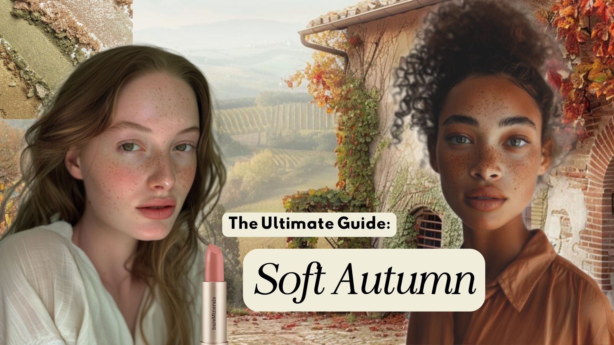
Soft Autumn: Soft And Muted
Have you ever followed a YouTube makeup tutorial and looked at the mirror with dismay as the hour spent carefully contouring and accommodating your hooded eyes was all for naught? You couldn’t put your finger on it, but it just looked… off.
Or maybe you eagerly opened your latest online shopping purchase only to find it’s making you look a bit like death. You can see in the image below that gray makes me look tired and my face undefined. Whereas, the warm brown gives me more definition.

Well, seasonal color analysis is a great way to prevent these color missteps.
Let’s be honest, our visual representation of the world is crafted largely by our clothes and appearance. It’s not shallow to want to craft these highly impactful elements of our lives, and in fact, they help you feel a sense of identity and connection to your aesthetics.
I mean Gisele always looks beautiful, but she definitely shines more in her soft autumn season!
Now, if you’ve landed on Soft Autumn, or have maybe fallen down a rabbit hole of exploring all the 12 color seasons, then this article will be your ultimate guide to the Soft Autumn color palette.
Please note: There are many different color theories out there and some systems have more or less options. They also go by different names at times. Soft Autumn is sometimes referred to as Soft Autumn Light or Tinted Autumn (although there are slight variations between different systems.). I have based this information on the 12 seasonal color palettes (not the 16), so for the sake of cohesion, I will only be referring to it as Soft Autumn because I am trained in the Sci-Art system.
Let’s go over some color basics to make sure you are looking at the correct season.
Are you warm or cool?
Honing your seasonal color can be a process in training your eye. And one of the first tasks you will need to evalute is whether you are warm or cool.
Look at the two images above. The dessert landscape evokes a completely warm sensibility whereas the artic image is most definitely cool.
{refer to this article if you want to learn more about the color characteristics of seasonal color}
Now, if only our faces were as easy to decipher. Well, as your train your eyes to see colors more concisely, you will get there.
There are many ways to begin to determine this but the most beginner friendly ones are the following:
Gold vs. Silver Test Work?
So gold vs. silver can be a helpful test, but a small piece of jewelry really won’t cut it. A small delicate bracelet or ring is not going to have enough of an obvious reaction.
If you have large pieces of metallic fabric in gold and silver that can work. But, you must also keep in mind that certain seasons will have variations of gold vs. silver. For instance, autumn does better with more antiqued gold or hammered gold, so neither traditional gold or silver may be obviously right or wrong.
The metallic draping above shows that the golds are much better for me than the silvers (I’m a verified sci-art Bright Spring). You can see that the hair cap stays the same color in each photo so the white balance is consistent, and yet in the pure silver, I look very sallow and flat. Bright Springs like Dark Autumns have neutral/warm undertones.
What about vein colors or the tan/burn test?
No, both of these have been largely debunked. Veins do not give you any meaningful data. And warm-toned people can burn, and cool-toned people can tan. Don’t
Magenta/Orange Test: This is especially helpful.
Drape fabric (next to your face) that is true orange and hot magenta. Now, these colors are strong, so take that into consideration. But generally, there should be a clear winner in terms of which color works. If the orange suits you, you are warm. If the pink looks better you are cool, and should go back to this article.
Now, even if you haven’t trained your eye yet, this color test/draping will help. Both of these photos were taken with no makeup, natural light, and with the same camera settings.
If you are in fact a Soft Autumn you will most likely have these answers: gold jewelry looks best on you, and and orange suits you best. But because you are a neutral/warm season you may look ok in silver or magenta. These two drapes are very saturated and Soft Autumn is a muted season. So there are many variables that can affect your interpretation of your fabric drapings.
The modern approach to seasonal color analysis is all about how the undertone of your skin reacts to color. And that is why the best and most accurate method is draping fabric near your face. If you want to try this I have a DIY Seasonal Color guide here.
We may earn a commission from you clicking a link below. And as an amazon associate, we earn on qualifying purchases. Full affiliate policy, here.
What is a Soft Autumn?
The Soft Autumn Color palette is within the Autumn Season but sits between the True Autumn and the Soft Summer. Whereas soft summer leans cool, the Soft Autumn will be warm-based (hence the previous section).
So your color palette will be composed of warm and muted colors.
In terms of contrast, the Soft Autumn has moderate to low contrast. Your hair, eyes, and skin will blend into each other. To see this more clearly, you can take a well lit photo and de-saturate it ( we are not adding a B&W filter to it!). As you can see below there is little contrast in the left photo, while the right image has stark contrast between their features.
If you’re confused about terms like muted/bright and contrast, this video can help clarify it.
Soft Autumn Color Characteristics
Hue: Warm/Neutral
Value: Light/Medium ( Value is based on tints and shades. Tints have white added to them, shades have black added to them. For Soft Autumn, you will have medium-value shades. Tints will be found more commonly in the spring season).
Chroma: soft/muted ( you have gray added to your colors)
Soft Autumn Coloring
Here is a general overview of the Soft Autumn features. However, please note that one characteristic deviating from this list will not eliminate Soft Autumn as your season. It is more about the entire holistic view of your traits and colors.
Soft Autumn Skin Tone
The Soft Autumn usually has neutral or neutral-warm skin tones. When we did the silver/gold test above, gold will most likely be your better metal. Now, if you have a more neutral leaning skin tone, then you may look good in both silver and gold. So don’t let one test derail you.
- Warm Ivory
- Rosey Beige
- Pale Tan
- Medium
- Tan
- Almond (warm)
Soft Autumn Eye Colors
Remember that soft autumn is basically a true autumn that has had their colors de-saturated a bit, so it will have a more toned-down look.
- Soft Blue
- Soft Blue-Green
- Hazel
- Soft Amber/Topaz
- Light to Medium Brown
The eye color is not the only determining factor in seasonal color analysis. Many analysts believe that the shapes created within your eye can also guide you toward your exact season.
Autumns, in general, tend to have warmer rust, orange, and brown shades, or warmer blue/green shades. The iris pattern most commonly associated with the Autumn family is called the “Aztec Sun”. It creates a sun-like shape of mixed warm colors that essentially have “separate rings”. However the eye pattern is only one potential factor and should be used as a determining factor.
Soft Autumn Hair Colors
- Golden Blonde
- Light Golden Brown
- Medium Brown
- Strawberry Blonde
- “Mousy” Brown ( I reject this terminology, but it’s what many color analysts use to refer to this specific shade of brown)
Look for golden or warm highlights. It’s important to note that you need to look at any naturally occuring highlights and hair colorings, not any died, bleached, or bayalaged sections of your hair.
Now, you’ve confirmed you have muted colorings, but could you possibly be a soft summer?
Soft Autumn Versus Soft Summer
So it is important before diving headfirst into all the facial colorings, to firmly determine whether you are warm or cool.
While Soft Autumn and Soft Summer are both muted coloring palettes, the Soft Autumn is warm. This means the color palette will have warm undertones whereas the Soft Summer will lean towards cooler based colors.
Soft Summers will go for soft fuschia (cool), where Soft Autumns will go for salmon pinks (warm).
Comparing colors (color draping) close to your face can help you determine this if the tests above were not clear.
Soft Autumn Celebrities with Palettes
Now that you’ve determined your season, let’s look at some examples of people with coloring similar to yours.
- Gigi Hadid
- Giselle Bundcheon
- Drew Barrymore
- Toni Colette
- Mischa Barton
- Devon Aoki
- Adele
- Rihanna (suspected)
- Storm Reid
- Kirby Griffin
Soft Autumn Color Palette
The Soft Autumn needs colors that reflect their muted warmth, so they opt for more de-saturated warm colors. They tend to be overwhelmed by vibrant hues like pure emerald and would look much better in a moss or olive green.
Dark colors also tend to overwhelm your muted delicate blend. Especially high chroma dark colors like pure black or navy. But muted dark shades like aubergene or mahogany work as long as they don’t have too much pigment.
You can see in the above photo the warmer, muted pink makes Giselle look like she’s glowing whereas the harsh black makes her look washed out and sallow. The same thing happened to me when I wore the bright orange in the first photo.
Soft Autumns tend to do best in soft, rich, warm, and inviting shades. You want colors that make you look more alive and not drain the warm tones from your face.
Here are the best colors for a Soft Autumn:
- light milk chocolate
- antique gold
- butterscotch
- dusty turquoise
- moss
- olive green
- warm pastel pink
- baked clay
- teal
- rich spruce green
- antique rose
- rich warm grey (almost brown)
- mahogany
- coffee brown
- camel
- stone,
- light navy,
- deep periwinkle
- aubergine
- mint
- salmon
- light pink
- rust
- warm off-whites
- sand
Soft Autumn Color Palette
It is important to not feel restricted in your palette! Every palette will have their own version of a color. So I’m not telling you to eliminate the role “true black” plays in your wardrobe and outfit building, but rather to try and swap “true black” for “warm deep charcoal” as shown in the below neutrals palette. This will have the same “effect” as black on you.
Soft Autumn Neutral Colors
The Soft Autumn needs to take special care when choosing their neutrals because the traditional black, navy, and gray wash them out.
Opt for light tans, beiges, and taupes or dark warm browns for neutrals if you can.
You can also try swapping in a warm pewter for any traditional gray pieces.
Colors to Avoid as a Soft Autumn
Soft Autumns have a delicate beauty to them and any stark colors or extremely vibrant colors will drain this quality.
Stay away from stark white, black, and any jewel tones like emerald or sapphire.
You also want to avoid anything with a blue undertone as well as anything that is more pastel.
Pale pinks can look good on you as long as they are not too cool-toned and have some warmth to them.
A good rule of thumb is to stay away from anything that makes you look drained, sallow, or washes you out. This would include all high chroma, and cool-toned colors.
Soft Autumn Business Color Palette
Here are some neutrals and accents that work well for a corporate or business casual wardrobe. Depending on your office style expectations, the neutral color palette may be more appropriate, however.
Soft Autumn Color Combinations
Because you have a lot of soft tonal colors in your palette outfits that are monochrome, tonal, or analogous look amazing on you. They tend to match your moderate contrast and don’t distract from your delicate blend.
If you want slightly more color differentiation in your outfit I would opt for colors with the same hue intensity. So you pair a medium hue muted pink with a medium hue muted orange.
Complimentary colors (even within your palette) will create a bit too much juxtaposition in your look and draw the eye away from your beautiful gentle aesthetic. But they can be accomplished depending on your style goals (you’ll see some examples below).
If you need a more business professional outfit or want to opt for an outfit with a bit more contrast you can try a lighter neutral paired with a darker accent within your color palette.
How to Use the Soft Autumn Palette
Now that you know what colors work best for you, let’s talk about how to use them.
The best way to start is by finding a color palette that you love and starting with that.
You can also look for pieces in your wardrobe that you know work well with your coloring and build from there.
Once you have a good foundation, you can start to experiment with different ways to style your looks.
Soft Autumn Outfit IDeas
Now, your best outfits will come from learning your body types, proportions, and overall personal style. However, here are some outfit combinations and ideas just to get your creative juices flowing.
- Pair a light milk chocolate top with an warm ivory skirt and nude heels for a warm and inviting look.
- Try a muted spruce green blouse with a pair of light jeans and nude pumps for a casual yet stylish outfit.
- Wear a warm stone-colored dress with aubergine heels and a light warm ivory clutch for a feminine and glamourous look.
- Rock a warm pastel pink blouse with a pair of dark denim jeans and nude flats for a romantic and soft look.
- Style a (muted) rust-colored sweater with camel-colored pants and brown boots for a cozy and chic outfit.
Here are a few more ideas with the items linked below each images.
Soft Autumn Jewelry and Metals
When it comes to jewelry and metals, the best bet for a Soft Autumn is going to be soft and muted (are you surprised??).
Brushed metals, matte metals, antique metals, and textured metals (like hammering) are great. They cut down on the overwhelming shine and tend not too overpower your coloring.
Rose golds, soft yellow golds, matte silvers, pewters, and bronze can all work for the Soft Autumn. Copper (while it is warm) usually has too much orange in it for it to work.
Cream and pink pearls also look fantastic, as well as any natural elements.
For stones, you can try smokey quartzes, light/soft turquoise, light corals, jaspers, and soft jade. Opt for rounded stones over faceted stones to create a softer appearance and less shine and contrast.
Soft Autumn Prints
Choosing prints for your wardrobe can trip anyone up because you can’t always find a print that includes only your season’s colors. So here are some tips to help you navigate this hurdle.
Because Soft Autumns have low to moderate contrast you want that to be reflected in your prints as well. Depending on how much contrast you specifically have, you may be able to handle a slightly more moderate contrast print.
You also want to pay attention to how much of an impact a “wrong” color has within the print. You can see an example below.
The first print is a low-contrast print with all colors from the Soft Autumn Palette. The second print has that same Soft Autumn flower but has a deep and rich cool green within the leaves creating a high contrast print that is too contrasted for the Soft Autumn. However, in a pinch, a Soft Autumn might be able to make it work since the leaves are not the largest design element. Whereas in the third image, that same green is a background color, this print would drown out a Soft Autumn.
Contrast and the overall aesthetic weight of a print are important, as well. If we look at the two prints above, while they are both within the SA palette, the second print has a very dark quality to it overall. This will most likely overwhelm the Soft Autumns delicateness.
So keep in mind the overall contrast of the print, the impact of a color outside your palette, and the overall effect of the print. You usually have more flexibility if the color outside your palette is a neutral, in a sister color palette, or is a smaller design feature.
Soft Autumn Print Ideas
Soft autumns look amazing in the following styles of prints
- low contrast prints
- loosely arranged prints
- natural elements (flowers, woods, leaves, etc)
- soft shapes
- smaller arrangements
Soft Autumn Makeup
As a Soft Autumn, you want to focus on creating looks that are gentle, romantic, and natural.
Your makeup should enhance your features without being too harsh or overly done. This includes your eye makeup which many of us lean automatically towards black mascara or eyeliner, and that will overpower the Soft Autumn.
Soft Autumn Foundations
The key to finding a Soft Autumn foundation is to get it properly matched to your skin tone. Here is a great video to explore that.
Ultimately you are neutral or neutral warm so you will want a foundation that has those undertones and matches your specific balance.
Because you have muted tones to your appearance choosing the texture of your foundation and concealer is important as well. Opting for a satin finish is usually best. Overly dewy or matte foundations can overpower your delicate muted look. However, this also comes down to personal preference for the aesthetic of your makeup.
Soft Autumn Blush & Bronzer
Traditionally, bronzer is a great addition to the Autumn makeup palette. But the Soft Autumn has a very delicate balance of muted tones, so anything overly shimmery or pigmented can detract from your beauty.
If you are set on using a bronzer over blush opt for a peachier shade with not a lot of shimmer, or a muted light tan shade.
Blushes are great on the Soft Autumn and can range anywhere from peach, cinnamon, salmon, light mauve, vintage rose, and dusty deep mauve (for darker skin tones). I think it best to try these shades on in person because if you are an fairer Soft Autumn, you may need to experiment with whether a tan pink or peach looks more fitting.
Blushes (or bronzers) should seamlessly blend with your complexion. You are low to moderate contrast so you don’t want anything that disrupts this and creates a stark contrast.
Soft Autumn Lipsticks
Lipsticks can really make or break your Soft Autumn makeup, but luckily nowadays there are so many lipsticks to choose from you really just need to focus on finding your shades and availability shouldn’t be an issue.
Matte or satin finishes are the most seamless for the Soft Autumn. And you will want to look for muted shades with golden bases.
Lipstick Shades:
- Rose Gold
- Deep Blush
- Terracotta
- Tan Pink
- Brick Red
- Spiced Peach
- Mahogany
Here are some options I liked (but again, best to try these on in the store if you are unsure). Also, sometimes the link doesn’t pinpoint the exact shade, so be sure the name matches!
- Sephora Collection Matte: Capricorn
- Sephora Collection Matte: Love Love (matte sand nude)
- Sephora Collection Matte: Brunch Date
- Sephora Collection Satin: Oui
- Nars: Pigalle (neutral pink chocolate, matte)
- Nars: Rosecliff (soft rose, satin)
- Nars: Gipsy ( sheer)
- Nars: Immortal Red (matte)
Soft Autumn Eyeliner and Mascara
We often, no matter our season, all seem to grab the blackest of black eyeliner and mascara. And for Soft Autumns this should be remedied!
Soft Autumns don’t do well with stark pigments like pure black.
For eyeliner opt for browns, warm greys, and even muted green tones. This will draw out the warmness in your eyes.
For mascara, brown, darker taupes, and warmer gray shades can be used. Remember moderate to low contrast is ideal for your makeup. It needs to blend with your coloring and not create an overwhelming focal point.
A lot of brown eyeliners and mascaras have too much richness in them for the Soft Autumn so make sure the brown you choose is more muted.
Soft Autumn Eyeshadows
Depending on the look you are going for, Soft Autumns have a wide range of eyeshadows to choose from. Opt for muted, warm shades first and foremost. In terms of texture, you’ll want to generally stay away from high glitter shades or high shine.
Soft Autumn Nail Polishes
Really you can choose any colors from your palette for nail polishes, although different shades will give you a different look.
Here are some options to get you started:
Is that color in my season?
Understanding your colors in real life can take some time. We have already gone over that you are muted, neutral/warm, and light/medium value.
When looking at a color, here are some things to think about:
For Soft Autumn, you will want colors that have more yellow added to them. And you will look for colors that have been softened by gray and sometimes a touch of black. If the color has a lot of white added to it, it will most likely be in the Spring season. You want to go for softer colors.
You can also try a Soft Autumn color swatch fan to help you get better acquainted with your palette, and assist you in shopping choices.
Want some Capsule Wardrobe Ideas for Soft Autumn? Check them out here.
Knowing your color season is, in my opinion, a very useful tool in your style toolbox. It allows you to stop spending money on pieces that you look back on and think “Why do I look like death warmed over in that piece?!”. And it helps you craft the most functional, inspiring, and authentic wardrobe.
It helps you find strength through style.
I hope you’ve found the beauty in your soft delicate coloring, and can go be the best version of yourself.
Keep glowing, soft autumns.
Be sure to pin the image below for each access to this ultimate guide!
Have you done Spring yet? Did I miss it?!!!
Spring is not up yet, I’m still working on all the images for them. Any particular spring sub season you want first?
@Gabrielle Arruda, Light Spring please!
@Gabrielle Arruda, have you uploaded light spring yet? I found your website and its so amazing!! So much information that hasnt been posted anywhere on the internet! Thank you so much!
I’m working on spring next!
Wow this is so helpful. This us embarrassing but I had my virus done 3 times. Just didnt seem right. None of them identified me as soft muted autumn. Other Autumns and True Spring they said. I love my muted color palette. Wish I could have swatches but this page is amazing. I can’t thank you enough.
I’m glad it was helpful! Color analysis can be a journey!
Wow this is so helpful. This is embarrassing but I had my colors done 3 times. Just didnt seem right. None of them identified me as soft muted autumn. Other Autumns and True Spring they said. I love my muted color palette. Wish I could have swatches but this page is amazing. I can’t thank you enough.
This is the absolute best soft autumn article I’ve seen. Thank you so much!
Thank you!!
This was exceedingly insightful and detailed, I am obsessed with your blog and channel.
I’m so glad you found it helpful!
This is the best article I have ever read about Soft Autumn. Thank you so much!
So helpful and interesting to read. I believe I am a soft autumn but I struggle to train my eyes with colours!
Thank you for this informative post!
Thank you so much!! Perfect for me. Your explanations made it so much easier for me to understand all this new information. Just been told I am a soft autumn and beginning to see why some colors look good or awful. Need to train my eye …. couldn’t Even distinguish between cool or warm colours…. love all your info Gabrielle
I’m so glad it’s helped!! and thank you!
this is amazing and so comprehensive. i noticed you didn’t include materials. I’m wondering about satin, leather, shiny fabrics etc.. if there is any guide for that? Thank you!
I loved this article, and bought Nars Immortal Red as a result.
Oh my goodness. It was awful. One of the worst lipsticks I have ever tried.
Far too dark, and matt and made me look like a wanna-be-goth.
On the other hand, Gypsy and Rosecliff are perfect on me.
Ahh, I’m sorry that Immortal red was a bust but glad that Gypsy and Rosecliff ended up working. Sometimes it can be a bit of trial and error!
THANK YOU for this! I’ve been trying to help a daughter shop and was having so much trouble choosing flattering shades. Finding this is a game changer! Sending you so much love and appreciation!
I’m so glad to hear this has been helpful!!
Thanx a lot, Gabrielle! I’ve never been strategic colors-wise, just was noticing that I look awesome in burgundy but washed out in bright green. Yet, somehow, thought I was a deep winter due to dark hair + eyes. So refreshing and inspiring to finally click with my season! Magical, sending u lots of love~
So glad this has helped!
These guides ares sooooo good and detailed!! I hope you continue them! Even though this Soft Autumn guide finally cleared up my color confusion (I was always so puzzled by both gold and silver looking nice on me as long as they weren’t saturated), I’d really love to see the others!
Yes, I’m working on some now! I’m glad it was helpful!
Hello,
My Mom is a soft autumn (deep), will it affect the colors alot?? Ive been wanting to invest in new make-up products for her since whatever i use is kinda harsh on her (im a dark autumn) but finding something that fits her is difficult since i only have experience with my own colors. Mom doesnt use makeup so she, herself, am clueless.
Compared to a dark autumn, yes. You’re going to be looking for warm colors but they need to be much more muted than deep/dark autumn.
Hi Gabriella, could you maybe help me. I’m a bit confused with my season. I think I’m a soft autumn or a clear spring. Could you maybe help me out. My natrual hair colour is a light brown but I dyed it dark brown so I’m not so sure where I stand now.
Hi, so dying your hair shouldn’t change your season. In fact hair color is really not a major element to consider, your skins undertone is much more important. I’d try the magenta/orange test to confirm you are a warm toned and then access your contrast level ( SA’s tend to muted warmth). Springs will be more clear.
This is the most thorough article I have seen on this topic yet! And I’ve read a lot of them!
Thanks so much for all of your hard work in compiling such useful information for us black loving Soft Autumns ?, now off to my closet for a little revamping! Ugh
I’m so glad it was helpful!
Great article, so thorough! This soft autumn appreciates it. My veins are not blue or green, they are aqua. Soft dusty mid-toned aqua is one of my best colors.
Just wondering if you had done light spring yet. My daughter is a soft autumn and she found this so helpful. I’m a light spring and would love to see what you put together for that.
Not yet! But I’ll try to do it soon!
Very good! Can you tell those 42 color names thank you ❤️
This article finally made me 95% sure that I’m Soft Autumn, seeing Light Spring I think will make me 100% sure, lol!
Can you recommend a reliable, portable warm autumn color file that is less than forty dollars? Thank you!
This is such a helpful guide!! Thank you so much. You explained everything so clearly.
Oh, it seems that Pinterest links aren’t working. Wanted to let you know in case that wasn’t just me.
Thanks again for your clear, helpful guides!
Thank you for this extremely helpful analysis of soft autumn! I am definitely an autumn but I am not a true or deep autumn so I started to question my season. However, I am absolutely a soft autumn and the colors you’ve recommended for this specific type of autumn are the colors I look best in but before today I didn’t realize what that meant. Now I can build my looks around this deeper understanding!
This is superior! Thank you so much for the help.
Omg I love this article I was told I was a soft summer but looked awful in pastel colours and I’ve always liked earth colours! I have blue green eyes with gold flecks so it’s been difficult to determine which season I am. But now I definitely know I am a Soft Autumn! Thankyou so much!!! Am off to buy a soft green faux leather trench coat from Next and wearing tone on tone with it!
This is the most comprehensive write up I have seen on colour analysis. Thanks for the eye opener.
I am still stuck between if I am a light Spring or Soft Autumn. I can’t tell if I am muted or bright, because my eyes are actually gray–and in some light they can skew almost aqua, in others almost slate. I have read that if you have neutral or mix of cool/warm to opt for the transition shades: so it comes down to these two. I feel like I will never know if I am muted or clear. My skin is always typed in the warm/warm neutral. My lips are naturally cooler pink, hair golden ash blonde. HELP> 🙂
Brandi, you wrote your comment more than a year ago now so maybe you’ve already figured it out, but if you’re still struggling between muted and clear here’s what helped me settle it. If you see clear bright colors before you see you, like they just overpower you and insist on drawing your eyes to them first, then you’re not clear. It will literally feel like a struggle not to keep looking at the color when you put a clear bright color on a person with muted coloring. By contrast, when you hold up the muted color you’ll feel a sense of relief, your eyes will come forward. But, if you’re clear, muted colors will seem drab and lifeless next to you. Almost dirty. You’ll feel a sense of relief to put clear colors next to you because your eyes will come alive and your skin will glow. You’re looking for harmony between you and the color.
I have struggled with my colors for years! My veins are mostly green, my eyes are hazel with gold and brown, but my skin is not really golden. (I have brown freckles)I’ve been told I’m an autumn, but I’m not sure which one, and now that I let the color grow out, my natural hair color is platinum blonde, not gray. Thank you for any help you can give!
My veins (mostly green), my eyes (hazel with brown and gold aztec sun and green too), my hair color (dark brown with red highlights in the sun when I was young but now platinum blonde since I don’t color it anymore), all tell me I am an autumn, probably a soft autumn, but my skin tone is not really golden. I have brown freckles. Does it matter that my skin looks more summery?
Thank you so much! ?
Thank you for this amazing tutorial! Been not sure about my type until now, and different apps and articles did not help much. But your description of differences between types and your test tricks helped a lot! I have neutral to warm skin tone and hazel eyes “Aztec sun”, and exactly as you noted, matte silver and gold jewelry suite me the best. Also, I see now why I love turquoise/orange play of colors so much. You are the best! Looking forward to explore more of your in-depth content!
This was really helpful, I wasn’t surprised as these are the colors that I’ve always been drawn to but it is nice to have a guide as a build a wardrobe, especially with online shopping.
I think a lot of us are instinctively drawn to our colors! Glad it was helpful!
Great post…!
I think soft autumn is actually the easiest to determine out of the 12 possible categories, because the washout effect while wearing saturated colors is SO dramatic. You posted some pictures of you in orange sweater on here to give us examples of an unflattering color for your skin tone, and one can notice that you look better in cool colors, but that is not nearly as unflattering in intensity as stark colors on a soft autumn person. If anyone’s reading this and looks like a drowning victim in highly pigmented, saturated colors and stark black and white, no need to wonder anymore – you’re soft autumn for sure. And if you’re pale like me, don’t get confused just because you’re getting away with wearing silver jewelry or light grays. Pale complexion helps pull it off. I barely get away with black even when wearing make up (I can’t use black for my brows and lashes either, not a good look, but cooler brown ups my contrast to kind of moderate). It’s a little easier if it’s a purse or pants or shoes, when it’s not all upon my face. It’s one way to incorporate black if you like the color a lot. Very cool or un-muted spring colors will still be unflattering for this type, no matter how pale. Thank you again Gabrielle, fantastic post and especially the helpful palettes.
I found your site so very helpful. Thank you.
Fantastic article! Thank you so much
This is very thorough, thank you. From what I’ve seen I look like a Soft Autumn. I do not look good in bright and bold colours. High contrast doesn’t work for me either. My eye, hair and skintone all blend together. It’s rather subtle and muted.
My style is definitely warm and soft.