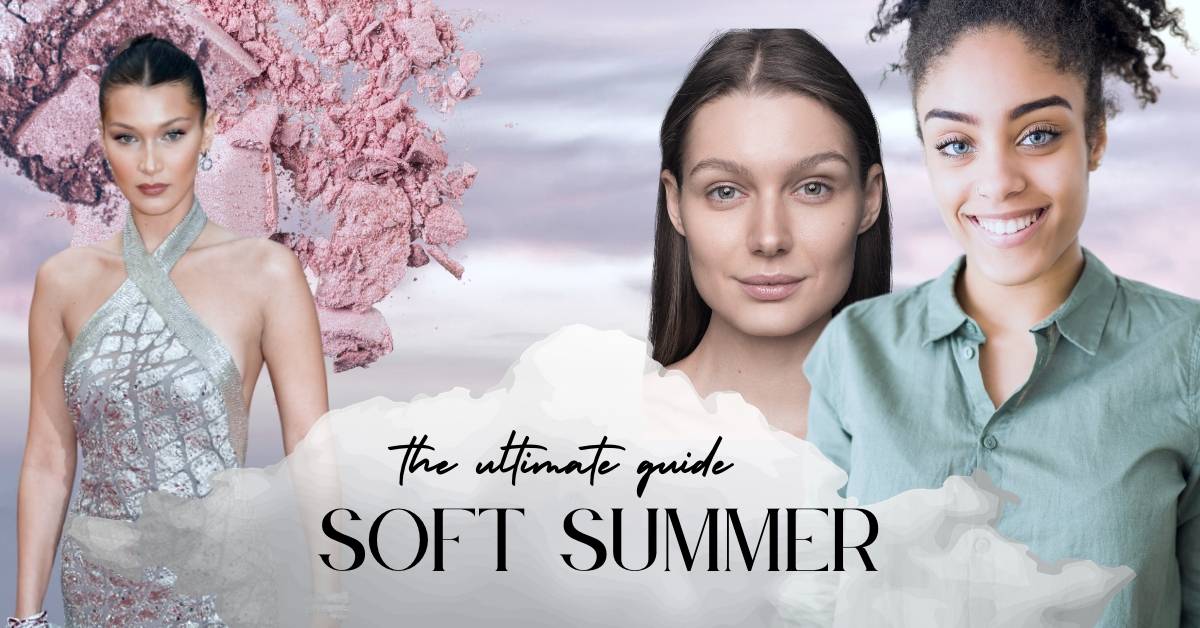
Soft Summer: The Ultimate Guide
In a world where fashion trends come and go, finding a style that genuinely complements your unique features can be a challenge. That’s where seasonal color analysis comes in. This life-changing system helps you discover the colors that not only look great on you but also make you feel confident and radiant. By identifying your “season,” you can create a wardrobe and makeup collection that enhances your natural beauty, and allows your personality to shine through.
I remember a time when I struggled to find the perfect outfit for a special event. Despite trying on countless dresses, nothing seemed to look right. The colors either washed me out or clashed with my skin tone, leaving me feeling overwhelmed and discouraged. It wasn’t until I stumbled upon seasonal color analysis that everything changed. I was able to choose colors that made my eyes sparkle and my complexion glow. It was like a missing piece to my style puzzle.
My friend Emily, for example, always gravitated towards black and white clothing. She believed that these were the only colors that suited her, but after learning about her Deep Winter coloring, she began to experiment with vibrant jewel tones. The difference was astounding! The rich, bold colors made her skin appear more radiant, and her confidence skyrocketed.
Let’s delve into the Soft Summer color palette, its main characteristics, and how to build a wardrobe that will bring out the best in you. Get ready to embrace your Soft Summer colors and create a wardrobe that enhances your natural beauty and makes you feel confident every single day! And if you have some reservations- don’t worry- your palette is not all pastels!

We may earn a commission from you clicking a link below. And as an amazon associate, we earn on qualifying purchases. Full affiliate policy, here.
Characteristics of the Soft Summer Season: Defining Soft Summer
It is always important to take into consideration where a season is placed on the seasonal color wheel, as this provides valuable information about the characteristics of that season and where certain confusions or complimentary palettes might come from.
First, let’s look at the Soft Summer placement. They are next to Soft Autumn and True Summer. Soft Summers have cool undertones but they are often more neutral cool than the pure cool undertones of the True Summer.
Their neutrality is subtle, but because they are close to Soft Autumn, they can have a touch of warmth that creeps in and makes it less cool than say a True Summer.
Undertone: Cool/ Neutral Cool
Chroma: The chroma of Soft Summer colors is generally muted or softened. This means that the colors are neither overly bright nor intense but have a more subdued and gentle appearance. (This is not the same thing as “light” colors and Soft Summers can have some stronger colors in their palette. The muted or softened appearance only really becomes apparent when you compare the color to pure black).
Hue: Soft Summers hue is neutral leaning cool. This means that they have cool undertones but may have some subtle warmth. This also means the gold versus silver jewelry test will not work for you because most likely you will be able to wear both.
Saturation: Soft Summer colors typically have medium saturation, which means they are not extremely vibrant or bold but are also not extremely dull or washed out. This balance allows the colors to harmonize well with the natural coloring of Soft Summer individuals.
If your brain is melting from all the new terminology, let’s break this down a bit more.
Seasonal Color Analysis is a spectrum. There are individuals who are cool-toned and there are individuals are warm-toned, but what about you “neutral” people? Now while we haven’t done seasonal analysis on every person in the world, I would argue most people who are “neutral” still lean slightly warm or slightly cool.
If you are “neutral” leaning, then you need to most likely consider the sub-seasons of each category (like Soft Summer, which is neutral cool) and not the “true” seasons.
If you think you might be a summer, but not sure which one. Check out my Summer Season overview here.
Common Hair, Eyes, and Skintones: Soft Summer
Remember that in-person color draping is the most effective method of determining your seasonal color. Seasonal color palettes are most effectively found by seeing how your skin undertones react to color. So take the following descriptions with a grain of salt. These are common Soft Summer coloring options, but they are not the only possibilities.
Hair: Soft Summer hair colors range from medium to dark ash blonde, light to medium ash brown, and occasionally cool-toned dark brown. The hair color typically lacks warm undertones and has a cool, smoky, or muted quality.
Eyes: Soft Summer eyes can be blue, green, hazel, or at times cool-toned brown. The eyes often have a soft, gentle, or smoky appearance, which sets them apart from the more vibrant eyes of other seasons. It is completely possible to also have brown or darker eyes as soft summer, remember that the most important aspect is how your undertone reacts to colors!
Skin: Soft Summer skin tones are usually fair to medium with cool undertones, such as pink, blue, or even a slight grayish quality. The skin may also have a neutral appearance, which can make it difficult to determine the undertone at first glance.
Soft Summers: Gray Hair
Summers usually blend to silver hair, which can seamlessly harmonize since the natural hairs usually are ashy in tone.
But, if you don’t have silver hair this does not mean you aren’t a Soft Summer.
Determining If You Are A Soft Summer
Determining if you are a Soft Summer involves assessing your skin undertone (first and foremost!) and conducting a color draping test. Then you can take into consideration your natural hair, and eye color as potential tangential factors. Here’s a step-by-step guide to help you determine if you’re a Soft Summer:
Identifying your skin undertone:
Properly drape magenta and orange and see which color is best. While neither may be your “perfect” color if you are cool-toned it’s likely that the bright orange will wash you out or make your skin look uneven.
You can see below the magenta makes my skin look frozen and my eyes look dark and one color. Whereas orange gives my face natural definition and makes my eys look wetter and more dimensional. ( I am a verified sci/art bright spring).
Assessing your natural hair and eye color:
Soft Summer hair colors typically range from medium to dark ash blonde, light to medium ash brown, and occasionally cool-toned dark brown, with a cool, smoky, or muted quality. Soft Summer eyes can be blue, green, hazel, or cool-toned brown and often have a soft, gentle, or smoky appearance. But remember this is a very base eliminator and the best way is to do color drapes.
Conducting a color draping test
A color draping test involves holding different colors of fabric close to your face to see which shades complement your skin tone. For Soft Summer, focus on cool, muted, and medium-intensity colors. You can use the Soft Summer color palette as a guide but also experiment with other seasonal colors for comparison. If the Soft Summer colors make your complexion look more even, your eyes appear brighter, and your overall appearance harmonious, you might have found your season.
Conducting an At-Home Color Drape
When conducting a color draping test, it’s essential to pay attention to several factors that can influence the results. Here are some guidelines to ensure you get accurate and reliable outcomes:
Lighting: Natural daylight is the best lighting source for a color draping test. It provides the most accurate representation of colors without altering their appearance. Avoid fluorescent or yellow-toned lighting, as these can distort the colors and affect the results. Opt for being around 3 ft away from a North Facing window if possible, this creates the most even lighting. Avoid taking photos at “golden hour”.
Hair: Tie your hair back or wear a neutral headband or white hair scarf to keep it away from your face. This will help prevent any influence from your current hair color on the test, especially if it’s dyed or not your natural color. If you have very short hair, consider wearing a light gray or white hair cap.
Makeup: Remove any makeup before the test, as makeup can alter your skin tone and coloration. The goal is to assess your natural coloring without any external influences.
Clothing: Wear a white or light gray top or anything that won’t interfere with the fabric drapes. This neutral background will help you focus on the colors you’re testing without interference from your clothing.
Draping fabrics: Use a variety of fabric swatches in different colors, including those from the Soft Summer palette and other seasonal palettes. This will help you compare and contrast how different colors affect your appearance. Fabrics are much more effective than lipstick or makeup tests. Feel free to use any fabric around the house (sheets, curtains, clothes, towels, etc).
Test one color at a time: Hold each fabric swatch close to your face, underneath your chin, and observe the effect it has on your complexion, eyes, and overall appearance. Snap a photo to review after all color drapes have been completed. Take note of which colors make your skin look more even and radiant, and which colors make you appear washed out or tired.
Take photos: Capture photos of each color swatch near your face. This can help you review and compare the effects of each color more objectively later.
Assess your reaction: Pay attention to your emotional response to each color. Colors that suit you well often evoke a sense of harmony and confidence. But try to keep a neutral expression throughout the photos.
When taking photos during a color draping test, it’s generally better to use the rear-facing camera on your smartphone or device. The rear-facing camera usually has higher resolution and better image quality compared to the front-facing camera (or selfie camera), providing more accurate and detailed images for comparison.
However, using the rear-facing camera can be challenging when trying to capture photos of yourself. To overcome this difficulty, you can ask a friend or family member to take photos for you. Alternatively, you can set up a mirror behind your device to help you align the shot or use a tripod and set a timer to capture the images hands-free.
Remember to ensure that you have consistent, natural lighting for each photo to maintain the accuracy of the colors being compared.
Try to keep the photos consistent! This includes taking them in a shorter period of time, with the same location/setup, and keeping the white balance the same.
But is this color even good?
Here are a few things to look at when you color-drape.
Skin complexion: Observe how each color affects your skin tone. The right color should make your skin appear more even, radiant, and glowing. If a color makes your skin look dull, or washed out, or emphasizes imperfections, it’s likely not the best match.
Eye brightness: The right color will make your eyes appear brighter, more vibrant, and lively. Colors that don’t suit you may make your eyes look tired, dull, or overwhelmed.
Shadows and lines: Pay attention to how the color affects the shadows and lines on your face. Flattering colors will minimize the appearance of dark circles, wrinkles, and other lines, while unflattering colors may accentuate them.
Overall harmony: The right color should create a sense of balance and harmony between your hair, skin, and eyes. It shouldn’t clash with or overpower your natural features.
Emotional response: Take note of how you feel when wearing a particular color. The right color should evoke positive feelings, such as confidence, happiness, and a sense of being at ease with your appearance. (Although don’t go by this factor alone because sometimes we have color preferences that are outside the goals of seasonal color analysis)
Comparison: Compare the effects of different colors on your appearance. This will help you see which colors make the most positive impact on your overall look.
Instant lift: When you find the right color, it often gives your face an instant lift, making you appear more refreshed and awake.
Let’s look at some of my drapings to see how this works.
If you tried the pink/orange test and it didn’t seem conclusive, you can also try the following drapings:
Once you start to see if you are cool or warm or neutral-leaning, you should continue to drape lots of different seasons for comparison. Just because your hair/eye colors line up well with one season, it shouldn’t be assumed you are that season. It is best to drape a variety of different colors.
My drapes here focused on the difference between Summer and Winter seasons- but if your undertone test was not clear, drape as many colors as you can find.
Here are some tips if you want to do an at-home color drape test:
So, after you color drape you may come across a few colors that seem to work but contradict your overall placement. You’re sitting there so sure you’re a Soft Summer about to embrace all those gorgeous rose colors, mauves, and soft blues and then you try a slightly warmer shade and it works. And all of a sudden you’re like, could it be… am I a Soft Autumn?
Or maybe, you’re rocking those Soft Summer shades but also feel you shine in a navy or darker color and are wondering if you have a home in the summer season or will be exiled to the winter season.
Well, don’t start shredding those dusty rose-colored dresses just yet, let’s discuss.
Remember when I mentioned the color wheel placement and characteristics are important? Well, that’s because a lot of people have neutral-leaning skin tones. This means there are a lot of people who fall into the “sub-seasons” (ie Soft Summer). Now Soft Summer is next to Soft Autumn. While Soft Summer is primarily cool, and Soft Autumn primarily warm, they both have soft, muted shades in their palette. And Soft Summer can have some subtle warmth to their tones, which means they can sometimes borrow a bit from SA.
Now, there are many different seasonal color systems out there, based largely on the same principles. Some systems have 16+ seasons, and some only have 4 or 12. Some focus more on custom-created palettes, others on “wow” colors, or actual colors color picked from your face. Whatever system you resonate with and makes you feel good, should be your focus.
I, personally, like the Sci/Art foundation of seasonal color because it’s based on Munsell Color Testing (which I studied in my undergraduate program). This is also why I decided to get certified in the Sci/Art system and offer in-person PCA.
In Christine Scaman’s book “Return To You Natural Colors”, she says that “Soft Summer is the neutral season where Summer is beginning to integrate Autumn” and that the colors for Soft Summer are “not just darkened True Summer colors. They are also grayer and gently warmed with gold, bringing into being the most subdued cool colours of the spectrum”.
So Soft Summer will naturally be able to handle a touch of warmth, as they have some neutrality to their undertones. But they will lean more cool overall.
Now, you may be thinking, OK, this makes sense. Well, I’m going to throw you a curveball. Soft Summer also has some common ground with Deep (or dark) Winter. ( don’t throw your phone at the wall just yet, ok!?)
To sort this out let’s look at our seasonal color wheel again. So SS (soft summer) and DW (dark winter) are both in the cool family. And they are both sub-seasons leaning towards the autumn family. This means they both have neutral cool undertones leaning toward Autumn.
Now, their color palettes have some distinct differences. Including saturation, intensity, and overall contrast. DW features more saturation and vibrancy and darker/clearer colors than SS.
But, Soft Summer, while they have muted/soft chroma, they have medium saturation levels in their palette. But if you happen to drape a medium-intensity, cool-toned teal you may find yourself stuck between those two seasons.
All of this to say, the more drapes you do the better! This will eventually flush out your priorities in your palette and your most dominant traits.
While Soft Summer has dominant traits of Neutral/Cool, Muted/Soft, and Medium Intensity/Value, you may find that one trait is more important for your wardrobe palette than another.
Different color systems use this information in a unique way. But there will be Soft Summers who need to prioritize muted/soft over neutral cool. And there will be Soft Summers that need true cool undertones prioritized but can handle a wider spectrum of intensity.
Seasonal Color Analysis is an overarching guide for you to apply and follow as you see fit.
Soft Summer Celebrities
So, there is no “ultimate” verified list of celebrities for each season. And because there are multiple systems, sometimes celebrities are classified differently.
Plus, it can be hard to determine celebrities’ true undertone and contrast level with red carpet magic and color corrected-photos.
But, here are some celebrities that I believe fall into the Soft Summer palette.
Rosie Huntington-Whitely
Bella Hadid
Jennifer Aniston
She is a perfect example of someone who has been classified generally as Soft Summer but can also pull off a lot of colors in the Soft Autumn palette. Because of this, I would say her primary concern is not neutral/warm versus neutral/cool but rather low chroma.
Now all of the above celebrities are fairly “straight-forward” Soft Summers. But the reality is, it’s a spectrum and drapes are the most accurate way to determine your season.
There are other websites that will give you a huge long list of celebrities that fit the Soft Summer Palette and choose the most “de-saturated” picture they can find of the celeb and say “see muted and cool!”. But, celebrities, while a fun visualization is not really data sets.
If we take someone like Leona Lewis in the pictures below, we would be utterly confused about her season. These photos have been color-corrected, with massively different lighting and makeup hiding her true reaction to the colors she’s wearing. While I would comfortably say the warm tones aren’t doing her any favors, her exact sub-season would need drapes.
Now, this may not be as fun as celebrity seasonal color typings, but I actually think art is a much better way to start to hone your eye for general color understanding.
While celebrity color typing can be fun, and interesting to see how color works for them- typing from edited photos is highly unreliable. Just see the above images of Jennifer Aniston (in the same dress/same day) and see all the different color corrections/filtering/lighting changes.
Understanding Soft Summer: A Different Perspective
Before Sci/Art and Color Me Beautiful, there was a painter named Johannes Itten.
While painting he first started to split colors into two sections (yellow=warm and blue=cool). Then he further divided them into light or dark. And he applied these categories to 4 seasons of the year.
For instance, a person who is dark and cool would look amazing in a winter landscape. Hence the general placements of landscapes/nature/seasons and a person’s colors.
The 12-season color theory started with Albert Munsell, he wanted to look at color as 3-dimensional space. Evaluating not just the hue and values of the color but also the chroma.
And from this exploration he scientifically communicated color and created accuracy and “numbers” for each applicable color. You no longer had to describe a color as a “dusty antique rose that’s light with some gray”. Instead you could say a C-3-8.
Look at some of these paintings for instance
Let’s look a Vermeer’s Girl With The Pearl Earring. If we analyze her skin tone- we can see that it is composed of “lead with red lake and vermilion” (source).
While some of the colors used in this painting lean warm or even winter (the white and black), the ones closest to her face could be within the Soft Summer palette. And her slightly grayed/muted contrast within her features speaks a lot about the soft summer colorings.
Or take Van Gogh’s Almond Blossom painting. We can see his use of soft cool colors harmonizing with the Soft Summer palette seamlessly. And somewhat bridging into Soft Autumn colors, which a neutral-cool SS may be able to borrow from.
Or even some of Degas’ Ballerinas. the below palette is a great example of how Soft Summer doesn’t need to be “light pastels” and it often has a lot of medium-intensity colors within it.
And another great example is “Delphi” by Theodoros Stamos:
All of this to say- your hair, eyes, and skin tones can give you an inkling into your palette and help you determine your dominant traits, but the color theory behind seasonal color analysis goes much deeper than that.
Soft Summer Color Palette
If you skipped directly to this part of the article, I won’t judge you. This is probably what you came here to find. But, while I can give you this palette to get your Soft Summer wardrobe more harmonious, understanding the reasoning behind these choices and your own ability to see colors will benefit you long term. (hence, all the content before this section?).
So, here’s a general overview of Soft Summer colors:
Remember, we are looking for neutral/cool, medium-intensity, and muted/soft characteristics overall.
Soft Summer Neutrals
Here are some neutrals to create a base palette for your wardrobe.
But what about true black and white?
I know. You might be having a panic attack thinking “how can I possibly survive not using true black or white in my outfits!?”.
So Soft Summer has their own “version” of black and white in the palette- most often cool ivory, or deeper charcoal gray. And these colors can have “richness” and only seem more muted when next to a true black for instance.
However, seasonal color is one tool in your style toolbox. And personal preferences, style goals, and overall essence will help you decide if you want to add in white/black to your palette.
I think Jennifer Aniston is a great example of this. While she definitely shines the most in Soft Summer colors, she also implements a laid-back classic/natural style that often utilizes black and white.
And because true black and white have been so ingrained in us as “base fashion colors”, we often don’t react as negatively to them being outside the color palette.
While I wouldn’t say Jennifer Aniston “shines” in black or white, they don’t distract from her beauty overall.
A true white can cause a “blanching” effect on Soft Summers, so be sure to test it out for yourself and play with the placement if you opt for this color option. I think Jennifer Aniston’s dedication to her fake tan also “assists” in avoiding the blanching effect. She’s very dedicated to convincing the world she’s an autumn. But overall her skin looks a bit dull when she wears white, we lose definition in her features.
Whereas Jennifer Aniston in anything super bright and warm looks significantly more “wrong” and draining than the black or white.
This leads me to…
Worst Colors for Soft Summer
Soft Summers typically look their best in muted, cool, or neutral-cool shades. Colors that may not be as flattering for Soft Summers are those that are highly saturated, warm-toned, or have high contrast. Here are some examples of colors that might not be the best choices for Soft Summers:
Bright, warm yellows: Colors like canary yellow or sunflower yellow are too warm and saturated for Soft Summers.
Warm, orangey reds: Shades like tomato red or bright orange can clash with Soft Summer’s cool undertones.
Rich browns: Milk chocolate brown or rich caramel may be too warm and intense for Soft Summers.
Bright, warm greens: Colors like lime green or Kelly green are too saturated and warm for Soft Summers.
True black or true white: These high-contrast colors may not harmonize well with the soft and cool qualities of the Soft Summer palette.
Bold, saturated purples: Bright, warm purples like magenta or fuchsia might not be the best choice for Soft Summers.
It’s essential to remember that personal preferences and individual variations play a role in how colors look on a person. You may find that some of these colors work for you despite not being ideal for the Soft Summer palette. Sometimes a great outfit that follows your body’s silhouette or flatters your essence, can trump your colors to some degree (and vice versa). Experiment with different colors and combinations to find what makes you feel confident and comfortable.
How Do You Use Color In Your Wardrobe?
You may be thinking people always compliment me when I wear tomato reds or warm greens, so I can’t be a Soft Summer. Or “My favorite color is canary yellow”, so no SS palettes would work for me.
There are multiple ways to use color when getting dressed. Seasonal color palettes attempt to harmonize your natural coloring with your outfit and makeup coloring. This allows YOU to shine and be noticed first.
Wearing a bright or louder color may get your compliments or may make people notice your existence… But most likely they are responding to the color itself. So instead of “you look so amazing” (in season colors), you get “that blouse is so pretty” ( the blouse color is pretty).
Color Combinations for Soft Summer
I don’t want you to feel limited by any advice or guidance in this article, so please remember to tailor it to your authentic style goals.
But, generally, Soft Summers work beautifully with a blended color palette and color combinations. You can implement a “vanishing edges” approach instead of a sharp color-blocking technique.
Because there is a soft transition between your features (no stark contrast), gentle transitions between colors in your outfits work beautifully. That does not mean it is all muted or faded. You can pick the richer shades in your palettes and create a beautifully blended look that has drama as well.
The blended colors work seamlessly whereas the harsh linear elements in an outfit give a harsher balance overall. If all the colors are in your SS palette, these lines will be less stark and obvious. But, if you opt for a neutral shade outside your palette, these higher contrast linear lines can become distracting.
Diffusion of color is key.
Depending on your unique balance or dominant priorities, you may find where you place each color as an important factor as well.
But, if you’re going with a color that might not be your “best”, place it lower on your body and farther away from your face as it will be ultimately less impactful.
Here are some chic color combinations for Soft Summer:
Soft summers are described as having the colors of a “misty afternoon,” and your combination of these colors can have the same effect.
There’s an innate calmness in your coloring and you can carry this through when building an outfit. So keep these adjectives in mind: blended, blurred, misty.
Analogous colors can also be stunning on you, but keep a more gradient approach as opposed to high contrast color blocking.
Soft Summer Aesthetic
There is an enchanting quality about the soft summer aesthetic. Some words to describe your palette and essence might be peaceful, refined, reflective, serene, soft, tranquil, or laconic.
Sometimes people who land on soft summer feel like they don’t shine as brightly as the more vivid seasons like spring and winter. But you absolutely glow in your colors and have a graceful and gallant appearance. Don’t feel like you need to compete with the high saturation seasons, your beauty is luxurious and delicate.
Soft Summer Jewelry
So remember you are technically neutral/cool but that usually means that you can wear silver or gold with silver being marginally more harmonious.
If you opt for gold you want gold that is light to medium in color and nothing overly yellow or orange.
And brushed or matte metals are by far your best texture options. Any jewelry that has high shine, high color contrast, or darker/heavy elements will wash about your beautiful blended traits.
Transparent stones are also a nice choice, as they create a soft, delicate impact. Opals, smokey quartz, pearls, and pink topaz are all easily used.
Blue/green stones, turquoise, and aquamarine are great options as well.
And because you have this soft blurred quality, softly rounded shapes look beautiful.
Soft Summer Prints
When incorporating prints into a Soft Summer wardrobe, it’s essential to keep in mind the overall characteristics of the palette – cool or neutral-cool, medium intensity, and muted colors. Here are some print ideas and tips for Soft Summers:
Choose soft, muted, or blended prints: Opt for prints with colors that align with the Soft Summer palette. Look for patterns that incorporate cool and muted tones like dusty blues, soft teals, muted lavender, rose pink, and sage green.
Opt for low-contrast prints: Prints with low contrast between the colors work well for Soft Summers, as they maintain the soft and harmonious appearance that characterizes the season. Avoid high-contrast prints that feature very light and very dark colors together.
Floral patterns: Soft, romantic floral patterns in cool and muted colors can be a lovely choice for Soft Summers. Look for watercolor-like florals or designs with a vintage feel.
Abstract and watercolor prints: Abstract and watercolor-style prints that incorporate Soft Summer colors can create an interesting and harmonious look. These prints often have a softer, more blended appearance that works well for Soft Summers.
Geometric patterns: When choosing geometric patterns, opt for those with softer lines and lower contrast. Subtle and cool-toned geometrics can be a great addition to a Soft Summer wardrobe.
Stripes and plaids: Soft Summer can wear stripes and plaids as long as the colors used are cool and muted.
Animal prints: Soft and cool-toned animal prints like gray leopard or cool-toned snakeskin can work well for Soft Summers, as long as the overall color scheme remains harmonious with the palette.
Texture and fabric: Consider the texture and fabric of the printed garment. Soft Summers look great in fabrics that have a gentle drape and a slight sheen, like silk or soft cotton blends.
Now it is likely that you will come across prints that have some soft summer colors but with other season colors mixed in. So what is a fashion lover to do? You need to take a holistic pov.
If you haven’t trained your eye yet, a color fan can help you see what elements of the print are in your palette.
Now it’ll be easier to pull off a print with a “wrong” color if:
- small design element (your eye won’t register it as much)
- in a sister palette can true autumn or deep winter (but we don’t want these elements to be the main focus regardless)
- a neutral color
The first print is perfect for SS and includes all SS colors. The second print would be workable for many Soft Summers, as the out-of-season color is a small design element. And the third print would be the worst for a Soft Summer because its base color is actually deep autumn and would create too much contrast/warmth.
Remember to examine the contrast of the prints, and the overall print impact when evaluating if it’s right for you as well. Both prints above are in the Soft Summer palette and look beautiful, but they create different overall vibes and for this model, I think the blended print is a bit more harmonious.
Soft, Calm, Delicate, and Blended prints are fantastic choices for you overall.
Soft Summer Makeup
If you only apply one suggestion from this article, let it be to embrace Soft Summer makeup. Using “your” colors on your face can have a dramatic impact on your style and improve your overall radiance.
This doesn’t mean you can’t ever use a red lip for impact or opt for heavy black eyeliner, but generally, soft summer makeup will make you shine like no other makeup can.
Foundations for the Soft Summer
Ideally, you want to match your skin tone perfectly for foundation. But please don’t trust your local Sephora salesperson or any nifty machine to tell you how to do that.
Your skin is neutral/cool, and many foundations will say they are cool-toned and will not actually work for you.
Because you have delicate coloring, you want a texture that is not too heavy and not too thick. We want a light, and fresh-faced texture, that isn’t overly shiny. Soft, matte natural-looking skin is your best bet.
Here are some general examples of foundations for Soft Summer:
( note the color for reference as links may not load the exact shade)
Pay attention to the name and color if you want to explore any of the above options, as the link will not always load the exact color I’m referencing. Also, please understand these are just examples, and may not work for your coloring/neutral cool balance. So test them out for yourself!
Soft Summer Lip Colors
The best lipstick shades for SS are dusty rose shades, soft plums, plum rose, and neutral mauves that don’t lean too dark.
Sheer formulas are also going to make you shine. They provide that light tint, without looking thick or heavy on your face.
And since you have seamless transitions between your features (nothing overly harsh), the same principle can be applied to the impact of your lip colors. We want gentle transitions in colors, nothing overly contrasted/sharp.
And if you want a darker shade from your palette, then making sure it’s a sheer formulation will be incredibly helpful to not disrupt your balance.
Now, if you are darker skin-toned Soft Summer do you also naturally need to only use the darker shades of your palette? Now according to Christine Scaman, “ Darker makeup does not always follow along with darker skin. Many women of mixed racial heritage are often coloured with this palette and wear the same colors as Caucasian women just as beautifully”. (source)
Here are some beautiful soft summer lipsticks:
( note the color for reference as links may not load the exact shade)
Your best textures are a natural matte ( not cakey or overly dry looking), moist, creme, or a very subtle metallic effect that is sheer.
Soft Summer Blush
( note the color for reference as links may not load the exact shade)
Soft Summers should opt for blush shades that complement their cool or neutral-cool undertones and the muted quality of their color palette. Here are some blush color suggestions for Soft Summers:
Dusty Rose: A soft, cool-toned pink with a hint of mauve creates a natural, flattering flush for Soft Summers.
Muted Mauve: A subtle, cool-toned mauve shade adds a touch of depth to the cheeks without overpowering Soft Summer features.
Soft Plum: A light, cool-toned plum shade provides a subtle pop of color that harmonizes well with the Soft Summer palette.
Neutral Rose: Antique rose color that doesn’t lean too warm or bright
When selecting a blush, it’s essential to consider not only the color but also the finish. Soft Summers should look for blushes with satin, matte, or natural finishes, as overly shimmery or glittery blushes may not harmonize as well with their overall coloring. Because Soft Summers are close to Soft Autumns, they can sometimes get away with a slight or faint metallic effect (like Soft Autumns shine in), but this will need to be astutely chosen and tested.
As always, feel free to experiment with different shades and finishes to find the blush that makes you feel most confident and comfortable.
Soft Summer Eye Shadows
( note the color for reference as links may not load the exact shade)
Soft Summers look excellent in soft and blended eyeshadows. They can also use the neutral grays from their palette to create a soft but dynamic eyeshadow look.
Anything from cool taupe, cool coco brown, mauve taupe, or even light pewter can work.
For eyeshadow highlights, try an antique neutral light beige, an eggshell, or even a nude soft pink. But be wary of colors that are too “frosty” or overly light as that may create unnatural contrast.
Can I use shimmery eye shadow as a Soft Summer?
With every decision regarding your personal style and impression, good judgment is the foundation. Blended shimmer in small doses can look beautiful and reference the “foggy morning” effect that pairs beautifully with a soft summer. But overly metallic or high contrast shine can create disparity in your look and pull focus.
Soft Summer Eyeliner and Mascara
You want to generally stay away from true blacks for eyeliners and mascaras, if at all possible. For eyeliner, you can opt for a primarily cool, medium pewter, or fog gray. And if you go for something darker or heavier, make sure your entire look has a similar cohesion.
If you are pairing eyeliner with a blended eyeshadow look, opt for one shade darker to create a beautiful blurred edge technique.
Mascara should be charcoal gray. And if that’s not an option or you are on the darker side of this palette you can try a Soft Black or soft teal-navy.
A cool-neutral brown can also work, but in my experience is harder to find.
Contouring and Bronzer
Generally speaking, Soft Summers do not handle contouring or bronzer well and it should be avoided. Contouring creates more contrast within your face and features, which is not naturally how you present. Those blurred color transitions are striking in their own unique way.
And bronzer is a more traditionally warm-toned or neutral/warm element. Often times bronzer is too yellow, orange, or red to harmonize with summer colorings. But, if you want to appear more “sun-kissed” it will take a trained eye to harmonize bronzer well. Subtlety and small dimensional changes will be best.
Nail Polishes for Soft Summer
Here are some great SS nail polish options:
- Zoya, Sailor (deep navy shade)
- Zoya, Fern (cool blue-gray)
- Zoya, Petra (deep mauve)
- Essie, Mooning (blue-gray)
- Essie, As if (blue)
- Essie, Soft Taupe Gray
Hair Coloring for Soft Summer
This is a slightly controversial topic. Many people and color consultants believe that if you follow seasonal color analysis, the best hair color you have is your natural color.
And be forewarned that if you do color your hair, getting your hair back to your natural shade is difficult. Even great hair colorists can struggle to get the subtle dusty quality of your natural shade.
If you opt for highlights make sure that they do not create too much contrast, or veer too warm in tone. Yellows or golds will throw off your coolness. A closer match would be a cool caramel or cool taupe brown that is not too far off from your original tone and blends seamlessly. We want to leave a lot of your “base”/natural color and use any highlights for subtle dimension. Bayalage might be a successful technique to apply.
If you are doing all-over color, make sure you are opting for a neutral/cool color and one that won’t provide too much contrast between your other colorings. A slight degree of warmth (since you are neutral/cool) can work for some. And you’ll probably find more success shifting only slightly from your natural color if you do decide you want to dye your hair.
Generally, a Soft Summer would struggle to seamlessly pull off shades that are far from their palette or overwhelm their delicateness. A warm ginger red or a stark black would dominate their look and hide their natural color harmonies.
The best advice is to find a stylist who truly understands colors and ideally seasonal color analysis to change up your look without disrupting your natural essence.
Soft Summer Outfit Ideas
Obviously, seasonal color analysis is just one part of the puzzle when it comes to authentic personal style. But, if you’re curious about what some SS outfits might look like, here are some inspirations for you.
And remember don’t be afraid to pull the darker tones from your palette if you want more intensity in your look!
Tips for Shopping Soft Summer
No one said creating a perfect color wardrobe would be easy, but the more you learn your colors and understand the reasoning behind them the better your shopping habits will be.
Once I learned I was warm and bright, it was so much easier shopping because I could knock out any muted or cool-toned pieces without any regret.
But, as you progress and hone your wardrobe, here are some Soft Summer shopping tips.
1. Know your colors: Familiarize yourself with the Soft Summer palette, including the range of colors and their undertones. Having a clear understanding of the colors that work best for you can help you identify suitable pieces more easily.
2. Carry a color reference: Bring a color reference with you when shopping, such as a Soft Summer color swatch or palette card. This can help you compare potential clothing items to your palette and ensure they align with your season.
3. Lighting matters: Be aware that lighting in stores can sometimes distort colors. If possible, check the color of the garment in natural light to get a more accurate idea of how it will look on you. You can step outside the store (with permission!) or stand near a window to do this.
4. Do a quick drape: Take a photo of yourself holding the garment up to your face or body. Viewing the photo can sometimes provide a more objective perspective on how the color looks on you. (Make sure the lighting is as natural as possible for this “quick drape” test).
5. Shop with a seasonal color buddy: Have any friends or family members interested in seasonal color analysis? Bring them with you! They know the principles and can help you be objective with a color.
6. Be patient: It might take time to build a wardrobe that perfectly aligns with your Soft Summer palette. Be patient and don’t feel pressured to buy something that doesn’t feel quite right. Gradually curate a wardrobe that genuinely reflects your season. Because the more you buy now, the less money/space/energy you’ll have when the perfect piece comes along.
7. Customize: If you find a piece that you love but it’s not in your Soft Summer palette, consider customizing it with accessories or layering to make it work. For example, wear a Soft Summer-colored scarf, cardigan, or coat to balance it out. Also, consider the purpose of the garment. If it’s for your wedding day you might want to stick with a SS color, but if it’s just a sweatshirt you plan to wear to bed, being outside your palette might not be as crucial.
8. Darker shades: If you’re struggling to determine if a darker shade is within your palette try comparing it to a true black. This should make it more obvious if it is muted or medium-intensity.
The Soft Summer season truly is the ethereal, breath-taking kid of the color analysis world, embracing its muted, cool-toned hues with grace and sophistication.
So go forth, drape yourself in the dreamy tones of a Soft Summer, and watch as the world becomes your very own Monet masterpiece. After all, who wouldn’t want to live life as if they’ve stepped into a watercolor wonderland?
I know this post is…robust… So be sure and pin the below image so you can refer back to this ultimate guide!
This was so helpful – thank you!
I will try some of your recommendations for soft summer. I have been analyzed twice professionally as a soft summer and once as a light spring. I know light spring colors are often too bright for me but sometimes soft summer makes me look very tired especially eye makeup recommendations. I have tried all of the 12 Blueprints soft summer colors in lipsticks and eyeshadow and generally have not enjoyed wearing them as they make me look tired. I will try some of your recommendations.
Have you explored draping on your own? This article might help you explore those options a bit further and potentially find a more concrete answer: https://gabriellearruda.com/discover-your-best-colors-diy-seasonal-color-analysis-guide/
@Gabrielle Arruda, i have not. I will definitely review. I know that when I wear a tee shirt that is orange (definitely not a fall orange more of a coral orange) I look my very best without makeup. It is a tee that goes with a pair of pyjamas so not something normally in my wardrobe but feel refreshed when I wake up and am wearing it.
This guide is so helpful! I have been analyzed as soft, cool, deep. I have been analyzed as Soft Summer, Soft Autumn and Cool Winter. Reading the suggestions for draping really helps!
So glad it helped you!
Your article is fantastic! Makes me happy to be a SS, even if self-assessed, but I think I’m on the right track. I could never understand why I didn’t feel amazing in vivid, cerulean blue, now I get it! Its not the blue, its the bright contrast. Thank you.
Very helpful! I tried the colour draping with my mom and sister, which worked well as we could all give input on what each our best colours were. I was really struggling with figuring out whether I am a Soft Summer or Autumn, but the orange/pink test was very clear that I am cool, not warm! Your post is definitely one I’ll be coming back to reference.
Thanks for the detailed article. I know I am a summer (cool undertone with slightly yellow overtone) that leans soft, but some of those colors look blah on me. Some of the cool summer colors are too cool and light, hence my conundrum. Plus my hair is a dark cool brown (with silver gray making an appearance), and my eyes are a grayed hazel olive. I just pick and choose between the too palettes though I wish I could be certain of where I fit.
WHICH SEASON ARE U I HAVE THE SAME COLOR COMBINATION
These are so wonderfully done! Most people don’t go as in depth and give as many examples. Will you be doing Bright Winter? That’s what I am and could use all the help I can get! ?
Yes, soon! and thank you!
thank you for this extremely detailed guide
This was so in-depth, and super helpful! Thank you for taking the time to go through everything. This is probably the first time that I actually understand/comprehend my personal color story. Love your work!!
Thank you so much! Glad to hear it helped!
This is so in-depth and informative. As a light summer, I’ve always loved the soft summer palette. It’s like a fairytale.
Finally someone with great insight and lots of excellent tips! Thank you so much!
Hi! This was the most helpful site I have seen on color seasons! Thank you! I wonder if you could provide a list of the actual names of the makeup you recommend for SS. I had difficulty identifying the names/colors. Thanks so much!
I was analyzed a year ago in PEI by Christine Scaman as a soft summer & she gave me so much information. I am grateful as I was always told I was an autumn by two previous analysts. I found your additional information very rewarding. Thank you so much.
Hi! I’ve been wondering lately and you’re the best person to ask – do you think there is some potential link between the colour seasons and kitchener’s essences? I struggle to see how SS could be dramatics, for example.
I was looking at Zyla’s archetypes as well; factors like colour palettes/shades, chroma, and contrast feature a lot in the defining elements of the archetypes, and I’ve been trying to figure out if my SS typing could help me figure out (or give some input in terms of) my essences and archetypes.
What do you think? Is there anything in it?
I like how you mentioned that soft summers can sometimes handle certain winter colors or autumn colors.
I’ve known some colors that are “my” colors for years. My mom is an artist and I enjoy color theory too. So it’s come easy to me to see when something compliments or clashes.
What I struggle with is that I have cool toned hair and neutral to cool skin but my eyes are hazel green with warm brown centers. Plus, even though my hair is ashy and cool it will have red tones in the sun I never seem to fit totally into any season.
Without a doubt I’m low chroma and medium contrast.
Wow! Amazing , fun and informative article! I loved it! It helped me understand better what colors suit me best!
this is the most comprehensive and thorough guide i’ve been able to find, thank you for this resource! It’s so helpful to have the steps laid out clearly, I feel more comfortable embarking on this journey now!!
Excellent info, thank you so much!
This post was sooooo incredibly helpful! I’ve been buying the wrong color of clothes and makeup for years. Knowing that I’m a SS makes all the difference in the color of clothes that I buy now. I can easily and quickly rule out colors and patterns that don’t work for me. You’ve saved me time and money, but more importantly, my confidence level has soared – thank you!!!
I’m so glad to hear this!!
I had to leave a comment.
In years, this is the first time I read a post on a blog that is THAT USEFUL ! For once, I didn’t feel like it was a SEO written post indeed it was so well explained, written… It was smooth ! Perfection.
Thank you so much for the time and effort you put into this article and your blog.
You are definitely helping a lot of women (like me !).
If nobody told you already (which I doubt) : you are made for this. Please, keep writing.
Love from Belgium,
Louise
Thank you so much Louise! It really means a lot to hear this!!
Gabrielle, your post regarding seasonal color analysis is the best I’ve read. You provided information I can apply while shopping for clothing, makeup and jewelry…and even use when conferring with my hair stylist. Thank you so much for sharing your expertise.
This makes me so happy to hear! Thank you for such a kind comment, it means a lot!
This was brilliant, thank you so much for the dedication you out into this ? I was typed deep Winter sine I am on the darker side lol but didn’t understand why I felt overwhelmed by that PALETTE. ThI thought I was soft deep Winter, but found it still too intense and too muddy for me. I read soft summer was cousin of the mentioned palettes and omg…what a resonance I felt! Found colores I know suite me but never understood why they weren’t in my supposed palettes ?. I don’t know if it’s coincidence but I have also a ethereal romantic natural essence. Love it when it all makes so much sense, I feel so connected to my genuine spirit ???
I’m so glad you connected to this palette! Sounds like it would be beautiful with you belnd!
Thank you for your in-depth deep-dive into color. I just did a few tests and am a Soft Summer. But I have always known it, even though someone back in the 1980s in a 5-minute test tried to tell me I was a winter. Yikes! I look drowned out in any intense bright or strong color. The fun part is, every single color you list here – make-up and hair color and clothing – I have always done (with a few exceptions, like black and white). But this explains why I am always frustrated with how stark white blouses look on me. I gravitated toward everything that works with my coloring, naturally. That seems amazing to me! For instance, I have always known I can’t pull off intense eye-make-up or bright red lipstick.
This is great! I love the palettes. Very helpful and thank you.
So glad you liked it!
Thank you so much for this in-depth analysis of Soft Summer! And especially thank you for including that quote by Christine Scaman that mixed race people are often Soft Summer and can wear the same makeup Caucasians do. I felt certain that I was a Soft Summer a decade ago, but two different color analysts said on their blogs that people of color couldn’t be Soft Summer. That left me stymied and doubting my own eyes, but they were both adamant about it when I questioned them. So, I searched for another palette that would work as well for literally a decade and finally came back to Soft Summer because nothing else does work as well for me. I wish I hadn’t allowed myself to get thrown off course, but now I can make up for lost time.
I’m so sorry you had this experience. I’m actually getting certified in Sci-Art with Christine Scaman and I love the approach they take. But, I’m glad you’ve found your home in Soft Summer, and can embrace those beautiful tones!
Really helpful – thank you. Years ago I was analysed as a Spring, but as I got older and my hair became grey, I found I could not wear Spring colours and went into a sort of wilderness experience. I got analysed again as a Summer – but I have struggled with which Summer. I have read your article on Cool Summers – but after reading this I think that I am in fact a Soft Summer. I am getting there and your articles have been so helpful.
So glad it has been helpful!
As a soft summer myself, my tip for mascara is the brown one from gitti. Looks much better on me than black. For clothes I found a lot of beautiful muted styles at Sézane.
Thanks for sharing!
Thank you so much for this – the comparisons with art and vs soft summer really helped me understand what my own season is, and the most important aspect of my seasonal qualities
I love your blogpost on this!
I printed out some stuff to put in inside my closet door, so I can remember!
My favorite soft summer brands from europe are OPUS, sézane, Reiss, &other stories, etam sometimes i find amazing stuff at Mango
Love those brands, thank you for sharing!!
Thank you for this fantastic text about the soft summer season, it’s the best info I found online and I’ve been searching and reading a lot. This is very useful for me in so many ways❣️
I’m so excited to hear this, glad it was helpful!