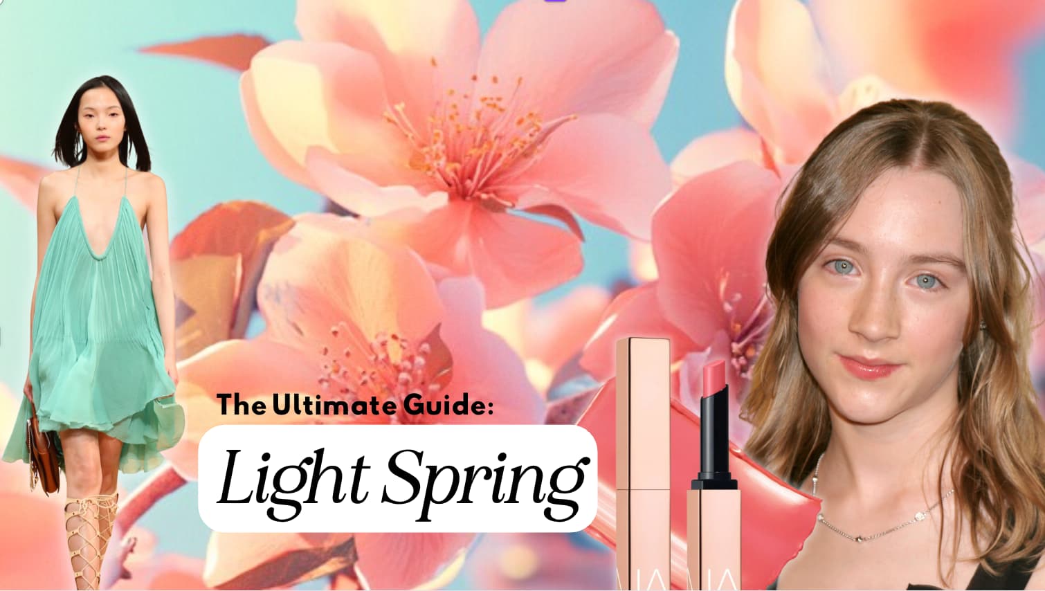
The Light Spring Seasonal Color Guide
It usually begins with a quiet surprise.
Maybe it’s the soft gold of a scarf that brings your face to life in a way you didn’t expect. Or the moment you catch your reflection wearing a color you’ve always dismissed—some tender shade of melon, mint, or petal pink—and suddenly, you don’t look tired. You look… like you.
That’s the quiet magic of discovering you’re a Light Spring. This palette doesn’t announce itself with boldness or drama. Instead, it works like sunlight filtering through a window—subtle, warm, and luminous. And when it’s right, it changes everything.
Light Spring is not the season of extremes. It’s defined by its glowing light values with a gentleness that might be mistaken for fragility, but that would be a mistake! This is a season full of clarity, vitality, and life. It’s sunrise in color form. The radiance of this palette doesn’t shout; it invites. It softens. It uplifts.

Color analysis, when done well, offers more than just a list of flattering shades. It gives you a new lens for seeing yourself clearly—for recognizing that beauty isn’t something you add on, but something that’s already present, waiting to be illuminated. For a Light Spring, that illumination comes through color: a wardrobe that echoes the light you already carry.
This article is an invitation to explore your Light Spring palette not just as a tool, but as a reflection. A mirror, held up to your natural coloring, showing you what’s always been true: you don’t need to be louder or more dramatic to be seen. You just need to be in harmony.
The Light Spring Color Palette
The Light Spring palette is a study in radiance. It is soft, but not dull—light, but never washed out. These colors carry a quiet clarity, like morning light across a meadow of wildflowers. They are not here to dominate the room, but to lift, to invite, and to warm.
What makes Light Spring unique is how it balances warmth (neutral/warm), lightness, and clarity. Remember in seasonal color analysis we are trying to find the boundaries of each of the 3 color levers (hue, value, and chroma). The palette leans warm, but not in a heavy or earthy way (like autumn). Instead, its warmth feels sunlit and fresh. The lightness is unmistakable—no other season shares such an expansive range of gentle, high-value colors. And yet, within that lightness, there is life. There’s no dullness, no grey haze. These colors glow. They shimmer. They breathe.
Many people misunderstand “light” to mean pale or boring—but for Light Spring, lightness is not a limitation. It’s a superpower. It allows for subtle, elegant combinations that are youthful without being childish, romantic without being saccharine, and airy without disappearing. The palette sparkles with an easy optimism: lemonade, chamomile, melon, mint, cloud blue, raspberry sherbet.
This is not a palette of extremes. Nothing here is too loud, too icy, or too muddy. There is no jet black or stark white—those would weigh down the face and compete with the delicacy of the natural coloring. Instead, Light Spring relies on blended contrast, where light neutrals support brighter mid-tones, and every color feels touched by sunlight.
Light Spring’s unique placement—right at the edge of Spring and Summer—means it pulls warmth from Spring and softness from Summer. This gives the palette a warm-neutral hue, predominantly warm but with a slight influence of summers coolness. It means the colors can have a soft freshness without tipping into the dusty or faded territor. They remain lively, but never too bold.
We may earn a commission from you clicking a link below. And as an amazon associate, we earn on qualifying purchases. Full affiliate policy, here.
Color Dimensions
Understanding the three dimensions of color—hue, value, and chroma—can help make sense of why this palette works so well for Light Spring coloring. Remember these color qualities are to determine your range, not to confine you to a small sample of colors.
- Hue: Light Spring colors are warm-neutral, which means they mostly lean warm but are softened by a subtle cool influence (summer). This gives the palette versatility and prevents it from feeling too yellow or golden like True Spring. They have a slight influence from their neighboring summer sister.
- Value: The defining dimension for this season is light. Light Spring has the highest overall value and this is your primary characteristic! Even the deepest colors here are soft and supportive rather than stark. This means you have a lot of tints in your palette (colors that have white added to do them, and few colors that have black added to them).
- Chroma: The chroma is medium leaning ever so slightly bright. These are not neon brights or muted earth tones—they’re fresh, clear, and softly vibrant. The colors feel clean without being sharp. They have a quiet strength to them, like a well-tuned melody.
This unique combination—light, warm-neutral, and medium chroma—makes Light Spring an exceptionally uplifting and wearable palette. It creates the feeling of brightness and movement without demanding attention. It lets you shine, but never overwhelms.
How Light Spring Compares to Other Seasons
At a glance, Light Spring can seem deceptively simple—“pastels,” people might say. But once you begin comparing Light Spring to its neighboring palettes, you realize how precise and meaningful its balance truly is. Light Spring is not just light—it is warm and clear, lifted and alive, and its uniqueness becomes especially clear when seen beside other seasons that share one or two qualities, but not all three.
Let’s look more closely at how Light Spring distinguishes itself.
Light Spring vs. Light Summer
These two are often confused, and for good reason—they share a similar lightness and soft, non-dramatic quality. However, they part ways on two key aspects: undertone and chroma.
Please note that neither of these seasons need to have “platinum” or light yellow blonde hair. Natural hair colors often lean much darker than people assume. Learn more about Light Summer, here.
- Temperature: Light Spring is Warm/Neutral, while Light Summer is Cool/Neutral. Light Spring colors feel sunlit and creamy—chamomile, cantaloupe, soft coral—where Light Summer leans mistier, with cool pinks, mauves, and powdery blues that seem filtered through fog. On a Light Spring, Summer’s coolness can start to look faded or tired. On a Light Summer, Spring’s warmth can turn them slightly sallow or look childish.
- Chroma: Light Spring is clearer. Its colors retain a sense of freshness and brightness, while Light Summer’s palette is more muted, with a soft, powdery finish (more gray muting the color).
So while both seasons are light, Light Spring has sparkle, while Light Summer has ethereal softness. One is dew on petals, the other is petals under cloud cover.
Light Spring vs. True Spring
True Spring and Light Spring share warmth and clarity, but they differ in subtle ways.
- Undertone: True spring is pure warm undertone and light spring is neutral/warm because it has a subtle influence from summer.
- Value: Light Spring is noticeably lighter in value. True Spring contains mid-range and even slightly deeper colors like grass green, mid-orange, and goldenrod—tones that would overpower a Light Spring face.
- Chroma: True Spring is brighter. The colors are clearer, more vivid, more saturated. A Light Spring wearing True Spring hues may find the palette looks too bold or juvenile on them—almost cartoonish rather than fresh.
Light Spring borrows some of the warmth and joy of True Spring, but refines it—softening the saturation, and lifting the overall value. If True Spring is a burst of laughter, Light Spring is a quiet smile that lingers.
Learn more about True Spring, here.
Light Spring vs. Bright Spring
This is another comparison worth exploring, especially for clients who feel vibrant but not loud.
- Chroma: Bright Spring is very high chroma—its colors are crystal-clear, bold, and saturated. Think lime zest, hot pink, and glowing turquoise. These hues are too sharp for a Light Spring’s natural delicacy. Where Bright Spring pops, Light Spring glows.
- Value: Bright Spring can go deeper and darker than Light Spring. Colors like bright navy, ink blue, or vivid tangerine might energize a Bright Spring but could overwhelm a Light Spring’s features.
Bright Spring and Light Spring may both share some cheerful personality traits, but visually, Light Spring needs more softness and less contrast. Some Light Springs may find they can borrow more easily from Bright Spring if they true warmth of True Spring turns them a bit sallow.
Learn more about bright spring (my season!) here.
Light Spring vs. Soft Autumn
It’s tempting to confuse these two because they share warmth and a certain style gentleness—but they couldn’t be more different in how they express those traits.
- Chroma: Soft Autumn is low chroma, muted, and earthy. These are softened browns, olives, dusty peaches, and muted golds—hues that would appear muddy on a Light Spring.
- Value: Soft Autumn is deeper overall with a medium value.. Its palette feels grounded and calm, whereas Light Spring feels lifted and airy.
A good mental image: if Soft Autumn is the golden hour before sunset, Light Spring is the golden light just after sunrise.
Common Coloring for Light Spring
Light Spring individuals often present with soft, glowing features—nothing too sharp or deeply contrasted. There’s usually an overall lightness and delicacy to the appearance, and the features seem to naturally blend rather than stand in high contrast. Still, it’s important to remember: coloring alone can be misleading, and the only accurate way to determine your season is through in-person draping with calibrated drapes.
That said, many Light Springs share the following general characteristics:
Skin: Often light ivory, soft beige, or creamy peach tones. The skin may have a warm undertone but remain luminous and even—never ruddy or overly golden. Freckles may appear, but they tend to be soft and light. Any skintone can be a Light Spring, so please don’t use this a determining factor!!
Hair: Typically blonde—ranging from light golden to soft strawberry blonde—or light golden brown. As Light Springs gray, the hair often shifts toward a delicate golden-grey or beige-blonde, not silver or stark white. It is not dyed platinum blonde!
Light Springs DO NOT need to have platinum level or light bottle blonde hair. In fact, their natural hair color often leans much darker than the internet assume.
Eyes: Blue, blue-green, aqua, or soft green are most common. The irises usually appear light and clear, sometimes with warm flecks around the pupil. There may be a sparkle or brightness to the eyes, but not the intensity seen in brighter seasons.
Many Light Springs will find they have low contrast between their hair, eyes, and skin—no single feature dominates. This low contrast is part of what makes the Light Spring palette so effective: it supports and lifts the natural coloring without weighing it down.
Of course, exceptions exist. Some people with darker features may still be Light Spring, and some with light hair may belong to an entirely different season. That’s why draping remains essential—only through comparative color draping against the face can we truly see what harmonizes and what distracts.
If you’re interested in my seasonal color in-person services, check them out here. Please note, I am often booked a few months out.
Gray Hair and Light Spring
Light Spring often grays with grace. Hair typically shifts into soft golden-grey, beige-blonde, or pale taupe, echoing the season’s natural lightness and warmth. These tones blend beautifully with the palette—especially when supported by colors like oyster, feather grey, and champagne.
Unlike deeper seasons, Light Spring never relied on high contrast, so the appearance of gray doesn’t disrupt the harmony. In fact, it can enhance the delicate, luminous quality of this season.
Light Spring ages lightly—gracefully fading into softness rather than stark change.
The Light Spring Color Palette Aesthetic
Light Spring feels like a fresh breath of air you didn’t realize you needed—gentle, uplifting, and quietly radiant. It’s a season of softness touched by light: not faded, but illuminated. The colors here don’t press forward; they invite. They lean in with warmth, offering subtle joy rather than demanding attention.
These are the hues of new beginnings: peach blossom, lemon chiffon, soft seafoam, rosy shell, and meadow green. Even the more energetic colors—like clear coral or aqua—maintain a sense of ease. Nothing here is heavy or dark. Nothing is stiff. It’s movement, lift, and glow, captured in color.
Light Spring has a sense of effortlessness. It brings out your features without muting or exaggerating them. It gives the face warmth, the eyes clarity, and the skin a kind of candlelit softness that glows. Even the neutrals—ivory, feather grey, light camel—feel like they belong on the body rather than against it. They are natural extensions of Light Spring’s quiet radiance.
Words That Describe the Light Spring Palette
- Uplifting
- Fresh
- Delicate
- Buoyant
- Creamy
- Airy
- Effortless
- Warm
- Refined
- Playful
- Softly bright
- Romantic
- Springlike
- Inviting
- Gentle
- Harmonious
- Feminine (though not exclusively so)
- Sweet, but not sugary
- Light-filled
- Cheerful
- Crisp, but not sharp
- Tender
- Glowing
- Easygoing
- Petal-like
- Natural
- Illuminated
- Breezy
- Pastel-with-purpose
- Whispered warmth
Light Spring Color Fan
Your Light Spring color fan is a visual anchor—something to help you assess whether a color holds its own alongside the palette without fading away or overpowering it. You’re not hunting for exact matches, but rather looking for harmony. Do the colors feel like they exist on the same plane? Do they sit comfortably together without one shouting or disappearing?
The fan helps you see when a color belongs—when it shares that distinctive Light Spring clarity: light, fresh, and quietly radiant.
Take a look at the playlist below to watch how I use the fan to evaluate color harmony.
I provide all my clients with the large NDU color fans in their determined season to make shopping and wardrobe-building more intuitive. These fans are samples, not limitations—they represent a curated range within your palette, but they’re not your only options. If you’d like to explore one yourself, you can a get free color card with NDU color fan purchase using my code ARRUDA at checkout!
Light Spring Celebrities (Best Guesses Only)
These celebrity examples are speculative—true seasonal color analysis requires in-person draping, and on-camera appearances can be altered by lighting, makeup, photo editing and styling.
So if you feel like this is a narrow example list, I totally agree! I’d rather not speculate on celebrities at all, but these celebs are “most-likely” Light Springs. But to be clear, any skintone and ethnicity can be a Light Spring. Draping is the answer, not the reductive reasoning of skin/eye/hair combos. And just because you share similar coloring to a celebrity, does not mean you both will react to colors in the same way.
- Evan Rachel Wood
- Sarah Snook
- Deborah Ann Woll
- Amanda Seyfried
- Elle Fanning
- Lily Cole
- Jessica Chastain
- Taylor Swift
- Kate Bosworth
- Candice Swanepoel
- Willow Hand
- Saoirse Ronan
Neutrals for Light Spring
Neutrals are the scaffolding of your wardrobe—the colors you reach for when you need structure, quiet, or simplicity. But for Light Spring, not all neutrals are created equal. In fact, the wrong neutral—too dark, too cool, or too stark—can dull your natural warmth or drag your features downward. They are not the right “support” for underneath your delicate coloring.
The right neutrals, however, feel like extensions of your coloring. They lift rather than flatten. They let your brighter shades breathe, and they bring a quiet kind of polish to your palette. While I may cover a “feeling” or natural expression of this palette, I also want to emphasize that you can have any style “aesthetic” or style goal and use your palette. Whether you aim for corporate looks, minimalist, or goth, there is an application from your palette to work with.
What Makes a Light Spring Neutral?
A true Light Spring neutral will have the same essential qualities as the rest of your palette:
- Light in value
- Warm-neutral in undertone
- Medium in chroma (clear, but not loud)
These tones echo your skin and hair in a natural way—they feel lived-in, effortless, and fresh. The most flattering ones look as though they could have come from your own features.
And this is where I’m going to ask you to check your palette bias. We tend to imagine the palettes in a very narrow sense, picking out the trademark colors and saying Light springs wear cantaloupe, warm white and light tan. But you get beautiful medium blues, grays, and creams that would be perfect as a neutral base.
Core Light Spring Neutrals
These are your foundational shades—the ones that build your wardrobe and pair effortlessly with your brighter hues:
- Ivory – your best alternative to white; soft, creamy, never stark
- Champagne – elegant and glowing, especially in flowing fabrics
- Light camel – warm, natural, and grounding without heaviness
- Shell pink – soft, barely-there warmth that doubles as a blushy neutral
- Feather grey – gentle, low-contrast, with a warm undertone
- Almond beige – smooth, earthy, and warm without looking flat
- Oyster – a pale, luminous grey-beige hybrid that plays well in cooler lighting
- Soft gold – more of a finish than a flat color, but incredibly versatile in accessories or textiles
These neutrals can be worn head-to-toe or as a base for Light Spring’s cheerful corals, aquas, and soft greens.
Using the Light Spring Palette
Wearing your Light Spring palette isn’t just about choosing pretty colors—it’s about learning how to create harmony between your natural coloring and what you wear. It’s all about intention and developing your own unique style pov.
This is not a season that thrives on high contrast or stark statements. Instead, Light Spring is about soft structure, brightness without boldness, and contrast that feels gentle but defined. There’s movement in these colors, but it’s more like a breeze than a gust—controlled, fresh, and uplifting.
Start with Light, Clear Neutrals
Your best neutrals are light, warm-toned, and creamy—never stark or cold. Ivory, champagne, warm stone, feather grey, shell pink, and light camel give your outfits structure without weighing you down. These shades are beautiful on their own and even more effective when they act as a backdrop for your brighter accent colors.
Try pairing:
- Ivory with soft coral
- Light camel with mint
- Feather grey with warm light blue
Even in neutral-heavy outfits, aim to include some warmth and a bit of color near the face. Light Spring needs that subtle lift. This can be in the form of jewelry, a lipstick, or even an outer layer.
When just starting your Light Spring color palette, focus on the items closer to your face. These pieces will have the most impact.
Build Outfits with Gentle Contrast
Because your coloring is low-contrast, you don’t want too much sharpness between your clothing items. Instead of black and white or navy and red, aim for soft contrast—medium next to light, warm paired with warm-neutral.
Think of contrast more as flow than friction—colors should support one another rather than compete. We aren’t creating electic color combinations ( but if you really want to, you can!)
Let Color Do the Work
Light Spring thrives in color. Even your “bright” shades—coral, clear turquoise, mango—have a luminous quality to them. These are the hues that will make your skin glow and your eyes sparkle, even with minimal makeup. You might be a bit shocked at these colors when you first see your palette. Especially if you’ve leaned into more popular neutrals like grays, navys, and black previously.
This palette is even sometimes wrongly confused as childish or saccarhine, but that couldn’t be further from the truth. These colors show you in your best light, and they can be sophisticated, elegant, and radiant.
Lean into:
- Clear coral instead of red
- Swap your blues instead of deep/dark navy
- Chamomile instead of mustard
- Peach instead of deep rust
This isn’t about playing it safe—it’s about choosing colors that feel alive, rather than overpowering.
Use Dark Colors to Ground—Not Compete
Light Spring can wear “deeper” colors—but they need to be used with intention.
The best way to use depth? Keep it away from your face or soften it with lighter colors nearby. If it needs to be a coat, opt for a cream scarf on top. You’ll slowly find how to balance out colors that “push” your color boundaries. Or you can just embrace a piece outside your palette. I can’t emphasize this enough- but there are NO hard and fast rules. It is all about customization.
Darkness should never weigh you down—it should hold space for your light.
Denim for Light Spring
Classic denim isn’t made with Light Spring in mind. Deep indigo, stark whitewash, and heavy black denim can feel too harsh or disconnected from your palette’s soft, sunny radiance. But that doesn’t mean denim is off the table. In fact, with the right approach, denim can become a lightweight anchor in your wardrobe.
Your Best Denim Washes
Light Spring is all about airiness and freshness, so your ideal washes are soft, light, and warm-leaning. Think:
- Warm light blue
- Sky blue or pale chambray
- Sun-faded turquoise or aqua-tinted denim
- Creamy ivory denim
- Medium Clear Blue
These hues mimic the sun-washed tones in your palette and create harmony with your skin, eyes, and hair without adding heaviness.
But remember that borrowing a truer blue from True Spring or even a soft blue from Light Summer is also workable. As long as the denim isn’t distracting, it won’t effect your outfit dramatically.
Don’t worry about denim too much in the beginning. As long as it isn’t true black or aged vintage green/blue, it shouldn’t disrupt your outfit rhythm too much.
Fabrics & Textures for Light Spring
Light Spring’s beauty isn’t just about color—it’s about how things move, how they catch the light, and how they make you feel. The most harmonious fabrics for this season reflect its core qualities: lightness, breathability, and clarity.
In short? The texture of a Light Spring wardrobe should feel the way the colors look: lifted, sun-touched, and fresh.
Best Fabrics for Light Spring
Look for materials that are:
- Lightweight
- Softly structured
- Breathable
- Smooth or subtly textured
These allow Light Spring’s colors to shine without being weighed down or dulled by heavy, matte, or overly coarse textures.
But again, these are just starting suggestions. Play around with your own style complexity and examine how you might want to play with your color palette, textures, and fabric weight together. This is intended to be just a starting point.
Great options include:
- Cotton voile
- Fine-Grain Linen blends (especially in warm weather)
- Silk and silk blends
- Polished cotton
- Rayon challis
- Lightweight twill or soft denim
- Fine jersey knits
- Cashmere and merino in light gauges
- Chiffons
- Charmeuse (lower shine)
These fabrics hold shape without stiffness and allow color to appear clean and radiant on the skin.
You don’t need heavy bulk or rugged textures.
Finish Matters: Sheen Over Shine
Light Spring benefits from a soft glow, not a hard shine. Fabrics with a natural luster, like silk, polished cotton, or certain knits, bring out the palette’s clarity and warmth. Avoid high-shine satins or metallics that look too cold or artificial.
Aim for:
- Sheen (think: pearl, cream, soft gold)
- Matte-sheen blends
- Delicate textures that catch light without glare
We can see that Amanda Seyfried’s original makeup, outfit, and texture really drag her face down. Her face feels heavier in the jaw area, and her skin has a duller quality to it. When edited to be in the texture and light spring palette, her entire look feels lifted, bright, and buoyant.
Carefully Consider:
Fabrics that are too heavy, too dull, or too rough can overwhelm Light Spring’s delicacy. Avoid:
- Chunky knits or bulky wool
- Raw denim or heavy corduroy
- Stiff synthetics with a plastic sheen
- Slubbed or aggressively textured materials
- Highly distressed finishes or heavy fades
These can create visual weight that disrupts your natural lift. But, your mileage may vary on this, especially when considering other style toolbox elements.
In Colder Weather
If you live in a climate that demands heavier layers, look for Light Spring versions of winter staples:
- Brushed wool in soft oat or ivory
- Cashmere
- Lighter camel coats over ivory knits
- Layered textures in the same value range (e.g., soft boucle with fine knits)
- Accept you may have some textures that are not a perfect fit. Style needs to be functional, and we are shooting for progress not perfection.
Prints & Patterns for Light Spring
Prints can be one of the most expressive parts of a wardrobe—but for Light Spring, they require a bit of finesse. Too bold, and they overwhelm. Too faded, and they fall flat. The sweet spot lies in light value, soft clarity, and playful warmth—prints that feel like a garden in bloom, a watercolor sketch, or a sunlit breeze on fabric.
Done well, Light Spring prints create visual interest without stealing the show. They add brightness and personality while still keeping the overall look light, lifted, and fresh.
Best Print Styles
Light Spring prints are most successful when they reflect the same principles as the palette: delicate contrast, lightness, and a sense of joy.
Look for:
- Watercolor-style
- Intricate florals
- Whimsical motifs like birds, leaves, waves, or abstract florals
- Stripes
- Gingham
- Polka dots, especially smaller-scale
- Painterly or hand-drawn effects that feel fluid and soft rather than crisp or graphic
- Monet, Manet, or Renoir style prints
- Retro 70’s inspired prints can be fun as well
The best prints feel sunlit, even when made with multiple colors. If a pattern feels too harsh, dark, or icy, it likely doesn’t belong in this season.
Color Proportion Matters
When choosing prints, keep the color ratio in mind. Aim for at least 70% of the print to be made up of Light Spring-friendly colors—this helps maintain overall harmony.
- Use ivory or champagne as a base color for grounding
- Accents in mint, coral, soft yellow, or powder blue bring playfulness
- If a print includes darker or more contrasting colors, make sure they’re used sparingly and well-distributed across the pattern
A print should support your features, not compete with them.
What to Avoid
- High-contrast black and white prints
- Muted, dusty patterns common in Soft Autumn or Soft Summer palettes
- Bold geometrics in Bright Spring or Winter chroma
- Heavily traditional or severe motifs (think sharp plaids, strong paisleys, or stiff damasks)
These types of prints can overpower your natural coloring, dragging the eye away from your face and dulling your skin tone.
Print Scale
Light Spring can wear a variety of scales, but medium to small prints generally work best. Oversized prints can feel too dominant unless the colors remain soft and well-balanced. Keep in mind:
- The more contrast in a print, the smaller the scale should be
- Light, airy colors allow for slightly larger scale prints without overwhelm
Jewelry for Light Spring
Jewelry can either amplify your natural light or cast shadows across it. For Light Spring, the right pieces feel like a soft glint of sunlight—not too shiny, not too matte, and never overpowering. Your best jewelry doesn’t demand attention. It reflects it.
Where some seasons thrive on bold contrast or moody depth, Light Spring is lifted by pieces that feel delicate, glowing, and warm without heaviness. Think soft radiance over sparkle, subtle gleam over electric glitter.
Best Metals
- Light gold – soft yellow gold with warmth, not brassy or antique
- Champagne gold – refined and glowing, like light filtered through honey
- Rose gold – especially when it’s subtle and peachy, not deep copper
- White gold or light silver – only when polished and paired with warm stones; brushed silver can look too cool or flat. You’re neutral so you can handle some silver, but do so with intention and observation.
- Warm-toned mixed metals – like pale gold with hints of pink or pearl
Avoid very cool-toned silvers, oxidized finishes, or stark platinum, which can dull the skin and clash with your natural warmth.
Finishes to Favor
You’ll shine most in soft luster and gentle gleam, rather than high-polish or matte extremes.
- Polished but not mirrored finishes
- Brushed or satin metals that still catch the light
- Pearlescent or opalescent textures
- Enamel or resin in Light Spring colors for playful, fresh accents
Gemstones & Color Accents
Light Spring gemstones should echo the palette: bright-but-soft, translucent or milky, never too dark or moody.
Try:
- Peridot, citrine, sunstone, peach moonstone
- Aqua chalcedony, light turquoise, mint quartz
- Light coral, pink opal, morganite, rose quartz
- White or champagne pearls, especially baroque or imperfectly shaped
- Lemon-colored quartz, green amethyst, opal, topaz in clear tones
Avoid overly dark or saturated stones like garnet, emerald, amethyst, or black onyx—they can feel too weighty and stark.
Style & Scale
Keep shapes rounded, fluid, and organic rather than angular or harsh. Jewelry that feels whimsical, artistic, or romantic fits this season beautifully.
Best scale:
- Small to medium for everyday
- Larger pieces only if the color and material are light enough to balance the volume
Look for:
- Delicate layered chains
- Petal-inspired shapes
- Light-colored beads, enamel, or translucent stones
- Fine gold hoops or soft geometric forms
Makeup for Light Spring
Makeup for Light Spring is all about creating harmony and glow—not covering, contouring, or dramatizing. It’s about enhancing your natural clarity and warmth with colors that feel like they belong on your face, not over it.
The wrong products—especially if they’re too cool, too deep, or too ashy—can quickly drain Light Spring skin, making you look tired, flat, or overdone. The right ones will bring out your radiance and make your features appear effortlessly fresh, awake, and warm.
Think: light textures, soft shimmer, warm undertones, and a playful-but-polished finish.
Foundation & Base
For Light Spring, the goal of foundation is to even out the skin without masking its natural glow. Your coloring is already soft and light, so heavy coverage or the wrong texture can easily look chalky or overdone.
What matters most isn’t the label (neutral, warm, cool)—those terms vary wildly between brands and don’t always reflect true undertone. Instead, focus on how the product behaves on your skin:
- Does it disappear seamlessly, or does it leave a shadow or cast?
- Does your skin look healthy and alive, or flat and dulled?
- Does it brighten and lift, or make you reach for more bronzer and blush to “fix” it?
Look for:
- Lightweight, radiant formulas—like tinted moisturizers, skin tints, or light-reflecting liquids
- Natural-to-dewy finishes, which add a healthy glow without shine
- Sheer or buildable coverage, rather than matte or full-coverage masks
- Colors that match your actual skin, not your assumptions about it. It’s time to shed those ideas that were given to you by a makeup counter when you were 14!
The best Light Spring foundation feels like a second skin—one that breathes, reflects light, and lets your natural coloring show through. If you find yourself layering powder or bronzer to “warm it up,” it may be the wrong base altogether.
Blush
Blush is one of the easiest and most impactful ways to bring Light Spring coloring to life. When chosen well, it adds that signature lift—giving the skin a lively flush that feels fresh and natural. And you really shine with blush on, it’s an easy win. I know when I was shown my Bright Spring blush, the color scared the crap out of me. So if you’ve never attempted a meolon or peach blush, just try a little bit and see how it goes! I was shocked my electric pink blush ( a color I NEVER would have picked up myself) looked so harmonious.
Look for:
- Peach
- Warm pink
- Apricot
- Salmon
- Melon tones
Best textures:
- Cream or liquid formulas for a soft, dewy finish
- Powders with a satin or luminous sheen (avoid true mattes)
Lip Color
Your best lip shades look like they belong to your face—not your outfit. They echo the natural coloring of your lips, just enhanced. Think clear warmth, soft brightness, and a feeling of ease.
Best everyday shades:
- Peach
- Coral pink
- Salmon
- Strawberry
- Warm rose
For a bolder look (still within range):
- Watermelon
- Pinky Red (with a touch of warmth and lightness)
- Bright peach-coral
Great finishes:
- Satin
- Glossy balms
- Moisturizing sheer lipsticks
Eye Makeup
Your eyes sparkle in soft, light surroundings, and your eyes are usually incredibly captivating! You don’t need dark definition or graphic lines—just gentle contrast and the right warmth.
Eyeshadow shades to love:
- Light sage
- Light aqua
- Champagne
- Camel
- Soft peach
- Honey brown
- Teal blue
- Warm pink
- Pale copper
- Spruce and moss green (in small, sheer doses)
Stick with soft shimmer or satin finishes—too much glitter or stark matte can feel disconnected from the skin.
Eyeliner:
- Medium brown
- Soft grey-brown
- Warm taupe
- Teal or light blue for a playful touch
Mascara:
- Brown or brown-black is best—black can look inky or heavy
- Try tubing or lengthening formulas that define without clumping
Finish & Overall Look
The Light Spring face is never high-drama. It’s radiant, soft, awake—almost sun-kissed, but never bronzed/earthy. Think of makeup as a lift, not a mask. You want movement in your finish, light-catching surfaces, and enough color to bring life without losing clarity.
Your ideal makeup look feels:
- Fresh
- Juicy
- Harmonious
- Softly structured
- Light-filled
Makeup Techniques for Light Spring: Key Points
Makeup for Light Spring is all about enhancing your natural lightness without overpowering it. Foundation should be lightweight and luminous, never matte or heavy. Warmth is key—peach, coral, and apricot blushes bring life to the face, while lips shine in soft pinks and melons with a satin or gloss finish. Eye makeup should feel gentle: skip the black liner in favor of warm browns, soft greens, or champagne gray and opt for hazy, blended shadows in champagne, sage, or light aqua. Every element should flow—no harsh lines, no high contrast—just soft clarity and warmth that echoes your natural glow.
Nail Polish for Light Spring
Nail polish is a fun way to express your palette—even if it’s just a small pop of color. For Light Spring, the best shades feel fresh, cheerful, and softly bright. You want color that adds glow without looking heavy or harsh.
Best Light Spring Nail Colors
- Peach
- Coral
- Melon
- Clear warm pink
- Watermelon
- Apricot
- Soft aqua or mint
- Champagne beige
- Shell pink
- Golden nude
These colors feel playful and polished without weighing down the hand.
French Tips & Neutrals
- Try ivory instead of stark white for French manicures
- Soft beige-pinks and peachy neutrals flatter beautifully
- Pale gold shimmer can be a lovely alternative to standard nude
Hair Color for Light Spring
Light Spring is a season of softness and sunlit warmth—your hair color should reflect that same energy. Whether you’re coloring to enhance your natural tone, soften gray, or try something playful, the goal is always the same: to maintain the light, warm, and glowing harmony of your palette.
Flattering Colors to Dye
If you’re looking to refresh your hair or make a subtle shift, Light Spring does best with shades that are:
- Light golden blonde
- Buttery blonde
- Peachy strawberry blonde
- Warm beige blonde
- Light copper or golden apricot
- Pale golden brown
For gray blending, look for:
- Champagne blonde
- Light golden beige
- Sunlit sand tones that gently soften and unify the overall color
Stick with colors that feel like they were kissed by sunlight—not heavily toned or chemically altered.
Techniques to Embrace and Avoid
Techniques to Embrace:
- Sun-kissed highlights that mimic natural lightening of the hair
- Balayage or babylights in golden tones
- Glosses or glazes that warm up the natural base and add shine
- Tonal blending (not contrast-heavy) between roots and ends
- Face-framing lightness to brighten your overall look
Techniques to Avoid:
- Ash tones or “cool” toners—they can dull or gray out your skin
- Heavy ombré or stark root shadows—too dramatic for your soft contrast
- Dark lowlights that cut through the lightness
- Cool platinum or icy blondes
- Box dyes labeled “ash blonde” or “neutral beige”—often too muted or flat for you
Aim for movement, glow, and natural lightness—not definition or bold contrast.
Fun Hair Colors for Light Spring (Yes, You Can!)
If you love experimenting with creative colors, you absolutely can—just keep them light, warm-leaning, and softly clear.
Try:
- Peachy coral highlights/streaks/dip dye (especially on blonde bases)
- Rose gold or pale strawberry tints
- Soft mango or apricot glosses
- Light seafoam or minty green accents (when done sheer and subtle)
- Pastel mango or cantaloupe dip-dye ends for a playful summer look
- Warm light purple
Even in fun colors, you’re looking for lightness, warmth, and clarity—the same things your palette thrives on. Keep saturation soft and application sheer or tonal, and your hair will still harmonize beautifully. You’ll be a sherbert dream!
Common Pitfalls for Light Spring
Every season has its style traps, and Light Spring is no exception. These aren’t “rules” to scold you with—but understanding what doesn’t work can help you recognize why certain outfits, makeup, or hair colors never felt quite right, even if you couldn’t put your finger on it.
Here are the most common missteps Light Springs encounter:
1. Wearing Too Much Darkness
Your natural coloring is low-contrast and high in value—so adding black, charcoal, or deep saturated tones often overwhelms your features. Instead of defining you, they pull focus or dull your natural glow. This is especially common in outerwear, dress pants, and eveningwear.
2. Using Cool or Icy Tones
What may work for Summers or Winters—like icy blue, silver grey, or pure white—can wash you out. Even “classic” pinks or mauves might look oddly greyed on your skin. Remember: your undertone is warm-neutral, and clarity matters more than fashion trends.
3. Choosing Makeup That’s Too Muted or Too Bold
Many Light Springs accidentally lean into makeup trends made for other seasons. Brownish nudes, plum blushes, or berry lipsticks flatten your face, while bold red lips or black liner can feel costume-like. Your face shines most with coral, peach, soft red, or strawberry tones.
4. Thinking You Need to Add Contrast to Be Seen
Because Light Spring is delicate, many people fear they’ll “disappear” unless they add visual weight—darker eyeliner, deeper lip colors, or high-contrast outfits. But your palette isn’t about more. It’s about letting light and warmth create dimension in subtler, more sophisticated ways.
5. Falling into the Beige Trap
Yes, Light Spring loves a good neutral—but beware of overly flat, drab versions. Dusty taupe, dead beige, or yellow-grey blends can sap your features. Your neutrals need to have clarity and warmth: think ivory, almond, shell pink, champagne.
“I’m a Light Spring and I Think I Hate It”
Let’s talk.
If you just found out you’re a Light Spring and your first reaction was something like, “Ugh. Pastels? Really? That can’t be right,”—you’re not alone.
Maybe you’ve always loved black. Maybe you associate light colors with feeling girly or fragile or overly sweet. Maybe you don’t see yourself in the Pinterest boards of floral sundresses and soft makeup. Maybe you were hoping for drama, for edge, for something that felt more you.
And here’s the truth: being Light Spring doesn’t mean you have to become someone you’re not.
Your palette is not a personality diagnosis. It’s a set of tools. A framework that shows you how to work with your natural coloring instead of against it. You can still be minimal, romantic, edgy, modern, classic, tomboyish, artistic—whatever you want. The palette doesn’t limit you. It frees you to do all of that in harmony with yourself.
Light Spring is often misunderstood. People see “light” and assume it means boring or basic. But in reality, Light Spring is one of the most complex and nuanced palettes. It walks a tightrope between warmth and neutrality, softness and clarity, lightness and brightness. It requires precision. And when it’s right, it doesn’t just flatter you, it really lets YOU shine.
If you’re struggling with the identity of Light Spring, try this:
- Focus on texture and shape first—not just color
- Try one or two “safe” colors from your palette- a color you are drawn to- before overhauling everything. Over time you might notice that you grab those items first because of the effect they have on you.
- Look at Light Spring through your lens: soft doesn’t mean weak; it can mean quiet power, refinement, joy
- Remember that drama doesn’t only come from contrast—it can come from clarity, movement, or even restraint.
You don’t have to become the stereotype of Light Spring. You get to redefine what it looks like—on your terms.
And you don’t need to toss your favorite black leather jacket, just find a light spring tee to go underneath it or a fun strawberry lipstick to balance it out.
Light Spring Capsule Wardrobe
I create a new capsule wardrobe for each of the 12 seasonal color palettes at the start of every weather season. Find them all here.
Light Spring: Out-of-Palette
When Light Springs go dark or step outside their palette, the effect can be striking in effect…but also distracting. On Amanda and Saoirse, the bold lip takes center stage without much support from the rest of the styling, which creates contrast from their natural coloring. That’s absolutely a valid choice, especially if you’re going for a gothic, editorial, or conceptual vibe. But notice how Elle’s darker styling works more cohesively—her makeup, dress, and accessories are in dialogue, so even though it’s out of palette, the look feels complete. If you’re drawn to moody tones or gothic drama, you don’t have to go out-of—palette. Consider creating the effect with shape, texture, or contrast within your season if you want to go for style “harmony”.
And if you do go outside the palette, be mindful of the story you’re telling—are you letting the color lead, or are you leading? This is where intention plays a really important role, and why some looks might sing and others might flop.
Color analysis isn’t about rules—it’s about clarity. It’s about stepping into who you already are and realizing how much easier everything feels when your outside starts reflecting your inside.
Being a Light Spring means you get to move through the world with warmth, brightness, and ease. Your palette lifts, glows, and harmonizes—not because you’re trying harder, but because you’ve finally stopped fighting what already works.
Now that you know your colors, go live in them. Go be your radiant self.
Thanks Gabrielle. This has given me a new appreciation for this palette I at first felt so much resistance too.
I’m thrilled to hear this! Embracing a palette can be tricky at first, but each palette has such a range, they really can be beautifully adapted to your style preferences
Along with being detailed in its information, this article is beautifully written, Gabrielle. Thank you for sharing your insights in such a thorough and lovely way!
Thank you so much! I’m so glad you enjoyed it!
After lots of DIY draping, I was pretty sure I’m a spring of some sort, and this makes me feel like I’m very likely a light spring! All the blond celebs are so often shown with bottle-blond hair, so that people don’t think those of us with dark blond hair could be light season. This was so helpful!
This is the best explanation of seasonal color palettes on the internet. 💓
Thank you!
For over a decade I didn’t use analysis because it always typed me as a deep winter or deep autumn, and neither of those sets made any sense to me at *all*, so I just dismissed it as a gimmick for bored upper middle class women. Then almost a year ago when I was helping a friend shopping for an event we experimented with some of those color analysis app filters just for fun, and I was FLOORED because I realized how perfectly the light spring palette, of all things, fit me, every single color made my skin look so even and bright and my eyes actually shone. I haven’t looked back since and now everything I have and wear makes total sense, and I get called things like “the stylish person” in the places I go. The real kick in the pants to this experience is I have a medium-tan complexion with dark brown hair and dark amber eyes, hence getting put into winter and autumn groups by people in the past. There’s so many people out there doing typing and sadly draping who really do still stick to typing based on what feels a little bit like racial biases, equating types, especially value subtypes, with melanin, and I’m happy to see more people understand that everyone is unique and it’s a matter of how things combine together is what counts. I have my own personal theory that size and ratios of facial features plays a role as well. I’m someone with quite small eyes for my broad and wide face, and slightly small lips for my face too, and I get the sense that a lot of other examples of light springs of all skintones have similar “soft ratios” of features. I wonder if that might be a better indicator of subtyping for value level than the colors present on someone themselves. Whenever I wear a dewy or slightly shimmery spring color around my eyes and in the corner it makes them absolutely “pop” and look bigger and clearer, and it bizarrely looks completely natural on me, even in summer when I’m completely tan colored! i really appreciate how you have a lot of people of color and some men in many of your reference images, seeing that makes me appreciate your posts and I hope that more people who have likely been disgruntled or confused by being mistyped based on race/gender/etc get to have their own validating experience like me and maybe even get into analysis themselves. It is still very much a “white woman” thing here and although there’s systems getting poopular in Asia, I really don’t think their systems make practical sense since they are so specific with little variation of tone, and they seem to be tailored towards business attire and making people look as light/pale as possible even if the palettes don’t fit their innate chroma. That’s just my observation based on the people “debunking” those systems online.
Anyways, thank you. 😊
Hey Gabrielle! Loved your analysis on Light Spring color season, however it would be even more complete if you include people of color: Hispanics, Asians, Black people etc., who also can fall into this color season. There are so many misconceptions out there of how springs, especially light springs, can only be white, fair and blonde, when that’s definetly not the case! It’s important to demystify things! Best regards! =]
I totally agree! I hesitate to use celebrity examples though because I find the reliability of assessing their season has so many pitfalls (editing, lighting, makeup etc). But, I will try to make this more expansive, as I find more in-draped examples of this!
You impress me as you are very detail oriented and your use of color pictorials is fantastic! I know now without a doubt that I am a light spring because of your very factual explanations. Thanks!