Autumns: A Seasonal Color Overview
The Essence of Autumn: Seasonal Color
As one of the most diverse color seasons, Autumn brings a profusion of colors and textures that evoke warmth, richness, and a deep connection with nature. The colors of Autumn are characterized by their brown, gold, or black underwashes, creating a palette that feels both inviting and invigorating. Whether you’re embracing a rustic, country-inspired look or simply looking to bring the season’s hues into your wardrobe, understanding the essence of Autumn’s colors will help you create harmonious and impactful outfits.
Exploring your seasonal color palette can be an difficult process at times, trying to understand the goals of the system, determining your color own qualities, and accurately picking out colors within that palette. It can feel like a lot to learn!
This article aims to explore the overall Autumn season, including Dark Autumn, True Autumn, and Soft Autumn and how they all have similar features that are in essence warm and muted. This is a great way to starting exploring the autumn season and to gather the true essence of this rich season’s palette.

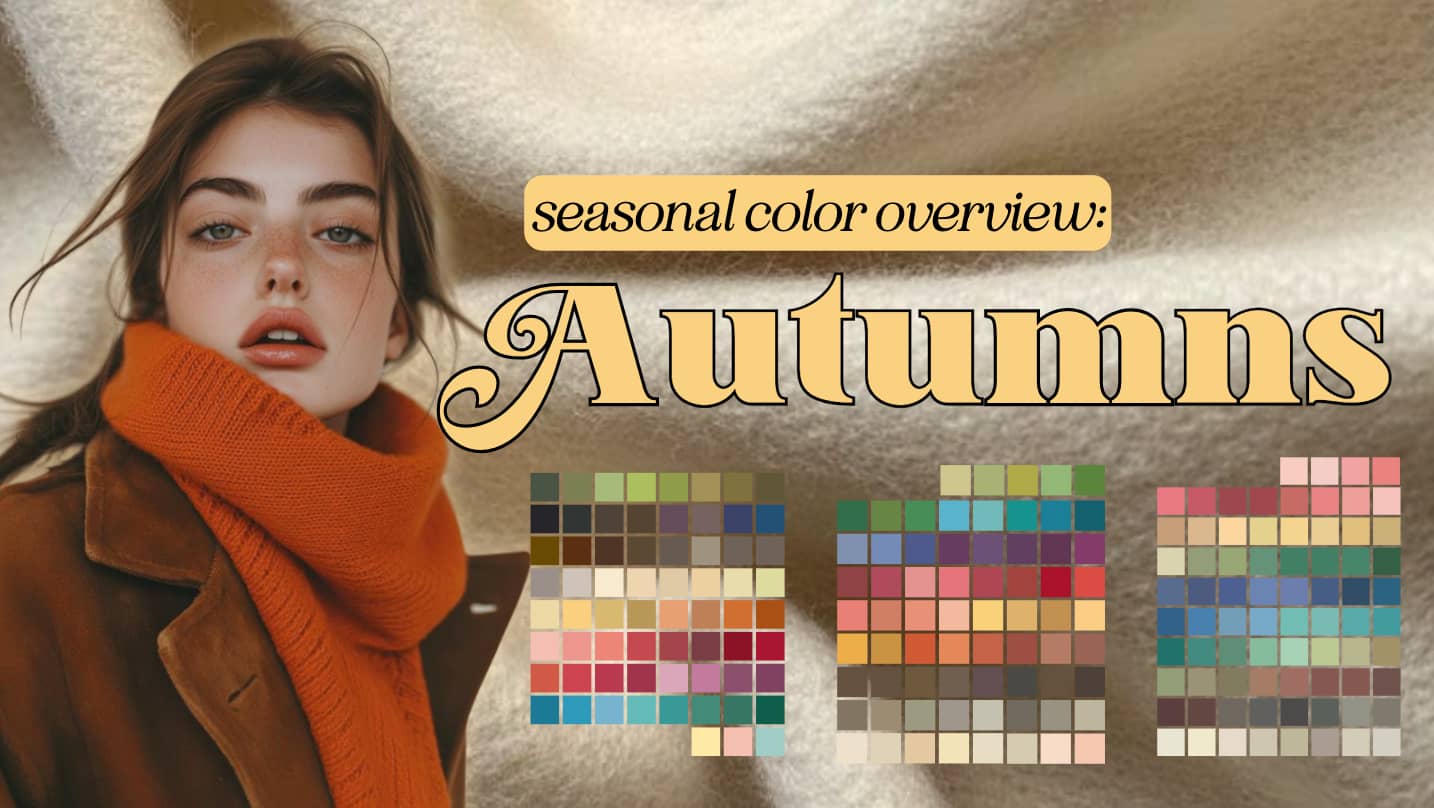
Autumn stands out as the season with the most variation in its color palette. The shades are rich, and muted. This gives Autumn a distinctly warm and organic feel, it feels cozy and like a friendly hug. Unlike the more structured sleekness of Winter and the more tranquil Summer, Autumn colors are naturally disordered and can range from rich to soft. There are no clear or pale shades, and cool grays, bluish-reds, or pure blacks are absent. When envisioning Autumn, think of RICH and YELLOW-BASED BLEND as the defining elements of its color story.
The Autumn Season Subtypes
There are three main subtypes in the Autumn family, and here’s a general breakdown and overview of the color qualities for each.
Confused about the terms “hue”, “value”, and “chroma”, refer back to my seasonal color overview for an in-depth explanation.
Hue: Neutral/Warm
Value: Low
Chroma: Medium-High
Hue: Warm
Value: Medium
Chroma: Medium
Hue: Neutral/Warm
Value: Medium
Chroma: Low (Muted)
If we examine their palettes next to another we see the subtle shifts from Deep autumns black influence, to the pure warmth of True Autumn, and finally the subtle gray washes of Soft Autumn.
Even just narrowing down your season to the general Autumn family will be incredibly instrumental in your wardrobe building and shining in your best colors. All of a sudden, walking into a store and being able to say “nope those cool brights aren’t for me” will be so freeing and exciting!
I also want to mention that a lot of people when they get typed, don’t immediately “love” their palette. There can be a moment of shock or discomfort when you look at your palette, even when you objectively saw those colors make you shine in your draping. But, every palette has their own versions of most hues, and have a range of “bright”, “neutral”, and fun colors. Seasonal color palettees aren’t meant to be restricting, but rather show you the general boundaries of what colors make your natural coloring shine.
If you’re interesting in my Sci/Art In-person draping, you can learn more about it here. And just remember, that seasonal colors are only one tool in your style toolbox.
Adjectives that Describe Autumns
When describing Autumn, the following adjectives encapsulate the essence of the season, each bringing to mind a specific quality that defines Autumn’s unique character. These are just potential adjectives, so if you don’t resonate with them, it doesn’t mean you can’t be part of the autumn family.
- Adventurous: Willing to take risks or try out new ideas, often involving excitement or unpredictability.
- Flaming: Intensely passionate or fiery in appearance or emotion.
- Powerful: Having great strength, influence, or effect.
- Baroque: Extravagantly elaborate, often in a dramatic style.
- Profuse: Abundant or plentiful; pouring forth liberally.
- Bizarre: Strikingly out of the ordinary; odd or eccentric. (in an enchanting way!)
- Gorgeous: Beautifully impressive or very attractive.
- Radiant: Emitting light or heat; glowing with joy, health, or emotion.
- Blazing: Very bright or intense; showing strong feelings or excitement.
- Gusto: Enjoyment or vigor in doing something; zest.
- Random: Made or done without a specific plan, pattern, or purpose.
- Boisterous: Noisy, energetic, and cheerful; rowdy.
- Hearty: Loudly vigorous and cheerful; warm and friendly.
- Renaissance: A revival or renewed interest in something, often associated with cultural rebirth.
- Brazen: Bold and without shame; confident in a striking or audacious way.
- Intense: Existing in an extreme degree; showing strong feelings or concentration.
- Resplendent: Attractive and impressive through being richly colorful or sumptuous.
- Invigorating: Making one feel strong, healthy, and full of energy.
- Rich: abundant; deeply satisfying.
- Brassy: Bold and noticeable
- Iridescent: Showing luminous colors that seem to change when seen from different angles. Think of a stream with golden sunlight pouring through the trees, catching the water at different angles.
- Robust: Strong and healthy; vigorous and sturdy.
- Coarse: Rough in texture
- Lavish: Sumptuously rich, elaborate, or luxurious.
- Rococo: Highly ornate and decorative, often in an intricate or asymmetrical style.
- Coppery: Resembling the reddish-brown color of copper; warm and metallic.
- Liberal: Open to new ideas; generous and giving.
- Rough: Having an uneven or irregular surface; not smooth.
- Daring: Boldly courageous; willing to take risks.
- Loud: Bold and likes to have their voice heard
- Rustic: Relating to the countryside; simple, rough, and charmingly rural.
- Earthy: Resembling or suggestive of earth or soil; practical and straightforward.
- Luminous: Emitting or reflecting light; shining brightly.
- Sanguine: Optimistic or positive, especially in a challenging situation.
- Eccentric: Unconventional and slightly strange; deviating from the norm.
- Lush: Growing vigorously, especially rich in foliage; luxurious and opulent.
- Spicy: Lively and engaging.
- Energetic: Showing or involving great activity or vitality; vigorous.
- Lusty: Healthy and strong; full of vigor and enthusiasm.
- Strong: Having physical strength or power; able to withstand force or pressure.
- Extravagant: Excessive and lavish.
- Vigorous: Strong, healthy, and full of energy.
- Fiery: Consisting of fire or burning strongly and brightly; passionate and intense.
- Peppery: Spicy and sharp; having a lively or spirited character.
- Zesty: Full of flavor; lively and exciting.
- Flamboyant: Tending to attract attention due to exuberance, confidence, and stylishness.
- Potent: Having great power, influence, or effect.
We may earn a commission from you clicking a link below. And as an amazon associate, we earn on qualifying purchases. Full affiliate policy, here.
Autumn Color Palette Chart
Now, if you’ve deteremined your subtype already, you may realize that certain colors in the autumn chart may not suit you quite as well as your subtypes version, and that’s totally normal.
This chart with the colors names is to help you understand the over arching feel of autumn’s color palettes and how these colors all feel like they are part of the same “family”.
When you do determine your seasonal color subtype, I highly encourage you to buy a color fan to use as a tool in your shopping and wardrobe decision making. I give all my color clients fans from NDU colors and since I have a working relationship with them you can use my code ARRUDA for a free color card.
Now let’s explore some visuals and descriptions for how each hue shows up in the Autumn color palette. While you don’t need a degree in color theory to use seasonal color, it does help to begin to train your eye how your palette visually presents itself.
Autumn Whites
Autumn whites embody the soft, cozy warmth of the season, best represented by warm ivories and creamy ecrus. These off-whites bring a sense of subtle elegance and comfort, blending effortlessly with the deeper hues of Autumn. Unlike stark, cool whites that might feel too sharp, these softer shades echo the natural light of an overcast sky or beautiful dried pampas grass, creating a harmonious backdrop for the season’s palette.
Some analysts mention that you shouldn’t wear a white that is “whiter” than your teeth. Generally, I don’t find this helpful. Too many factors including health and diet habits can affect your teeths coloring.
Autumn Grays
Gray is a rare presence in Autumn, yet when it appears, it carries the mellow tones of the earth. Sage and pewter grays, infused with hints of green and yellow, bring a muted, calming effect, like the mist rising over a forest at dawn or pepples in a stream. These grays are far from cold; instead, they evoke the serenity and stillness found in nature, making them a subtle yet powerful component of the Autumn palette.
Autumn Browns
Browns are the backbone of the Autumn palette, deeply rooted in the richness of the earth. From the light, golden beiges reminiscent of wheat fields to the dark, coffee browns that mirror the deep woods, these shades exude warmth and stability. They are the colors of the forest floor, the bark of ancient trees, and the fertile soil, grounding the Autumn palette in nature’s strength and endurance.
Many autums find grounding their wardrobe with browns to be an excellent base. Brown, at first, can be a polarizing color and you may find yourself saying ” I don’t like all those muddy colors, I just like black”, but give yourself some time to embrace the rich browns of your palette and see the true effect they can have on your style and outfit building. Over time, you may find releasing black to be possible (something I personally went through as a Bright Spring and thought I would never do!)
Autumn Reds
Autumn reds are as vibrant as the leaves turning in the fall, capturing the fiery essence of the season. Deep burnt bricks and burgundies reflect the rich tones of a forest in full autumn blaze, while soft tomato and muted reds burst akin to the last rays of a setting sun. These reds then mellow into bronzes, terracottas, and rusts, echoing the natural progression from the height of autumn’s glory to the earthier tones as the season deepens.
While you make not have the cool, blue-based reds that Winter has, your reds still have a lot of presence and richness!
Autumn Yellows
Yellows in Autumn are like the sun breaking through the clouds on a crisp autumn day, golden and glowing. The deep marigolds, goldenrods, and mustards bring to mind fields of wildflowers and the last warm light of the year. These shades then brighten into soft sun and butter yellows, capturing the cheerful energy that still lingers before winter’s onset. Autumn’s yellows are bold and full, enriching the palette with a sense of optimism and warmth.
They don’t feel bouncy or playful like the yellows of the Spring season. But instead, create a vibrant yet warm glow and calmness.
Autumn Greens
Greens in Autumn are as varied and abundant as the trees that hold onto their leaves just a little longer. The palette starts with acerbic limes and leaf greens, rich and warm. These then transition into dusty avocados and mosses, reminiscent of the deeper, more mature foliage. Rich ivy, cypress, pine, and spruce greens reflect the strength and resilience of evergreen forests, while olive and sage bring a subtle, earthy sophistication to the mix. These greens are dynamic, embodying both the vibrant life and the quiet, enduring nature of the season.
Autumn Blues and Blue/Greens
Autumn is not known for pure blues, but rather for blues that carry a hint of warmth. Aquamarines, turquoises, and tourmalines have a yellow undertone that makes them feel more connected to the earth and sky. These shades deepen into peacocks and teals, colors that suggest the depth and mystery of a quiet lake or the feathers of a bird preparing for winter. These blues are comforting and rich, providing a beautiful contrast to the warmer tones of the season.
You will find some muted sea blues and muted navys present as well, but they are not as dominant as your blue/green options and found more commonly in the Dark Autumn and Soft Autumn palette.
Autumn Purples
Purple in Autumn is a rare but striking presence, ranging from muted warm grapes and creating deep, moody periwinkles. These shades evoke the twilight hours when the sky turns a mysterious, almost magical shade, or the dusky lavender of late-blooming flowers. Autumn purples are introspective and serene, adding a touch of mystique to the otherwise earthy palette.
Autumn Pinks
Autumn pinks are soft and earthy, leaning towards dusty rose and muted salmon. These shades are like the last blush of flowers before the frost or the gentle flush of cheeks in the cool autumn air. They bring a delicate, romantic touch to the otherwise robust and warm Autumn palette, offering a subtle contrast that still feels deeply connected to the natural world.
Autumn Oranges
Autumn oranges are vibrant yet earthy, capturing the warmth and richness of the season. These oranges range from deep, burnt shades like terra cotta, pumpkin, spiced apricots or autumn ember. Unlike the sharp, high chroma oranges of spring, Autumn oranges have a warmth and depth that make them feel both energizing and grounding. They evoke the colors of fallen leaves, ripe gourds, and the glowing embers of a cozy fire. These shades are bold but not overwhelming, blending seamlessly with other Autumn colors like browns, greens, and yellows to create a harmonious style combination.
Autumn Style Aesthetic
Random Disorder or Irregular Balance
The key to expressing Autumn colors through design is embracing a sense of random disorder or irregular balance. This is best achieved through styles that emphasize natural, rustic impact, often seen in handmade or global designs like the peasant or prairie look, kaftans, tunics, capes, ponchos, and layered garments.
Here are some things you might consider…
- Natural Impressions: Garments with a rustic or natural feel, such as peasant tops, prairie skirts, kaftans, and tunics, work beautifully with Autumn colors. These styles often incorporate loose, flowing silhouettes that mirror the natural movement of the season. Cottagecore is a great trend for the autumn palettes to explore and you can learn more about the cottagecore aesthetic and how it works for your body type or seasonal color here.
- Layering is Key: Capes, ponchos, and shawls add layers of texture and visual interest, perfect for showcasing the depth of Autumn’s palette. The idea is to create a look that feels organic and lived-in, as if each piece has a story to tell.
- Textures Over Solids: While solid colors can work, they are most effective when paired with rich textures like tweed, corduroy, raw silk, and linen. These materials add a tactile dimension to your outfit, making the colors appear more alive. And when the weather is warmer try breezy cottons or handkerchief linens in their place.
- Bold Patterns: Autumn colors shine in patterns that are random and profuse. Think of splashes of paisley, bold plaids, intricate mosaics, and large florals like Hawaiian prints or jungle motifs. Global or Cultural prints, such as those inspired by Egyptian or Persian designs, are particularly fitting but be mindful of not culturally appropriating.
- Generally avoid ( or test) patterns that are too severe or delicate, as they can diminish the impact of Autumn’s warm hues
Patterns are crucial in Autumn—random, busy patterns like bold florals, global prints (without culturally appropriating), and irregular geometrics work particularly well. Solids require rich textures to succeed in this season.
When choosing a pattern, try to have the most prominent colors be in your palette (ideally the print is 70% autumn). The Autumn prints are sophisticated and stunning, and can create a magical experience when worn to their full potential. If the above prints aren’t singing to you, don’t feel like they are your only options!
Jewelry for Autumn: Enhancing Natural Beauty
When it comes to jewelry, Autumn’s rich and earthy palette is complemented by pieces that have a natural, rustic, and often opulent feel.
Embrace Richness and Unique Flair
Autumn’s colors and textures pair beautifully with jewelry that carries an earthy, unique, or handcrafted vibe. Look for pieces that feel substantial and have a sense of history or connection to nature.
- Metal Choices: Warm metals like brushed or hammered bronze, brass, and gold are ideal for Autumn. These metals reflect the warmth of the season’s colors and add a rich, grounded feel to your look.
- Natural Materials: Incorporate jewelry made from natural materials such as turquoise, opals, raw coral, faux ivory, and “bone” pieces. These materials not only complement Autumn’s color palette but also add texture and interest to your outfit. You can also opt for stones in your color palette, but overly shiny or stark stones are not your best choice.
- Statement Pieces: Autumn allows for bold and expressive jewelry. Consider large bangles, loop earrings, and chunky necklaces. Pieces with an handmade influence are great, as are pieces with an asymmetrical design. These items often feature intricate designs and a mix of materials that mirror the season’s profuse and varied nature.
Avoid Cold and Stark Elements
Autumn’s warm, earthy palette doesn’t harmonize well with sharp, cold elements like diamonds or pure shiny silver. These can feel too harsh and out of place in the context of Autumn’s rich, organic colors. If you happen to be a neutral/warm season like Dark Autumn or Soft Autumn, your use of silver will still benefit from a matte or textured approach.
Fabrics for Autumn: Rich, Textured, and Full-Bodied
Autumn is a season that calls for fabrics with depth, texture, and a sense of richness (are you seeing the pattern yet?). The right fabric choices are crucial to bringing out the best in Autumn’s color palette.
Full-Textured Fabrics (Daytime)
Autumn colors thrive in fabrics that are substantial and full-bodied. These fabrics add dimension to the colors and help them appear richer and more vibrant. Some of the best fabrics for Autumn include:
- Tweed: A rough, woolen fabric with a soft, open weave. Tweed’s inherent texture makes it perfect for adding visual interest to solid Autumn colors.
- Herringbone: Known for its distinctive V-shaped weaving pattern, herringbone is another fabric that brings depth and a sense of structure to the warm hues of Autumn.
- Bouclé: With its looped, knotted texture, bouclé adds a tactile, three-dimensional quality to garments, making it ideal for showcasing Autumn’s rich, earthy tones.
- Corduroy: A ribbed fabric that’s both durable and cozy, corduroy is perfect for Autumn, offering both warmth and visual texture.
- Denim: Sturdy and versatile, denim is a perfect match for Autumn. Its rugged texture and durability align beautifully with the season’s grounded, natural vibe.
- Wool: Has a natural warmth and soft texture, is an ideal fabric for Autumn, offering both comfort and a rich, tactile element that enhances the season’s earthy tones.
Other options include cottons and linens.
Heavier, Richer Fabrics (Evening Fabrics)
For a more opulent feel, Autumn colors also work beautifully with heavier, richly textured fabrics:
- Brocades: These are richly decorative fabrics often woven with a raised design. The intricate patterns and heavy feel of brocades are well-suited to the luxurious aspect of Autumn styling.
- Panne Velvet: A type of velvet that has been flattened to create a smooth, reflective surface, adding depth and richness to the warm tones of Autumn.
- Rustic Jacquards: Jacquard fabrics with their intricate, woven patterns bring a sense of complexity and richness to Autumn looks, fitting well with the season’s preference for detailed, textured designs.
- Raw Silk: This slightly nubby, textured silk is a great way to incorporate a touch of luxury while still maintaining the organic feel that suits Autumn.
Specialty and Rustic Materials
Autumn’s color palette is enhanced by fabrics that have a raw, natural feel.
- Leathers and Suedes: These materials, especially in earthy tones, are quintessentially Autumn. They add a rugged, yet sophisticated edge to outfits.
- Feathers and Macramé: Fabrics and embellishments that incorporate feathers or macramé add a unique, bohemian touch, perfectly aligned with Autumn’s free-spirited, organic vibe.
- Linens: Linen, especially when left unpolished or with a rougher texture, complements the natural, unrefined beauty of Autumn’s color palette.
What to Generally Avoid
- Translucent Fabrics: Light, sheer fabrics like lace or chiffon can make Autumn colors appear too pale and delicate, detracting from the season’s inherent richness. But depending on the visual weight of the entire look, this may not be an issue. Be sure to take daily outfit photos so you can examine your looks! Layered soft fabric that still have a grounded appearance (like many Chloe dresses) would be perfect for an autumn. We just don’t want to veer into the overly airy and ethereal feel of summer.
- Delicate Textures: Fabrics that are overly soft or delicate can clash with the bold, textured nature of Autumn’s palette, making colors seem less vibrant. This will be a personal choice and may be impacted by your essence blend, body type, or style preferences.
Here’s the true magic of seasonal color analysis: imagine stepping into your wardrobe and finding that every piece feels like it was made just for you—like it was chosen with your essence in mind. When you align with your season, like the rich and inviting tones of Autumn, you tap into a style that not only looks good but feels right.
Seasonal color analysis helps you see the beauty in your natural palette, guiding you to choices that enhance your best features effortlessly. With Autumn, it’s about embracing the warmth, the layers, the textures that resonate with your inner vibrance. When you dress in harmony with your season, your style becomes a true reflection of you—authentic, confident, and undeniably powerful.
It’s not just about looking good; it’s about feeling like you’ve finally found what works, like you’ve found yourself.
Thank you so much for this post Gabrielle, I have been waiting for it. I am pretty sure I am an autumn, and even though I am not sure which one, this helps me a lot with textures, jewelry etc.
I’m so glad you found it helpful! It’s a great place to start!
Hi Gabrielle, thank you for this amazing post, it is so helpful.
Will you release a new fall capsule and outfit guide anytime soon ?
Greetings from France !
For the seasonal colors? yes, I’m hoping to get it out in a week or so.
Wonderful descriptions of the autumn seasonal palette- great resource to help visualize what to look for in colors and style for my wardrobe. Thank you!
I’m so glad you liked it!
This was so helpful to finally rule out autumn and leave the last few doubts behind. Looking forward to the springs! 🙂
Working on spring now!
This is so helpful, thank you. I’m intrigued by how the seasons are so associated with character – and how that adds to the four chair legs of style. I thought I was a Zyla spring but reading this autumn makes so much sense.
Its been so interesting watching your journey too and seeing you find yourself. It shows the process as dynamic which is very helpful for me in the messy middle.
Thank you so much, I’m really enjoying the journey so far and compounding the new style inputs and seeing how they work so well together. If these elements resonate with you, you might explore the autumn family. I know Zyla has his own system with parameters but I believe he also bases it on overall impression and character traits. Ultimately, I believe draping is the key, but theres definitely an essence present in each overall season.
such an amazing post – thanks Gabrielle!
You’re so welcome!
This is very helpful. A question, though. I have been typed twice as a true autumn, but I find some of the really warm colors in that palette (mustard, camel, salmon) seem to turn my skin yellow in an unattractive way. I often pull colors from soft (muted roses and soft olives) and dark (really dark greens, teals, and purples). Is borrowing from the neighboring sub-seasons an OK? I would assume a soft autumn (slightly grayer) olive would still look better than a summer shade. Are there any rules about straying into the other sub-seasons I should be aware of?
Rebecca, this is similar to me.
I started thinking about my palette on a temperature scale. Cools are a no go, but hot-warms are as well! Huh? I need the warm palette section sitting next to neutral, the “cool sprinkled” warms. (And I can wear some warmed-cools, because they belong to a sister palette.)
Color temps
Hot-warms to cooled-warms to to warmed-cools to cold-cools
With pale/neutral skin, yellows aren’t my best. But rusty oranges are one of my faves. Camel is a good neutral, but my personal coloration doesn’t do well in all neutrals (harmonize = neutral coloration looks great in neutrals, high color variation does not look its best surrounded by neutrals).
I find myself drawn to the lighter colors during summer (peach, marine, avocado greens), switching to their darker siblings for winter (cinnamon, teal, forest green).
Our sister season is another palette we can pull from, i.e. those that are to either side of our current sub-season. Gabrielle has done some awesome posts regarding the seasons. ??
Would love to see info on what happens when you go gray. I have let the gray come in (and have probably had more comments with that than before going gray!) grey around have but still pretty brown in back. The gray is pretty silvery and my brown went from light warmer brown to a cooler tone. And I have dark brown eyes. I think I am warm (spring and fall have some of my most flattering colors) but feel like it’s changing some with the gray. Suggestions on how to modify for gray?
I’ve always been drawn to the autumn aesthetic but not sure if I’m a deep winter or autumn. In summer when I tan naturally I think my palette changes? Is this normal? By the way I despise the deep winter aesthetic with its clean lines, I think it looks amazing on others but not me!
Hi Gabrielle! I’ve always loved art and psychology. So I want you to how wonderfully and perfectly detailed your prof info was. Your DIY was the cherry on top, as I can not afford much at this time. So big THANK YOU Gabrielle, and may God bless you always! ❤️
Hi Gabrielle! I am so grateful for Everything you’ve posted! I am especially impressed by all of the numerous topics for which you’ve written —-and in such perfect detail too! I want to share that I took, have always loved both psychology and art. So for years, I’ve deliberated out my sub season.( Perhaps Dark Autumn? ) Your DIY, was the cherry on top, as funds are limited. Thank you so much, and may God Bless you today and always Gabrielle.❤️
Thank you so much!! So glad you found your color home ❤️