Springs: Seasonal Color Overview
The Essence of Spring: Seasonal Color
Spring is the warm and energetic season characterized by its lively, clear, and bright palette. The colors of Spring are infused with energy and clarity, evoking a sense of youthful optimism and vitality. With its yellow-based tones and absence of dark or muted shades, Spring’s palette is as fresh as a crisp morning. Understanding the essence of Spring’s colors allows you to embrace a vibrant, joyful, and effortless style, perfect for reflecting the season’s natural brightness.
Spring stands apart with its clear, light, and warm palette. These shades carry a bright, stimulating energy that could be described as Sunny Brilliance! Unlike Autumn‘s deep, muted and rich tones, Spring’s colors are brighter, with no muted or blue-red shades nor any pure black. The emphasis is on clarity and contrast, which helps bring out the freshness and vitality of the palette. When envisioning Spring, think of a cheerful, youthful energy with a focus on yellow-based contrast. (think golden sun yellow, not lemon yellow ?)

This article explores the Spring season in its entirety, including Light Spring, True Spring, and Bright Spring, all of which share the core qualities of warmth and clarity. It’s the perfect introduction to understanding the Spring palette and discovering the overall essence of the Spring season.
Lightness? What do you mean?
In this article, “lightness” refers to both the value of color quality and the emotional qualities of the Spring palette. Visually, it means the colors are clear, warm, and some subseasons (like Light spring) have a higher value, meaning they are closer to the lighter end of the color spectrum. These colors also reflect more light.
Emotionally, “lightness” conveys a sense of ease, playfulness, and optimism. It’s about a carefree, youthful energy that comes through not only in the colors but also in the style choices, like fabrics that move easily or patterns that are fun and whimsical.
The idea is that Spring doesn’t weigh you down with heavy or intense colors or fabrics but instead lifts you up with a sense of lightheartedness and brightness.
The Spring Subseasons
In the 12-season system which I’m trained in, there are three main subseasons of Spring: Bright Spring, True Spring, and Light Spring. Let’s review their general color qualities ( hue, value, and chroma).
If you are confused about the terms “hue,” “value,” and “chroma,” refer back to my seasonal color overview for an in-depth explanation.
Bright Spring
Hue: Neutral/Warm
Value: Medium
Chroma: High
Just remember that you can’t just “guess” your season, use AI to tell your color palette, or go off of eyes and hair color alone. I am a certified 12 Blueprints Color Analyst (which is Sci/Art based) and I am a Bright Spring!
True Spring
Hue: Pure Warm
Value: Medium
Chroma: Medium/Bright
Light Spring
Hue: Neutral/Warm
Value: High (Light)
Chroma: Medium
Light Spring Full Guide will be added soon!
If we examine their palettes next to one another we see the subtle shifts. All colors are warm and clear, but with Bright Spring, we have higher chroma (a Winter influence), and with Light Spring, we have higher values ( and a Summer influence)
Even just narrowing down your season to the general Spring family will be incredibly impactful when it comes to building your wardrobe and embracing your best colors. Imagine walking into a store and confidently thinking, “those dark, muted shades aren’t for me,” and feeling empowered to focus on colors that make you shine. It’s an exciting, liberating shift!
It’s also important to note that when people first discover their palette, they don’t always fall in love with it right away. There can be a bit of surprise or uncertainty when you first see your colors, even though you saw how beautifully they worked during your draping. But don’t worry—every palette offers a range of hues, from bright and playful to more neutral and subdued options.
The goal of seasonal color palettes isn’t to limit you, but to highlight the colors that make your natural beauty stand out, giving you the freedom to confidently embrace your unique style within those color boundaries. How you apply it to your style goals and preferences is up to you!
Adjectives that Describe Springs
These adjectives encapsulate the lively, innocent, and animated nature of Spring, each reflecting the buoyant personality of this season. These are just potential adjectives, so it doesn’t mean you can’t be a spring if you don’t resonate with them.
- Alert: Sharp and lively, always ready and aware, embodying a quick response.
- Enthusiastic: Full of eager enjoyment, displaying energy and passion in everything.
- Natural: Effortlessly real and genuine, Spring embodies a light, authentic quality.
- Animated: Full of life and movement, energetic and expressive in demeanor.
- Expressive: Displaying emotions openly and freely, often with a radiant energy.
- Neat: Tidy and well-organized; clear, clean aesthetic.
- Bashful: Subtly shy, endearingly modest in expression.
- Fair: Radiating light and balance, with an even and honest quality.
- Optimistic: Expecting positive outcomes
- Blithe: Carefree and happy, with an easygoing, cheerful attitude.
- Flirtatious: Playful and light-hearted, with a teasing, fun-loving spirit.
- Perky: Cheerful and energetic, with a bouncy, animated personality.
- Bonny: Pretty and attractive, full of charm.
- Fresh: Crisp and rejuvenating, with a sense of newly blossoming beauty.
- Playful: Engaging and full of fun, not taking things too seriously.
- Bright: Vivid and clear, exuding a radiant, lively quality.
- Friendly: Warm and approachable, with an easygoing attitude.
- Pretty: Delicately attractive, soft and charming.
- Bubbling: Full of energy, effervescent and overflowing with excitement.
- Fun: Enjoyable and lively, sparking joy and entertainment.
- Quaint: Endearingly old-fashioned, with a simple, charming elegance.
- Candid: Honest and open, with a straightforward and sincere quality.
- Gingerly: Careful and cautious, approaching things delicately.
- Sincere: Honest and genuine, without pretense or exaggeration.
- Charming: Delightfully attractive, with an irresistible appeal.
- Glad: Happy and pleased, showing a bright and cheerful demeanor.
- Sparkling: Shining brightly, full of life and energy.
- Chipper: Cheerfully lively, always in good spirits.
- Happy: Feeling or showing pleasure and contentment.
- Stimulating: Energizing and motivating, sparking excitement.
- Hopeful: Full of optimism and positive expectations for the future.
- Tidy: Orderly and neat
- Clear: Free from ambiguity, bright and transparent.
- Innocent: Pure and untouched, with a fresh and youthful essence.
- Timid: Shy and cautious, yet endearingly soft.
- Crisp: Fresh and clean, evoking a sharp, clear atmosphere.
- Inquisitive: Full of curiosity, always seeking to explore and understand.
- Trim: Neat and well-maintained, showing careful attention to detail.
- Curious: Eager to learn or know more, with a lively sense of wonder.
- Jovial: Full of good humor and cheer, radiating happiness.
- Vivacious: Lively and spirited, bursting with energy.
- Cute: Endearing and charming, often in a youthful way.
- Light-hearted: Carefree and without concern, exuding a joyful spirit.
- Youthful: Radiating the energy and innocence of youth, fresh and vibrant.
- Delightful: Highly pleasing, with a charm that brings joy.
- Lively: Full of life and energy, actively engaging with the world.
- Whimsical: Playful and fanciful, with an imaginative, quirky charm.
- Effervescent: Bubbling with energy, full of life and vivacity.
- Merry: Cheerful and full of joy, radiating happiness.
We may earn a commission from you clicking a link below. And as an amazon associate, we earn on qualifying purchases. Full affiliate policy, here.
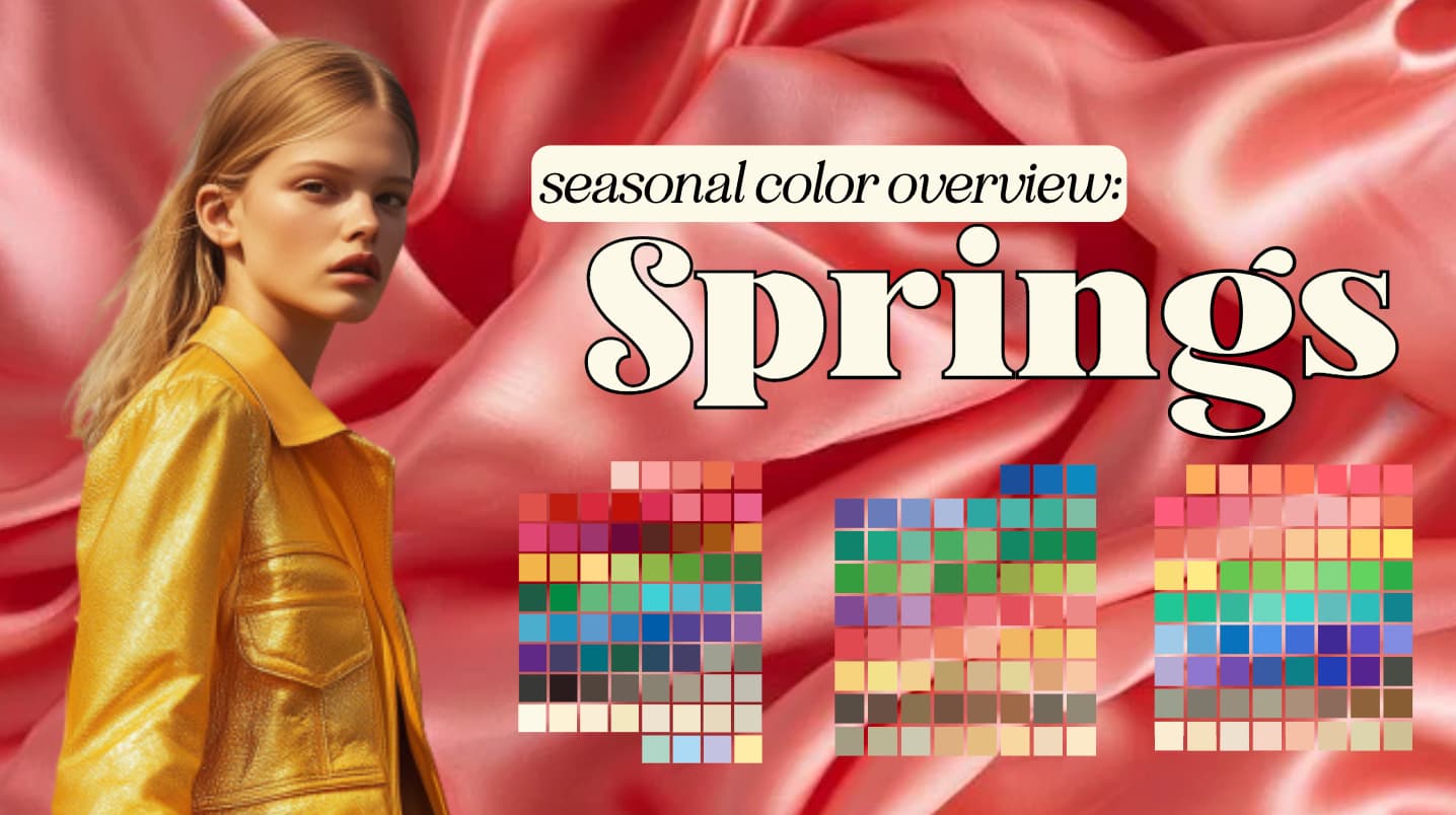
Spring Color Palette Chart
Now, if you’ve already determined your Spring subtype, you may notice that certain colors in the overall Spring chart may not suit you as perfectly as the specific shades for your subtype, and that’s completely normal.
This color chart is designed to help you grasp the overarching feel of Spring’s color palettes and how all these hues work together as part of the same vibrant, light, and harmonious “family.”
When you do determine your seasonal color subtype, I highly encourage you to buy a color fan to use as a tool in your shopping and wardrobe decision making. I give all my color clients fans from NDU colors and since I have a working relationship with them, you can use my code ARRUDA for a free color card.
Now let’s see some visuals of how each hue shows up in the Spring seasonal family.
Spring Whites
Spring’s whites are light, creamy, and clear, providing a gentle foundation for the brighter colors in the palette. Think of warm ivories and delicate bright ecrus, which feel as light and airy as a springtime cloud. These shades are best worn in smooth, fine fabrics like silk, cotton, or linen, which maintain the purity of the color without dulling it. Heavier or more textured fabrics, such as wool or boucle, can overwhelm the clarity of Spring whites, making them appear too muted. These whites feel inviting and natural, perfect for creating a base that enhances the playful, vibrant tones in the Spring spectrum.
Spring Grays
Gray, though less prominent in Spring’s palette, plays a key supporting role in offering subtle sophistication. Spring grays are golden-toned, often referred to as dove, pewter, or davey gray, evoking sun shiny down on seaside pebbles or the shimmer of light reflecting off water. These grays are light and luminous, with an understated elegance that works well when paired with brighter hues like coral or light navy. Avoid darker, charcoal-toned grays, which can appear too harsh against Spring’s lighter, more delicate colors. Instead, think of these grays as the perfect neutral to balance Spring’s playful energy while maintaining a refined air.
Spring Browns
Browns in the Spring palette feel warm and approachable, offering shades that range from soft ivory-beiges to golden camels and creamy milk chocolates. These are not the heavy, earthy browns of Autumn, but rather light, fresh tones that exude warmth without being too dense. When combined with vibrant accent colors like coral or aqua, these browns come to life, creating a harmonious balance that feels bright yet grounded.
Spring Reds
Spring reds are clear, warm, and full of life, starting with warm bright tomato, poppy red, and watermelon red. These shades feel romantic and bright, with a magnetism that exudes the Spring individual. . Be cautious of cooler blue-reds, which can feel out of place and too stark against the natural warmth of Spring’s palette.
As a Bright Spring, the reds are some of my favorite colors!
Spring Yellows
Spring’s yellows are golden and glowing, like the first rays of sunlight filtering through the trees. These shades range from pale buttercups to brighter daisy yellows, offering a cheerful, uplifting energy. Unlike the deep golds of Autumn, Spring yellows maintain a lightness that feels fresh and youthful. Think of soft chamois or light golds that pair beautifully with Spring’s blues and greens. Sunny Brilliance indeed!
Spring Greens
Greens in Spring are crisp and invigorating, starting with soft turqouise and warming up into bright, clear celery and grass greens. These colors evoke the fresh growth of new leaves and blades of grass, embodying the essence of nature’s renewal. Spring greens are “cool-warm,” meaning they maintain a brightness that feels alive and fresh without leaning too far into the coolness of Winter. These greens pair beautifully with blues and yellows, creating a harmonious, nature-inspired palette. (After all, the seasonal color palettes have a basis in natural settings and landscapes!)
Spring Blues
Spring blues are some of the clearest and brightest in any seasonal palette. Starting with soft aquas and bright ultramarines, these blues exude a lively, refreshing energy. The darkest shade within this palette is a bright navy, which is still much lighter and clearer than the blackened navies of Winter. Spring’s blues feel dynamic and playful, like a clear sky after rain, and offer a sense of depth without heaviness. These blues pair beautifully with Spring’s yellows and greens, creating a crisp, clean contrast that feels both sophisticated and fresh.
But don’t be afraid to add a bright warm-red lipstick if you want to lean more romantic or vibrant (especially my bright springs!)
Spring Purples
Spring purples are whimsical and can include some “bluer” shades like periwinkle, cornflower, and violet. These colors feel delicate yet playful, evoking the lightness of early morning flowers. Unlike the deep, moody purples of Winter, Spring’s purples maintain their warmth and lightness. These purples are ideal for adding a touch of femininity and elegance without overpowering the rest of the palette, making them perfect for subtle accents or accents in patterns.
Spring Pinks
Pinks in the Spring palette are clear and warm, leaning toward coral-pinks, bright salmon, and clear peach. These colors feel lively and full of joy, embodying the playful, flirtatious energy of Spring. Unlike the cooler pinks found in Summer or Winter, Spring’s pinks radiate warmth, creating a vibrant, yet soft effect that works beautifully in both solid garments and playful patterns.
Spring pinks evoke the flush of early blossoms or a cheerful spring sunset, making them a go-to for adding lightness and brightness to your wardrobe.
Spring Style Aesthetic: Clear, Youthful, and Refined
The key to expressing Spring’s colors in design is through clear, well-defined patterns and silhouettes that stop short of being labeled as “severe”. Spring’s inherent youthfulness thrives in tailored, refined styles that maintain a sense of playfulness without feeling overpowering.
Think of fresh, crisp outfits with small, repetitive prints—polka dots, tiny florals, and whimsical motifs like butterflies or strawberries work well for this palette. This need not be childish and can be very sophisticated! This will depend on how you combine your colors and your outfit rhythm.
Spring garments should highlight the natural body form with clean lines and gentle yet fitted shapes. Avoid overly dramatic silhouettes that can make Spring’s colors feel out of place. Instead, opt for tailored jackets, A-line skirts, shirtwaist dresses, and simple, well-defined details like scalloped edges or grosgrain ribbons. The overall effect should be light, fresh, and cheerful, never too rigid or heavy.
Spring’s colors are best expressed in smooth, polished fabrics such as cotton, silk, fine linen, and polished cotton. If you opt for more softened textures, make sure the colors still appear clear, and consider adding some color blocking to keep the outfit lively!
{understand your best textures article}
Spring Patterns and Textures
Patterns for Spring can be energetic and playful. Small, repetitive patterns like polka dots, stripes, fruit rpints, and delicate florals work best, offering a playful, refined look. Abstract, or blended prints can feel out of place.
Aim for prints that are at least 70% within your palette, ideally with the other 30% of the colors in sister seasons. However, it can be hard to find this out shopping, so don’t get overwhelmed by these guidelines.
Fabrics for Spring: Seasonal Color
Daytime Fabric Suggestions
For daytime looks, Spring’s palette shines best in fabrics that are lightweight, crisp, and refined. The goal is to maintain clarity and brightness, so fabrics should reflect light rather than absorb it, allowing the colors to feel lively and vibrant. It should feel like these colors are radiating light! That’s your Sunny Brilliance coming alive.
- Cotton Broadcloth: A staple for daytime wear, cotton broadcloth is smooth and lightweight, perfect for capturing the fresh, clean aesthetic of Spring.
- Seersucker: This fabric’s subtle texture adds a playful dimension while still feeling light and breathable, making it great for warm, sunny days.
- Fine Linen: Linen works beautifully in Spring’s palette when it is lightweight and smooth, offering both breathability and a sense of casual elegance.
- Polished Cotton: With its slightly glossy finish, polished cotton adds a refined yet fresh touch, ideal for blouses, skirts, and dresses.
- Oxford Cloth: Perfect for more structured daytime outfits, oxford cloth maintains a polished appearance without being too heavy or stiff.
- Denims should be bright and clear and not overly worn/distressed. Mediumweight denim is ideal.
Evening Fabric Suggestions
Evening looks for Spring should maintain the overall energy of the palette but with a bit more sophistication. Fabrics should have a smooth or slightly reflective finish to capture the brightness and elevate the look for nighttime settings. It’s important to avoid overly heavy or textured fabrics that could weigh down the colors or dull their vibrancy.
- Silk: Light and luxurious, silk adds a smooth, fluid quality that enhances Spring’s colors in evening wear, especially in shades like coral, aqua, or peach.
- Taffeta: With its slight sheen, taffeta offers a structured yet elegant option for evening gowns or skirts. It holds shape well while still reflecting light beautifully.
- Satin: Satin’s glossy finish provides a polished and sophisticated look, perfect for evening events where Spring’s colors can shine in their fullest brightness.
- Chiffon: For a more flowing, delicate look, chiffon adds an ethereal quality without overwhelming Spring’s palette. It works well for evening dresses, especially when layered or used in lighter shades like pale yellows or blush pinks.
- Lightweight Crepe: Offering just enough texture to add interest while maintaining clarity, lightweight crepe fabrics work well for more formal evening occasions, giving the outfit a soft but defined appearance.
These colors will not look juvenile or cheap on a Spring. They would appear romantic, charming, and captivating! A spring in their colors is someone that everyone naturally gravitates towards.
Jewelry for Spring: Warm and Playful
When it comes to accessories, Spring’s colors are complemented by delicate, whimsical jewelry that enhances the light energy of the season. Clear gold is the best metal choice, adding a soft, warm glow to the overall look. Silver can work for some of the neutral leaning Springs, but rich metallics like brass or heavy bronze should be avoided as they can overwhelm the palette’s clarity.
Look for small, playful pieces that reflect the youthful energy of Spring. Think of dainty charms, ribbons, small pearls, or light, trinket-style jewelry. These details add just the right touch of femininity and fun without overpowering the lightness of the palette.
But remember that your color palette is only one pillar in style journey, and it is important to adapt these recommendations to your own style goals and style toolbox.
Spring is all about embracing that fresh, feel-good energy, like stepping outside on the first warm day of the year. It’s about wearing colors that feel alive, fabrics that move with ease, and patterns that make you smile.
With Spring’s palette, it’s never about overcomplicating things—just think bright, clear, and light. Whether you’re dressing for a breezy afternoon or a chic evening out, keep it simple, playful, and a little bit whimsical. Let your wardrobe mirror the same optimism and excitement that comes with the season’s first blooms, and you’ll always look and feel like a breath of fresh air.
Hi, Ms Arruda
I would like to say that I appreciate your work on your blogs and you’re doing a great job. I have two questions. The first one have you thought of writing a post or article about combining the Seven Style essences with each of the 12 sub-seasons and which of them are more compatible or more likely to naturally occur? The second question is whether you’re planning to continue on making article guides regarding Kibbe I.D.s?
Thank you for taking the time to read it.
I’m sorry, but I really have to disagree with your color analysis, you should get a second opinion. There’s no warmth in your skin when you wear those colors: you look ghostly and pale. You see those bright colors first, not your face.
“visible warmth” of skin does not dictate your season. My color analysis was done during my color certification to be a trained analyst, by someone who has been doing this for decades. I very much trust her process. It’s fine if you disagree, but you might be missing the point of seasonal color. It’s not about blending in or stereotypical boxes, it’s about finding colors that lift your features and make you look like a fully finished painting! Cool colors had a blanching effect on me. While pictures don’t tell the whole story, I am very happy with my Bright Spring palette
I just wanted to say that I think your website is fabulous and has been very helpful! Of all of the different color analysis websites out there, this is the best! I have been buying the complete wrong colors for my color type my entire life. Now in my mid 40’s, I’m just starting to put everything together…. body type, style essence, and seasonal color. It’s never too late!
This is so exciting to hear!! I’m so glad you’ve stepped into a style you love and feel authentic in!
Your descriptions of the different colour seasons and your colour perception in general, is the best I have seen anywhere; many congrats! I feel you really understand the nuances of each season, not always seen everywhere; far too many sketchy outlines of what seasonal analysis is about. I also see you are a bright spring, as I am too. I do disagree with the lady who thought you were too pale or cool tone. Online analysis always pinpointed me as a Winter, as I have very pale ivory skin and at first sight look cool toned. However, draped in good light, by a professional analyst, I look washed out with cool colours, coming to life with coral and sunny greens and reds.