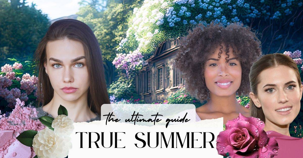
True Summer Seasonal Color: Ultimate Guide
Have you ever seen a photo of yourself and wondered, “Eek, why do I look like death warmed over?”. Or maybe you have an event coming up and you just want to shine. Well, determining your seasonal color analysis is a great place to start.
Color is truly one of the most pivotal aspects of personal style and it can really bring your outfit (and face) to life. You won’t be staring at your closet in front of a sea of clothes wondering what to wear or what pieces will look good together. Because filling your closet with your seasonal colors will not only make YOU look great but it will do wonders for the versatility of your closet.
Now, I’m a big believer in closet auditing, and I was shocked at how many horrible colors I was wearing that truly made me look ill. Was it the end of the world and ruined my life forever? No, but it certainly wasn’t doing me any favors. And since I’ve begun the slow transition to a closet with my seasonal color palette, I can tell you that it truly makes my face brighter, and highlights all the work I’ve done on my personal style expression.
So, if you’ve found this article you’ve probably landed on (or are considering) the True Summer as your palette. Let’s explore!
But wait… Is True Summer the same as Cool Summer?
So, this kind of depends on the system you are studying and how many options there are. Lots of systems will use these terms interchangeably. However, there are some distinctions between the two.
For exploration purposes, or a DIY process, I wouldn’t be too concerned about this in the beginning of your color journey, but it may help to distinguish further down the road.
If you are looking at a 12 season system, True and Cool may be used fairly interchangeably, whereas in a 16-season system, they will be differentiated.

True Summers tend to be able to wear all the subgroups for their season, but typically not outside their season (they don’t get sister seasons outside of summer because they are in the middle of the seasonal color wheel).
Cool Summers have a dominant characteristic of cool and they can sometimes lean a bit more towards the cool winter palette, but with less contrast overall.
For our purposes in this article, I will be using a 12-season comparison. I really think that is a good place to start when you exploring your seasonal color palette. Once you narrow that down, you can always expand to a larger season system if you find you need it. But, trying to tackle color theory and the characteristics of more than 12 categories, is most likely going to overwhelm you. Accept that this can be kind of a journey.
We may earn a commission from you clicking a link below. And as an amazon associate, we earn on qualifying purchases. Full affiliate policy, here.
True Summer Characteristics
Understanding seasonal color analysis is basically an education in color theory and color qualities. As I’m becoming a certified color analyst myself, I can tell you that a lot of the work is similar to my Color classes in college. It involves mixing paints, learning color vocabulary, and learning about the history of seasonal color analysis. So some stylists may tell you not to worry about the terms, but if you want true freedom in choosing colors while shopping, this base knowledge will help you accomplish that.
If all of this seems a bit daunting, let’s first look at a “seasonal analysis” color wheel:
True Summer, as seen above, falls directly in the middle of all the summer seasons, in between Soft Summer and Light Summer.
Remember that Autumn/Spring have warm undertones and Summer/Winter have cool undertones. Often times seasons can borrow from their sister seasons, but because True Summer has a purely cool undertone, they can only borrow minimally from their sister summer seasons and on rare occasions can pull a few colors from True Winter (if they have darker contrast). ( In the 12-season system, remember in 16 these are differentiated).
The True Summers defining characteristic is a cool undertone. That is usually the first step in determining seasonal color analysis, and you can check out this DIY color analysis article if you’d like to know the steps to do this.
Here are the True Summers main color qualities:
Undertone: Cool undertones. Some seasons have “neutral leaning” undertones which means they can lean slightly warm or cool, but True summer sits on the purely cool end of the spectrum. Their undertone is blue-leaning. Lots of color analysis focuses on blue vs. yellow and if a color has more blue added to it or yellow added to it. Any season can have a yellow overtone (olive), but for True Summer their undertone is completely blue based. If you’re curious about how yellow fits into this palette, don’t worry we will get to that!
Undertone/hue general definition: underlying quality of color (cool- blue based, warm- yellow based)
Overtone definition: The surface color. For instance, the color brown has a warm overtone, but the undertone can be cool or warm depending on if it is closer to blue or yellow.
Value: When we are examining value we explore how much white or black is added to the color (tints: white added, shades: black added). The True Summer color palette has a fairly broad range but stays more in the light, medium, and some medium-dark values. They do not have the contrast of the Winter palette, so their palette is not as deep in value.
Value definition: Light to dark scale ( add white to lighten= tint, add black to darken= shade)
Chroma: When it comes to chroma (or intensity) True Summers (TS) lean more muted. They are not “drab” in any way and you will find some nice saturation in some of their palette. However, in their chroma scale, they are not “bright”. If you look at the munsell color system below, TS would not have a highly bright chroma (like the 12).
Chroma/Intensity definition: Bright to muted scale ( add gray to lower intensity= tone)
Munsell Color Theory is a great place to start understanding basic color qualities and how colors might work within your seasonal palette. Munsel focuses on how we see the colors (colors in vision) versus other color theories like how color is seen in light or color in pigment.
Munsell is a great resource to start understanding the basics of how color can impact your style and your seasonal color palette because our goal with this information is to “look our best”. It focuses on how colors appear next to one another and in relation to things (ie, how you look against that color).
And if you’re getting frustrated, and ready to just go with the frequently wrong colorwise.app and call it a day, I promise it will all start to make sense. It just takes a little time.
I think it’s important to note that seasonal color analysis is a spectrum, and it is not dependent on any individual factor. If you are a person of color it does not mean you are only an autumn or winter. There will be a diverse array of examples in each season, and there are also people who don’t look like stereotypical seasons that have draped to confirm themselves.
And there are people who are purely cool, but that doesn’t mean they don’t have a warm overtone, or that there are not “neutral-leaning” people. If you have determined you are neutral, you should head over to the subseasons (for summer that would Soft Summer or Light Summer). The “true” seasons for each overarching season are the “pure” undertones with no influence from their counterparts. Meaning True summer is a cool undertone, not cool leaning warm.
How do you determine undertone? Check out this article, it is often the first step to complete and requires DIY drapings.
Common Hair, Eyes, and Skintones for True Summer
Seasonal color analysis has come a long way over the decades, and it has evolved to be more precise and has been tweaked into many different “systems”/approaches. But most analysts today believe that you must drape colors in order to determine your season. We are essentially looking at how your skin, and complexion react to the color. Does it make you shine, does it bleach you out, does it make you look sallow? Just listing your hair/eyes/skin tone does not always lead to a clear answer.
So the following information is just a baseline set of characteristics and should not be treated as a firm “rule”. While coloring can help you get started, and it’s not inconsequential, if you believe you could be a True Summer and don’t quite fit into the following categories, continue to drape and test. Remember, it is a SPECTRUM!
Hair: True Summers have a primary trait of “cool” but there are kind of two possibilities in how this shows up; sometimes in lighter hair colors (more delicate contrast) and sometimes slightly darker shades (slightly higher contrast). They generally have ash brown, burnt umber, grayish brown, chestnut brown, or burgundy brown hair shades. However, they can (less frequently) have sandy brown hair or lighter ash blonde. It is casually said that Summer seasons often have lighter hair as children that darken as they age and can appear warmer blonde in childhood (but not a universal truth).
Eye Colors: Blue, Gray-Blue, Soft Gray, Green, Gray-Green, Hazel, Aqua, and at times Soft Cool Brown
Skintones: They have cool undertones and tend to have a pinkish quality to their skin, although a yellow overtone is completely possible, so drape! Oftentimes times they have porcelain, rose beige, and medium to light complexions. They can also have light to medium brown freckles. Some older seasonal color analysis resources claim that freckles are only for warm seasons like autumn/spring but this is not the universal case. Because of their fair complexions, they can sometimes have sensitive skin that shows blemishes or ruddiness easily.
Summer Eye Pattern: Yay or nay?
Ultimately, eye patterns and their significance depend on what system you are using and how old the system is.
In my opinion, eye color and pattern are one potential factor in determining your season and are certainly not fail-proof. So if you lined up every confirmed-draped True Summer, would they all have the same eye pattern? Unlikely.
So you can examine your eye pattern but don’t use it as a sole factor.
Summers have the “cracked glass” pattern and can have a ghostly or kind of shapeless form around their pupil. When we are determining the “cracked” effect we are looking at the color that travels from the pupil to the outer iris edge. It can even resemble whitecapped waves in water.
They can also have a cloudy, soft, web-like pattern.
By all means, examine your eye patterns, just don’t think it’s the fast track to finding your seasonal color.
Turning Gray: True Summer
Some True cool seasons can go gray or silver earlier in life, but this is usually not an issue for their overall palette. Because they have that ashiness already present in their hair colors oftentimes the transition can be very smooth.
Sometimes their silver can have a blueish undertone or they can have a more luminant white color. These tones still work beautifully with your palette and very few adjustments will likely need to be made to your use of color and makeup. But if you’re struggling you can try achieving more contrast by using your soft white instead of deeper tones which might harmonize slightly better.
Contrast Level in True Summers
Remember there can be essentially two general versions of True Summer. The more stereotypical is the darker true summer with darker ash brown hair and cool cloudy eye colors. When you grayscale (desaturate the photo) these TS’s tend to have more contrast and can resemble a winter. And these TS can at times lean more into higher value contrast in their use of the TS color palette.
And then there are lighter TS like the blonde and blue eyed people who have less contrast overall and might even be confused for a Spring until they are draped. When we desaturate their photos they have less contrast overall and can have a more delicate look.
The True Summer color palette appears colorful and will appear even brighter when a TS wears it because it harmonizes so beautifully with them. But they do not have the brightness that Winters has. So this can take some fine-tuning to recognize and it is why draping and basic color understanding is key to this journey.
Now that we see the range of True Summer, let’s also explore how they compare to other seasons. This can be a helpful exercise to visually understand some stereotypical characteristics of the seasons, but please remember this does not span the potential of any season.
True Summer vs. True Winter
These two are across from one another on the color wheel and they both share a primary characteristic of “cool”, and have purely cool undertones. However, when side by side we can see that the True Summer has a more muted quality overall than the True Winter. Where True Summer next to her colors individually might feel saturated or bright, she doesn’t have the sharpness, gleaming, or royal look that True Winter exudes. True summer could be described as more fresh, refined, moonlight, and calm. While I’m not going to go so far as to say this is a personality or essence assessment, they give off different vibes.
Christine Scaman of the sci-art system says that “cool freshness is the prevailing feeling of this season” in regards to True Summers and I think that is so well phrased. (page 317). She compares True Summer to watercolor paints and True Winter to acrylic, and again I think this nuanced distinction can help you get a feel for the overall seasons well.
True Summer has a mistier, slightly heathered feeling when they are compared to True Winter. Overall TW has a more saturated palette.
True Summer vs. Deep Winter
When comparing True Summer to True Winter (not a typo), True Summer can sometimes feel a bit warmer, even though they do not have any warmth in their undertone. This is just because their value contrast is lower. And this is also why they can feel similar to the Deep Winter which is cool/leaning neutral.
Because they both share this muted qualities (to varying levels) sometimes a few Dark Winter colors can be easily worn by True Summers. Especially some of the medium blues and greens. And Deep Winters can sometimes borrow some of deeper greens or reds. However, the broader palettes definitely don’t pass back and forth easily. Deep Winter should avoid Summer’s pastels and TS should avoid the warmer shades of the DW.
True Summer vs. Soft Summer
True Summer is predominantly cool. Soft Summer is cool leaning warm and they tend to have a lighter or more muted value scale. So while they may appear similar, Soft Summer is the darkest of the summers, so it doesn’t have the saturation that a True Summer really needs. True Summers should really stay away from some of the warm-leaning shades a Soft Summer can handle.
True Summer vs. Light Summer
Same issue as with Soft Summer. Light Summer in neutral/cool which means they have a touch of warmth that is not visible with a TS. They have far less of a blue tone to their coloring and have a touch of yellow, as shown by their proximity to light spring (reference the undertone definition above if you’re confused by this).
Being a light season does not mean you only wear light colors or only have light coloring. But compared to TS their value range is mostly found in the lighter range spectrum (more tints-adding white). Where TS can handle a more medium to medium-dark value range. The Light summer chroma range is also lower-medium so their an airyness compared to the TS.
Determining if you are a True Summer
The most effective method to determine your seasonal color is by draping a variety of colors. You can see a professional as well, but I would encourage you to see one in person, and do a lot of research on the analyst and your preferred system (there is a very, wide spectrum of results based on the quality of the analyst and the system used).
Now, I have this draping how-to article that should help you narrow things down step by step.
But, if you’re reasonably sure you could fall into the True Summer category, you could try a more targeted draping test.
In order for your photos to be accurate, you must keep the settings consistent from photo to photo and have ideal lighting conditions.
Here are some tips:
Lighting: Natural daylight from the north-facing window, midday (not golden hour!), around 3 ft away.
Hair: Tie your hair back (especially if it’s dyed)
Avoid: Remove jewelry, makeup (yes, even mascara), and potentially glasses as well to get the most accurate pictures.
Lock your white balance: If the backgrounds of your photos are changing dramatically, lock your white balance or use a gray photo square to help adjust your white balance consistently post-shoot.
Test one fabric at a time.
What are you looking for?
We are looking at how our skin reacts to the color, which is why tying your hair back and covering it (especially if dyed) is essential. And you have to remove all makeup.
We are checking if our facial lines, shadows, blemishes, or scars are being de-emphasized or diminished (this is a good color if so). we are also checking if the color gives us a healthy glow or causes us to look sallow or jaundiced.
Good colors should smooth out our skin and make our eyes sparkle a bit. It should generally feel harmonious and not draw too much attention away from our own coloring.
True Summer Celebrities
I hesitate to even have this section because typing celebrities is kind of a fool’s errand (even though it can be fun). I obviously just went over an extensive list of how to evaluate a drape, and we can see that none of these standards can be applied to professionally edited celeb photos. So, while we can approximate a celebrities season, there is no ultimate “verified” list of celebrities.
And I caution you to use a celebrity as a benchmark for your own color determination.
As you can see above, photos of celebs can be highly different and altered even from the same event. So, take the following information as a strongly suspected list of examples and not the only examples possible.
And use the following people as potential example parameters, not hard comparison points.
You can really see how the cool rose pink makes True Summer Barbara Palvin shine. It seems much more harmonious and cohesive on her than the bright orange.
True Summer Imagery
Seasonal color analysis was actually based on seasons and how artists painted those seasons.
Johannes Itten was one of the founders of this concept when he realized his students would use complementary color skin tones to match their landscapes. He furthered this down to a blue and yellow divide and then added the aspect of bright and soft to the mix as well.
This is still what the overarching concept of color analysis leans to today. So what is the True Summer landscape?
We want to imagine a garden with a rose archway and an amazing array of flowers from peonies, carnations, roses, and even fruits like raspberries or herbs peaking through. A romantic, delicate air of sophistication and simple color schemes. Deeper evergreen colors in the background with blue, pink, soft white, and cool green present throughout.
Keywords for True Summer
These keywords should help give you an energy or feeling of the True Summer color palette.
- Peace
- Abundance
- Romantic
- Cool
- Serene
- Watercolor
- Blended
- Calm
- Gradual
- Moonlight
- Graceful
- Sophisticated
- Curved
- Fresh
- Gentle
True Summer Art Imagery
As we just discussed the roots of seasonal color analysis began with artists and pigment color theory and eventually evolved to more advanced color theory like Munsell (the vision of color), I thought it could be fun to see some examples.
Now the below examples use pigments to create color, but their palettes can have a similar feeling to our TS palette and contain a lot of the same color qualities. It can really help you see how the colors are being used and how they react to colors in and outside the TS palette.
Let’s explore.
Nn. Flowers, Katya Medvedeva
GVM008, Vexta
Train Station at Yonkers, Hayley Lever
Whether you choose to have a professional type you or you DIY the process, a huge part of successfully using your palette will be understanding the foundation of color theory.
True Summer Color Palette
Enjoy the cool, freshness of this palette. You have a refined, sophistication to your coloring and the TS palette reflects this.
I am a big believer in consuming as much education on a topic as one can, and going back to older resources as well. However, since the “true” seasons have been around the longest, be wary of comparing older palettes to your true Summer palettes. The older “summer” palette would encompass both soft and light summers as well. Different systems may quantify how much saturation a “true summer” can have based on whether they also have “cool summer” as an option etc… All of this to say, you may find a wide variety of True Summer palette examples.
If you’re struggling with whether or not a color is in your season, it can take some time to hone your eye. Comparing that color and how harmonious it looks to other colors you know are TS is a great way to do this.
And when you’re dealing with the darker colors in your spectrum, start off by making sure it is cool-toned (closer to blue than to yellow in its undertone hue). And then evaluate how much gray is in the color, and how soft is it? We don’t want too much saturation (that would lean toward winter). And then evaluate the depth of the color by comparing it to your own colors in your season or comparing it to something like a true black. If it looks harmonious against a true black, it is likely too saturated and deep in value. It should look just a touch grayer than the black. Comparison is very helpful when learning your colors!
Higher pigment is okay for TS, but we still want the color to feel soft when compared to the truly saturated tones of the winter palette.
True Summer Neutrals
Generally speaking, if possible you should lose “true black”. I know that’s a very difficult thing to say and I feel you because I am in the summer family and I love my black clothes.
True Summer has their own “black” which includes a medium-dark blue, deeper green/gray, navy, or even a dark cool brown (can have some red in it but not yellow).
And when it comes to white you are not going for “stark white” like the Winters. Instead, you are going for a slightly softened white, which can appear warmer than the winter white. It’s not actually yellow, but it lacks the higher contrast blue undertone of the winter white. It feels muted. The Camilla flower below is a good example of this.
You have a great selection of neutrals in the form of medium grays, navies, mushroom grays, and blues.
What if I still want to wear white or black?
No one is going to stop you. In fact, you can wear any color you like, there will be no color police chasing you down. This is just a collection of the best colors, and you get to decide how and when to apply that information.
And, if you really like your black or white pieces try putting them further away from your face or layering one of your TS colors on top to diminish the starkness a bit.
True Summer: How to Use Colors
True Summers have a blended, watercolor effect overall and this can be applied beautifully to their overall outfit balance as well.
As mentioned previously, the higher contrast True Summers may lean towards more contrast in the outfit color combinations but this is not necessary and should be tested individually.
True Summers look amazing in all sorts of color combinations from monochromatic to tonal, to analogous colors. But ideally, we want some flow between the colors.
You can see below how these color combinations might manifest and how important soft and flowing texture can be to the tonal looks.
We just want to avoid a largely stark contrast in our outfits, there should be more haziness or flow when our eye takes the full outfit in.
And for business or formal outfits, you can lean more towards those light and dark color combinations that tend to give a crisper or starker contrast overall. This adds a formality, but shouldn’t be used for all TS outfits.
Textures for True Summer
I find it easiest to match your texture and fabric weight to your body type or your essence blend.
But generally, True Summers have a flowing, water-like quality to their coloring. This can be reflected in fabric weight by choosing fabrics that are light to medium and can be draped or allow for movement. Fabrics that have a floating quality are also very effective.
You can try fabrics like light cotton, chiffons, organza, gauzy fabrics, crepes, soft sheen silks, soft knits, or smooth wool. Fluffy or fleecy fabrics can add to the blurred edges effect and can harmonize beautifully.
Pearlescent or shimmering textures are great for you. We want any shine to feel blended and soft, and any high contrast shines to be generally left for the Winter seasons.
Anything that is very stiff, heavy, plastic, or highly artificial-looking can overwhelm your gentle coloring.
Print Picking for True Summer
Finding the perfect print can sometimes feel like a fool’s errand. I think shooting for prints that are “ideally” at least 80% in your color palette is a great place to start.
We want any “out-of-season” colors within the print to be smaller aspects within the design itself.
It is generally recommended that medium-scale, more delicate prints be used for the Summer season. However, I think your body type can shift this, so don’t take it as an overall rule.
We do want prints that have a blended quality or soft edges. We are trying to avoid super high-contrast prints with stark edges. Seasonal color analysis attempts to blend your color harmony and levels with the clothes you wear, so keep that in mind. We shouldn’t “see” the print first.
Watercolor prints, small florals, and soft geometrics can all work beautifully. I think ombre prints/fabrics could also be a fantastic option. As well as “brush stroke” style or hand-drawn prints.
In terms of contrast of colors within a print, I think it’s best to shoot for medium contrast between the colors. Prints that are composed of your darkest and lightest colors in the palette, may feel too strong, but this can certainly be experimented with.
Generally, avoid the super high contrast prints, prints with very large or very dense scales, and high contrast geometrics.
Jewelry for the True Summer
Jewelry is one of the places I feel almost anyone can apply their seasonal color analysis. Since these pieces are usually larger investments, it’s great to have color knowledge that can guide you to the right investment choice that you will love for years.
Because you are “purely cool” you will generally want to avoid gold, especially yellow gold, bronze, brass, or anything that feels close to a “yellow” base over a blue base.
It’s not to say that if you have gold jewelry that you love you “can’t” wear it. You get to dictate which elements of your outfit and personal style you apply this to.
Generally speaking, silver will make you shine. This can include pure silver, sterling silver, nickel, platinum, and potentially a cool white gold (no visible yellow).
You can pull off slight texturing like hammering or brushed metals, as it diffuses the highlights and creates a natural blending of colors. But a softer, smooth finish is also a beautiful choice.
I’ve been referencing the concept of Summers are like water frequently in this article. And that can be continued in the jewelry shape by choosing circular, round, or curved pieces. Anything that swirls or curves can really keep that soft movement going.
Things like dewdrop lines, vines, or intertwined shapes are great.
Stones don’t need to the be loud, over-the-top sparkling diamonds that the winters rock. They tend to be more gentle and ethereal. Pearls, pink tourmaline, moonstone, aquamarine, amethyst, and various (softer) sapphires can all be fantastic. Smaller diamond shapes can also be great, just make sure they don’t overwhelm your harmony.
Denim for the True Summer
If you haven’t noticed you have some fantastic blues in your palette. And for this reason, your denim choices are fairly easy.
The “true” denim shade is great for TS’s. And if you want to go slightly lighter or darker that is usually an easy pairing, just make sure the darker tones don’t have too much black to their shade (we want more “gray” added which will soften it to a tone, and give it a softer look).
Denim has a broad range of textures but medium ones tend to work well for you (not completely “faded” and not completely saturated). If there is a lot of “fading” make sure the color contrast isn’t too steep (generally avoid the super dark denim with almost white fade marks).
A lot of jean stitching can be yellow/orange. Usually, this is such a small detail, that it won’t matter or affect the overall outfit harmony.
True Summer Makeup Guide
If you’re trying to glow up quickly, using makeup within your palette can really be an effective tool. These colors are directly on top of your face, so it makes sense their impact would be crucial and can make you go from sallow (wrong colors) to radiant.
If you’re new to all of this, I highly recommend you try the makeup on in-person and don’t just rely on the salesperson’s opinions. A lot of makeup is listed as “cool” or “warm” when it’s dealing more with the overtone, so it’s not as easy as this or that.
But if you’re like, I look great in a yellow overtone concealer, I must not be True Summer because they are purely cool. Well, yellow is a natural pigment of everyone’s skin (even if you are purely cool). This can mean that some TS have a yellow overtone, which makes color matching in person even more essential.
True Summer Foundation
You want a perfect match in your foundation that can take a lot of testing (in natural light). You want the foundation to appear as if it’s not even there and for there to be no visible line between your neck and the jawline.
Your colors can range from alabaster to olive colors to deeper cool tones.
Because there is such a wide range of possibilities, I do not plan on recommending specific foundation brands. This is best done in person.
However, because you have more softness than Winters, a lighter or sheer product can be a perfect texture for you. Tinted moisturizers, sheer foundations, or adding moisturizer to a foundation you already have, are all great options.
Sheer and moist look fantastic on you and reflect back on that water-like feeling we are aiming for.
If the foundation feels too heavy-handed, you could try a small amount of concealer with soft, loose powder. We don’t want a caked-on feeling, but we also don’t want a glazed-donut effect. It’s a fine balance.
If you go for delicate coverage, a translucency that matches your skin, you will be in great shape.
True Summer Blush
It can be easy to fall into the “warm” blush trap because you do have some beautiful pinks in your palette. But again, trying these colors on in person will be an essential learning curve. You want to avoid any warm blushes that end up looking orange or muddy brown on your skin.
So this is really where you need to hone your warm/cool knowledge and opt for cool blushes. If a blush is making your teeth look more yellow, then it is not the right shade for you.
Some colors to shoot for are soft mauve, orchid mauve, watered-down pink, dusty rose, lilac, and a cool plum.
True Summer Bronzer
I know we see those sun-kissed beauties on Instagram and it’s easy to think, I’ll add some bronzer and be a glowing goddess. But honestly, bronzers and True Summers just don’t gel very well together. Even cooler bronzers tend to muddy your complexion, and if you want to add some soft shimmer a highlighter or blush might be a more effective method.
True Summers are more English roses than sun-kissed.
True Summer Highlighter
I know you may have been disappointed that bronzers were not recommended. But a beautiful silver highlight can give you a glow that you will absolutely fall in love with. This can be used on cheeks, eyes, or even near your lips. It creates a moonlit effect and is absolutely enchanting.
True Summer Lip Colors
I can tell you from personal experience that finding your ideal lip colors can really shift your overall look and take your makeup game to A+.
We again want to go for lip shades that are closer to blue than to yellow. Which means we want cool colors.
The level of intensity you should be aiming for will depend on your own contrast level (remember when I mentioned the spectrum of True Summer? Examine your own contrast level). This will ensure balance and that your lip color won’t pull focus. This can also be dependent on the purpose of the makeup; are you going out to a gala where you want a dramatic effect, or are you picking up your kids from daycare and just want to look like a living human being?
- Light Cool Pink
- Deep Rose
- Amaranth
- Dark Mulberry
- Soft Plum
- Soft Violet Fuschia
- Rose Red
- Soft Lilac
Taking photos of the lipsticks and evaluating them can sometimes be a good indicator of what levels you like personally.
Sheer colors are especially beautiful on you.
I think Clinique Black Honey is not a universal color, as Tiktok might suggest, but it can be great for the True Summer palette. It looks very dark in the tube but generally applies clear/sheer.
True Summer Eyeshadow
You have a ton of great colors in your palette that can easily be used in eyeshadows. Including a great variety of neutral shades like dove, gray, and ash brown.
But remember we liked blended and soft edges with no huge amounts of contrast. So if you are opting for a smokier or blended color eye, make sure the range of colors is not too broad. And keep your lines softer. For this reason, geometric lines should be avoided.
Soft highlights and shadows that match your eye color can create a striking effect. Just don’t go too stark with the application.
Black, and warm-toned shades should be avoided here.
Pearlescent or shimmer eyeshadow can be used, but this needs to be tested carefully. Too much shine or a heavier application can overwhelm your softer qualities and lean more towards Winter.
All cool grays can be a great way option as well.
True Summer Eyeliner
Liquid liner can be challenging for True Summer because it creates a very strong geometric line. If this is your preferred method, avoid black liquid liner and opt for a gray or pewter to create a softer, more blended effect.
Some True Summers can also handle a more muted navy eyeliner, but a softer application will be essential to explore.
You can also try a soft blue-gray or denim blue if the navy is too much for your coloring.
True Summer Mascara
Charcoal gray, gray tones, or soft black will be the easiest mascara colors for you. I know you might be thinking “ I don’t need to ditch my black mascara, it looks good on everyone”. And it is true that black mascara has become so common, we don’t register it viscerally as “wrong”. But, once you try the slightly softer colors you’ll be amazed at home more harmonious and gentle it can be with your coloring
True Summer Brows
I think eyebrows are sometimes an overlooked aspect of our makeup routine. Gently defining your brows can do wonders and is definitely recommended for True Summer.
And as someone who grew up when overplucking your brows was super trendy, can I just give a general caution to not touch your brow shape? Groom them, but allow their beautiful natural shape to shine!
If you have super light brows, lean into that ethereal/angelic quality it gives you. Or you could try lightly defining them, but avoid stark contrast or “darkness”.
We just want to slightly enhance, not craft anew.
True Summer Nail Polish
Here are some great shades to try:
True Summer: Dying Your Hair
As a summer who has dyed their hair, I can tell you it can be a hard decision to rewind. The cool ashiness we naturally have can really be hard to replicate. And brassiness (even when not going blonde) can appear over time.
It is not generally recommended to go blonde, but if you’re set on this decision make sure it is soft and ashy and not golden/yellow. If you go this route, pay attention to what it does to your complexion, you may find it brings out the redness in your skin.
If you want to opt for highlights we want them to be blended, soft, and lower in contrast. So pay attention to your natural base color and don’t deviate highly from this.
If you are darkening hair, try not to go more than one shade deeper than your natural coloring. I know the instinct is to add some contrast to your coloring because it’s “striking” but, it can overwhelm the gentleness naturally found in your face. You have a slightly ethereal look, don’t overwhelm it with deepness. You won’t be magically turned into a winter by going dark.
Red hair is very uncommon, naturally, for the True Summer. So if you want to dye your hair red, I would reconsider what effect you want. Most reds are going to clash with your pure cool undertones. If it’s a color change you want, try a more unique plum or blue.
True Summer Outfit Ideas
Your style puzzle and personal expression are for you to determine. However, I wanted to give you some examples of True Summer outfits that might help jump-start your own ideas.
The best outfits will come from a place of authenticity and reflect your own body type, essence, and style goals. If you want to explore this further, I have a video on authentic personal style building, here.
True Summer Shopping
It can be tricky to determine if a color is in your palette, especially in the beginning as you are training your eye.
The best way to test a color (including gray) is to lay it next to colors you are sure are in your season. If you have no idea what colors belong in your season, it can be helpful to buy a seasonal color swatch palette or fan.
Then you can lay the fabric next to the confirmed colors and step back. Evaluate whether or not the color “jumps out” or blends in. We want it to blend in with our palette and feel as though it belongs.
We should also be assessing if the color is closer to yellow or closer to blue. In my outfit below you can see three blues/purples. The purple in my shorts is warmer because it is closer to yellow than it is to blue. The second middle purple is indeed cool, but we can see that chroma/intensity is high and would likely be from a winter palette. The third blue is heathered and has some gray to it, making it a summer color. When we see all these colors together we get a sense of their balance and color qualities individually.
If a color placed on top of your palette feels greenish or yellow, it’s probably not going to be a great choice.
Start by just testing your ability to recognize warm or cool shades, or more neutral leaning shades.
Remember that colors can have a warm overtone (like brown) but still have a cool undertone.
Orange typically won’t be found in a true summer palette. But yellow will be. Yellow (because we all have yellow in our skin) will be in every palette. But the True Summer yellow will be the cooler version of yellow. Visualizing this on a color wheel or color picker can help.
This is why half of this article was spent talking about color theory and qualities. Once you understand those and begin to “see” the distinctions, determining what colors should be in your palette will come much more naturally. And you will find some colors that can “bend” your palette as well.
I’ve tried my colors and I hate them.
So there are a few reasons why you might not be vibing with your palette.
- It’s not your palette. Even if you have been professionally draped, you may not have landed on the correct season. While not every shade in a palette needs to be a complete slam-dunk on you, if more than half the palette isn’t working, then it is time to redrape.
- You’re not used to being harmonious or people seeing you first. A lot of people “hide” behind the colors they wear. They essentially want people to notice the color first. That’s ok, and it may take a bit of time to adjust to being so “front and center”. Tackle what you can, and maybe just apply these concepts to your makeup and work your way towards a full look.
- I can’t give up black and white. I get it, and it may take some time to find your perfect TS black and white alternatives. If you want to keep black and white firmly in your palette, try adding TS colors on top or close to your face to soften their effect.
- You like a different overall vibe. Certain style expressions lend themselves more easily to different palettes. While I encourage you to apply those same looks in your palette, sometimes this might not always be ideal. Goth style might be applied to grays, but if you’re set on blacks, ultimately that’s your call.
- This is an option, not a rule. Dressing with your colors in mind is a fantastic way to level up your overall style. And if you’re in a rut or not feeling your best, it can be a great place to start. However, there are no color police. If you really love that orange-colored sweater and feel great in it, rock it! And don’t be afraid to eventually customize your own palette once you understand color more astutely.
I hope this deep-dive article has started you on the beautiful path to embracing your gentle, flowing colors.
Sometimes people think of summer colors as drab or too soft, but that couldn’t be further from the truth. You have a floating, angelic quality that should be enhanced and appreciated.
You belong in the garden or in the waves. Fall in love with those qualities, my gorgeous True Summers.
Another VERY thorough and awesome article 🙂 Love the makeup suggestions! I think I’m a light summer! Would love to see one for light summers too (knowing you I’m sure it’s in the works). I find it a lot harder to accessorize as a summer – black shoes/bags are just such a norm/staple, it’s hard to find shoes in our colour palette.
Totally true and I will definitely try to do light summer soon!!
I would love a comparison between the 12 and 16 system in terms of True Summer, Cool Summer and the relation to Winter. I was those twice as Winter, but I’m not convinced. I my best colour is a a medium dark taupe, pastels underwhelm me, the bright pinks of Winter overwhelm me.
@Kathleen,
I agree, it is SO hard to find things in a TS palette!
Even Kettlewell, which is known for seasonal color clothing has an extremely limited selection and the colors seem approximate.
I wish there was a database or catalogue of brands, stores and products in our colors!
@Erah, Vero Moda and Object usually have clothing in True and Soft Summer color palettes.
I can’t attest to the quality of their clothing, though.
Thank you! This is my season and this is my favorite description so far. xoxo!
Glad you found it helpful!
Yesssss, finally!!! I’ve been WAITING for your true summer deep dive to be published. Thank you for your detailed explanation!!
I really appreciated the color pairing examples. Before I discovered seasonal color I wore a lot of black and white because I was told they’re neutrals and look good on everyone, but I never felt like it looked right on me. I now totally understand why, and am thrilled to have some fun, low contrast, pairings to try. Thank you for another killer article!
I’m so glad you liked the article! I know this one was late to arrive, but I hope it was worth the wait. And, I have a lot of black in my closet too, but it’s so nice to start that transition to more harmonious neutrals (I’m slowly doing it too!)
What a great article! I am definitely in the summer family and I’ve been narrowing my absolute top colors down for the last few years to greens, blues and greys, soft whites… and trying to find some of those awesome cool browns!
Love that we’re summer buddies ? I feel like you had been typed as a winter before and I always thought it was a *little* too intense for you.
Such helpful posts! I got a little confused reading about eye patterns, because I have the amber Aztec sun and some freckling in my hazel green eyes. But the undertone of my fair skin is cool — nothing looks worse on me than orange! The makeup suggestions are truly helpful. I just tried MAC Faux on the theory that I might be a Soft Summer. I was shocked by how chalky/ orange it looked on me! (I have worn nothing but Black Honey and the alleged dupes of Black Honey for decades.) Now I need to shift my attitude from *avoiding terrible colors* to choosing the ones that are enhancing.
The eye pattern isn’t a definitive test at all, and there are a lot of variations even within the pattern. And yes, finding your “terrible colors” can definitely help you narrow down what color qualities might work better. And makeup suggestions are usually general, I would’nt worry if a specific makeup item doesn’t work, if you’re cool and muted then explore summer drapes.
@Gabrielle Arruda, Now I’m not sure where I saw the MAC Faux suggestion! However, I’d been looking for a lighter shade than Black Honey. So I grabbed Bobbi Brown Lilac and thought “This is IT!” Laughed when I realized you had suggested it for Soft Summer, not True Summer. Time to reevaluate! I’m definitely cool and muted. I have probably been cheating toward Dark Winter colors — to go with black sweaters I bought when I thought of myself as “just cool” and black as “not that bad.” Well, it’s a journey!
This was so incredibly informative and the best write-up of True Summers I have seen yet! I’m definitely a true summer over a cool summer, and have been making colour choices since I found out. It makes such a difference and people regularly compliment me because I’m not wearing black like everyone else! Thank you!
Totally agree, color can be such a game changer! I’m so glad you found it helpful!
Such thorough and helpful information! Thank for you the time and thought you put into creating this! I would love to check out a light summer guide as well!
I plan to do light summer eventually!
Do you do color analysis ( finding a persons color?)
Currently no, I don’t offer analysis.. Finishing up my certification in two systems and then will hopefully set it up!
Thank you so much for this great article! So thorough and helpful. I am 90% sure that I am a True Summer. The summer colors almost unanimously look good on me and better than warm colors for sure. The only thing that befuddles me is that I look HORRIBLE in most cool toned eye shadows and many cool toned lip colors. I am quite fair, naturally a level 7 blonde with cool blonde highlights, and gray-blue eyes. Brown eye shadows look great on me as long as they aren’t too warm. But grays, purples, taupes? All look so bad and make me look sick. Any insight? Thank you!
I think this is common actually. Colorful eyeshadow doesn’t work for everyone (I feel the same way). There are lots of browns that lean cool in cosmetics as well. I would also maybe explore your Kitchener Essence blend, this could also be why the more bold colors look off.
Oh this is awesome but i would love to have one of these on cool summer! I havent been able to find much info elsewhere so a full article on it would be so helpful?
This is fantastic! Keep up the good work. ❤️
I love this article. I believe I am a true summer. Nearly every suggestion strikes true to me. However, the blue or grey eyeshadow looks so bad on me and bronzer looks great. I have ash hair and grey/blue eyes. Would that make me a different season?
No not necessarily! These are broad suggestions, everyone is slightly different and will resonate with different elements!
I am honestly freaking out inside. After almost a decade of dying my hair with henna, I decided to let my hair go natural, which is ash brown and silver. I’d completely forgotten how amazing cool tones look on me because the auburn/copper hair and neutral skin undertone had me wearing warm colors all the time. I’d left my first estate. I’m rediscovering myself and remembering my true nature and now with this information on the True Summer palette (which I think I am) I cannot wait to wear all these gorgeous shades. This never-ending style journey just gets more interesting as we go along in life. Always love your content; on-point and very detailed. Much love from one fashionista to another. xx
So much love back! I love that you had this realization!
Will a True Spring one be coming soon? Just found out I am and am mind-blown!
I am finishing up True Winter now and then will start True Spring. So this month it should be out!
Thanks for your very in depth article. Makes so much sense. I have a question. I was analysed as a true summer. Only thing is I have naturally dark auburn hair. Everything else is cool toned. Can I still be true summer if my hair is warm? Should I tone down my hair to fit into my colour season?
Yes you can still be true summer with auburn hair. I wouldn’t change your natural color just to “fit” into a seasona, it will automatically harmonize with this palette
Thank you so much! It took me awhile to figure out I’m a true summer and after reading this article, it makes sense why so many high quality, classic pieces in my closet feel awkward when I wear them. Sure enough, the neglected pieces are the non-recommended colours and patterns for true summers. I’m not going to throw out every bold or high contrast item today, but I have a better idea of what to subtract from and add to my closet from now on.
Gaby,
I recently joined your FB group and have been getting feedback on my essences. I thought surely I have some E but apparently that doesn’t seem to be true according to almost everyone in the group. Per them I’m a GDR with a base of N.
The styling suggestions for TS would be sooo convenient if I had E essence!
How do YOU resolve your S coloring with Dramatic and Romantic essences?!
Do you have any celebrity/outfit examples of TS with different essences?
Thank you for all you do and how incredibly informative your content is, plus explained in a logical, systematic way! I love your videos.
This is, by far, the best explanation of true summer I have seen. The best!! Thank you. I was told that since my hair prematurely turned white, I was going to be a light summer. But those brighter colors didn’t look good to me when I wore them. Now I know why. Thank you!!!
You’re so welcome!
Thank you for writing this! Due to being quite tan most of my life, I thought I was supposed to wear warm tones, however, my natural skin tone is cool. Do true summers ever tan and how do you make sense of that?
Yes True Summers can tan! In seasonal color analysis we are looking at the undertone, which does not change with sun
This is TOTALLY Kate Middleton’s color palette!
Could you do the guide for the cool (not true), summer, the one that leans to winter? 🙂
I’ll try to add it to my list!
@Gabrielle Arruda,
Wait, I thought this WAS the cool summer palette since true and cool are interchangeable in the twelve season system?
Yes in the 12 season palette they are interchangeable. But I just mentioned 16 in case people were confused when people differentiate between cool and true. Cool tends to bridge between true summer and true winter in the 16 system
This is an extremely well written article! Thank you for the time you spent making this. I’m looking forward to your light summer article!
Thank you! Working on it soon!
I feel like I have found myself after reading about the True Summer! My choices and things that I love all make so much sense now and I now understand why I have had trouble with my makeup all my life! Thank you!!
You’re so welcome!
This is an amazing article thank you for writing it!!
I have been a analysed as a cool summer but found this very informative and helpful as I have only just started my journey ?
Wonderful article! Thank you. And yes, please, would you write an article for the cool summer individual.
Hmm.. did an online analasys once and they thought I was an autumn
(Im a natural ash blonde) few years later a draping consultation, they said soft summer, but i’m still not sure and think I might be true summer..
How can i see the main difference and know if i am a true/cool or soft summer
Draping fabrics is really the only way to be sure.
I’m in love with this guide! I thank you for sharing this knowledge, I’ll probably come back to this page over and over ??♡ I also really appreciate the inclusion of people with brown eyes and in general diverse ethnicities; I have brown eyes myself. It’s amazing to see how the colour seasons are so clearly illustrated in people regardless of those factors.
– a True/Cool Summer who is finally understanding many things including the reason why black ~which supposedly works for everyone~ doesn’t work for her, lol
So glad it was helpful!
Very helpful article. I’ve been mentally stuck between light and soft summer for a while. The soft summer palette drags me down (too muddy), while the light summer palette feels too pastel and bright. I may indeed be one of those medium ash blond & muted-aquamarine “cracked glass” eyed people who is a true summer after all! (Would love to see more examples of male colour analysis references too.)
Thank you for this indepth discussion! I feel confident that I’m a TS and I’m motivated to revisit my closet to weed out the bold winter tones that just don’t love me. Thanks also for the palettes, mood board, and art examples! Great perspective.