True Winter Seasonal Color: Ultimate Guide {cool winter}
Once you begin to notice color, boy do you notice color. You’ve started your path to understand seasonal color analysis and you find yourself staring at your favorite character on TV, wondering… How? Why? Why would they put her in that shirt?
And yet, somehow your own season still alludes you.
Seasonal color analysis is a journey, and if you think you might be a True Winter (also known as Cool Winter) you’ve come to the right spot.
Uncovering your best colors can take time. It’s a process of shedding preconceived notions, outdated stereotypes, and examining how your natural colors interact with the colors you wear.
It’s not a set of rules that are forced upon you or a box you’re being shoved into. Rather, it is an opportunity to embrace your truest self, make smarter shopping choices, and find some clarity in how your authentic personal style expresses itself. Plus, you get that beautiful glow too 😉
So let’s get into it!
Characteristics of True Winter ( Cool Winter)
Understanding seasonal color analysis and personal color analysis starts with a basic understanding of color theory. While the roots of seasonal color analysis used to be based heavily on your combination of skin, hair, and eye color alone, we have fine-tuned this process to examine how colors interact with our skin undertone.
So understanding how that color is created, and where it falls on the color spectrum can illuminate what season you are.
To get a broader understanding of it, let’s examine the 12 seasonal color wheel.

While determining your undertone is a great place to start, it is not the only place to begin. We will get into that later.
However, as a reminder, if you have a cool or neutral/cool undertone you are within Winter or Summer. And if you have a warm or neutral/warm undertone you are either a Spring or Autumn.
If we look at the color wheel we can see that True Winter falls in the center of the winter palette. True Winters (also known as TW from here on out) has a completely cool undertone, and coolness is their most dominant trait.
You might have heard that it is common for a season to borrow from their sister seasons (or the seasons that fall directly next to them. Now for True Winter, your sister seasons are both the other Winter subtypes- Dark Winter (aka Deep Winter) and Bright Winter (aka Clear Winter). You are the anchor for the winter seasons and you exude directness and intensity.
So you won’t be borrowing from any warm-toned seasons. However, that does not mean you can’t wear yellow and even orange. But we will get to the true winter color palette shortly, don’t worry!
Now, there are some general color qualities that are found both in your coloring and within the TW color palette.
We may earn a commission from you clicking a link below. And as an amazon associate, we earn on qualifying purchases. Full affiliate policy, here.
True Winter Color Qualities
Hue/Undertone: The undertone of the TW is purely cool.
Value: When we examine value we are looking at how much white or black is added to the color. When examining your face you will find your values lean dark. However, your palette has a wide range of values that go from the lightest (icy pastels and pure blue-white) to the darkest (true black, blue-black).
Chroma/Intensity: When we are looking at the chroma or intensity we are examining how much gray is being added to the color. When lots of gray is added it becomes a tone (summer or autumn season) and when no gray is added the color is considered bright. True Winters thrive in highly saturated colors which means high intensity/chroma (no grays).
The Munsell Color Wheel is a foundational tool for understanding the roots of PCA. You can see how the color qualities relate to the terms we just discussed.
And we can see how colors are placed within the general four seasons below.
Ok, I hear your deep sighs of frustration and your lingering finger wanting to click over to the colorwise.app and call it a day. But, just give me a few more paragraphs to make some more illuminating points…
True Winter Common Hair, Eyes, and Skintones
Depending on what system you prefer, seasonal color placements may be slightly varied. True Winter may be referred to by another name, and with certain systems (ahem, House of Color, ahem) you may find a huge amount of blonde winters…
It’s important to note that while draping is the preferred and most reliable method for color analysts today, different systems use different criteria and have different control settings for what they are looking for.
I prefer the Sci-Art system (which is the system I am trained in!) or the Image Institute system.
Now, can you simply use your hair, eye, and skin color to determine your season? Not anymore. The days of “Color Me Beautiful” boxes are gone, and we now have a much better way to accomplish PCA.
And if you want to drape yourself at home, I have a complete guide on how to determine your season at home, here.
Now, even if we don’t use base coloring as a determining factor, a lot of people within a season will show similar coloring.
You can see the subtleties in the above image. It has a Dark Winter and a True Winter woman with each wearing a green top from their respective palette. But both would have similar coloring and would probably be confused if they went solely off of hair, eyes, or skin color. But when you put the “right” shade of green on each of them, it becomes clear why one is Dark Winter and the other True.
So please don’t use the following as an end-all-be-all list, but here are some common True Winter coloring possibilities.
Not all True Winters have black hair and light blue eyes 😉
Hair: True Winters can have light brown to medium brown shades of hair. Or they can have a variety of different shades of black from blue/black, or even black or brown with tones of red in it. The concept that True Winters have no highlights to their hair is a stereotype. I am studying both Sci-Art and Image Institute Color Analysis for certification and both prestigious schools of thought explain that natural tones in the hair are possible for many True Winters. The blonde True Winter does exist but is rare generally, and she often has trademark winter blue eyes.
Unless you follow the House of Color system where blonde winters seem to be plentiful….
Eye Colors: True Winters can have black eyes, dark brown eyes, steely gray eyes, icy blue eyes, and bright blue eyes. At times a yellowness can be seen in the eyes that are blue, green, gray, or brown which appears like an “icy hazel” color. So having a warm tone within your features does not mean you can’t be a winter.
Skin Tones: Skintones can range from the palest alabaster, olive skin, and darker cool tones. Olive skin tones can be mistaken for a warmer season or even summer season because they add that green/gray tint to the pure cool. This is why draping is key to determining your palette. You will also find people with strong yellow overtones can still have a purely cool undertone. Skin tones are extremely varied, and we must not use outdated stereotypes to throw people into categories. Darker-skinned winters will have a purple or blue-based undertone to their skin.
Olive True Winters
If you have an olive skin tone that does not make you automatically warm or cool-toned. And there are many olive winters out there. The most common color combination for olive winters is darker brown or black hair with a blueish/gray/green tinge to their skin color. Their eye coloring can be grey, blue, brown, or black.
If you have olive skin, your skin may appear slightly grayer and people may suggest that you are a Summer because of this. Mistaking the combination of colors as muted, when you are still very much a high-contrast winter. It is the combination of a purely cool undertone (blue), with a slightly green/gray tint (yellow overtone) that can confuse people. This is why draping is an essential step, especially if you have an olive skin tone.
If you struggle to find a foundation color that matches your skin, this is not surprising. Remember that undertone is different than overtone. Matching your foundation is mostly about overtone matching. So just because you opt for a warm foundation, does not mean you can’t have a purely cool undertone.
Winter Eye Patterns: Helpful or a load of crock?
Depending on your preferred system you may find eye patterns to be included. Some systems swear by eye patterns, but generally, I find it one small potential factor that should not be used as a sole determining element.
If you lined up 100 True Winters the likelihood of them all having the same eye pattern is slim.
If you’re curious… Winters tend to have spoke patterns to their eyes or sometimes a “plate” pattern.
If you’re trying to determine your own eye color pattern take a photo with a flash or using a flashlight. This may help you see the patterns more clearly.
The Autumn eye pattern is the Aztec sun which can feel similar to spokes. However, the radiating star from the pupil will not go all the way edge.
True Winters: Gray Hair
True Winters look stunning with silver hair. And they can often be found going silver earlier in life. Their hair may show as iron gray, steel gray, pewter, silver, and occasionally an oyster white.
Maturing True Winters may find makeup to be more essential to their overall look as they begin to lose some contrast as they age and the lines of their face appear less sharp. (Not meant to offend, as getting older, I know, is a blessing).
A bolder lip may help you regain some of that contrast within your face.
Contrast in True Winter
All Winters typically have a high contrast between their features. But, I think this can also be a tricky determining factor because we assume to be a winter we must be EXTREMELY contrasted.
And in fact, Christine Scaman mentions that True Winters can appear “deceptively medium from any perspective, with medium brown hair and green or gray eyes mistaking them for a season of medium colour scale proportions…” (Page 122). She goes on to further state that draping is the key to determining the dominant color qualities and that the number one priority for True Winters is Pure Coolness in the undertone, with chroma often taking the number two spot.
So even within the True Winter category, we see variations in how much contrast exists.
A good way to determine your contrast level is to de-saturate a naturally well-lit, filterless-free photo of yourself. Ideally taken with a real camera and not a phone camera.
If you are a person of color you do not automatically get placed into winter seasons, so be sure to drape and examine your contrast level. Look not only at your skin/hair but also at the contrast between the whites of your eyes and skin tone and how much intensity in color you can handle.
True Summer vs True Winter
In my opinion, there can be a fine line between true winter and true summer “in real life”. If we were to just look at the stereotyped images of each season, sure True Winter has raven hair, pale alabaster skin, and bright blue eyes. Whereas True Summer has an overall muted quality to them, ashy hair, softer blue eyes, etc..
Can these stereotypes be true? That can describe both seasons. But, this is why draping can be incredibly illuminating. Because True Winter can have brown hair and brown eyes, and so can True Summer… What then? Drape those colors and see which one truly harmonizes with you.
How does black compliment you? Does it feel separate from you? How does a gray heather tee shirt look on you? Does it wash you out or does it compliment your softness?
Stereotypes exist for a reason, but I also believe relying too heavily on base images in articles like this one, can lead to misidentification and a narrow view of each subtype.
It is also said that True Summer can more easily borrow from True Winter than vice versa. Whereas True Summer may be able to handle some of the higher chroma colors of TW, TW struggles with the tones and pastels in the TS palette.
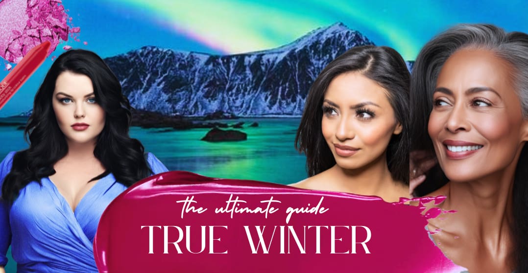
Think about it in terms of seasons, where would you fit most naturally? In the image below we can see that these two women have similar features, and even the backgrounds (the natural settings) are composed of a lot of the same hues. However, the true summer example is softer and fits most seamlessly with the softer garden image. The True Winter woman is sharper, more intense, and looks more at home against the mountains and northern landscape.
The Winter Season Contrast Levels
Winters are all higher contrast so it can be trickier to sometimes decipher the subseason, when their hair/eye/skin tones can all be quite varied.
I like Christine Scaman’s explanation of colors between the seasons when describing red. She says the following:
Similarly, we can see that Deep Winter and Bright Winter, are neutral leaning cool, which means they have some warmth seeping into their undertone and can pull some slightly warmer colors.
But True Winter is that anchor point for highly saturated colors.
Whereas Deep Winter has more darkness and some warmth.
And Bright Winter has even higher intensity and some warmth.
True Winter is cool primarily, with both darkness and high intensity as secondary/tertiary traits.
Determining if you are True Winter
As I’ve previously mentioned, draping is the best way to determine your seasonal color palette.
You can see a certified color analyst to clarify your season or reassure your assessment. But, be sure to study which system they use ahead of time, as palettes and factors vary widely from system to system.
If you’re just starting, I think it’s important to drape all the seasons (or as many as you can), because your preconceived notions may prove to be incorrect. You can see my draping guide, here.
But if you’ve been examining colors for a while and are close to landing on True Winter, then I suggest you try a targeted True Winter drape test to be sure.
Here are some colors you can try :
- True Black
- Bluish White
- Icy Blue
- Frosty Yellow (almost turning greenish but not quite, not a pastel!)
- Emerald
- Turquoise
- Cherry Red
- Fuschia
- Royal Purple
- Pomegranate
- Inky blue/black
- Blackberry
- Magenta
- Bright Periwinkle
Some tips to keep in mind while draping:
- Tie your hair back and cover it (especially if it is dyed)
- Lock your white balance or use a gray photographer square and adjust white balance after. Just take a photo with a yellow piece of fabric to see how much iPhones auto-color correct!
- Test One Fabric at a time, in front of a mirror with natural light if you can’t get photos to accurately display the color
Here’s what you are looking for:
True Winter Celebrities
Oh gosh… I struggle to decide if I should even have this section in there. Because I know these photos will end up on some Reddit forum with people arguing about the validity or feeling attacked that they can’t wear “ insert color I never said you couldn’t wear”.
Seasonal Color Analysis can take time, but it should be fun. And I get the entertainment value in guessing a celebrity’s color palette or trying to figure out why this color looked so stunning on them.
But, I would be remiss not to mention the fact that there is no “ultimate verified celebrity list” out there. Most if not all, celebrity placements are just educated guesses (and then a few very wild guesses).
To make matters more complicated, photos of these celebrities are done with full makeup, sometimes a fake tan, and a variety of different lighting and photoshop/editing/color correcting.
So, I don’t think any celebrity should be used as a data point for your PCA journey.
However, because it’s enjoyable to do… Here are a few True Winter Celebrities that most systems seem to agree on… And here are some of the colors that they shine in.
Liv Tyler
Liv Tyler is pretty much the go-to TW celebrity. She shines in all TW colors and has the stereotypical features of a True Winter. Anything too warm or light in value tends to wash her out.
Janelle Monae
I think Janelle is a great example of a POC true winter. She shines in purely cool colors and her undertone seems to lean pure cool. She can also handle the contrast combinations of a true winter.
Jennifer Connolly
In Zyla, Jennifer Connolly is actually a Soft Winter. While her characteristics line up with True Winter and I think she can pull a lot of colors from True Winter, I tend to prefer her when she lines up with the slightly softer colors from TW. Zyla’s “soft winter” encompasses her essence and vibe a bit more.
Celebrity Typing: Word of Caution
Please remember that celebrities have stylists and professionals for everything when they walk the red carpet. Also, remember that the goal of a red carpet is not always to “harmonize with one’s self” but to also stand out and make a statement.
All in all. Use celebs as a fun way to explore color analysis, but not as hard data or facts.
True Winter Imagery
The roots of seasonal color analysis were founded on how painters used colors to blend their subjects with the landscapes behind them.
This was first developed by Johannes Itten who started to realize the correlation between subject and season.
So it makes sense to describe the landscape associated with the True Winter. So often we think of seasonal color or body types as a scientific equation of hard facts. But I think it’s really helpful to feel the essence and overall impact of these systems and how they relate to you.
True Winter landscape would best be imagined through a Northern landscape filled with ice or even an iceberg. The Aurora Borealis could also be used as inspiration.
There’s a lot of power and dynamism in the imagery but it is the “strong but silent” imagery that makes it so powerful.
The contrast elements in these landscapes feel strong and clear, and the images feel majestic, like the pitch-black sky with stars that burn bright.
True Winter Keywords
The essence of a season can be an important thing to understand because you are tapping into that energy and trying to recreate it through your clothing/makeup/styling.
So while these words are not your color qualities, they do help you round out the feeling a True Winter gives off.
- Majestic
- Regal
- Sharp
- Opulent
- Quiet Boldness
- Gleaming
- Composed
- Luxurious
- Distinguished
- Impressive
- Refined
- Brilliant
Understanding Color Theory, Art, and Seasonal Color Analysis
The word harmony comes from the Greek word “harmonia” which loosely translates to “agreeing with” or “fitting in”. And our goal with our seasonal color analysis is not to look drab or not to have a color “pop”, but rather for everything to feel balanced and harmonious.
We are exploring where we fit into the universe. And I know at times Seasonal Color Analysis can try to get a bit too deep, but don’t worry I’m not going to tell you how your colors align your chakras.
Instead, we are trying to imagine what scenery and colors we would naturally fit into. Where do we look most in harmony in the world of landscapes?
Johaness Itten first started exploring this when he segmented people into yellow/warm and blue/cool and then furthered this to include light and dark.
This eventually translated to the understanding that a cool, dark, and bright person would look excellent with an iceberg or snow-covered forest in the background with the pitch black night sky. The person feels in harmony with the landscape.
It’s the understanding of the impact of what a person who fits with a misty morning expresses versus the True Winter’s majestic icebergs. You can see above my interpretations of the “natural landscapes” that fit each season, and below you can see examples of faces and how they harmonize with those landscapes.
Sometimes it’s nice to look at how this concept was applied in actual artworks. You can see below some famous artworks that use the color qualities of True Winter and the boldness they exude.
Seasonal color analysis should be a highly personalized journey that allows you to understand the relationship between you and the color(s) you’re wearing.
This leads me to the True Winter color palette, which is just a starting point for your color journey.
True Winter Color Palette
True Winters have a lot of pure pigments in their palette and they have the three primary colors in their palette (pure red, blue, and yellow).
Now if you watched my video below about determining which color a season falls into you may be surprised to see some “yellow-leaning” colors in the True Winter Palette. In the purest sense, we are looking at whether blue or yellow is being added to a color to determine if it leans warm or cool.
However, because True Winter has such pure pigments and such a majestic/strong presence you may find that some greens, pinks, and even reds have some visible yellow added to them. A touch of yellow added to the color does not relegate purely to warm seasons.
Overall your palette is striking and regal. Filled with darks like royal purple, blue-purple, and inky blue/black. And on the other side of the value scale, we find those beautiful icy colors like crystal ice blue, frosty yellow, and powerful peppermint.
Remember that this is just a starting point for your color journey and you should individually test out the colors and determine if they work for your entire style statement and style toolbox
Yellows are found in every seasonal color palette and are naturally found in our skin tones. For True Winter they will find pure yellow to be a good option. Any other yellow in their palette will be closer to the blue side of the spectrum and appear a bit more greenish than the warmer yellows of spring.
Can True Winters Wear Orange?
It depends on what system you are using to determine if orange is traditionally in your palette. For instance, House of Color has an orange in every palette.
According to Sci-Art Christine Scaman she says “Orange may be found in textile colours for the three Winters. In this season, it is sharp and bright, it is also rare”. (page 120). So while this color can work, it’s not necessarily that natural landscape harmony we mentioned previously, but can still be beautiful when worn.
My advice is to drape a high-chroma orange for yourself and see if you like it. This is your palette at the end of the day.
True Winter Neutrals
TW’s often have an easy time finding neutrals and business clothes because their color palette has such a great variety of neutral colors.
- Ice Gray
- Black
- Pure White
- Clear Charcoal
- Clear Slate
- Navy
- Royal Blue
Your gray has a sleekness to it and is not the heathered or softened gray of the summer palette. Your grays have a hard and forceful quality to them. (they are like a sword, not a misty cloud).
True Winter Worst Colors
So, ultimately your custom color palette will decide on many factors including personal preference. But generally, warm and muted colors will not make you look your best.
Can a True Winter wear Brown?
Yes, it’s just a more purple-brown than orangey brown. It looks great in the form of a print-like leopard when we have natural value contrast already within the color spectrum.
How To Style True Winter Colors
Sometimes it’s easy to get trapped in the “does this color work for me?” bubble and we forget about how we are implementing, emphasizing, and communicating with the full looks and full outfit color palette.
There is a formalness and regalness to the True Winter color palette and person. Their color use often reflects this; they thrive in value contrast within their outfits. This does not mean they only need to wear black and white to achieve this.
The TW value contrast can be achieved using neutrals like icey gray and inky blue/black or with a black dramatic look and a pop of fuschia lip color.
It is easy for TWs to default to all-black or black heavy styling because they do shine in black. However, they have a wide value range, and their styling is often best achieved when they incorporate some elements from the dark and light range.
There is a stillness and boldness within your palette and essence, so too much motion within your look can feel chaotic. I think sleekness or simple drama exudes your best features.
Make sure you have some striking elements in your look to match that impressive sophistication.
True Winter Color Use and Color Blocking
This kind of depends on the individual and their overall essence, or body type. Color blocking can be effective for most True Winters. However, you’ll want to examine how many colors are being used, and how you are breaking up the colors.
Two chromatic colors like Fuschia and Royal blue might be too high in energy for the traditional TW. But, this is not a hard and fast rule and may take some experimentation on your part.
Also, make sure your proportions are in check, and ideally one color has the main focus instead of 50/50 or a similar split.
Textures for True Winter
Texture is an important element when talking about styling, your color palette, and their effect. A soft knit texture can soften a bold color, and a highly shiny texture can create more contrast. Not to mention texture and fabric weight can drastically impact how it works with your body type or essence blend.
True Winters, luckily, can apply a wide variety of textures and fabrics to their style seamlessly.
You can opt for modern clean knitwear, smooth wool, most cotton, leather, and even velvet. When we look at the texture of knitwear, we want smoother wool not nubby or rough. Smooth cashmere is especially beautiful on you.
Businesswear or polished looks are usually easy for you to find in your color palette and include silks, wool, and cotton.
Shiny textures can also work nicely for you.
For casual pieces, you’ll lean a bit more towards luxurious and polished over playfully zany.
Denim For True Winters
Denim has become a staple in our modern wardrobes and because we as a society have become so well accustomed to it, denim outside your palette won’t feel “crazy wrong”.
However, if your goal is to get a truly cohesive wardrobe palette, True Winters look fantastic in black and dark navy denim. They can also do a true cobalt blue denim that doesn’t have any fading or wear marks.
The energy of the TW is fairly formal though, so if you’re opting for a true blue or worn-in pair of denim pants, you may feel it throws off your overall vibe.
True Winter Prints
Finding the perfect print in any season can be a bit like finding a needle in a haystack. You have to consider the overall use of colors, the emphasis points of the color, and the motion/scale of the print.
No problem? Right? Right….
Winters as an entire season tend to do well with sharply delineated prints and prints that have a bit of formality to them. We want each color to feel individual and to generally avoid any watercolor or blending effects.
In terms of scale, medium to larger prints are usually more striking on you. However, this might not apply depending on your kibbe body type or your Kitchener essence blend.
Abstract prints can be especially luminous on you and create impact without business. Overly small, and tight prints can sometimes feel too youthful or chaotic on you. And if you prefer smaller prints, try to keep them to a targeted area of your outfit to create an emphasis point instead of a full head-to-toe look.
Prints are a great way to incorporate some of your brighter, pigmented colors without feeling overwhelmed.
Overall they should add drama to your look but not necessarily too much movement. Remember you are that still evening sky ;).
It is possible that you might not be able to find a print that is completely in your season (although winters might have more luck in this area generally speaking). But it’s much easier if the print is from a sister season like Deep Winter or Bright Winter. And the more toned or warm the print is, the less successful it will be.
And if the print has a completely out-of-season color, we want it to be a smaller detail instead of a main element.
Don’t be afraid to examine the impact of the print. How does it harmonize with your body and how does it relate to your style toolbox?
True Winter Jewelry
Because you have a completely cool undertone your best metals will be platinum or silver. You might be able to pull off a truly white gold, but generally speaking, gold metals will not be great on you.
We want metals that are striking and that have a smooth, polished, and hard quality to them. It is best to avoid antiqued or brushed metals that feel softer.
In terms of jewelry shape ovals are mentioned as being perfect (Sci Art page 143). The helix is also a nice shape or a spiral. It’s a powerful shape that doesn’t get overly busy.
Because winters have an elegant and formal feel, they shine in a highly curated amount of jewelry. They choose a few impactful pieces that show off their strength and boldness.
You’ll get a lot of mileage out of large, smooth, simple jewelry that has a dramatic flair.
If you’re olive you may find yourself leaning towards gold, but overall this still isn’t your best choice.
You have a lot of jewel tones in your palette, so jewels like rubies, emeralds, sapphires, and diamonds are an easy yes for you.
True Winter Makeup Guide
Makeup can be a great way to test out a seasonal color palette because when you get the wrong lipstick color, it can be really obvious. That being said, a lot of elements affect whether or not the color works and that includes the techniques, your emphasis points, and of course the colors you choose.
Wearing the right makeup, and beginning to pay attention to the application that harmonizes best, can be a major game changer in your appearance. All of a sudden your face shines and feels enhanced by the makeup instead of like a cosplay or costume. (No hate towards people who prefer to use makeup as a transformational tool, that is of course a valid implementation as well, just different from SA goals).
I find referencing those keywords we went over in the previous section a good place to start with makeup application. But Winters, in general, really shine in makeup because their face naturally harmonizes well with the drama, so let’s get into it!
True Winter Foundation
So foundation can be difficult to find a perfect match no matter your season because there are a lot of factors at play. Just because a makeup brand says “warm” does not mean that you are warm-toned. Similarly, just because a foundation says cool does not mean it will work for you.
Often those color descriptors are generalized and refer more to the overtone of the color. You have a purely cool undertone.
The best way to find a perfect match foundation is to try them on in person with natural lighting. I found this guide to be especially helpful in evaluating a match.
If you are on the pale end of the spectrum for True Winter you will often find the alabaster or porcelain colors to be a good starting place. But your luminous and paleness has less of a rosy beige color than your Summer counterparts.
If you are an olive true winter, you will often find your foundations to have a more prevalent yellow tone to them, but we again want that greenish yellow. This can be deceptive because your yellow overtone “feels” warm, but your undertone is blue/green.
If you are a darker-skinned True Winter you might notice a blue or pink quality to the undertones of your skin. That is your coolness showing through! If you’re questioning your coolness, try a muddy/orange-brown and see how it harmonizes with you (if it looks ok, you’re likely NOT a winter).
True Winter Blush
You often have a lot of contrast within your facial features but not a lot of “natural” blush color to your cheeks. But, because you handle makeup so well the right colored blush can enhance your everyday look.
Blushes are often in shades like deep rose, plum, soft fuschia, or a clear red-violet. Whereas Dark Winter has a darker quality to their blush colors and more redness throughout, yours will have a distinct coolness in the form of a blue/red or Fuschia.
If you have an olive skin tone you might find a cherry red to harmonize better. And if you are dark-skinned a clear plum might be effective.
We want to avoid any ruddiness appearing on the skin after we apply the blush.
Some true winters are so fair that they find deeper shades of blush work better. Like this Nars Sin. But don’t be afraid of trying more highly pigmented blushes, you might be surprised how striking the bright blushes harmonize with you.
Depending on your face shape you may feel that a sharper application is best. But this is highly personal.
Bronzer: Yay Or Nay?
Generally, bronzer is a no for the winter seasons. It often leans too warm, too dark, or too muddy to highlight your best traits (even if you have an olive skin tone). It often looks separate from your face.
True Winter Lip Colors
Lipsticks and lip colors are fantastic for True Winters. You can handle the drama and it can even be toned down for more casual days.
Mature True Winters may find that they “need” lip color to help add those sharper lines into their face that can fade with age.
Remember brown leaning lip colors are not your friend. Even though certain browns can work for your clothing, those colors do not really exist in lip shades.
Here are some great colors to look for:
- Raspberry
- Plum Rose
- Soft Fuschia
- Blue Red
- Violet-Pink
- Red-Violet
- Clear Burgundy (blue-toned)
We want the color to be very clearly delineated so lip liner can help accomplish this with matter or sheer textured lipsticks. If you opt for a sheer texture just make sure enough color is visible and it’s not overly subtle or blended.
True Winter Eyeshadows
Eyeshadows for winter are usually easy to find. You can even find entire palettes that work for you (which is not the case for every season).
The important thing to note with eyeshadow however is the application. You have a wide range of values in your palette, and applying this same principle to your eyeshadow can be incredibly impactful. Whether you accomplish this through a gradient effect of colors from light to dark or you do it with textures from matte to shimmer, is dependent on your goals and preferences.
Here are some colors to look for:
- Ice Gray
- Steel Gray
- Charcoal
- Black or Black/Smoke
- Blue Black
- Dark Blue
- Silver Blue
- SIlver
- Shimmery Pure White
True Winter Mascara
Most guides will tell you that black mascara for the True Winter is the easiest and most harmonious choice. And generally, I would agree.
However, some older resources recommend matching your mascara to your natural hair color ( generally speaking, this may not be possible for a blonde or redhead).
So if black mascara is looking a bit separate from you, you could try opting for a shade slightly closer to your natural hair.
While I am not a True Winter, you can see how much the cool gray-brown highlights my coloring and the black drags down my eyes. So if you feel your contrast levels are slightly lower than some “stereotypical” TWs then this color mascara approach might be worth exploring.
True Winter Eyeliner
Eyeliner can be beautiful on a True Winter and allow your dramatic sleekness to shine. Liquid liner comes in a variety of different styles and applications, but generally, a smooth and sleek line that is not overly large will be ideal.
Pure black eyeliner may be too stark for you if you have a medium contrast level. In that case, cool graphite, inky navy, or a dark brown/black might be more successful.
Some seasons look beautiful when the color of the eye is reflected in their makeup, however, I find for winter this is not the case. If you have bright blue eyes the consistency of bright blue makeup can dull both.
A darker blue navy might create the contrast you’re looking for.
True Winter Eyebrows
You should be matching your eyebrow pencil to the shade of your brows, and not trying to “change” or darken them with a pencil.
You likely already have a strong brow shape, so the pencil is just to fill it in and give a more groomed appearance. This is especially important if you have a full face of makeup on.
Try to create natural stroke lines when using the pencil, as this will create a more natural look.
True Winter Nail Polishes
True Winter has some great nail colors to choose from. Here are some ideas to get you started…
- Essie, Push Play ( blue)
- Essie, Big Spender (fuschia)
- Essie, Cascade Cool
- OPI, Purple With A Purpose
- OPI, Bogota Blackberry
- OPI, I Can’t Find My Czechbook
- OPI, Let’s Scrooge
- OPI, Jade is the New Black
- OPI, Royal Navy
- OPI, Big Apple Red
But ultimately just remember your palettes dominant qualities and you should be good to go!
True Winter Hair Dye
We all have those horror hair-dye stories from our past…
Wait, I’m sorry- you didn’t try to foolishly go from a box red color to platinum? Oh, just me I guess ?
That being said, I know it can be so tempting to want to dye your hair or “switch up” your look. True Winters have a beautiful stoic simplicity about their looks that creates a polished and powerful look naturally. This is why highlights, balayage, or adding lightness to your color is really, really not recommended.
Now, you may be thinking well then I’ll darken my hair, add more oomph to my natural contrast levels… But this can lead to overwhelming or unnatural tones in your color. And it can be very difficult to get back to any cooler toned colors as many dyes tend to lean warm and cause brassiness.
If you want to go darker, evaluate your hair color at age 25 and shoot for darkness around that level. Opting for jet black just because you’re a TW does not mean it will work for you.
If you’re set on adding some unique color to your hair, you could try a cool red wine, bluish purple, or even red violet.
If you gray or silver early in life and aim to cover be aware that many dyes lean warm and this will disrupt your coloring. It can also feel a bit flat on you.
I’m not going to tell you to never color your hair, I know a lot of joy can be found in playing with our appearance. Just be prepared that the process to return to your natural coloring can be difficult for any cool-toned hair.
True Winter Outfit Ideas
Your style is a recipe that you build with your preferred ingredients and flavor profile. It is important to remember that each person is on their own authentic style path and that blanket advice will not work for everyone.
Experimentation and honing your preferences are key to a style you feel amazing in.
I wanted to include some True Winter outfit ideas to give you a visual example of how all of this information might manifest in an outfit. And for you to see some of the different principles we talked about in action.
But, please don’t get too hung up if these aren’t for you or if you don’t like the way I used the color palette. Each palette is exactly that, a palette for you to paint your canvas (or style) with.
So, take these outfits as some base inspiration. You’re the expensive, regal season so don’t be afraid to embrace that 😉
Check out my seasonal color capsule wardrobes and outfit ideas here!
Winter Perfume Ideas
So I’m not saying your coloring or even essence should dominate your scent choices. But if you’re curious Winter perfumes are generally recommended to be on the dramatic side (this makes sense, right?).
Stronger flower scents and sweeter scents can be especially effective. The spiced or light flower scents are more for Autumns or Summers respectively.
Winter Glasses
Choosing the right pair of glasses goes beyond seasonal color analysis and is heavily dependent on your face shape and overall essence.
{ultimate guide to face shapes including glasses selection!}
That being said, choosing a pair of glasses in the preferred metal (like silver) can be a great place to start.
You may also lean into black frames since black is in your color palette. However, be mindful if the thickness of the frame seems to distract from your features. You don’t want to overwhelm the polished and sophisticated coloring you have.
You could also try matching your glasses to your hair color if you want something simple and harmonious.
Tips for Shopping: True Winter
The resurgence of style systems and seasonal color analysis no doubt speaks to a society that is tired of making shopping mistakes and overbuying pieces they don’t like.
But, on the flip side, we can also fall in the trap of acquiring new information (ie you’re a True Winter) and then look at our closets and decide “everything must go”.
But, even if you’re been professionally analyzed as a True Winter, I don’t want your closet strategy to be “let’s just start from scratch”. Authentic style is all about getting to know yourself and testing out what you love and what you think you love.
And, if you’re wondering where to begin with you closet, check out my video and free worksheets on how to do a successful closet audit (no, it’s not just decluttering tips!).
We want to slowly progress and get to know our palette and how we like to use color in coordination with our other “style toolbox” elements.
But here are a few tips to shop with your seasonal color analysis in mind.
Know your colors: This is where understanding color theory and your basic color qualities can be essential. It’s great to be professionally analyzed and be “sure” of your season. But if you can’t apply that knowledge when you’re out shopping or determine how close a color is to your preferred palette, it really won’t be that useful. Accept this is a slower process than you might like and try buying a True Winter fabric swatch fan in the meantime.
Icy Colors: Finding icy colors (the lighter colors in your palette) can be tricky, especially when shopping online. Pastels and icy colors are different! Icy colors are the lightest in the spectrum and only have white added to them. If they feel soft, have any added gray, or would look nice for a baby shower, you’ve probably got the wrong color. Your icy colors still have some “bite” to them.
Trust your instincts: Family, friends, and store employees all have the best intentions. But their opinions are colored by their own preferences and they may not know anything about color or SA. So honing your own style preferences and color use is critical. Accumulating a basic fashion knowledge base (like color anlaysis) is fantastic, and can lead to better future style choices but just remember to connect to your fashion instincts as well. Your pov is key!
Shop slowly and under the right circumstances: Having a great shopping strategy is key to building a closet you love and not wasting money on clothes that will never get worn. I encourage you to wait for those A+ pieces and not just buy “good enough for now”. Mindlessly scrolling and being influenced on this or that piece is where great style can fall apart. You need to know your clothing inventory and you need to avoid those single event impulse purchases. Running into a store for a dopamine shopping fix because you need a new outfit for your date later is not likely to lead to your “perfect piece”. So, try to be patient on this exploration and limit your purchases.
Keep the bigger picture in mind: Sometimes we get so laser-focused on the right color we forget to check if we need the item itself or if it works with our entire outfit. Your entire outfit needs to work holistically to communicate what you want and who you are. So don’t drive yourself crazy if your shoes are a little muted for TW or that blouse could be a bit more pure in tone. I encourage you to take daily outfit photos so you can reflect on your style choices and have style data to make future choices more astutely.
I’ve tried the colors and I hate them… What now?
Ok , so there can be a few reasons you’re not vibing with your season.. but the first thing I need to mention is the fact that your season may not be correct.
Even if you’ve been professionally analyzed, you can come out of there with an incorrect season.
And if all you’ve done to determine your season was use an app, there is a strong possibility you have an incorrect answer.
So, if you’re really struggling with the palette, try draping and exploring other seasons. Stereotypes are rampant in seasonal color analysis, and it’s best to explore your placement slowly.
The next thing to consider is the emotional ties we have to color and how we see ourselves. When we wear “our” colors, we can feel a bit more vulnerable. The armor we had of people noticing our outfits first is suddenly gone. Or the mask that we used to hide our truest personality might feel like it’s been ripped off.
I’m not trying to get too deep with your or become your therapist, but it is completely normal to have an adjustment period of getting used to your colors and getting used to seeing yourself in your colors.
And as I mentioned, color is only one part of your style toolbox. So make sure you are using it in a way that reflects all of your style priorities and not being overly rigid to guides like this one. This is an overview of things to consider for True Winter, it is not a rule book.
I’m bored of these colors, what should I do?
It’s ok to step outside your color palette once in a while. It’s up to you how you use each piece and if you decide to borrow from other seasons.
The easiest colors to integrate are probably going to be your sister seasons Bright Winter or Deep Winter.
However, you may find adding in a few summer colors can be successful too.
It’s also ok to prioritize joyfulness or a certain vibe at times. Maybe you have an emotional attachment to that rust red sweater your mom bought you. Wear the sweater if it makes you happy!
Or maybe you want to feel ethereal and go lower contrast with your color combinations. Try it out!
The only way you’ll further progress your use of style is if you experiment, collect the style data, and then evaluate how you can tweak it moving forward.
If you’re in a rut, experimentation can lead to some truly new and unique results.
The goal is never to create perfect TW clones out in the world, but rather how this information can further you on your own style path.
Now, the length of these articles never cease to amaze me and in true Gaby fashion, each article I write seems to get longer and longer. But, I do hope this has given you a new perspective on how to use color in your style, and it sets you up on a journey to discover a truly authentic style.
You’re a regal beauty, don’t be afraid to show it.
Let’s find strength through style.
Thanks for this amazing breakdown, and even moreso emphasizing that there is no seasonal “box” – draping is the key. As a naturally blonde TW it can be frustrating to read over and over that I’m somehow tricking myself and don’t actually exists. But I’ve done very careful draping repeatedly, and prior to draping I actually wore Summer colors for well over a year (I looked either harsh, drained, or sunburnt in every photo). I’m sure your color series will save someone else from falling victim to the “box”method of SCA. My biggest challenge now is integrating my Essences. I have Ethereal first (followed by Romantic, Dramatic, and some Classic, which all work with TW). The Aurora Borealis and that Georgia O’Keeffe painting you featured are great inspiration. I tend to lean into monochromatic most, especially because of being a Kibbe SD. But I’d like to branch out a little! Thanks again for being so thorough and reasonable in your breakdown.
I’m so glad you found inspiration in the painting, it’s so beautiful!! And I’m glad you found the article re-affirming!
This was an AMAZING post… I LOVED IT! I was just recently professionally analyzed and I always thought I was a deep autumn (so I was wearing a lot of cream, beige, brown and rust that never made me feel like really good) and I ended up with the results that I am actually a TW and I was like: thaaatss whyyyy I use to think that I did looked good in black hahaha… And this post helped me soooooo much!!! The information here in invaluable! Thank you.
I’m so glad you found it helpful and congrats on finding your season- that’s such exciting new information to have and will really make you love your style!
My first self-analysis was Dark Winter (according to pure theory I meet quite a few DW traits), it doesn’t make me look bad nor do I dislike the palette but I felt that they were “funeral” colors ?, and on top of that something didn’t fit: the ochre and golden jewel tones of DW fade on my skin, they don’t look good at all and I understood why in this article, only trial and error gives us the answer as you well mention. What a great find it was to have found your blog, thank you very much ? a true winter just discovered ?
Love these, haves loved your content for months. When will you do light Spring, Light summer, or True spring?
I know these must take a long time. That’s guides are very thorough. But I’ve been anxious to read your take and tips for what I’m pretty sure is my season (or one of my sister seasons).
I would love to know how to dress as a light spring. Whenever I look at light spring colors they make me think of an Easter party at a country club which is not my vibe. Even Taylor swift (common celebrity light spring) never wears those colors anymore.
Yes I do plan to do all of them- it’s just been taking longer because I”ve had a lot of projects going and I’m becoming certified in two different systems for color analysis haha. But yes, they will definitely be made. I think light spring has some beautiful neutrals that don’t need to feel easter basket at all! I’ll try to add a section on this when I write it
@Gabrielle Arruda, thanks. 🙂 I’d Really appreciate that. Looking forward to it
Thank you so much for this guide. love it. Just wondering if you could do a guide for neutral leaning cool or warm, please. I was analyzed as neutral, leaning cool, and a True Winter. I am a bit confused about how I can be a True Winter if I am neutral. I am pretty positive that my season is winter, as black, emerald, and cobalt are amazing on me, but I wonder if I would be more of a “deep winter”.
Your guides are the best. FYI, I tried to look for the Sci-Art book, and it seems out of stock. Too bad as I would have loved to buy it.
I’m sorry to hear it’s out of stock! It’s a great book! I’m actually getting trained in Sci-Art certification from Cristine Scaman this month, so I”m very excited to further my knowledge on the topic!
This was amazing! Especially the outfit- and the lipstick examples! I am torn between if I am true/cool winter or Bright/clear winter. Your dark winter article helped me rule that out since I in a daily basis don’t think I can handle that much of depth and slightly moderate to mínimum chroma. ☺️ Looking forward to bright winter (especially the outfit and lipstick part) ?
I’m so glad you liked this! I’ll be working on Bright Winter soon (just a bit behind since I’ve been working on my sci/art color certification)
Hi Gabrielle, thank you for your work on this. I was professionally draped as a true winter but I find that I look awful in black. It looks too severe on me and makes my brown hair look out of place against my skin. Is it possible to be a TW and not look good in black? I find that sky blue and cool purples look good. FWIW I’ve also tried verifying my draping result with photo consults and have been told bright spring.
Yes, it can be possible that black isn’t your best neutral, as all palettes have various neutrals. I think that if you got an in-person drape that is usually the most accurate. Depending on the system you should have ‘seen’ why TW was the obvious result. The person who trained me Christin Scaman has a lovely youtube series about each seasons best black and white, so you might find that helpful
I have been draped as a True Winter and was told that this group usually looks better in dark navy, rather than black (although black is one of their colours as with all winters). I have coats in black and navy, because these are often warn with other colours underneath and/or in an outfit, but a black dress overpowers me slightly and dark navy looks so much better.
Navy is fantastic for True Winters!
This is is such a fabulous blogpost! Thank you so much for sharing all of this information and putting in so much detail, greatly appreciated, thank you!! I hope you have a gorgeous day!!
Thank you! I’m so glad you enjoyed it!
Hey Gaby, can you make a guide about Bright Winter next?
I am working on Light Summer now, and then Bright Winter! But I promise it will get done!
Yes please!!! I’m so looking forward to your Bright Winter guide!!
Thank you so much for incredible and generous expertise!!