Seasonal Color Basics: Color 101
The Basics of Seasonal Color: How Hue, Value, and Chroma Shape What We Wear
Color is often treated like a final detail—something we tweak at the end of a shopping trip or use to “add interest.” But what if color wasn’t just the garnish, but the entire foundation? What if it was the thing that carried emotion, harmony, and clarity before shape or trend even entered the picture?
That’s where seasonal color analysis begins.

At its heart, it’s not about rules. It’s not even about colors, really. It’s about perception—how we absorb and reflect beauty, how we express ourselves through light and form. And like any deep skill, it requires both practice and intuition. But even a foundational understanding can help you see yourself, and your wardrobe, in a completely new light.
Let’s start with what color actually is—and why we never see it in isolation.
We may earn a commission from you clicking a link below. And as an amazon associate, we earn on qualifying purchases. Full affiliate policy, here.
Color Isn’t a Thing. It’s a Reaction.
Color doesn’t live inside your clothes—it lives in your eyes. What we perceive as “color” is actually light, reflected off surfaces and interpreted by the brain. When pure white light hits an object, some wavelengths bounce back, and others are absorbed. If all are reflected, we see white. If none are reflected, we see black. If only red is reflected, we see red.
That means color isn’t fixed—it shifts depending on lighting, background, and context. You’ve probably seen this in action: a lipstick that looks great in the morning turns muddy in a restaurant. A gray sweater suddenly feels green next to your friend’s coat. This isn’t just your imagination—it’s science. And when it comes to clothing, this fluidity can either flatter you—or fight you.
Simultaneous contrast, as explained by Johannes Itten ( a master of color!), is the optical phenomenon where a color’s appearance is altered by the hues that surround it. The eye instinctively seeks balance—so when a color is placed next to another, we perceive it in heightened opposition to its neighbor
In the top image, the orange square appears more vivid and cooler on the deep violet background, while it looks softer and more muted on the beige. The second image reveals that both orange squares are exactly the same—your perception shifts because the surrounding colors influence your eye’s interpretation. This demonstrates how color doesn’t exist in isolation; it’s always in conversation with its context.
Understanding how color behaves in light and space—and in contrast—is the first step in using it well.
Understanding Hue, Value, and Chroma—And How They Relate to You
Every color has three dimensions, and understanding the difference between them is essential to seeing why certain colors flatter you and others don’t. These dimensions—hue, value, and chroma—combine to create the full personality of a color.
Munsell was the genius behind this idea, the idea that we could categorize color in a consistent way and understand what a certain color is made of by using these three color qualities. While you don’t need to deep dive into color theory to use your seasonal palette, understanding how his 3-D color wheel works is extremely beneficial.
1. Hue – The Color Family
Hue is what most people think of when they hear the word “color.” It tells you what family the color belongs to: red, blue, yellow, green, etc. When someone says they love “teal,” what they’re describing is a specific hue (blue-green). But hue alone isn’t enough to determine whether a color works for you. Two people can wear blue—but one might need a green-leaning teal while the other needs a violet-leaning periwinkle. The direction of the hue matters.
2. Value – The Lightness or Darkness of a Color
Value refers to how light or dark a color is. A pastel pink has a high value (it’s light), while a deep burgundy has a low value (it’s dark). Your natural coloring has a value range too—based on your skin tone, hair depth, and eye clarity. Some people look better in lighter colors that mirror their delicacy; others come alive in rich, shadowy tones that echo their natural depth.
3. Chroma – How Pure, Clear, or Muted the Color Is
Chroma refers to the intensity or purity of a color. Is the color vibrant and bright (high chroma)? Or is it soft, dusty, or grayed-out (low chroma)? A lemon yellow and a mustard yellow are both yellow, but their chroma levels are vastly different. And again—your natural features have a chroma range, too. Some people glow in vivid, punchy colors. Others are overwhelmed by them and need a more softened, nuanced palette.
To understand the color changes, review the image below. Tints and shades are a value change (added white or black). Adding gray is a Chroma adjustment.
What Seasonal Color Analysis Does
Seasonal color analysis isn’t about boxing you into a fixed list of colors—it’s about identifying the range of hue, value, and chroma that’s most harmonious with your natural coloring.
You already have a natural balance of these three dimensions. When you wear colors that fall within that balance, you look radiant. Your eyes become brighter. Your skin tone looks even. You need less makeup. You look more you, without needing any extras.
The goal of seasonal color analysis is to find:
- Which hue directions you can wear (warm or cool or a neutral season? red-violet or red-orange?)
- What value range supports your contrast level (light, dark, or somewhere in between?)
- How much chroma you can handle (are your best colors bold and clear—or soft and muted?)
When all three align, your clothing and your features no longer compete. They collaborate.
Warm vs. Cool: Not Just About Temperature
When we say a color is warm or cool, we’re not describing how it feels to the touch—we’re talking about its relationship to yellow and blue.
- Warm colors lean toward yellow and red. Think sunbaked terracotta, goldenrod, coral, and cream. They evoke sunlight, earth, heat, and vitality.
- Cool colors lean toward blue and violet. Think sapphire, icy pink, forest green, and charcoal. They evoke moonlight, water, quiet, and stillness.
But it’s not as binary as it sounds. Every hue contains a spectrum—there are warm versions of traditionally cool colors and cool versions of traditionally warm ones. A green can swing golden and olive (warm) or seafoam and mint (cool). Red can lean orangey (warm) or bluish, like cranberry or wine (cool).
Your natural coloring also leans warm or cool—and often subtly so– hence Kathryn Kalizs’s contribution of neutral/warm and neutral/cool to seasonal color. Some people have peachy undertones in the skin, or gold in the hair. Others have skin that looks almost gray-blue in the right light, or eyes that flash steel instead of amber. What looks radiant on one person can look dull, washed out, or even sallow on someone else—not because the color is bad, but because it’s fighting their natural coloring. We get the Christmas tree on the beach effect. It may be novel and interesting, but the two colors are not naturally supporting each other. Look at how flat and lifeless the evergreen tree green looks next to the warm sand and light sky.
This is why two people can wear the same white top and have completely different experiences. On one, it glows like moonlight. On the other, it looks a bit chalky or stark. It’s about whether the color is mirroring what’s already present in you.
Nature Knows Best: Where Color Harmony Begins
We often search outside ourselves for style inspiration—runways, trend reports, influencers. But one of the most powerful tools in seasonal color analysis is already living within you and learning to see yourself in new light, and with new power!
Your natural coloring is a pre-made palette. It has a undertone- much like a painters wash – that sits below every part of your coloring (hair, eye, skin, etc). It has texture and movement. And when you wear colors that echo those natural qualities—your skin undertone, the clarity or softness of your eyes, the lightness or richness of your hair—something clicks.
You don’t look “styled.” You look settled. Like you belong in your clothes without trying.
This idea isn’t new. Painters have long studied how colors in nature blend effortlessly—how a single wildflower contains tones that match its surrounding leaves, shadows, and soil. Your body is no different. Your hair might repeat a tone in your freckles. Your eyes might carry the same cool depth as your darkest lash line. These aren’t accidents. They’re the blueprint.
Color harmony means wearing colors that respect that blueprint. They draw attention to your features, not your outfit. They make your skin look smoother, your eyes clearer, your whole presence more grounded.
And best of all, you don’t need to guess why this one top worked but that other jacket didn’t land. Seasonal color palettes can be a helpful map to find the answers (but it doesn’t have to be rigid either!).
What Your Coloring Communicates (and How Harmony Actually Works)
Harmony isn’t about matching your clothing to your eye color or only wearing things you “like.” It’s about visual proportion—wearing colors that naturally support your features in a balanced, responsive way.
Think of it like curating a gallery: your face is the artwork. The colors you wear are the frame, the lighting, the wall space or the stand. A giant marble pillar with a tiny teacup-sized painting feels off. So does a massive painting on a dainty side table. The goal is scale and resonance—support that feels intentional.
Your natural coloring has a built-in visual energy. Maybe it’s soft and misty. Maybe it’s crisp and high-definition. Maybe it carries weight and shadow. The colors that work best on you will share that same scale of impact and the same color qualities.
- If you have “softness” as your trait—low contrast between skin, hair, and eyes, gentle transitions—you’ll likely find that muted, blended colors make you look elevated and cohesive. But if you wear sharp, neon tones, they can dominate you. The pillar overshadows the artwork.
- If your coloring has clear contrast and intensity, then you need colors with presence. Soft pastels might wash you out—not because they’re inherently bad, but because they don’t meet your energy. In this case, it’s the artwork overpowering the pedestal.
- Please note that “contrast” cannot be judged by a single photo and people who might appear soft (myself included) are not necessarily a soft color season. You might come fully to life (like me!) in brights.
Many people thought I was a Summer or Autumn (myself included) before I was trained by Christine Scaman of 12 Blueprints, and we determined my season to be Bright Spring. If you’d like to see some photos of my drapes and understand why I am, in fact, a bright spring and not an autumn, you can review the video below.
When color is in harmony with your own palette, everything aligns: your features feel more defined, your skin looks glowy, and your presence is amplified AND LIFTED.
It’s not about drama. It’s about proportion. Color should feel like it belongs in your orbit—not like it’s trying to dress you up, tone you down, or do all the talking.
Seasonal Color Theory: The Big Picture
Seasonal color analysis divides people into four main seasons (and then further in the 12 season system like Sci\Art)—Winter, Spring, Summer, and Autumn—each based on undertone (warm vs. cool), value (light vs. dark), and chroma (bright vs. soft).
Here’s a quick breakdown:
- Winter: Cool, high contrast, clear colors. Think icy pinks, bold black-and-white, and true jewel tones.
- Summer: Cool, soft, and muted. Think dusty rose, lavender, soft navy, and misty pastels.
- Autumn: Warm, rich, and earthy. Think olive, rust, camel, and golden browns.
- Spring: Warm, light, and clear. Think peach, turquoise, and coral.
- Please remember each palette has a HUGE range and these colors are just some basic exemplary picks, but don’t feel limited. If you’re an autumn who hates brown, no worries- you have a beautiful, diverse palette at your disposal.
Each season has a unique relationship to hue, value, and chroma. Once you identify your season, it becomes much easier to select colors that naturally support your features.
Color Relationships: More Than Just Matching
Great style isn’t just about finding your “season”—it’s about how you use color and apply it to your own style lens.
Let’s look at a few core types of color relationships and how they work:
1. Self-Harmony
Self-Harmony means wearing colors that directly reflect your own natural palette. If you’re a Soft Summer, that might look like wearing a heathered blue-gray that matches your eye color or a soft rose that echoes the undertone in your lips. The effect is subtle and cohesive—you don’t look like you’re “wearing color,” you just look radiant and at ease. These outfits often feature tonal blends and low contrast, and they work especially well for those with delicate, blended features. It’s a strategy that reinforces your inherent coloring without introducing strong shifts. David Zyla’s system seems to reference this approach.
2. Harmony by Dominance
Harmony by Dominance, on the other hand, focuses on visual structure within your palette. You’re still wearing colors that flatter you—but one leads, and the others support. Say you’re a Bright Spring and you wear a dominant clear turquoise blouse with accents of coral in your earrings and lipstick. The turquoise sets the tone and grabs attention, while the coral offers lively contrast—but both are still in harmony with your season. This approach allows for more contrast and intentionality in how you build an outfit. It’s especially helpful for high-chroma or high-contrast seasons (like Winters or Brights) who can carry a bold central color and want to experiment with styling dynamics.
3. Analogous Harmony
These are side-by-side colors on the color wheel—like blue, blue-green, and green. This approach creates visual flow and feels gentle and cohesive. Any season can apply these techniques within their palette.
4. Complementary Balance
These are opposite colors—like red and green, or violet and yellow. When done right (usually with one dominant and the other used as an accent), this creates high energy and contrast. It’s bold and eye-catching.
Any seasonal color palette can do their version of complimentary colors. Soft Summers might do cranberry with deep teal, while bright spring might do kelly green with poppy red.
5. Triadic Balance
These are three equidistant colors on the wheel—like red, yellow, and blue. When matched in similar value and intensity, they feel vibrant and playful. This often creates a more high energy look.
Light Changes Everything
One of the core truths of color analysis is that color is not fixed. You don’t see the color itself—you see the light it reflects. That means the same fabric can look different from one moment to the next depending on where you are, what time it is, or even what’s next to it.
This is especially important when evaluating how colors interact with your own coloring. The lighting in your bedroom mirror might be warmer or dimmer than you think. Office lighting might drain the life out of a lipstick that looked fresh in daylight. These changes aren’t imagined—they’re optical. Your brain is constantly recalibrating the color based on the environment.
This is why color analysis must be done in full-spectrum light (CRI above 90). Only in that condition can we accurately compare how a color interacts with your undertone, contrast, and clarity. Now someone might say, but that’s not the light I’m living in, so why should we use that as a standard? Because finding your seasons is like a color experiment, and we need the controls (the lighting, the drapes, the environment) to finalize your palette. As you will see below, no matter the lighting, the right color underneath you will continue to support you. But if we test you without stable and reliable controls, our experiment is flawed and our results cannot be trusted. Hence, we need the right lighting, with color accuracy and the full view of light spectrum available.
This testing allows us to see what colors naturally support your features- that give you lift, definition, and a “fully finished piece of artwork” ie your face. Because when we support our “artwork” ie- our face- no matter the lighting conditions, we will have that same lift and brightness to our features. It would be like moving the right artwork with the right base to a new room, you might not see the artwork as clearly in a darker or dim room, but the artwork itself would still feel supported and in proportion with its base.
Color is always relational. It shifts based on its neighbors, its surroundings, and—most of all—its lighting. If you’ve ever taken a garment outside and gasped at how “off” it looked, you’ve seen this in action. Once you know it, you’ll never unsee it.
So you may be thinking, then what’s the point? If the color I’m wearing is ALWAYS changing, then how can a palette even be helpful. Because of simultaneous contrast and findng those colors that are the RIGHT support for you, no matter how the color is perceived, it will have the same “glowy” effect and support on you.
Notice me in my Bright Spring green drape in two very different lightings, same natural support, definition, and effects we are striving for. While one lighting is ideal, we still see the same lift and definition in the lower light, even if all the colors look different. I think my cheekbone and jaw have equal definition and lift with the BS green drape regardless of the light source. (And yes, those are the same green drape!).
Why Some Colors Age You (And Some Don’t)
There’s a myth that only young women can wear bold colors. In reality, it’s not about age—it’s about your color palette.
Bright red, for example, can look stunning or off depending on its undertone and intensity. A muted brick or a deep wine might do the work of red without overwhelming the skin. With more youthful looking skin you just might have not noticed the negative effects of the bright red lipstick that was actually not in your season.
Harsh color contrast can exaggerate fine lines or discoloration if you’re not a Bright season or high contrast season. Whereas the opposite can happen, a muted lipstick on me (a bright spring) ages me and makes my face look heavier and dull.
It is true that as we age, our coloring can soften, but generally it is agreed that your season will not change. However, how you USE your season may shift with time. A true winter might find that the true red lipstick needs a full face of makeup to feel in balance later in her life, and that a medium cool pink lipstick works better.
Color and Shape: The Visual Weight of Color
Colors don’t just express mood—they affect how we perceive size and shape.
- Warm and light colors advance—they appear closer, larger, and more noticeable.
- Cool and dark colors recede—they make areas look smaller or further away.
- High-luminosity fabrics (like satin or sequins) make areas pop.
- Matte, shadowy textures diminish and soften.
This is why many people wear darker colors on areas they want to de-emphasize—and why a well-placed warm or bright accessory (like a scarf or earring) can bring attention exactly where you want it.
To learn more about this, check out my article on texture + color + light perception here.
What About Black?
Black is timeless. But it’s not neutral for everyone.
Because of its depth, black works best on individuals with high contrast, clear coloring, and cool undertones (typically Winters). On someone with low contrast or warm coloring, black can drain the face or create a stiff or frozen appearance (almost like they’ve gotten too much botox!).
If black is too harsh for you, try charcoal, espresso, deep navy, or a grayed eggplant. Every seasonal color palette gets their version of “black”, so don’t feel like that neutral is off the table if you’re not a winter. These can still function as wardrobe anchors—without fighting your natural palette.
You can see below that suspected Light Summer January Jones looks beautiful in black (she’s just a beautiful woman), but it doesn’t compare to her coloring in the charcoal gray. She looks more radiant, lifted, and fresh in the gray because it doesn’t “overpower” her. I hate to use the word overpower, because I think the internet collective has become fixated on it, and that bright colors in general are more rare in the style zeitgeist, so most any “bright” will be claimed to overpower someone… when in fact it does not. But, it was a fitting word choice in this situation.
The Psychology of Color: Why It Matters Emotionally
Color carries meaning, whether we intend it or not.
A cool blue-gray outfit says “calm, introspective, composed.” A vibrant coral says “warm, lively, spontaneous.” Neither is better—they just speak differently.
When your clothing color aligns with how you feel (or want to feel), it supports your presence. It helps others see you clearly. And when color contradicts your energy or message, it can create confusion—even if the outfit is beautiful on its own.
This is why color analysis is not just visual tool, but it can also be an emotional one. It’s about congruence. Your clothing becomes an extension of your self-expression.
Color Is a Language. Learn to Speak It Fluently.
The biggest misconception about seasonal color is that it boxes you in. In reality, it should be freeing you. It hands you a set of tools to build clarity, consistency, and freedom in your wardrobe. And, to learn when and why you might want to go against your palette (which is ok too!).
When you understand your seasonal color palette, you stop trying to fit into trends and start creating visual harmony that feels intuitive and powerful. For instance, I knew that when butter yellow became a thing, it was not going to be a trend I would partake in.
You gain the ability to experiment on purpose. You start to understand why something flatters you instinctively, and how to recreate that harmony again and again. Dressing becomes less about trying to “get it right” and more about choosing what supports your message.
And you don’t have to get it perfect. Color, like music, invites improvisation. You can start with a note, an idea, a lipstick, or a vibe, and build from there knowing HOW the colors are going to interact and support you.
Because color isn’t decoration. It’s design. It’s self-knowledge. And when used with awareness, it’s one of the most deeply personal forms of expression we have.
And, while I could nerd out on color for probably another 10,000 words, I’ll stop here. Welcome to the basics of color analysis. 😉
Thank you for this article. I am a soft autumn and literally GLOW in the soft autumn palette. But I am a mother to three small children, and I live in a mountain town, and the color black is SO FUNCTIONAL. It doesn’t show stains (kids and dirt and mountain living) and it’s readily available in all fashion lines. I try to balance with some gold jewelry but honestly, what’s a girl to do. Open to any and tips from my fellow light/muted season folks!
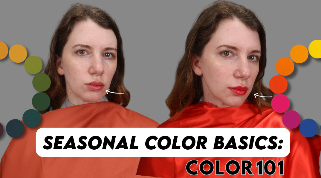
a great article, as always! I will say that I sent this to a few people though and the thumbnail of you wearing orange with a grey background makes it look a bit like you’ve been arrested…
haha fair! i should have chosen a different color
Another very helpful and insightful article! You have provided thorough explanations to questions I have pondered after being analyzed a spring rather than a summer. I will need to read this a second time for full comprehension.
I’m so glad to hear this!
Hey Gabrielle!
I really enjoyed the article and can definitely see the “lifting” effect that the spring colors have on you.
But I’m wondering if the “lifting” is something to look for the other seasons, too. Especially the muted seasons – or if there are other aspects that are more important. Like a smooth skin or reduced shadows.
Many greetings from Germany!
Lifting is something we want to see with any season!
This was interesting. I definitely feel like the color psychology is something I’m still working with. I feel like I resonate with the color moods of Deep Winter, True Winter, or Deep Autumn than I do with My real color season True spring. The “spontaneous, energetic, and sunny” feelings of spring don’t resonate with my personality. I still want to appear more sophisticated , regal, and calm like the deep seasons. However, I still don’t want deep colors to age me. Any advice how to not look old or sickly in deep color seasons, or should I just learn to accept my color season and the associations with warm spring colors?
I am a true spring myself. I also find the true spring colours can feel very bright. If you want a more sophisticated mature effect, opting for a true spring navy, or true spring brown might help. The true spring neutrals are very nice and will work in helping you feel less like you stand out. Or just wear the colours you want, with the knowledge that you may need more makeup than you would in true spring colours! As well, I think it’s not entirely about colours but also about how you carry yourself as a person.