Seasonal Color Analysis for Men: Soft Summer
Imagine you’re standing in a gallery looking at a beautiful painting. The only problem is the lighting is flickering, it’s fluorescent bulbs, and feels more akin to a police interrogation than a well lit museum showing. Well, that’s kind of what happens when you wear the wrong colors. You’re obfuscating your best features, making your true coloring dull and lifeless.
Most of us have spent years shopping in that “off” lighting. We buy the “universal” black blazer because we’re told it’s a staple or a crisp white button-down because it’s “classic” only to look in the mirror and wonder why we look tired or sallow. If you’re tired of those “looks like you could use another cup of coffe” remarks from your co-worker, I suggest you continue reading.
Seasonal Color Analysis isn’t about placing you in a restrictive box or giving you a list of forbidden items. Think of it as tuning the frequency. Every one of us has a natural color story written into our skin’s undertone, the spark in our eyes, and the pigments in our hair. When we dress in harmony with our clothing, we are essentially mimicking that natural palette, which creates an enhancing visual. The visual noise around our face disappears. Our skin clears up, our eyes sharpen, and people finally see us before they see our sweater.
Now, the fundamentals of color analysis are rooted in color theory and the three color qualities (noted by Munsell), so if you really don’t know where to begin, I suggest starting with this article first. It will give you a more objective understanding of what we are looking for in color analysis and the preliminary concepts it’s all based on. No, it’s not a woo woo thing, and I promise it does not relate to your astrological placement.
And the effect can be striking! Instead of following trends or shooting in the dark for the right color suit, you’ll have a foundational palette that makes shopping and wardrobe curation easier. And isn’t that what we all want? An easy wardrobe that highlights our most authentic selves?

So what the heck is Soft Summer?
Maybe you’ve fallen down the rabbit hole of seasonal color analysis, or your partner has been talking your ear off about color qualities and harmony…So you finally decide to google it. Well, I’m here to help.
Soft Summer belongs to the Summer family of seasonal color analysis and is defined primarily by softness, or low color saturation. Colors are muted rather than bright, sit within a medium light-to-dark range, and are cool overall but gently warmed by Autumn influence.
In personal color analysis, softness does not mean pale, faded, or weak. It refers specifically to chroma: the amount of pigment relative to gray within a color. Soft Summer coloring harmonizes best with colors that share this lowered intensity.
Low-saturation colors still carry visual presence, especially when they mirror your natural coloring. When harmony exists between person and clothing, the overall appearance becomes balanced and cohesive.
A Soft Summer man often appears most natural in colors that feel blended, refined, and moderate rather than sharp or high contrast.
Curious how the Soft Summer palette, characteristic, and outfit-building works on Women? Check out my Soft Summer: The Ultimate Guide here. You may find the visuals equally helpful to understand the larger concepts that you will also apply!
Understanding Soft Summer Coloring in Men
Soft Summer is a Neutral Cool Season derived primarily from True Summer with influence from Soft Autumn. This relationship introduces a slight warmth without removing the season’s fundamentally cool character.
The three defining color dimensions are:
- Soft (low chroma) which is your biggest priority!
- Medium value range
- Cool-neutral temperature
Soft Summer occupies the quieter rhythm of the Summer palette; it is comparable to summer colors viewed in shade rather than bright sunlight.
Transitions between skin, hair, and eyes tend to appear gradual rather than sharply contrasted. Because of this natural blending, clothing that introduces abrupt contrast can disrupt harmony, drawing attention away from the person and toward the garment.
Learn the basics of seasonal color and how hue, value, and chroma shape what you wear in this article, Seasonal Color Basics: Color 101.
Why Traditional Menswear Often Conflicts With Soft Summer Coloring
Many conventions of modern menswear emphasize contrast:
- black suits
- crisp white shirts
- saturated athletic colors
- sharply defined color blocking
Soft Summer coloring functions differently. These colors naturally create softened visual edges, where transitions appear gradual rather than sharply separated.
When high-contrast garments are worn, clothing may appear visually dominant or harsh. This effect is not a matter of personal taste but of color interaction. We end up paying more attention to the clothes rather than the face of the individual.
Bright or highly saturated colors are often chosen to communicate strength or authority, yet excessive brightness can appear demanding compared to harmonious soft colors.
For Soft Summer men, refinement rather than intensity produces the strongest visual presence.
I want to be clear that your colors are not “pastels” and soft colors! There is a huge range to your palette and your palette includes your own versions of lights, brights, neutrals, and darks. So this is not about dressing you in a powder blue suit if that’s not your jam. Rather it is about subtle swaps. For instance, the above soft summer white is more of a softened oyster white. You can see the subtle shift from the pure white of the winter season.
Confused with fashion principles and jargon? Check out these Fashion Fundamentals videos.
The Soft Summer Aesthetic for Men
Soft Summer colors are often described using imagery drawn from nature:
- fog
- rain-softened landscapes
- weathered stone
- muted water reflections
These metaphors reflect how the palette behaves visually. Colors blend rather than compete, creating calm cohesion.
Soft Summer presence reads as composed, grounded, and quietly confident. In clothing, this translates into an aesthetic that feels intentional but understated.
The goal is not softness in personality or styling, but harmony between natural coloring and garment color. Think of it like you’re blending into nature instead of being the Christmas tree on the tropical beach. While that combination may be novel, we can see that those are not naturally occuring. The effect is actually that the evergreen tree looks weaker and more drained next to the tropical beach instead of say, in the PNW.
Best Colors for Soft Summer Men
Soft Summer colors are more colorful than many expect. The palette includes a wide range of colors, so don’t be fooled thinking you have to wear dusty lilac or ballet pink!
Neutrals for Soft Summer Men
Wardrobe foundations work best in softened darks and midtones:
- soft navy
- muted charcoal
- pewter gray
- mushroom taupe
- cool brown
- cool olive
Dark colors should retain softness rather than the density of ink-like black. If you make no other change, try swapping your true black for a softened charcoal or fog gray. These little tweaks can make a huge impact. And you don’t need to overhaul your whole wardrobe or feel confined to only these colors. Instead, just try a few staple pieces in your palette, and focus on colors closer to your face being part of the soft summer vibe.
Accent Colors
Colors that enhance Soft Summer coloring include:
- slate blue
- antique turquoise
- soft pine green
- muted burgundy
- plum and berry tones
- dusty rose
The Soft Summer green is gently muted and slightly grayed, which allows it to blend naturally with the skin and feel integrated rather than separate. In contrast, the Winter green is more saturated and vivid, which can appear sharper and more dominant, pulling attention away from the face.
If you opt for the winter green, your skintone will likely look pale, your lips might turn a touch violet, and your bone structure will look softened.
The Soft Summer blue feels like a hazy coastal sky, softened and slightly blurred at the edges, while the Winter blue reads more like a clear midday sky with sharp light and strong definition.
I show these comparisons so you can understand what you are looking for when shopping. I know it may seem like you are getting the “weaker” colors, but when you wear them out, they actually have a strengthening and enhancing effect on a soft summer man.
The Soft Summer gray resembles weathered stone or soft fog rolling over a landscape, quiet and diffused with no harsh edges. The Winter gray feels closer to polished slate or wet pavement after rain, darker and more defined, creating a stronger visual contrast.
Many Soft Summers believe reds do not suit them, when the issue is saturation rather than hue. Softened reds often become some of the most flattering colors once correctly calibrated. But, if you’ve tried those true reds or blood reds, yes- they were the wrong choice! Your reds are more like cranberries, or softened berries in general.
Just a gentle reminder, the above colors are all compared to higher chroma colors, so yes they might appear dull. BUT, again, when you put them on, they will make you brighter and more alive; Instead of grayed out and dull in pure black. Speaking of colors you might want to skip…
Colors to Avoid
Less harmonious choices typically include:
- pure black
- optic white
- neon or highly saturated colors
- extremely sharp contrasts
These overwhelm the natural moderation of the palette. If we glance at the above image we immediately see the black fabric first. And the other neutrals are “behind” it from a planar perspective.
The same thing happens to your face when you wear black. Our eye is drawn to the black first and then we see your face. Think about it from a planar perspective. We always notice the front plane first. Our goal with seasonal color analysis to find the right “base” for your face, so that everything is well defined and supported.
Texture and Fabric Choices for Soft Summer Men
Soft Summer harmony relies heavily on surface quality.
Highly reflective or sharply shiny materials can appear overly harsh, while matte or softly textured surfaces maintain balance.
While these are not hard and fast rules, I want to give you all the information so that you can then decide what makes it into your style toolbox.
I am in no way supporting you giving up textures or colors you love if they fall outside your palette. Style is about personal expression and that includes your personal taste.
Effective fabrics include:
- brushed cotton
- flannel
- suede
- wool textures
- washed denim
- matte leather
- cotton oxford
- chambray cotton
- heathered cotton jerseys
- linen
Texture introduces visual interest without increasing contrast, allowing outfits to remain cohesive.
This can also include weaves or fiber blends (which people often confuse with actual textile names- but that’s ok because this isn’t a BFA in fashion design, but rather elements you can slowly begin to pay attention to!).
Some weaves or fiber blends that work well are low contrast herringbone, birdseye, heathered/marled fabrics, tweed, or flannel.
Discover how different textures affect our perception of color and style in this article.
Outfit Formulas for Soft Summer Coloring
Because Soft Summer colors naturally harmonize, combinations often appear refined without complexity.
Tonal Dressing
Different depths of one color family create smooth visual transitions.
Adjacent Color Pairing
Neighboring colors blend easily, producing cohesion rather than separation.
Soft Monochrome
Multiple textures within one color family create movement while maintaining harmony.
Dark colors work best as grounding elements rather than dominant features.
Did you know: Outfit harmony exists on a spectrum. Unlock the secret to what actually looks good on you from this article on Style Complexity.
You’re probably starting to sense a theme here… but for the sake of the people who skipped right to this section, I will repeat myself.
Prints for Soft Summer men should feel blended rather than bold. We are not trying to create sharp contrast, but a soft, continuous surface that supports your features. Look for low-contrast patterns like subtle plaids, micro-checks, tonal stripes, or soft windowpanes. From a distance, these often read more like texture than print, which keeps the focus on you instead of the pattern.
Denim for Soft Summer
Denim is one of the most common fabrics in a modern wardrobe, but not all denim works equally well for Soft Summer palettes. Because Soft Summer colors are muted, cool, and medium in value, the ideal denim reflects those same qualities. (I know I say muted, cool, and medium value a lot- but at least you’ll walk away remembering it!)
The best denim options will feel slightly softened and worn rather than stark or inky. And you’re in luck because your denim shades are very popular and easy to find. As long as you don’t got stark black or deep dark denim, you’ll probably be good!
Ideal Denim Colors
Soft Summer denim tends to sit in the cool mid-range blues rather than extreme light or dark washes.
Look for shades such as:
- soft navy
- washed indigo
- slate blue
- blue-grey
- muted denim blue
- stormy blue
These tones mirror the natural softness of the palette and integrate easily with other Soft Summer colors like dusty greens, blue greys, and charcoal.
Wash Matters More Than You Think
Denim wash dramatically affects how harmonious the fabric looks with a Soft Summer palette.
The most flattering washes tend to be:
Stone-washed or lightly faded denim
These soften the intensity of the blue and create a more blended appearance.
Vintage or worn denim
Slight fading naturally reduces contrast and creates a lived-in softness that aligns well with the palette.
Matte denim finishes
Soft Summers generally benefit from fabrics that absorb light rather than reflect it.
Avoid: High contrast fading/whiskering, very dark raw denim, or icy washes.
Grooming, Accessories, and Metals
Color harmony is a holistic concept; it doesn’t stop at the collar or the cuff. For the Soft Summer man, accessories and grooming are the final layers that solidify a look of refined, quiet confidence. Because your coloring is defined by Low Chroma (mutedness) and Medium Value (no extreme lights or darks), your goal with accessories is to maintain a “soft reflectivity”. So we are managing shine rather than eliminating it entirely.
The Metal Strategy: Brushed and Misted
In color terms, high-shine chrome or polished yellow gold represents a “jump” in intensity that your natural coloring doesn’t share. You want to avoid those high shine silvers and high shine golds. Now if you happen to be looking down at your wedding ring or fancy watch and thinking “oh darn”, I want to relieve those fears. Most small jewelry items or items lower in the body will have very little effect. In an ideal world would it all be in your palette? Probably.
But pay attention to those items that are large focal points in your outfit or that are very close to your face (glasses are a big one!).
- The Best Metals: Your “home base” metals are brushed silver, pewter, and satin-finish platinum. These metals have a “misted” quality that mimics the soft, cool-neutral undertones of your skin.
- The Eye Color Exception: While True Summer is purely cool, Soft Summer has that gentle Autumn influence. If your eyes contain visible green or yellow sparks, you can effortlessly wear satin-finish or “brushed” gold. The key is the finish: look for “antique” or “matte” gold rather than brilliant, yellow-orange gold.
- Hardware: Apply this to belt buckles, watch casings, and cufflinks. When metal is brushed or lightly textured it is an easy yes.
Eyewear: Frames and Lenses
Because glasses sit directly over the eyes—the focal point of your face—harmony here is non-negotiable.
- Frames: Choose matte eyewear frames in charcoal, slate, or a cool-neutral wood grain. Avoid thin, shiny wire frames that can look “sharp” against your blended features.
- Sunglass Lenses: Avoid the traditional high-contrast “blackout” lens. Instead, look for lenses that feel like an extension of your palette: cool pine green, muted charcoal, or dark smoked violet.
- The Summer Gradient: Summer is a season of gradual transitions. Gradient lenses (darker at the top, fading to lighter at the bottom) look exceptionally sophisticated on Soft Summer men because they repeat the natural “color flow” of your features.
The Golden Rule for Accessories: If a piece of jewelry looks like it’s floating off your skin( too shiny, bright, or reflective) it’s usually too high in chroma or contrast. The right metal feels integrated with your coloring rather than sitting on top of it. They should be one the same “plane”.
Footwear and Leather Goods
Traditional menswear often defaults to high-shine black or orange-toned “Saddle” browns. Both are disruptive to the Soft Summer palette.
- The Suede Standard: Suede is your “holy grail” material. The nap of the leather naturally diffuses light, which lowers the Chroma of the color and makes it appear more harmonious with your skin. But if you live in a rainy climate, RIP those nice suede boots you have. Remember that all of this “advice” should be filtered through the lens of your style needs and that includes weather conditions.
- Leather Finishes: When opting for leather, choose softly finished, matte, or tumbled leathers over high-gloss patent.
- Better Browns: Replace common camel and whisky-toned leathers (which look too orange next to your cool clothes) with taupe, gray, or cool-neutral “wine” browns (burgundy).
Grooming: Working With Your Natural Flow
- Hair and Silvering: Soft Summer hair usually has a “misted” or ashy quality. As you age and your hair silvers, it becomes a beautiful light neutral within your own palette. Generally we want to avoid repeating your hair color too exactly in your clothing (to prevent a “blended” or bland look), but to let those tones inform your choices for light-neutral shirts and knits.
- The Balanced Grooming Look: Avoid “stark” styles—like an ultra-sharp skin fade or a jet-black beard dye—which create a high-contrast look that your Low Chroma features cannot support. A slightly more natural, blended approach to grooming maintains the “composed and grounded” presence that defines your season.
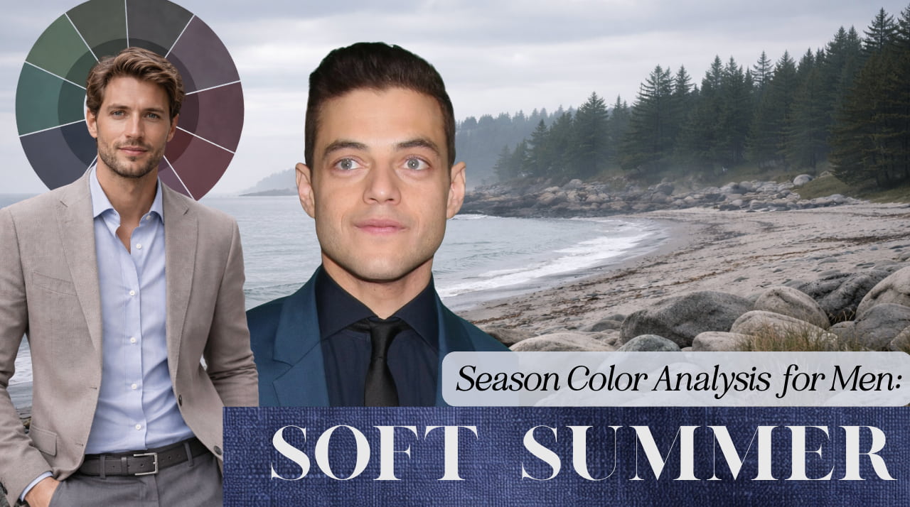
I think the above image of Rami Malek really highlights why cosplaying as a high-contrast male can go wrong and have the opposite effect you want. With his natural hair color (or closely dyed I’m not sure), his features stand out. You see his nose come forward, his eyelashed, his lips, and a 3D face. With the dyed jet black hair- his hair looks artifical, almost like a shoe polish has been applied to it. His skin has a sallow effect, and his features look washed out (much flatter!).
Now, I know they have different lighting, and we can consider that as impacting this visual change partially. However, the definition with the jet black hair is basically nonexistent and I am wildly distracted by his jet black hair.
You may actually find you appear more high contrast when wearing your colors, because your features are well defined and we get shadows/highlights in all the right spots.
Common Style Mistakes Soft Summer Men Make
- Wearing Pure Black as a Default: Black often appears too heavy. Replacing it with charcoal or shadow blue immediately restores facial clarity. If you make no other changes, try this one!
- Choosing Colors That Are Too Gray: Muted is not the same as colorless. If an outfit feels “dead”, liven it up with more hues from your palette! This is not a prison sentence to gray.
- Seeking Authority Through Brightness: High saturation (Chroma) is frequently mistaken for confidence. On you, it competes with your natural features, and softens your features… And I’m going to take a wild guess that isn’t your goal.
- Over-Reliance on Stark White: This creates a harsh contrast. Softer whites, like Vintage White (tea-with-milk), or light gray tend to integrate more naturally.
- Ignoring Texture: Flat, smooth fabrics remove the dimension Soft Summer relies on. Texture provides interest without requiring stronger color contrast.
Together, these adjustments shift focus away from clothing and back toward the wearer. We see you in all your handsome glory.
The Benefits of Dressing in Your Season
Soft Summer palettes excel at combining colors because shared softness prevents visual abruptness. Outfits naturally appear coordinated, allowing the viewer’s attention to move smoothly between garment and person. This is also creates a wardrobe that is highly versatile with one another. If everything is in your palette, almost anything can be combined with one another.
Soft Summer demonstrates that visual strength does not require boldness. Harmony itself communicates confidence. Again, poor Rami Malek opting for jet black when the charcoals are so much more striking ( I don’t mean to pick on him, I think he’s very attractive and a great actor). But, notice the color of his complexion, the outline of his face (specifically the jawline and cheekbone placement/shadow), lip color, and eye area. Seeing these changes can be subtle at first, but I promise the more you wear your palette the more attuned you will be to them.
So if you’ve made it this far, hopefully you’re starting to see that this isn’t about rules or restrictions, it’s about alignment. You’re not losing options, you’re refining them. And in doing so, everything starts to work a little bit better.
Getting dressed becomes easier. Shopping becomes more intuitive. Your wardrobe starts to feel cohesive instead of random. And most importantly, you start to look like yourself, just a more defined, more supported version of it.
Soft Summer is not a “lesser” palette or a muted version of something better. It has its own kind of presence. It’s calm, grounded, and intentional. Nothing is fighting for attention, but everything is working together.
And that’s really the goal here. Not to stand out for the sake of it, but to look clear, balanced, and fully put together without trying too hard.
Once you start seeing it, you won’t unsee it.
Not sure you’re actually a soft summer? I offer in-person color analysis in Seattle and sometimes Brooklyn. For more information, check out this page.