Summers: Seasonal Color Overview
The Essence of the Summer Seasonal Color
Imagine a season where the air feels like a gentle caress, where every color whispers tranquility, and the world seems to slow down in a serene dance of muted elegance—this is the essence of the Summer Season.

The Summer season in color analysis is a harmonious blend of cool, muted tones that encompasses three distinct subtypes: Soft Summer, True Summer, and Light Summer.
Each subtype shares the season’s signature blue-based undertones and gentle palette, but they differ in depth, chroma or intensity, and whether they are neutral or pure cool.
Whether you were typed into the general summer season or you’re still exploring your subtype, this article aims to give you an overview and feel for the essence of the full summer color palette.
Whether you identify with the softer, more neutral hues of Soft Summer, the classic cool tones of True Summer, or the lighter, brighter shades of Light Summer, I want to provide an in-depth look at how to embrace the beauty and sophistication of the Summer season.
As one the softer season in the seasonal color analysis system, it marks the beginning of the muted+cool color spectrum. Let’s explore the detailed attributes, color palette, and stylistic expressions of the Summer season, and how you might translate this enchanting palette into your personal style.
Adjectives Describing Summer
Summer’s essence can be encapsulated by adjectives that reflect its delicate and peaceful qualities. Please do not base your seasonal colors off of these adjectives alone this is merely to get an idea of the vibe of the palette and impression of the summer seasons.
Key descriptors of the summer season include:
- Airy: Light and breezy, evoking a sense of open space and freedom.
- Aloof: Detached and cool, maintaining a subtle, understated presence.
- Atmospheric: Creating a specific mood or feeling, often serene and contemplative.
- Balmy: Soft and gentle, like a mild summer breeze.
- Beautiful: Aesthetic appeal that is subtle and refined.
- Calm: Peaceful and composed, devoid of harshness or intensity.
- Chivalrous: Polite and elegant, with a touch of old-world charm.
- Composed: Stable and serene, not easily disturbed.
- Curvaceous: Soft, flowing lines that are pleasing to the eye.
- Decorous: Tasteful and proper, with a sense of refinement.
- Delicate: Fragile and fine, emphasizing gentle beauty.
- Demure: Modest and reserved, often shy but charming.
- Eloquent: Expressive and articulate, often in a subtle way.
- Ethereal: Otherworldly and delicate, almost magical in nature.
- Exquisite: Finely detailed and beautifully crafted.
- Floral: Suggestive of flowers, often in delicate patterns and soft colors.
- Flowing: Smooth and continuous, without abrupt changes.
- Fluid: Graceful and smooth, like flowing water.
- Gallant: Brave and noble, with a hint of elegance.
- Gentle: Mild and soft, never harsh or aggressive.
- Gliding: Moving smoothly and effortlessly.
- Graceful: Elegant and poised, displaying natural beauty.
- Impressionistic: Suggestive rather than detailed, capturing a mood or feeling.
- Introspective: Thoughtful and reflective, often quiet.
- Laconic: Brief and to the point, with a sense of quiet strength.
- Luxurious: Rich and plush, often in texture and feel.
- Mild: Gentle and moderate, without extremes.
- Noiseless: Quiet and subtle, not calling attention to itself unnecessarily
- Ornate: Decoratively elaborate, often in a delicate way.
- Pastel: Soft and light colors, often muted.
- Peaceful: Calm and tranquil, promoting a sense of relaxation.
- Pensive: Reflective and thoughtful, often with a hint of melancholy.
- Pleasant: Agreeable and enjoyable, creating a positive feeling.
- Plush: Soft and luxurious, often in texture.
- Quiet: Calm and serene, not loud or boisterous.
- Refined: Elegant and sophisticated, with a polished quality.
- Reflective: Thoughtful and contemplative, often introspective.
- Romantic: Suggesting love or passion, often in a gentle and dreamy way.
- Satiny: Smooth and softly glossy, like satin fabric.
- Serene: Calm and peaceful, untroubled.
- Sheer: Delicate and light, often transparent.
- Silky: Smooth and soft sheen
- Soft: Gentle and mild, without harshness.
- Soothing: Calming and comforting, reducing stress.
- Still: Quiet and motionless, promoting a sense of peace.
- Sweet: Pleasant and gentle, often with a hint of innocence.
- Tranquil: Calm and undisturbed, promoting relaxation.
- Translucent: Allowing light to pass through, but not transparent.
- Velvety: Soft and smoothly textured
Summer Season Sub-Types
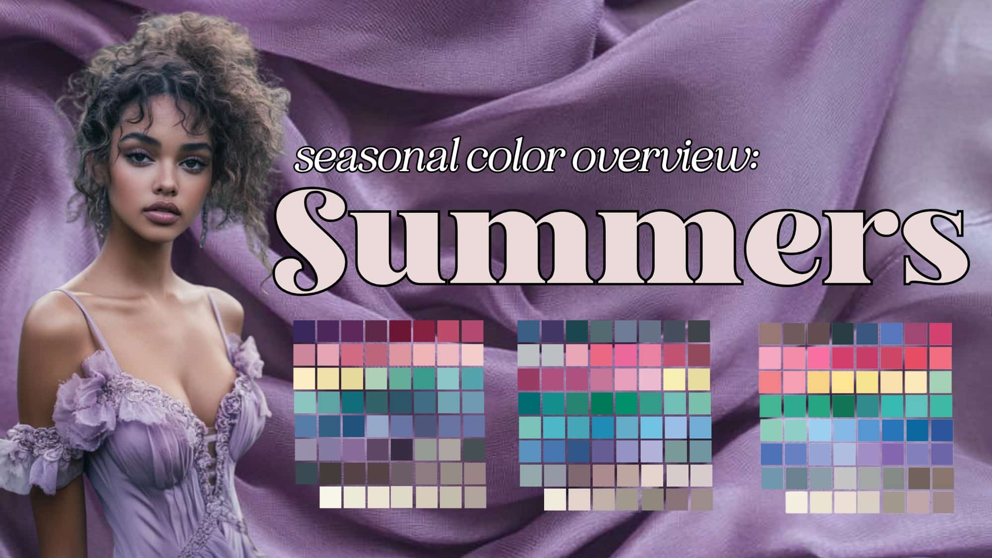
Depending on what system you use, the subtypes of summer may vary. I am a certified Sci/Art analyst and in the Sci/Art system we use Soft Summer, True Summer, and Light Summer.
Here is how they generally break down:
Please note that these are stereotypical examples of each of the subtypes, and if you have brown eyes or dark hair, it does not eliminate summer from being a possibility. In-person draping is the only way to determine your season. My goal with these images is to give you the impression of each subtype and some characteristics that are commonly found among each. I did a wonderful interview with a Summer woman who has dark eyes and hair, and I encourage you to watch it here. so you can see how race or features do not determine your seasonal placement.
Soft Summer
Hue: Neutral Cool
Value: Medium
Chroma: Muted/Low
True Summer
Hue: Purely Cool
Value: Medium
Chroma: Medium
Light Summer
Hue: Neutral/Cool
Value: High
Chroma: Medium
If you’re confused by this terminology, check out my seasonal color overview article here.
With their palettes all next to one another, you can see the subtle shifts between each of the subtypes progressing from lower chroma to pure cool to lighter values.
Even if you’ve only determined that you are “for sure” a summer, that will help you hone your style incredibly. Understanding why that warm, bright orange made you sallow, or that black just overpowered you can be incredibly illuminating.
We may earn a commission from you clicking a link below. And as an amazon associate, we earn on qualifying purchases. Full affiliate policy, here.
Summer Color Palette: Overview
If you know your subtype, some of these suggestions may feel slightly off or not as perfect as your subtype version. But this is to help you understand the overarching summer seasonal palette and how each hue appears.
Summer’s palette is known for its soothing and harmonious qualities, with colors that blend seamlessly rather than stand out starkly. This season’s colors are predominantly blue-based, with subtle underwashes of rose, gray, and blue. The overall visual effect is calming and fluid, with few vivid or clear colors and an absence of yellow-reds such as peach, orange, rust, and there is no pure black or pure white.
Summer Whites: The whites in the Summer palette are creamy and soft. Truly warm ivories are avoided, as they can make Summer skin tones appear sallow. Pure white is too stark and harsh for the gentle nature of this season. Dahlia white or milky white are great.
Summer Grays: These grays range from light to dark, often with a heavy wash of blue. They start with soft slate grays and deepen into steel and slate charcoal shades. Where winter grays feel cold and severe, summer has a softer quality that evokes coziness and comfort.
Summer Browns: The brown family begins with pink beiges, also known as “peiges,” which then deepen into cocoa browns with a strong rose undertone. These browns may blend into mauves and are cooler than the golden chocolate browns of Autumn. You may find some mushroom browns as well, but you’ll never find the muted camels or bright toffee colors of the warm seasons.
Summer Reds: Summers often struggle with choosing reds and consider them a color that just doesn’t work for them. But that’s because they often try the cool true reds of winter or the brick reds of autumn. Summer reds deepen into roses, rubies, raspberries, and rose-washed azaleas, with reds that are never as blue as Winter’s but include hues like cranberry and dusty burgundy.
Summer Yellows: These are among the least varied colors in the Summer palette. The yellows are often washed heavily with white, creating soft, cool shades like banana or cream yellow. Limoncello or a dry white chardonnay are great color references. But these yellows can be hard to find in real life, and I recommend buying a color fan to help you determine if a color is in your palette.
I give my color consults an NDU color fan, which I find a great palette and tool. Because I have a working relationship with them you can use my code ARRUDA for a free color card with fan purchase.
Summer Greens: Featuring a strong blue wash, Summer greens range from seamist to jade, sea green, spruce, and pine. These soothing shades often blend into bluer turquoise and teals, ideal for creating a relaxing environment.
Summer Blues: The blue palette includes soft powder blues, sky blues sometimes washed with gray (resulting in shades like French, cadet, and storm blues), and grayed French navies. The blues and grays often intermingle, offering a wide range of blue-gray and gray-blue tones.
Summer blues are incredibly beautiful and an easy entry point if you’re having trouble envisioning your new summer color aesthetic.
Summer Purples: The rose-washed purple family includes lilacs, lavenders, grapes, hyacinths, orchids, heliotropes, mauves, eggplants, amethysts, and plums. These colors are often associated with a dreamy, escapist quality, making them ideal for evening wear but less suited for projecting authority in daytime attire.
Summer Pinks: The summer pink palette with pinks evokes a delicate and refined elegance. These pinks range from the whisper-soft hues of pale pink and powder pink, which offer a light, almost ethereal touch, to the slightly deeper shades of dusty rose and mauve, which provide a gentle sophistication. The palette includes the romantic and subtle charm of blush and petal pink, reminiscent of blooming flowers, alongside the cool and calming cherry blossom and carnation pink. Each shade is carefully curated to enhance the natural beauty of those with cool undertones, creating a harmonious and serene effect that is both timeless and elegant.
While some of those pinks may feel like they are getting a bit “warm”, remember that two of the 3 summer seasons are neutral/cool (soft summer and light summer). This means those two subtypes handle touches of warmth in their palette. If you find yourself in the True Summer season, you will want to focus on pure cool colors.
Summer Color Palette Style
The design theme that best expresses the Summer palette is characterized by softness, flowing lines, and a harmonious blend of colors. Clothing and accessories for this season often emphasize gentle curves, long lines, and feminine details. Harsh, geometric shapes and overly structured designs are generally to be avoided, as they conflict with the season’s delicate and romantic impression.
And if you’re into the Kitchener Essence system, the summer season most often correlates with the Angelic Essence with is “subtle/blended” in his system.
Recommended Styles Inspirations
- Victorian, Grecian, Queen Anne’s, Louis XVI, and early 1900s styles like Edwardian, which support the romantic and feminine attitudes of Summer.
- Refined peasant looks, wrap dresses, princess lines, empire-waisted dresses, full prairie skirts, camisoles, Chanel jackets, smoking jackets, tulip hemlines, and full pleated skirts.
- Accessories like lace, frills, fur trims, puffed sleeves, and billowy fabrics.
- “Prom-style” dresses trimmed in lace and netting with low-cut bodices, defined waists, and full skirts.
Textures and Fabrics:
Soft, plush textures are ideal for Summer, such as velvets, cashmere, mohair, panne velvet, charmeuse, velour, jacquard, batiste, chiffon, georgette, crepe de chine, crepe silks, crepe wools, knits, challis, suedes, linen, raw silk, satin, heathery tweeds, herringbones, angora, and voile.
Finishing Touches: Jewelry, Accessories, and More
- Silver, platinum, and white-gold metals are perfect for Summer accessories. Warm-toned metals should be avoided.
- Other suitable additions include pearls, rubies, diamonds, pink sapphires, delicate princess-style jewelry, brooches, cameos, boas, velvet or satin ribbons, opera gloves, and fans.
- Hairstyles for Summers often include high buns with cascading tendrils adorned with combs, jewels, or flowers.
Key Considerations for Summer
Every person is going to decide how they want to come across and how their personal style interacts with their seasonal color palette. Remember that these are just the stereotypical summer “vibes” or moods. If they don’t resonate with your style goals that’s totally ok.
If your personal style is different than this overall vibe, check out my youtube series where I take your style parameters and create outfits around them.
Dressing as a summer is often beautifully harmonized by maintaining a soft, blended, and feminine look. Although Summers project a more serious and reserved impression than Springs, they should avoid gaudy effects. The natural tendency towards passive, serene, and introspective qualities means that contrast, blatant dramatism, and eclecticism should generally be avoided.
If those qualities interest you, then you will need to explore how you can use this palette in an authentic way. (It’s possible, just not the overall summer vibe).
The essence of Summer lies in its soft, blue-based blend, and the beauty of this season is best expressed through its gentle, harmonious palette and understated elegance.
The Summer season is a celebration of subtlety and grace. The colors are serene, romantic, and soft, blending harmoniously without harsh contrasts. By embracing these qualities, one can fully embody the serene and delicate nature of Summer and allow your truest beauty to shine.
Love this. Saw the true spring article too. Hope you do a spring guide next.
I will be doing the spring overview soon! Working on the winter one right now
Looking forward to your “winter” interpretations!
I’m working on winter now!!
Love this look into Summer and its sub groups.I have been colour anyalised as winter,clear and cool.
Now that I am grey and recently descibed as cool,I am drawn to soft and cool as I have a more reserved personality.My kibbie seems to be TR,I am 5.1 and curvy bottom half.I am stuck with dressing too mature at a youthfull 67 .I have been descibed as Neat.Salt and Pepper hair,rise beige skin and hazel eyes.Can you help pin down a look that is stylish and contemprary.Casual and comfortable since retiring.I want to look and feel at my best.
I’m sorry right now I’m not offering 1:1 consultations, but I do hope to bring that back. In the meantime, you should join my free facebook group. We share a lot of ideas there and it’s a great place to get feedback : https://www.facebook.com/groups/gabriellearruda
What a beautiful post! I did want to let you know that in the Recommended Styles Inspirations section, the image you used to illustrate “Victorian” is from the late 1810’s or early 1820’s. Victoria didn’t become Queen of England until 1837.
Oh thank you for that clarification!
That would make it Regency style then, which is also very flowing and feminine.
I’m loving these articles! You always put out such comprehensive and well-thought-out content!
P.S. I can see that AI is obviously very aware of “Instagram face”!
Thank you! Haha, yes I’m sure it is, but it gives me so much more potential for visual examples that stock photos don’t have.
For sure! It just makes me chuckle. 🙂
I am so looking forward to the Light Summer guide! You’re guides are the best! Thank you for this summer overview.
Your* guides
I’m working on light summer now! Hopefully in September it will be out pending any schedule issues
Your content is great. But the pop-ups seem excessive. I have to reload the page or scroll to where I was reading from about ten times in 5-10 minutes just to skim your articles. I often do not finish reading your work or spend more than a few minutes on your page because of the redirects, popups that take me off your page or from where I am reading.
I’m sorry to hear you feel that way. Unfotunately, that’s one of the ways I monetize my work and is how I’m able to give so much information away for free. The ads shouldn’t take you away from the site unless you click them or don’t click the X button. But, I understand that my content may not be for everyone and I appreciate you giving me the feedback.