Seasonal Color Palettes: Your Best Blues
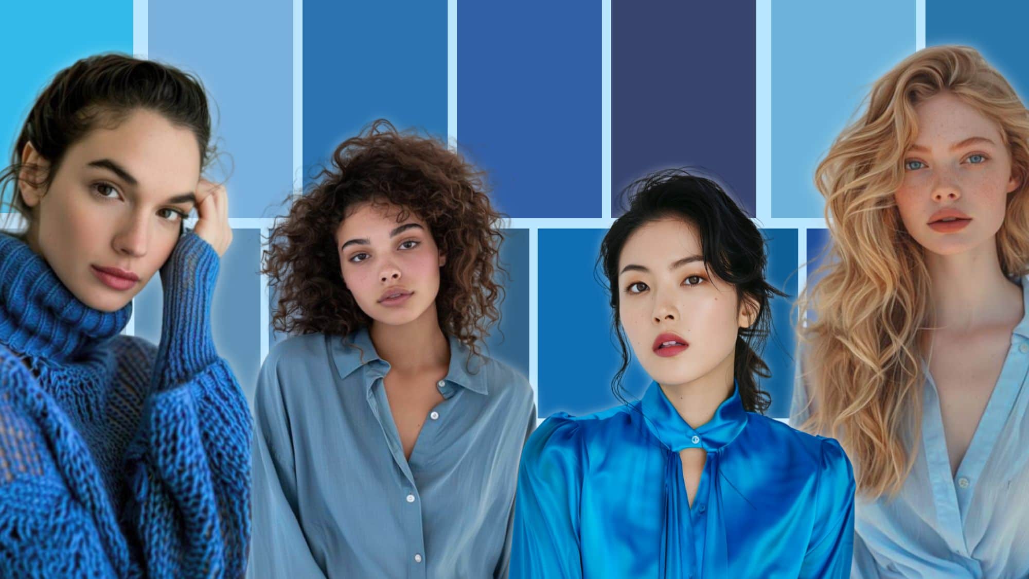
Color analysis has revolutionized the way we perceive personal style, revealing the profound impact that the right hues can have on our appearance and confidence. You suddenly understand why that one blouse you have a toxic relationship with is turning your face sallow. And why that thrift market find that cost $5 makes you shine.
Each season in the 12 seasonal color palettes offers a unique spectrum of blues, from the icy depths of True Winter to the warm, earthy tones of Dark Autumn. These blues are not just colors; they are reflections of nature’s own palette, carefully curated to enhance our natural beauty and harmonize with our inherent tones.
Beginning to understand your palette takes time, but I’ve compiled the best blues for each of the 12 seasonal color palettes to help you discover how these shades can transform your wardrobe and elevate your style to new heights.
We may earn a commission from you clicking a link below. And as an amazon associate, we earn on qualifying purchases. Full affiliate policy, here.
Are these the only blues I can wear?
Each of these palettes is a sample of blues that work within your respective seasonal color palette. They are not the only blues you can wear. But they do represent a wide range of blue options from each palette. This can also help you understand your palettes better because every season has its neutral colors, casual colors, and brighter colors respective of their three main color qualities.
If you need a refresher on the seasonal color basics, check out my article here.
So how can I tell if a blue is in my palette?
The easiest way to determine if a color is in your palette is to use a color fan. I like the ones from NDU colors and you can a free color card with any fan purchase using my code ARRUDA. These are the fans that I use for my sci/art color services.

When you are evaluating a color to see if it is in your palette, you are not looking for an “exact” match to the fan color. What you are examining is if the color you are testing harmonizes and “meets” the colors in your fan. You don’t want the color you’re testing to fade behind your fan or to overwhelm the colors in your fan.
Check out my video series here for more examples and how to use your color fan.
Seasonal Color Palettes: Your Best Blues
Dark Winter
Hue: Neutral/Cool
Value: Dark (low)
Chroma: Medium High
Typically, we think of deep, saturated intensity when it comes to Dark Winter. And it is true that you do get some beautiful midnight blues and colors that create a striking effect. But you have a huge range of blues and blue-greens.
So don’t feel like your palette has to be super dark at all times. You benefit from a balance of lights and darks when styling yourself and can handle some neutrality in your colors.
True Winter
Hue: Cool
Value: Medium
Chroma: Medium High
True Winter blues are intense, clear, and, at times, icy. These shades are akin to a deep cobalt or a bold royal blue, reflecting the crisp, cold nature of winter.
The clarity and coolness of these blues perfectly align with the high-contrast and vibrant tones of the True Winter palette.
We want your blues to have pure coolness (no yellowness added to them), this will be essential to honor your cool undertone which is your dominant characteristic.
Bright Winter
Hue: Neutral/Cool
Value: Medium
Chroma: High
Bright Winter blues are dazzling, cool, and intensely vivid, often taking on shades like electric blue or bright sapphire. These hues are sharp and striking, evoking the brilliance of a clear winter morning. The vibrant and crisp nature of these blues perfectly complements the bold and dynamic tones of the Bright Winter palette, infusing any outfit with a sense of energy and sparkle.
It is important to look at the range of the colors I’ve shown here (which have been taken directly from my palettes!). While Bright Winters can handle sparkling bright blues, they don’t always need “Lego” colors. They also have more casual and neutral blues in their palette.
Bright Spring
Hue: Neutral/Warm
Value: Medium
Chroma: High/Bright
Bright Spring blues are vibrant, clear, and warm, often resembling electric blue or bright turquoise. These shades are lively and saturated, reflecting the high energy and clarity of a sunny spring day. The brightness and warmth of these blues add a playful and dynamic touch to the Bright Spring palette, harmonizing with its overall vivid and cheerful tones.
But just like with any palette, we also have some neutral blues and more casual colors. As a bright spring (verified in Sci/Art), I’ve found I gravitate towards the brighter colors in my palette, but it took a little time to build this new color relationship. You can hear about my color journey here.
True Spring
Hue: Warm
Value: Medium
Chroma: Medium High
A lot of true spring (also called warm spring) blues will have a hint of yellow and lean more towards blue/green. I focused more on the true blues in this palette, so the range is a bit smaller.
These blues are still warm and clear, just what a true spring needs. You want your blues to be reminiscent of a fresh spring day and allow it to feel breezy and sun-kissed.
Now, there was a bit of confusion on these blues for True Spring. True Spring has a tone of blue/greens and teal colors, which you can see below. But I also wanted to show the range of the palette and that you do, in fact, get some more “truer” blue options. Remember that the stereotypes of a palette exist but that each palette has a very wide range of colors that fit their respective color qualities.
Light Spring
Hue: Neutral/Warm
Value: Light (high)
Chroma: Medium
Compared to the other springs, Light Spring blues have a bit more tranquility to them. These shades include a delicate baby blue that feels fresh and gentle, reminiscent of a clear spring morning sky, and a slightly deeper sky blue that evokes the brightness of a midday sky. Light aqua and bright turquoise add a fresh and inviting feel, with the turquoise being lively and vibrant like the clear waters of a tropical sea.
But it still has the typical freshness and buoyancy, a spring family trademark. They create a fresh, vibrant look and can look sophisticated, edgy, or romantic, depending on how you use the colors. Don’t feel confined to any style aesthetic based on your color palette!
Light Summer
Hue: Neutral/Cool
Value: Light (high)
Chroma: Medium
The Light Summer blue palette exudes a serene and ethereal beauty reminiscent of a tranquil summer day. These shades evoke the gentle whisper of a cool breeze over a still lake, the soft glow of morning light reflecting off calm waters, and the quiet elegance of twilight skies.
They have brightness and presence but still a muted softness that filters in. There’s a subtle sophistication to this palette that has depth and serenity.
True Summer
Hue: Cool
Value: Medium
Chroma: Medium
The True Summer blue palette exudes a refined and elegant coolness, embodying the timeless beauty of an English rose garden under the soft light of a summer afternoon. Each shade in this collection captures the essence of pure coolness, from the lightest powder blue reminiscent of a clear morning sky to the deeper, more saturated teals and french blues that evoke the serene depths of a shaded pond.
These blues are the colors of hydrangeas blooming in the cool shade, the distant horizon over a calm sea, and the delicate evening sky that bathes the landscape in a gentle, bluish hue. The palette’s purer, cooler tones create an atmosphere of tranquility and sophistication, perfect for those who appreciate the understated beauty and grace of summer’s true essence.
Remember that just because you are purely cool and muted, you still get colors like blue-green. With seasonal color analysis, we are just determining the boundaries of your three color qualities that make you shine. Every palette will get its own version of each color most often.
Soft Summer
Hue: Neutral/Cool
Value: Medium
Chroma: Soft/Muted (low)
The Soft Summer blue palette embodies a quiet, introspective elegance with its collection of dustier and darker hues. These blues evoke the tranquil, subdued beauty of a misty summer nights or a shaded woodland stream.
Each color feels like a whisper, understated yet profoundly soothing, creating an atmosphere of gentle sophistication. The cooler, grayer undertones of these blues provide a harmonious balance, perfect for those who find beauty in the subtle and the serene, in the quiet moments of summer that are both calming and deeply reflective.
This palette offers a nuanced elegance, ideal for creating looks that are both timeless and effortlessly graceful.
Soft Autumn
Hue: Neutral/Warm
Value: Medium
Chroma: Soft/Muted (low)
The Soft Autumn blue palette is a collection of hues that evoke the warmth and richness of the autumn harvest. These blues are gently muted, with a cozy, warm undertone that sets them apart from the cooler shades of summer. Think of the soft, dusky blue skies over golden fields, or the serene blue waters of a river winding through autumn foliage.
Each shade carries a base of warmth, making them feel inviting and grounded. From a mellow denim blue that suggests comfort and reliability to a deeper, slate blue that feels both elegant and earthy, these colors embody the essence of fall’s abundance.
True Autumn
Hue: Warm
Value: Medium
Chroma: Medium
The True Autumn blue palette is a collection of hues that capture the essence of the season’s deep, earthy richness. These muted blues, softened with gray undertones, evoke the cool, tranquil moments of autumn. Imagine the dusky blue of a calm evening sky as it begins to merge with the encroaching twilight, or the deep teal of a forest pond surrounded by turning leaves. The lighter, muted turquoise shades bring to mind the weathered, rustic charm of an old barn door, while the darker blues suggest the shadowy depths of ripe blueberries in harvest. Each color in this palette carries a comforting warmth, grounded in nature’s autumnal beauty.
True Autumn tends to have more yellow added to its colors, so you will find more variations of “blue” rather than a true pure blue.
Dark Autumn
Hue: Neutral/Warm
Value: Dark (low)
Chroma: Medium High
The Dark Autumn blue palette is a rich and moody collection that captures the essence of the season’s profound and intense beauty. These blues are deep and warm, reminiscent of the evening sky hours and the quiet mystery of autumn nights.
The lighter shades of turquoise and teal bring to mind the glistening of dew drops on leaves at dawn, while the medium tones evoke the serene and steady flow of a river trailing down a mountain. The darker blues, like deep teal and navy, suggest the velvety darkness of a starlit night sky or the inky depths of a calm lake.
Each color in this palette exudes a sense of warmth and depth, perfect for creating looks that are both dramatic and harmonious.
Diving into the world of seasonal color analysis and discovering your perfect palette can be a total game-changer for your style. It allows you to firmly identify a major style pillar of outfit building, and it can hone the direction of your shopping strategies and wardrobe building. You can finally look at your closet with a sigh of relief because, you know, these pieces all work together, and they make me shine.
The blues we’ve explored, from the warm, earthy tones of Soft Autumn to the rich, deep shades of Dark Autumn or the bright, vibrant sea blues of spring, show just how powerful the right colors can be. They don’t just make you look good—they make you feel amazing, too. When you connect with the colors that truly complement you, your confidence shines through.
This can help you find strength through style.
I’m a bit confused about the True spring blues. Maybe my eye is still off but I don’t see much, if any yellow in most of these blues.
I go back and forth if I’m light spring or True spring and most of the blues I feel like I see recommended are more similar to the True Autumn colors with that teal-ish colors.
Guess they are both warm seasons so it makes some scene but maybe I’m missing something.
These past few articles on the individual colors have been interesting.
Excited for you to finish True Spring!!!!
So yes True spring does get a lot of blue-greens, and I do plan to do a blue-green article. But they do have a few of these “purer” blues that only have a touch of yellow or are within their color qualities. Remember that every season pretty much gets a version of each color. So we are trying to find the boundaries of your color qualities and these colors are as “true blue” as you’ll get in True Spring. I just decided to show these ones (which are pulled from my palettes) to show you that TS goes beyond just blue/greens. Just like deep winter has some colors that are not deep and vampy, and bright spring has some colors that don’t look tropical.
Since I think a lot of ppl might be confused on this, I added an additional palette for true spring to show their blue greens. But you guys do get those first “blues” too!
Thank you for the clarification. 🙂
Hey! I’ve learned so much from you. Thank you! Would love a bright winter full guide ?
I will definitely be doing a bright winter guide as well!