
Texture and Color Perception: How Fabric Influences the Look of Color and Style Lines
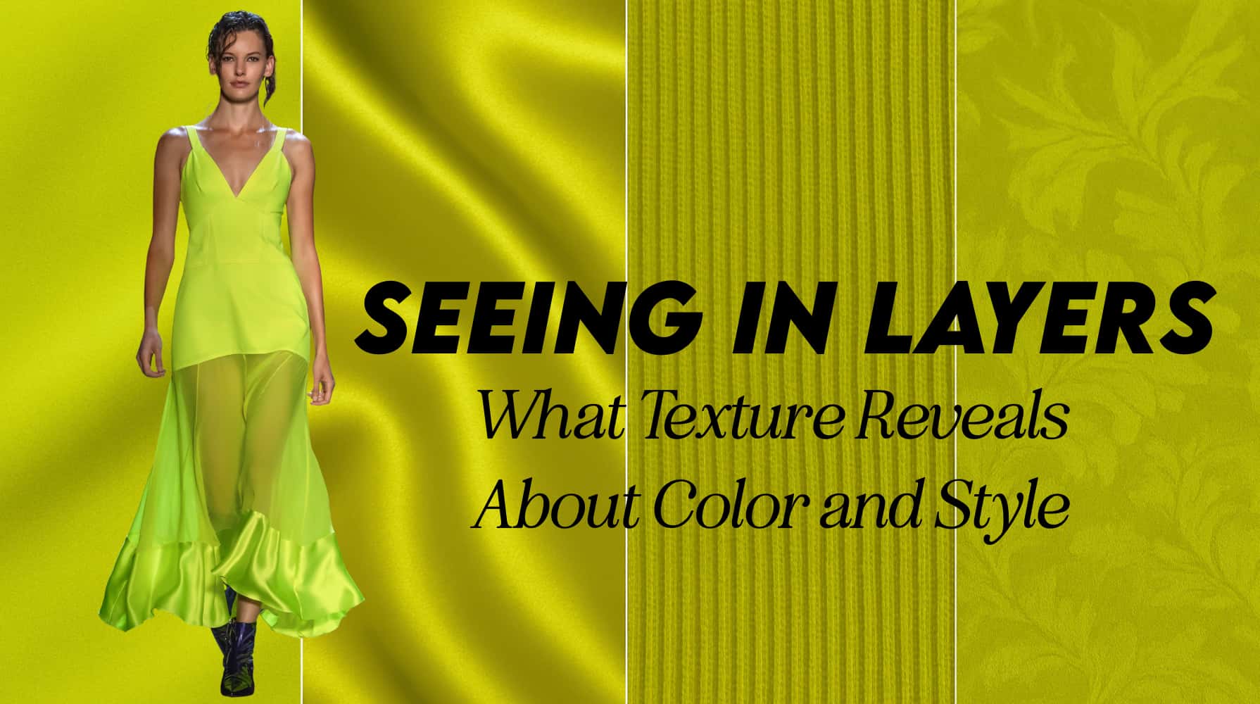
When we talk about style, color often takes center stage. But there’s another unsung hero quietly shaping how we perceive clothing: texture. The interplay between texture and color can completely shift how a garment feels, looks, and expresses your style identity. It’s less about following rules and more about developing a nuanced eye—one that notices how light, shadow, and surface work together.
I aim not to inundate you with even more things to pay attention to but rather to allow you the option to observe how texture affects color perception and personal expression, so you can make more intentional and expressive style choices.
So, as always, let’s deep dive into the texture + color effects.
What Is Texture in Clothing?

Texture refers to the surface quality of a fabric—how it feels to the touch and how it reflects or absorbs light. Think of the soft fuzziness of brushed cotton versus the slick coolness of satin. Texture influences both the tactile experience (how it feels against the skin) and the visual experience (how the eye processes the light/shadow/color).
From a color standpoint, texture acts like a lens. It can brighten or dull a color, deepen it or diffuse it, making the same shade look entirely different depending on what it’s made from.
If you’d like to learn more about texture, I have a great texture article here and a style complexity article here that may give you further guidance on finding your own innate texture and fabric ranges.
How Texture Affects Color Perception
Colors don’t exist in isolation—they’re always affected by what surrounds them and how light hits the shape of the item. Are we getting heavy shadows? Sharp highlights? A soft matte surface of dulled light? These are all elements to texture and how we perceive the color of the garment. Here are some more examples:
Smooth textures like silk, jersey, or fine cotton reflect light evenly, helping colors appear cleaner and more defined. These surfaces preserve the hue’s clarity, often offering a ‘true-to-life’ color impression and a polished, modern effect.
When applying a smooth texture to style lines we often create a clean outline and very defined silhouette. It is easy to discern the edges of the garment and how they interact with the body.
Rough or rippled textures such as knits, raw linen, or flannel absorb more light and create more natural shadows, giving colors a softer, muted, or even shadowed effect. These can create a feeling of warmth, approachability, or groundedness. They often create a fuzzier outline or can appear in more relaxed silhouettes.
This is of course only the more “obvious” exploration of these textures. You can find examples of flannels or linens being applied to more structured pieces. This usually involves more seaming, interfacing, and internal structure. When you apply these adjustments, you are essentially transforming the natural weight and drape of the fabric. This can create an interesting effect!
Shiny or reflective textures—like satin, patent leather, or metallics—amplify light, making colors look sharper or even more intense, especially under movement or spot lighting. They draw attention and often signal boldness or high energy. These pieces usually end up being the focal point within an outfit.
Because shine is advancing and matte is receding, our eyes are drawn to the advancing element. This is useful when determining your overall outfit rhythm and how you’d like the eye to travel along your body. If you compose an outfit of all shiny/reflective textures, this lessens the overall effect of the “spotlight,” and while your whole outfit may read bolder, the eye may travel in a more top-to-bottom pattern once again.
Surface effects and certain weaves from looped yarns (like bouclé), patterned weaves (like jacquard), and dimensional knits scatter light unevenly, softening color edges and reducing sharp contrast. Metallic threads add reflective detailing that catches the eye, creating points of shimmer and movement. Embroidery, while applied post-weave, can offer a similar tactile depth—disrupting the surface just enough to alter how color is experienced.
Together, these textures add visual interest and dimension, often transforming solid fabrics into something more layered, organic, or expressive. While one might say these are similar to our “rough or rippled” textures, I think there is a distinct difference. These surface and weaves create a dimensional aspect that can be reflective, rough, or patterned. Meaning the layers created can be applied with multiple textures at once. While not an entire texture category in it’s own, it is something to examine or consider if you are playing with color.
For instance a True Winter might look stunning in a black jacquard with silver metallic thread in it. Whereas a Soft Autumn might veer more toward the muted oatmeal embroidery with sage green threads.
Texture and Their Interpreted Energy
One powerful way to use texture is to match it to your “style energy” (bear with me on this one, I’m not trying to go too woo woo on you)…that is, how you naturally move through the world. Some people feel most at home in crisp cotton poplin or clean satin, while others feel more authentic in cozy nubbly knits or raw silks.
Within this specific consideration, we can see a clear overlap with how Kitchener’s Essence System handles fabric and texture recommendations. But, even if you prefer not to use your essence blend, or want to expand it, this can be an effective exploration.
Ask yourself:
- Do I feel more expressive in fabrics that shimmer and catch light?
- Do matte or rough textures help me feel grounded and relaxed?
- When I wear smooth, soft fabrics, do I feel polished—or exposed?
These are subtle cues to understand your own style pov when it relates to textures. If you want a more “concrete” approach, you could examine your style complexity.
Pairing Texture with Color Intensity
If you’re working within a specific color palette—like one defined by seasonal color analysis—it helps to notice how texture modifies your best hues:
- Clear brights (common in Spring and Winter palettes) often shine in smooth or glossy fabrics that echo their clarity. Think crisp taffeta, glossy leather, or fine cotton. Reflective and shiny fabrics are easy to pull off, as are clean mattes that give a smooth reflection of their underlying color.
- Soft or muted colors (found in Summer and Autumn palettes) tend to harmonize beautifully with woven, sueded, or matte textures. Think cashmere, brushed wool, or slub linen. Softer textures or mattes that diffuse the light and create the delicate colors naturally found in these palettes.
However, personal style always trumps seasonal generalities. A Summer person might love the drama of a smooth velvet in a soft plum. An Autumn could find joy in a high-gloss leather jacket in a deep olive. Use your palette as a starting point, not a rulebook.
Texture and Visual Focus
Texture doesn’t just influence how color appears—it can also guide the eye. Typically the more reflective or detailed pieces tend to command the eye (all things being equal). Whereas matte or textures tend to recede slightly and create more of a conversation between pieces.
- Shiny or crisp fabrics attract attention. If worn near the face, they become focal points. This can be a strategic choice if you want to highlight an area, use jewelry, or highlight your natural coloring.
- Flat or blended textures recede. They can create softness, especially in areas where you want less visual emphasis. They also create a dialogue with one another. Whereas a shiny focal point might scream “Look here!”, layered blended textures create a conversation between them. It creates a gentler guidance of the eye when taking in the style lines.
Layering textures is a powerful way to create visual interest without overwhelming color. A monochromatic outfit in different textures feels dynamic and dimensional.
Though the above two looks share a similar style aesthetic and layered, structured vibe, they create entirely different visual effects through texture.
- The first look (with high-shine leather and croc-embossed accessories) creates a precise focal point, using reflective surfaces and sharper style lines to command attention and lead the eye first to to the center of the body and then radiating outward.
- The second look (with matte suede, shearling, and soft leather) diffuses attention across the outfit. The textures soften the style lines, and the eye moves gently rather than locking onto a single point.
This contrast shows how texture can transform the energy and visual flow of a look—even when the color palette and silhouette feel adjacent.
Movement and Texture
Don’t forget movement. Fabrics like chiffon, silk charmeuse, or liquid knits don’t just have texture, they have motion. A fabric that flows or drapes will appear more alive, softening the outline of the body and adding visual rhythm. More structured fabrics—like stiff linen or raw denim—create contrast and definition.
And depending on whether your fabric has a high shine texture, surface effects, or is matte, this may affect the visual impact and overall color perception. As you can see above there are two silver gray, fluid dresses. The reflective one commands more attention and reads as higher energy. Whereas the matte silver dress feels soft and light.
Choose what suits your mood, your context, and how much structure or ease you want to bring into your look.
Suggestions, Not Rules
Rather than memorizing texture “do’s and don’ts,” try this:
- Test your colors in a range of textures. Hold up your seasonal red in silk, cotton, and velvet—notice how it transforms.
- Shop with your hands. Touch everything. Your sense of touch will often lead you to what feels right emotionally, not just visually.
- Photograph outfits in natural light. Some textures that look great in-store lighting will photograph poorly, or vice versa.
- Balance visual weight. If you’re wearing something heavy and textured on the bottom, try a lighter texture up top—or lean all the way into it for an intentional look. But pay attention to the outfit balance and rhythm.
Observations on How Texture Shapes the Way We Perceive Clothing
Let’s talk about some common textures and the overall effects they can have. Remember, that any of these style principles can not necessarily be examined in isolation. Many elements (essences, body, style goals, colors, and shapes) can impact how we feel about the success of an outfit. This is just one element to begin to notice in your daily outfit process.
Smooth, Sheen, and Shine:
- Fabrics like satin, silk, taffeta, or polished cotton give a clear, bright effect. Light bounces off the surface, amplifying the intensity of a color.
- These textures feel more formal, crisp, or elegant and often create a sense of sophistication or “sharpness.”
- When paired with vivid colors, they can look more high-energy or assertive; when used with softer shades, they create a polished ease.
Try: Using glossy textures to draw attention to your upper half or to bring focus to a statement color or shape. Examine outfits that you felt weren’t successful for their textural focal points. Perhaps you have a large shiny buckle in your midsection that is drawing attention to your stomach instead of your face. Depending on your style goals, this may be something to adjust or balance out.
Matte and Blended:
- Fabrics like suede, velvet, raw silk, flannel, or washed cotton absorb light, softening the effect of a color. This can result in a more muted, mellow, or cozy impression.
- These materials often suggest approachability, subtlety, or softness, especially in quiet or neutral tones.
- They can also help balance overly bright colors, toning down the visual “volume.”
Try: Incorporating matte textures when you want a calming or understated feel—even with saturated colors.
Nubby, Irregular, or “Natural” Weaves:
- Think tweed, boucle, hand-knits, slub linens, or hemp. These textures scatter light and offer depth without shine.
- They create visual interest without sharp contrast, and are often associated with artistic, earthy, or relaxed aesthetics.
- When used with mid-tone or muted colors, they evoke softness and complexity—like fog on a field or dappled light.
Try: Mixing irregular textures into monochrome outfits to add movement without relying on pattern.
Crisp or Stiff Textures:
- Tightly woven fabrics like poplin, twill, taffeta, or waxed cotton retain structure and form.
- These materials enhance body architecture and can emphasize tailoring, sharp silhouettes, or modern minimalism. They can also easily create “extension” from the body and create intentional style contrast. Something to consider 😉
- With color, they tend to hold clear definition, making the hue feel more exact and graphic.
Try: Using crisp textures when you want a cleaner or more architectural effect. Examine how this may relate to your Kibbe Image Identity or your body shape. Crisp textures may not suit curves easily without a more custom fit or extensive seaming.
Soft, Flowing, or Drapey:
- Chiffon, modal, rayon, viscose blends, jersey, and fine knits bring movement and fluidity to your outfit.
- These textures often soften edges, helping an outfit feel more romantic, natural, or approachable. They can also have an otherworldly quality to them when paired with reflective textures.
- Depending on the color and styling, they can lean ethereal, effortless, or sensual.
Try: Letting flowing fabrics create fluid visual rhythm—especially when moving. This draws attention through softness rather than shine.
Combining Textures for Depth:
Contrast in texture can define or diffuse an area. You can:
- Use matte plus shine to create focal points (e.g., a matte outfit with a glossy shoe or bag).
- Pair lightweight with heavyweight to balance volume.
- Keep a monochrome palette but shift textures to keep the look dimensional.
As you observe texture more consciously in your wardrobe, you may begin to see how even small shifts (like swapping a cotton tee for a silk one) change your whole mood or presence.
Texture as Expression
Ultimately, texture is a form of nonverbal storytelling. It’s how we signal mood, era, ease, formality, playfulness, or power—without ever changing color. A black cotton t-shirt reads differently than a black velvet camisole, even though they’re the same hue.
Texture invites us to go deeper than the surface and feel into the details of what we wear. Whether you’re curating a capsule wardrobe, exploring your seasonal colors, or just dressing for joy, let texture be part of your style toolbox.
Thank you for such a thoughtful and thorough post! Texture and fabrication seem to be a huge component for me, and this is very helpful. I received a custom color analysis, which placed me on the spectrum between Cool Summer and Cool Winter – softness of CS with the depth of CW. However, if I use soft matte, or rougher textures those softened colors are a bit draining and underwhelming and make me look tired. With sheens like silk they are perfect! If I borrow from CW I have to stay away from any satin or shine, otherwise the colors are overwhelming. CW in soft knits or jersey works pretty well. I do think essence is a component, which you touched on. I have Ethereal primary, and Romantic as a close second, along with SD body. I think softened colors with a lot of sheen/shine work well with balancing standing out (SD and Romantic) and fading into the mist (Ethereal).