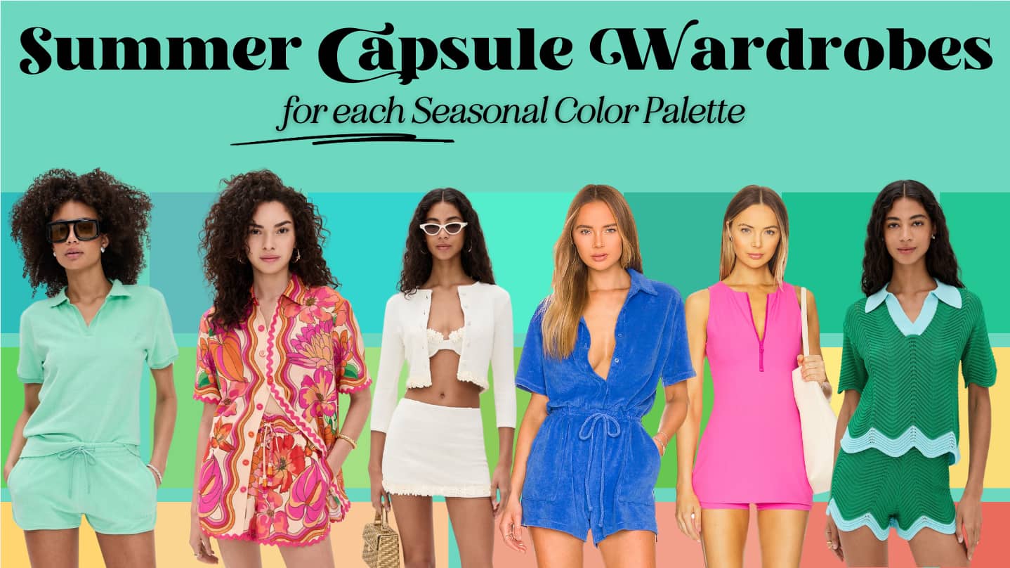
Seasonal Color Summer Capsule Wardrobes 2025
Summer arrives not with a whisper, but a hum—the steady, golden rhythm of long days and open skies. There’s a stillness to it, yes, but also a vivid clarity. The world is alive and glowing, and we’re all craving the sun on our skin (with spf, of course). This is the season of embodiment—of color touching skin, of fabric moving with heat, of feeling like yourself in full definition.
If spring was the season of awakening, summer is the season of becoming. Whether you’ve just discovered your seasonal palette or have lived with it for years, this is the moment to lean into what your colors can do—not just on you, but for you. A capsule wardrobe lets you take that knowledge from theory into tactile, wearable reality. It’s not about restricting your choices; it’s about deepening your relationship with what already works and creating ease when building outfits. More pieces you love, less stuff.
The Summer 2025 capsules I’ve curated are grounded in the feeling of this season: light radiating off pavement, fabrics that move with you, colors that breathe in the sun. Each capsule offers neutrals and accent colors that help bring your palette to life in summer’s natural rhythm. Some are light and airy, others cool and grounded, still others vivid and radiant—but all of them align with the hue, value, and chroma that flatter their given palette.
I also tried to reflect the overall energy of the color palettes. If you want more general information on the seasons, check out my Summer Overview, Winter Overview, Autumn Overview, or Spring Overview. It’s a good place to start to understand the color profile and vibe of each overarching season.
We may earn a commission from you clicking a link below. And as an amazon associate, we earn on qualifying purchases. Full affiliate policy, here.
Your Palette Is Bigger Than These Capsules
Every seasonal palette contains a full spectrum: soft and bold, light and deep, muted and crisp. Your seasonal color palette is not meant to be a rulebook or a strict set of guidelines but a gentle boundary that you can decide how to apply and when to abandon.
These capsules offer just one way to begin—they’re one narrow example, not blueprints. If your personal style leans modern, romantic, minimalist, vintage, or somewhere in between, your palette can stretch to meet it. What matters is how your colors express you.
Use these capsules to explore combinations, identify what feels fresh, or rethink your neutrals—but always let your personal style POV lead. Whether you dress with contrast or calm, simplicity or drama, your colors are tools. You get to decide how you use them.
Before You Shop
As with all seasonal capsule collections, remember that colors may vary on screens, so I do my best to match the colors how they are presented online, but they may not be that color in real life (that’s the problem with edited photos!). These pieces are selected to be palette-appropriate based on hue, value, and chroma—but always verify with your color fan when possible. Check return policies, observe how fabrics respond in person if possible, and use this as a jumping-off point for building a wardrobe that feels aligned and expressive.

If you’re looking for a physical reference, I use the NDU fans in all my Sci/Art-based consultations, and you can get a free color card with code ARRUDA.
Do not feel the need to buy new things every season! Seasonal color can help you build a sustainable wardrobe that you love. Take your time with any purchases and make sure they align with your style goals.
The 12 Seasonal Color Capsules for Summer 2025
Light Spring
Hue: Neutral/Warm
Value: High – light and bright
Chroma: Medium – clear, not bold
Sister Seasons: Light Summer, True Spring
Light Spring in summer feels like walking barefoot through dew-touched grass before the day heats up—soft, glowing, and full of early warmth. Your palette thrives on freshness, not contrast. Think pale daffodil, seafoam green, and watermelon sherbet against gentle ivory and sand.
Choose soft shapes and breezy fabrics that echo your palette’s lightness—white linen pants, a peach-toned blouse, sea-glass jewelry. You don’t need saturation to make a statement; your charm is in freshness, in the way your colors shimmer rather than shout.
Neutrals like ivory, cream, and warm taupe become your canvas. Pair with coral, soft aqua, or buttery yellow for a layered but effortless effect. Think wrap skirts, ballet flats, and gauzy knits that catch light and movement. You embody the glow of morning sun through sheer curtains—let your wardrobe do the same.
True Spring
Hue: Warm
Value: Medium – vibrant, not too dark or light
Chroma: Medium–High – clear and fresh
Sister Seasons: Light Spring, Bright Spring
True Spring in full summer is the color of zest—lemon trees in bloom, melon slices on printed plates, and golden fields under a bluebird sky. Your palette glows with warmth, but it’s also distinctly alive, buzzing with playful clarity.
For fabrics, opt for those that move with the heat: crisp cottons, brushed linen, soft poplin. A coral sundress with golden jewelry, or green linen trousers with a butter-yellow tank, brings your palette to life. Play with texture and color-blocking to capture your innate energy without feeling too styled.
Warm beige, camel, and ivory work beautifully as your grounding tones, while your brights—green, coral, sunflower yellow—give your outfits that unmistakable sun-drenched joy. This is not a time for overly muted tones or high contrast; it’s about radiance, flow, and a sense of natural charm.
You exude pure joy!
Bright Spring
Hue: Neutral/Warm
Value: Medium
Chroma: High – vibrant and clear
Sister Seasons: True Spring, Bright Winter
Summer brings your palette to full throttle—vivid, cheerful, and sharp. Imagine juicy mango, turquoise pools, lemon sorbet, and the clear white of sunlight bouncing off water. You were made for summer sparkle.
Your wardrobe should have clean shapes, contrast, and light fabrics that support bold color play. You can handle those vibrant color combinations if you choose! And don’t forget about adding a fantastic pop color lipstick.
Use ivory, warm taupe, and soft camel as base colors. Then go bold: lemon, mint, watermelon, and clear sky blue all work together because your palette thrives on clarity and contrast. Let the season reflect your joy—it’s not loud, it’s luminous.
Bright Winter
Hue: Neutral/Cool
Value: Medium
Chroma: High – crisp and intense
Sister Seasons: True Winter, Bright Spring
Bright Winter in summer is high contrast under high sun. Your colors are pure, cool, and charged with energy. Think sapphire lakes, lightning against midnight skies, and glossy fuchsia petals in full bloom.
Structured cottons, polished blends, and sleek jersey are your fabrics of choice. Go bold: cobalt wide-leg pants, white tank, hot pink earrings. You are dynamic and clean-cut, even in the heat. You are the energy of summer, spicy and fun!
Use sharp neutrals—white, black, gray—and bring in high-voltage accents like lemon yellow, magenta, or electric blue. You don’t soften for summer, you keep the energy sharp and alive!
True Winter
Hue: Cool
Value: Medium-Dark
Chroma: High – high contrast and clean
Sister Seasons: Bright Winter, Dark Winter
True Winter’s summer is elegance in high contrast. Picture cool marble, black linen in shadow, or a white dress reflecting blue-toned light. You don’t need to adjust—just let the season refine your lines.
Try crisp poplin shirts, sharply tailored shorts, or polished cotton dresses. A white column dress with jet sandals and sapphire earrings? Perfect. You create structure through restraint.
Neutrals like black, true white, and icy gray form your signature, just pair it with some of your brights to keep summer’s energy present. Add cobalt, deep magenta, or emerald for a bit of energy. Minimalism shines on you, so embrace it!
Dark Winter
Hue: Neutral/Cool
Value: Dark
Chroma: Medium-High – rich but clear
Sister Seasons: True Winter, Dark Autumn
Dark Winter in summer is like twilight in the city—dimmed light, sharp silhouettes, and glints of saturated color against black. Think fuchsia lips at dusk, navy cotton dresses, and berry sorbet in the heat.
Your fabrics should balance weight and breathability: twill pants, crisp shirting, stretch knits. Indigo jeans with a vivid pink blouse and vintage black slides keep your palette fresh and grounded. Your looks don’t have to feel heavy! Balance your depth with your chroma and you’ll have a fresh summer look.
Slate gray, espresso, and deep navy are grounding. Accents like teal, fuchsia, icy mint, and plum elevate the look without overwhelming. You don’t fade in summer, you ground it.
Dark Autumn
Hue: Neutral/Warm
Value: Low – deep and rich
Chroma: Medium/High
Sister Seasons: Dark Winter, True Autumn
Dark Autumn doesn’t fade in summer—it simmers. Like sun-warmed stone, antique brass, or the forest at golden hour, your palette holds depth even in the brightest months. Where spring may have pulled you toward contrast, summer lets you explore dimension.
Think rich olive shorts with a prussian blue tank, paired with gold sandals. Instead of the heavy knits of colder months, reach for soft linen blends, raw silk, or structured jersey. Your palette still craves substance, but now through texture and drape rather than weight.
Use espresso, umber, or warm charcoal as your anchors, and play with saffron, deep teal, or weathered rose as accent tones. The magic here is how you bring the earthiness of your palette into summer’s fluidity. Your colors don’t fade with the heat—they deepen.
If using your lights from your palette feels like it’s washing you out ( depth is important to you!), try opting for more color contrast between the pieces you’re wearing. Also be wary of not using lights that are too close to your natural skin tone, this tonality can appear a bit draining.
True Autumn
Hue: Warm
Value: Medium – balanced, not extreme
Chroma: Muted – grounded and rich
Sister Seasons: Dark Autumn, Soft Autumn
For True Autumn, summer is a golden interlude- sun hitting clay walls, shadows flickering through tall grass, and ripe figs at sunset. This is a season where your warmth glows from within, not from intensity but from richness and texture. Tactile qualities are an important element to your style feeling alive!
Your fabrics should be breathable but weighty enough to hold shape: sand-washed linen, tencel, soft twill. Imagine tan shorts paired with a soft terracotta blouse, or a soft leaf and rose dress with carved wood jewelry and braided sandals. Summer is about balancing natural elegance with ease.
Neutrals like camel, tobacco, and golden taupe will be your wardrobe foundation. Add in marigold, avocado, and coral for accenting, and focus on building layered looks that feel lived-in, textural, and sun-kissed. Your palette always feels like a late afternoon breeze.
Soft Autumn
Hue: Neutral/Warm
Value: Medium
Chroma: Low – subtle and blended
Sister Seasons: True Autumn, Soft Summer
Summer for Soft Autumn is the scent of hay, the first bite of a sun-warmed peach, and the faded beauty of old stucco buildings under a midday sun. You don’t need brightness—you need gentle warmth.
Focus on woven textures and soft fabrics: cotton slub, bamboo jersey, silk-linen blends. Let your colors blend softly into each other. A soft mossy skirt, muted coral top, and warm taupe espadrilles create gentle structure without harsh contrast.
Taupe, sandstone, and soft brown provide an easy base, while accents like dusty rose, sun-faded teal, and warm sage bring quiet elegance. This is the summer of subtle touch—fabrics you reach for instinctively, colors that warm you without demanding attention.
Soft Summer
Hue: Neutral/Cool
Value: Medium
Chroma: Low – gentle and matte
Sister Seasons: Soft Autumn, True Summer
Soft Summer lives in the corners of the season—the overcast mornings, the soft blues of dawn, the lavender skies after rain. Your summer wardrobe should feel like a gentle drift rather than a full swing.
Reach for pieces that float rather than cling—modal tees, chambray dresses, brushed cotton trousers. A soft periwinkle top with cool gray culottes and a dusty rose bag is understated but deeply cohesive.
Use cool taupe, dusty navy, and soft white as neutrals. Accent with muted lavender, seafoam, and heather rose for a layered, relaxed look. Your palette isn’t about punchy brights or sharp contrast—it’s a watercolor painting, alive with mood and breath.
True Summer
Hue: Cool
Value: Medium
Chroma: Medium – not bright, not dull
Sister Seasons: Soft Summer, Light Summer
True Summer in summer is serenity in motion. Your palette is what shade feels like when the temperature rises—cool, diffused, and effortlessly chic. Hydrangea blue, cool mauve, and cloud-gray create visual ease without dullness.
Fabrics should hold their shape but move: poplin skirts, silky knits, lightweight denim. Try a dusty blue wrap dress with silver sandals, or heather navy shorts and a soft rose tank with polished accents.
Neutrals like soft white, storm gray, and dusky navy are ideal for building outfits. Add powder blue, misty lilac, or cool mauve for freshness. Let your summer wardrobe reflect your season’s calm elegance—no hard lines, just smooth transitions and effortless refinement.
Light Summer
Hue: Neutral/Cool
Value: High – airy and light
Chroma: Medium – softly clear
Sister Seasons: Light Spring, True Summer
Light Summer in the heat is like a watercolor postcard from the coast—pale waves, scattered shells, and the faint shimmer of sea glass. Your colors are cool, airy, and brushed with light.
Choose crisp but breathable fabrics: cotton eyelet, soft linen, summer-weight denim. A cool blush tee tucked into light gray culottes with silver accents feels both ethereal and present. You don’t need complexity—just clarity.
Cool taupe, powder navy, and stone gray act as grounding tones. Accent with light aqua, soft periwinkle, or frosty pink. Your palette works best when treated like a breeze—something that moves through, lifting and softening everything it touches.
Two Ways to Approach Seasonal Weather Dressing
1. Let the Season Shape Your Palette’s Mood
Instead of reinventing your wardrobe, simply shift your focus within your palette. Every season contains colors that evoke different energies—summer is about radiance, ease, and expansion. A Dark Autumn might lean into golden ochre and rose to echo sun-warmed earth. A Soft Summer could flow toward sea glass tones and lavender dusk. You’re not changing your season—you’re highlighting the colors that mirror the season’s atmosphere.
This approach is about shifting colors within your palette as the weather changes.
2. Keep Your Colors, Shift the Context
If you love consistency, let fabric and silhouette do the seasonal work. Your deep winter black still works—it just becomes a crisp poplin shirt instead of a wool coat. Linen replaces leather, and airflow replaces layering. You’re not adjusting your identity, just your expression. The same palette worn with breathability and movement can feel entirely renewed.
Both approaches are valid. But it can help you define your approach so your purchases are streamlined and you can feel like your wardrobe is supporting your goals!
Summer is the season where your colors can fully unfold—under sunlight, with ease, with energy. Whether you’re soft and subtle or bold and brilliant, you have space to experiment, expand, and refine.
This capsule is your starting point, a collection of inspiration and visuals to help you understand HOW the colors can come together.
Let me know how your colors show up this summer, or if there’s a palette you’d love to see styled differently in the fall.
Until then, stay radiant.
Yes please to fall wardrobes. i enjoy using your suggested color recommendation for bright spring.
Really thorough and helpful as always! I always love looking through these for inspiration. I had my color analysis session at the end of last August, so this is my first full summer knowing my Bright Winter colors and I’m having a blast figuring out my summer vibe. I thought sharing what I’ve been doing might be helpful since I’ve seen a lot of Bright Winters (and other Winters as well) post that they find it difficult to sustain a summery feeling while still keeping their contrast levels high. I’m not especially close to Bright Spring, although I love the Bright Spring tropical, endless summer feel. So I’ve leaned into that while still keeping the colors firmly Bright Winter. Some of my best new purchases this summer include:
– breezy Hawaiian style shirts with magenta and cyan backgrounds
– a really fun fuchsia and black leopard print silk tee to wear with black jeans or shorts
– an airy cotton white and electric kiwi striped button down, for jeans or really anything else
– a cobalt blue maxi skirt with cherry red and aqua ginkgo leaf print, worn with black patent leather sandals
Top it off with colorful earrings and fun summer makeup (currently loving Revlon’s ‘Electric Melon’ lipstick topped with Nyx’s lip oil in ‘Supermodel’), and keep your toenail polish fun and bright (I recommend Zoya’s ‘Lara’ and ‘Reagan’), and you’re good to go. It’s like being on vacation even when you’re stuck inside the office!
Thanks so much again for creating these every season!
Please send email notification of new posts and publications. Love your site! Thanks.
I do try to send out emails with new articles, but i don’t have an auto sending option. But if you are on the email list you will get updates when a new article drops