The Best Denim for all 12 Seasonal Color Palettes
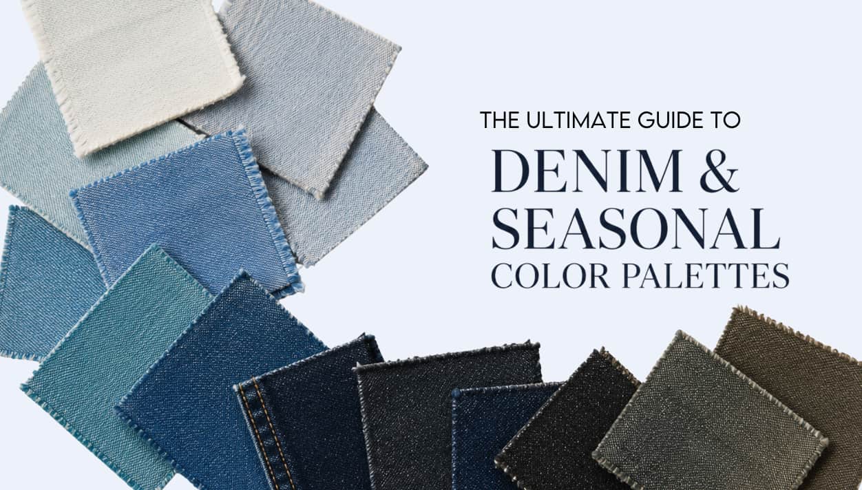
The Best Denim Washes for Every Seasonal Color Palette
We’ve all heard the golden rule of fashion: “Jeans go with everything.” But the truth is, blue behaves totally differently depending on your seasonal color palette. And since you’ve likely got a pile of jeans clogging up your closet, let’s get a little clarity on which denim styles “ideally” fit your seasonal color palette.
Denim is a bit of a shape-shifter; it sits right on the line between a neutral and a color, doing both jobs at once. Fortunately, unlike a lipstick or a sweater framing your face, your jeans don’t need to be a rigid, perfect match to look good. Because they’re worn on your lower half and we’re all so used to seeing them, you actually have way more flexibility than you think.
Color analysis isn’t about hunting for a strict list of “approved” pants. It’s about the big picture. You may decide- ehh, any denim really works for me. Or you may want to hone down your shopping experience and understand how the wash, texture, and contrast play with your natural coloring. We aren’t aiming for perfection here; we’re just looking for harmony. Think of these recommendations as a spectrum, not a rulebook.
Blue Isn’t Just “Blue”
When we look at a wall of denim, we see “blue.” But blue shifts dramatically depending on its base color hue or influence. To find your ultimate match, you have to train your eye to see where the fabric is secretly leaning:

- Some denim leans turquoise or green. (often Spring)
- Some denim leans violet or smoky. (often Summer)
- Some denim has a warm gold or orange cast. (often Autumn)
- Some denim becomes almost blackened or inky. (often Winter)
The Four True Seasons at a Glance
- Spring Denim: Clearer, brighter, sometimes turquoise-cast, and more visibly “blue.”
- Summer Denim: Softened, grayed, airy, and blended, with a clear pink-violet influence.
- Autumn Denim: Warmed, bronzed, earthy, and softened with a distinct golden/orange cast.
- Winter Denim: Highly pigmented, midnight blue, blue-black, with stark contrast.
The other big question I get as an analyst, besides denim, is what are my season’s neutral colors- so if this is also on your mind, be sure to check out my ultimate guide on seasonal color neutrals here.
How Denim Fading and Distressing Change Harmony
Fading softens the visible color in denim, changing how much pigment remains in the fabric. As jeans become more faded, they often become grayer, dustier, and less saturated. Distressing adds another layer by increasing texture contrast through whiskering, abrasion, bleaching, and worn areas. Some palettes harmonize naturally with softened, weathered denim, while others require stronger pigment retention and cleaner contrast to maintain harmony.
The softer seasons (autumn and summer) often do best with slight weathered, softened, or aged denim. Although, this becomes more flexible once we get into the neutral seasons, so be sure to look at your exact season when evaluating how much distressing or fading works for you. Spring and Winter benefit from clarity and contrast. Winter can sometimes handle stark contrast whiskering, when the fading creates a sharper line, but it’s not my favorite look for Winter overall.
Why Contrast Stitching Matters
Never underestimate the power of thread and details! While we aren’t trying to drive ourselves mad finding the “perfect” denim with the “perfect” stitching and hardware, it’s nice to know what is best for your palette. That way, if you ever do uncover the holy grail of jeans for your season, you can snatch them up!
- Autumn: Burnt orange, camel, and warm brass harmonize beautifully and lock in that needed warmth.
- Summer: Silver, soft blue, and muted stitching blend seamlessly into a cool, soft profile.
- Winter: White, black, navy, and silver sharpen the denim and provide that essential crispness.
- Spring: Blue, white, and lighter warm neutrals keep the appearance feeling clear, light, and fresh. Gold hardware is great, although some of the neutral seasons can do silver as well.
How Texture Impacts Things
Texture directly dictates how color is perceived by the eye. It can either amplify a color or quiet it down. And if you’re familiar with my content you know how much I believe in fabric selection and texture evaluation for personal style.
Check out some of my articles on texture including: Textures 101, and Seeing in Layers (how texture impacts color perception).
Texture Matches by Season:
- Summer Seasons: Best with washed denim, brushed textures, matte finishes, and softened weaves.
- Spring Seasons: Best with cleaner finishes, sleeker surfaces, crisp dye saturation, and absolutely zero visual “dustiness.”
- Autumn Seasons: Best with rugged texture, grain, slub, and aged or earthy finishes. Autumn needs some “character” in its denim.
- Winter Seasons: Best with polished denim, smooth or controlled textures, high pigment, and sharp contrast.
This is general advice; there is a lot of nuance to consider, so we will get into specifics for each of the 12 seasons shortly. As well as, remember that these are general guidelines. I’m helping you visualize the larger picture for each season so that you might take this information and apply/break/amend it for your own personal style.
The Biggest Denim Mistakes by Season
- Too Much Gray: A common trap for Springs and Winters that instantly drains their natural clarity.
- Too Much Saturation: A common issue for Summers that completely overwhelms their delicate, soft coloring and pulls focus from their palette.
- Overly Rugged Denim: Visually overwhelms bright, clear palettes.
- Heavy Contrast Whiskering: Looks incredibly harsh and disjointed on soft palettes.
- Extremely Inky Denim: Way too sharp and heavy for Summers and many Autumns.
- “Colorless” Denim: So faded that it acts as a placeholder instead of supporting the outfit. Summers can sometimes go too soft in this area.
Christine Scaman has a video on denim for the seasons here, and in it she mentions pasting in a color from your palette to “build” and outfit for testing purposes. We want to see the color/denim on the same “plane” or as she says “the same energy”. If we see the top in front of the denim, the denim is too soft. If we see the denim on the front plane, it’s too much. We are looking for equal energy.
The 12 Seasons Denim Guide
Winter Seasons
Winters often struggle with jeans more than expected because standard denim can easily look too casual or washed out. To make denim read as Winter, look for black content within the dye, “midnight blue” works exceptionally well here.
Winter denim should feel newer and crisper. Traditional fading can make a Winter’s entire outfit look less sophisticated. You may find it helpful to embrace that a Winter’s “casual” look is slightly more polished or dressed up. Once you get over that hurdle, you will find some beautifully pigmented jeans for your closet.
True Winter
The Vibe:
True Winter denim works best when it feels crisp, cool, and saturated. Your ideal washes sit in the medium-dark to dark range with a rich, highly pigmented blue that feels clean, sharp, and almost “straight out of the tube.” Unlike the softer seasons, your denim should retain visible clarity rather than fading into gray or softness. You can also wear icy light denim exceptionally well, provided it stays cool and bright rather than weathered.
Finishes:
Cleaner, smoother finishes are your strongest look. Slight sheen, crisp surfaces, and rich pigment all reinforce True Winter’s cool precision. Avoid rugged textures, heavy distressing, dusty washes, muddy indigo, warm undertones, or overly softened denim that dulls your natural contrast.
Details:
White, navy, black, or silver stitching keeps the look crisp and cohesive. Silver or gunmetal hardware reinforces your cool clarity, and sharp black denim is one of your strongest neutrals. Traditional orange stitching is usually too warm and distracting, but it might be unavoidable.
Best Color Directions:
- midnight indigo
- blue-black indigo
- clear navy
- crisp medium blue
- icy blue denim
- cool charcoal denim
- sharp black denim
Bright Winter
The Vibe:
Medium-dark to dark denim with extremely clear, highly saturated pigment. Your best denim often looks intensely blue, electric, vivid, or almost synthetic in its clarity. Bright Winter handles bold indigo beautifully, especially when the blue undertone remains highly visible (pair that with one of your brights and it’s perfection!). Blue-black, sharp black denim, and even icy light denim can work extremely well here. Unlike softer seasons, your denim should retain visible brightness and energy rather than fading quietly into the background.
Finishes:
Crispness and polish matter far more than softness. Look for smooth surfaces, cleaner finishes, controlled fading, and strong dye saturation. A slight sheen on the fabric surface works beautifully. Avoid dusty fades, muted denim, rugged textures, weathered washes, earthy undertones, or anything that feels softened and aged.
Details:
Keep it clean and high contrast with white, navy, or black stitching. Silver hardware is usually strongest, although minimal gold hardware can occasionally work (since you have a spring influence).
Best Denim Colors
- electric indigo
- vivid navy
- blue-black denim
- highly saturated cool indigo
- sharp black denim
- icy light denim
- crisp medium-dark blue
Dark Winter
The Vibe:
Dark, cool, and richly pigmented denim is your sweet spot. Dark Winter handles substantial depth beautifully, especially when the color still retains visible saturation and clarity rather than fading into softness or grayness. Your best washes tend to feel smoked, shadowed, inky, or blue-black rather than bright or electric. Compared to True Winter, the effect is slightly more deep and atmospheric, though still distinctly cool and dramatic.
Finishes:
Matte or lightly textured denim works beautifully here, especially finishes that feel polished, weighty, substantial, and refined rather than rugged or distressed. Slightly shadowed surfaces are often more harmonious than icy, ultra-crisp finishes. Avoid dusty washes, heavily faded denim, warm indigo, rugged abrasion, or anything that appears chalky or weathered. We want a touch of Autumn’s texture here, but not so much it feels soft.
Details:
Dark Winter wears deeper contrast beautifully. Navy, charcoal, black, gunmetal, and subtle silver details all work well here. Matte black denim is especially strong, along with smoked blue-black denim and dark indigo washes with visible depth. Orange stitching is often too warm, while bright white contrast stitching can sometimes feel overly sharp compared to the softer depth Dark Winter naturally carries. But again, don’t drive yourself mad. There are no color police waiting in the wings to fine you for your unharmonious stitching.
Best Color Directions:
- smoked indigo
- blue-black
- deep navy
- dark sapphire
- dark teal blue
- charcoal denim
- gunmetal gray
- matte black
- cool espresso-black
Summer Seasons
Summers need to look for a softer, less intense blue pigment. Your most harmonious jeans will often have a beautiful, subtle pinkish violet cast running through the denim. While moderate fading works perfectly for your soft coloring, you want to avoid “placeholder jeans” that have become too light or too soft and entirely colorless. Summers still need true pigment, even in their faded denim.
Light Summer
The Vibe:
Light Summer denim works best when it feels soft, airy, and effortlessly relaxed. Your ideal washes sit in the medium-light to medium range, with a cool blue base softened by a gentle gray or light blue influence. Rather than looking bright or dramatic, the color should feel calm, delicate, and naturally blended. Compared to Light Spring, Light Summer denim is cooler, softer, and more muted, with less visible brightness.
Finishes:
A lightly sun-bleached effect or gentle fading works beautifully, especially when the denim still retains enough pigment to feel intentional. Soft matte finishes, subtle whiskering, and lightly weathered washes all complement your palette. Avoid heavy distressing, overly rugged textures, very dark indigo, strong orange casts, or extremely faded denim that becomes chalky and colorless.
Details:
White, soft blue, navy, or silver stitching keeps the look light and cohesive. Soft silver hardware and muted contrast details blend naturally into the palette, while heavy orange stitching or high-contrast hardware can feel visually distracting.
Best Color Direction:
- soft aqua-cast blue
- misted indigo
- soft cornflower denim
- silver-blue denim
- light steel blue
- airy medium wash
- coastal weather blue
True Summer
The Vibe:
Medium denim with a softly blended, cool appearance. True Summer denim works best when the blue feels calm, balanced, and slightly softened. Think classic cool denim with a gentle gray-violet influence rather than icy brightness or deep dramatic contrast. Your best washes feel refined and airy, yet still retain pigment.
Finishes:
Softly faded and lightly heathered finishes work beautifully, especially when the denim still retains enough pigment to feel intentional and cohesive. Slight sun-fading, softened indigo, and smooth matte finishes are ideal.
Details:
Tonal stitching, navy stitching, faded blue stitching, soft silver hardware, and muted contrast details all work beautifully here. The goal is blended softness rather than sharp contrast. Traditional bright orange stitching often feels too warm and visually disruptive against True Summer’s cool, refined palette.
Best Color Direction:
- cool classic denim
- silvered indigo
- blue-violet denim
- softened navy
- faded steel blue
- weathered blue
- cool slate denim
Soft Summer
The Vibe:
Soft Summer denim works best when the color feels muted, blended, atmospheric, and gently weathered. Your ideal washes usually sit in a softened medium range rather than extremely light or dramatically dark. The effect should feel hazy and low contrast, with visible softness woven directly into the denim color itself. Cool smoky blues, softened indigos, and grayed blue-violets are especially harmonious here.
Compared to True Summer, Soft Summer handles noticeably more mutedness and visual softness. The denim should feel relaxed and diffused rather than crisp or highly pigmented.
Finishes:
Soft Summer thrives in denim with softened chroma, matte finishes, gentle fading, and naturally weathered texture. Subtle whiskering, lightly brushed surfaces, faded knees, and softly blended washes often work beautifully because they reinforce the palette’s low-contrast harmony.
Details:
Low-contrast detailing is key. Tonal stitching, softened navy stitching, smoky blue stitching, faded charcoal thread, soft silver hardware, and muted gunmetal all work beautifully.
Best Color Directions:
- smoky indigo
- weathered denim blue
- softened slate blue
- faded blue-violet
- washed navy
- muted charcoal-blue
- softened periwinkle denim
Autumn Seasons
There is something magical here because the strength and purpose of jeans align so well with Autumn, it’s a natural fit! When shopping, you are often looking for that slightly gold or orange cast to your denim.
Burnt orange stitching helps your denim harmonize effortlessly. Unlike Winters, Autumn denim can tolerate a lot of fade, and colored denim is an incredibly strong look for you.
True Autumn
The Vibe:
Medium to dark denim with visible warmth, earthy depth, and softened richness. Your best denim feels grounded, substantial, and naturally weathered. True Autumn denim often carries a subtle bronze, olive, teal, or tobacco influence beneath the blue, giving the wash a distinctly earthy quality while still reading clearly as denim.
Compared to Soft Autumn, the color here is richer, warmer, and more saturated. Compared to Dark Autumn, the effect is slightly less pigmented and dark.
Finishes:
True Autumn thrives in denim with texture, grain, matte surfaces, and organic-looking wear patterns. Slight fading, whiskering, slub texture, and rugged finishes often enhance harmony because they reinforce the palette’s earthy, tactile quality. Denim should feel durable and lived-in rather than polished or sleek.
Styling & Details:
Burnt orange stitching, tobacco brown thread, antique brass hardware, matte gold hardware, and warm copper details all look incredibly harmonious here. True Autumn also pairs beautifully with rugged textures like suede, leather, corduroy, tweed, canvas, and weathered finishes that reinforce the palette’s grounded warmth.
Best Color Directions:
- bronzed indigo
- warm blue
- earthy navy
- muted teal-blue
- warm slate blue
- peacock blue denim
- tobacco-cast denim
Colored Denim:
True Autumn handles colored denim exceptionally well. Olive, rust, burgundy, acorn, moss, tobacco, dark teal, and warm forest green denim all integrate beautifully into the palette.
Soft Autumn
The Vibe:
Medium-light to medium denim with a softly weathered, muted, and earthy quality. Soft Autumn denim works best when the color feels blended, relaxed, and gently warmed. Your ideal washes often carry a softened olive, taupe, bronze, or smoky teal influence beneath the blue, creating a distinctly organic effect.
Compared to True Autumn, Soft Autumn denim is quieter and more diffused. The overall effect should feel mellow and atmospheric rather than rugged or richly saturated.
Finishes:
Soft Autumn thrives in denim with softened chroma, matte finishes, gentle fading, brushed textures, and naturally worn surfaces. Slight whiskering, subtle weathering, and muted washes often enhance harmony because they reinforce the palette’s low contrast and earthy softness.
Details:
Traditional tobacco stitching, muted camel thread, warm taupe stitching, antique brass hardware, softened gold hardware, and weathered copper details all integrate beautifully here. The goal is softness and warmth rather than sharp definition or high contrast.
Best Color Directions:
- weathered denim
- blue warm gray-blue
- muted slate blue softened
- indigo smoky teal-blue
- muted navy
- bronzed blue-gray
Dark Autumn
The Vibe:
Dark Autumn denim works best when it feels deep, earthy, substantial, and quietly dramatic rather than crisp or high contrast. Your ideal denim sits in the darkest part of the Autumn spectrum, but still retains warmth, softness, and visible texture. Instead of icy blue-black or sharp indigo, think smoked navy, espresso-indigo, bronzed blue-black, deep teal-cast denim, and shadowed warm indigo.
Compared to True Autumn, the effect here is richer, darker, moodier, and more refined. Compared to Winter, Dark Autumn denim is noticeably softened, warmer, and more grounded.
Finishes:
Dark Autumn thrives in denim with depth, matte texture, subtle fading, and rugged richness. Prussian blue, deep teal-indigo, and warmed navy washes are especially harmonious. Matte and textured finishes almost always outperform sleek, icy, or hyper-polished denim.
Styling & Details:
Dark Autumn looks incredible in rugged, tactile styling. Leather, suede, brushed knits, aged metals, distressed textures, matte finishes, and substantial fabrics reinforce the palette’s earthy drama beautifully. So don’t be afraid if those details are naturally integrated into the jeans or added into the outfit as a whole.
Burnt orange stitching, tobacco thread, dark bronze hardware, antique brass, weathered copper, and warm gunmetal all integrate naturally into the palette.
Best Color Directions:
- espresso-indigo
- bronzed blue-black
- smoked navy
- deep teal-indigo
- warm Prussian blue s
- oftened black-navy
- shadowed indigo
- antique blue
Spring Seasons
Spring denim is all about energy, so it requires more visible blue pigment. It needs to feel cleaner and brighter, often holding a beautiful “lagoon quality” or a “Caribbean ocean green” cast. It should look at home in a tropical landscape or a spring meadow.
You want to avoid heavy, dusty fading and overly dark, Winter-level weight. Springs actually tolerate “standard jeans” fairly well, provided that core brightness remains.
Bright Spring
The Vibe:
Bright Spring denim works best when it feels bold, clear, and full of life. Your strongest washes are highly saturated, distinctly blue, and if they are dark, they still retain a visible hue. Bright navy, vivid true blue, and clear light blues all harmonize beautifully because they maintain the fresh, energetic quality that defines the palette. The denim should feel lively, polished, and unmistakably colorful. These colors can be hard to find, but eventually (in my experience) you find denim that is close enough.
Finishes:
New-looking denim is your strongest direction. Choose clean, crisp, highly saturated washes with smooth surfaces and visible pigment retention rather than bleached, faded, rugged, or worn-out finishes. Bright Spring can handle more brightness than the other Spring palettes because it borders Winter. Avoid smoky indigo, chalky fades, muddy undertones, or overly distressed denim that dulls the palette’s natural vibrancy.
Details:
White or bright navy stitching reinforces the clean, high-contrast look of the palette. Brighter gold hardware is often the strongest choice because it echoes Bright Spring’s brilliant clarity, but since Bright Spring is a neutral season, clear silver can also work beautifully. The overall effect should feel fresh, crisp, and energetic.
Best Color Directions:
- bright navy
- clear indigo
- vivid denim blue
- true blue
- bright medium blue
- clear light blue
True Spring
The Vibe:
True Spring denim works best when it feels fresh, lively, and clear. Your ideal washes sit in a bright medium range rather than extremely dark or heavily faded territory. Classic medium blue denim is often your strongest direction, especially when it carries a slight turquoise or sunlit quality that keeps the color feeling energetic and warm rather than cool or smoky.
Compared to Bright Spring, the effect here is lighter, warmer, and more playful. Compared to Autumn, the denim is cleaner and brighter with far less earthiness or softness.
Finishes:
Cleaner washes with light-to-moderate saturation work beautifully, especially when the denim still feels youthful and colorful rather than rugged or weathered. Slight fading can work if it stays bright and sunlit rather than chalky or gray.
Avoid dusty washes, smoky denim, heavy whiskering, rugged distressing, overly dark indigo, black denim, or anything heavily muted. Excessive fading often removes the lively clarity that makes Spring denim work so well.
Details:
Blue stitching, white stitching, brighter gold hardware, and cleaner contrast details all harmonize beautifully with True Spring’s fresh warmth. Traditional heavy orange stitching can sometimes feel visually heavy, while stark silver hardware may start pulling too cool. The overall effect should stay bright, cheerful, and clear rather than dramatic or rugged.
Best Color Directions:
- classic medium blue
- clear true blue
- turquoise-cast blue
- sunlit denim blue
- clear warm blue
- bright sky-blue denim
- vivid classic denim
Light Spring
The Vibe:
Light Spring denim works best when it feels airy, fresh, cheerful, and lightly sunlit. Your ideal washes are lighter and clearer than most Spring palettes, often carrying a delicate turquoise, aqua, or cornflower influence that keeps the denim feeling youthful and luminous.
Compared to True Spring, the effect here is softer, lighter, and more delicate. Compared to Light Summer, Light Spring denim stays warmer, brighter, and clearer with noticeably more freshness and sparkle.
Finishes:
Light Spring thrives in denim with a soft, fresh appearance and light-to-medium visual weight. Gentle fading, washed finishes, and lighter textures often work beautifully because they reinforce the palette’s easy brightness and relaxed warmth. Softer denim textures naturally harmonize well here, especially when the color still retains clarity.
Avoid heavy gray casts, rugged distressing, smoked indigo, antiqued finishes, muddy denim, or overly dark washes that feel visually weighty. Extremely faded denim can also lose the lively clarity that keeps Light Spring harmonious.
Details:
White stitching, light gold hardware, brushed gold, pale brass, and lighter blue stitching all work beautifully with Light Spring’s delicate warmth. The overall effect should feel fresh, buoyant, clean, and approachable rather than dramatic or heavily contrasted.
Best Color Directions:
- light turquoise-blue
- cornflower denim
- fresh light blue
- clear aqua-cast blue
- light classic denim
- sunlit medium blue
- bright light blue
At the end of the day, don’t stress too much about finding the “perfect” pair of jeans. Your palette is just a tool to help you clear out the closet clutter and make shopping a little easier, not a rulebook to keep you trapped. Take a look at what you already own, trust what makes you feel good, and remember that harmony is the goal, but it’s not the only path.