
Your Best Reds: Seasonal Color
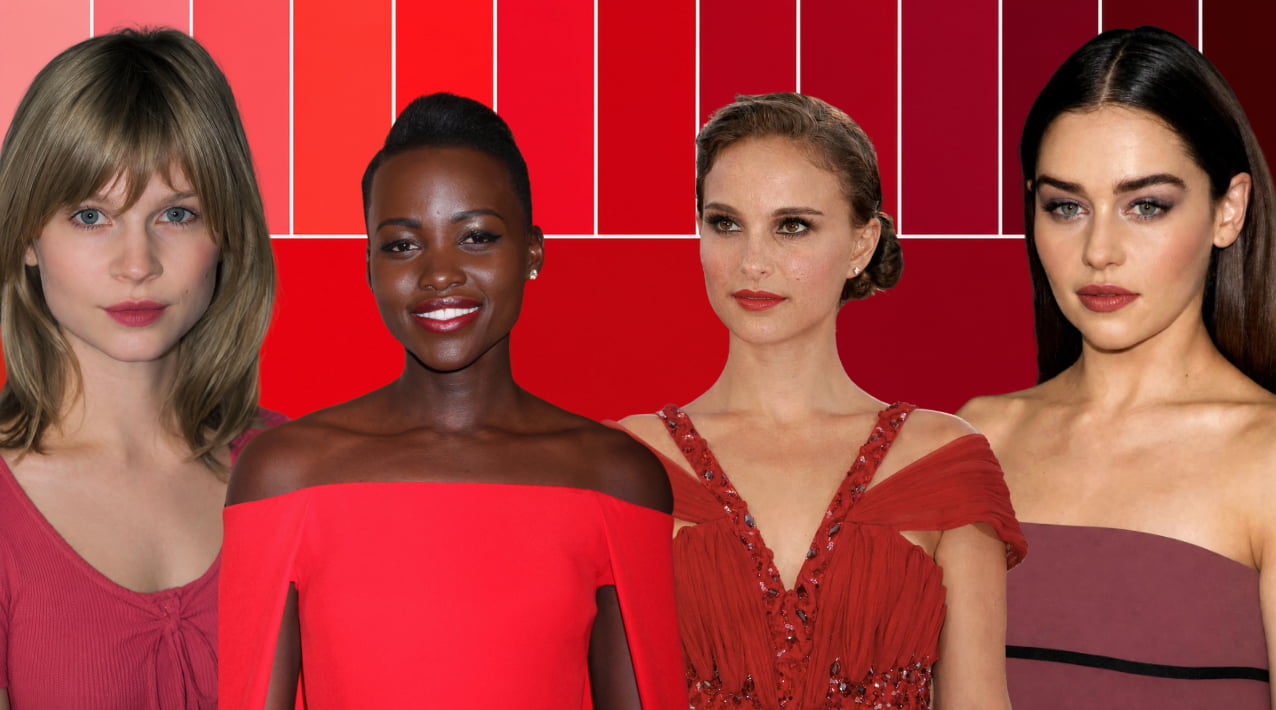
Red is one of those colors that almost everyone has an opinion about.
It’s usually either “RED IS MY FAVORITE!” or… “ I HATE RED!”. Seldom somewhere in between.
In my color analysis appointments we have a whole section called “the red test” for draping and people always laugh when they see the range of it… Red is a base hue. When you add yellow to it, you shift it toward orange, when you add blue to it you shift it towards purple. So when people say they cant find their reds- I always challenge them to what they actually think “red” is…

Every seasonal palette has reds, but they vary dramatically depending on the hue, value, and chroma of the palette. Some reds are warm and sunny, some are cool and refined, some are softened and earthy, and others are so bold we are scarred from wearing them (if you’re not a winter ;)).
Learning your palette, and seeing what your “best” reds are, is actually very freeing. It allows you to see your best colors, colors you might borrow, and colors you might avoid (especially when paying a hefty price for that designer bag or lipstick).
Why Every Season Has a Different Red
Red isn’t just one color. In the Munsell Color System, every color is defined by three qualities: hue, value, and chroma. As those three qualities change, so does the character of the red.
- Hue changes where the red sits on the color wheel. Move toward yellow and you begin to see tomato, poppy, and coral reds (your Red-Orange spectrum). Move toward purple and reds become raspberry, magenta, and berry (your Red-Purple spectrum).
- Value changes how light or dark the red is. The same basic red can become a light watermelon red or deepen into wine, burgundy, or oxblood. One way to think about lightness and darkness of a a color is by adding white or black to it.
- Chroma changes how clear or muted the color appears. High-chroma reds feel crisp and vibrant, while lower-chroma reds become softer, dustier, and more subdued. When we soften a color, we are adding gray to it (most often).
Every seasonal palette is built from these three dimensions, and it’s not about boxing you in, but rather finding a flexible border for you to play in.
If you’re confused about seasonal color, check out my main seasonal color guide here, or my seasonal color 101 article here.
Disclaimer: There is a A LOT of nuance to each palette. Palettes can get stereotyped online, where people get a very narrow understanding of what a palette can be. Dark Winter is just cool and moody, summer is just pastels etc… The truth is, is that each palette has a broad range of lights, brights, darks, and neutrals. And we are trying to push those boundaries to include a wide array of choice for each person. So if you’re like well that red looks too warm for a summer, it is likely still in palette, and just on one side of the spectrum of that palette. If that color isn’t for you- totally ok! But everyone sits along the spectrum within their season, and their mileage may vary on what colors they enjoy and embrace.
Best Reds for All 12 Seasonal Color Palettes
Dark Winter
Hue: Neutral/Cool
Value: Dark (low) (dominant trait)
Chroma: Medium High
Dark Winter reds feel rich, mysterious, and can embrace the romanticism of red easily. They range from deep wines and mulberries to cool berries, dark rubies, and plums. These reds seem to pull you in. They have a beautiful depth that feels elegant but mysterious, like candlelight reflecting through a glass of red wine.
Because Dark Winter borders Dark Autumn, you’ll notice a touch more earthiness than the other Winter palettes. They never become brick red or rusty, but they don’t have the icy clarity of a True Winter red either. But I do want to provide some more context for your reds. People always assume all of Dark Winters colors are DARK, DARK, DARK! But you do have a range, and your medium value colors are bright and beautiful. You have some very beautiful berry shades and floral qualities to them. So if moody temptrest isn’t your vibe, you can apply this palette to any style archetype or goal.
True Winter
Hue: Cool (dominant trait)
Value: Medium
Chroma: Medium High
True Winter reds are bold in the most classic sense. They range from striking cherry reds to cool crimson, blue-reds, and vibrant red-violets. Every red feels clean, crisp, and have a certain regal quality to them. They feel timeless and when we think of the color “red” we often think of a True Winter red.
They feel polished without trying too hard and dramatic without feeling heavy. On a True Winter, these reds don’t overpower. Instead, they echo the natural clarity already present in your features.
Bright Winter
Hue: Neutral/Cool
Value: Medium
Chroma: High (dominant trait)
Bright Winter reds are joyful. They range from true reds and scarlets to brilliant raspberry reds and lively coral-reds, each one feeling energetic and modern. They have a sparkling clarity that makes them feel almost illuminated, like sunlight catching the glossy surface of a perfectly ripe cherry. Or the lacquered finish on a sports car.
These reds aren’t subtle, and they can intimidate people who don’t love color or are new to their Bright Winter palette. But when given the chance, these colors light you up and make your face come alive. Fashion in general is a little timid around brights and people online tend to default to the whole “I see the color first” thing, but don’t let that dissuade you! These are your beautiful, striking reds and when you wear them your face becomes defined, your eyes glow, and the color creates a beautiful base for your features.
Bright Spring
Hue: Neutral/Warm
Value: Medium
Chroma: High (dominant trait)
Bright Spring reds are vibrant, fresh, and full of energy. Think tropical flowers and jello colors! They range from lively poppy reds and brilliant coral roses to clear watermelon shades and tropical red-oranges. Every red feels illuminated, almost as though the color is glowing from within. These aren’t muted or earthy reds. They have a sparkling clarity that makes them feel bold, playful, and impossible to overlook.
If you’ve always loved bright reds but worried they were “too much,” Bright Spring might surprise you. These colors have enough warmth to feel inviting, but enough clarity to stay clean and vibrant. They bring a sense of movement and excitement that mirrors your own natural brightness.
When I was in my color analysis training and we determined I was a Bright Spring (in the Sci\Art method), I was TERRIFIED of that red. But after about 2 weeks, it became my favorite color in my palette.
Want more Best Color Articles? Check Them out here.
True Spring
Hue: Warm (dominant trait)
Value: Medium
Chroma: Medium High
True Spring reds are warm, cheerful, and bursting with life. They range from glowing coral reds and warm poppies to juicy tomato reds, warm red-oranges, and fresh salmon shades. Every red feels kissed by sunshine, carrying a warmth that’s unmistakable and the trademark of this palette.
These reds have a natural optimism to them. They remind me of spring gardens just beginning to bloom, baskets of fresh fruit at the farmer’s market, and the first warm afternoon after a long winter. They bring color to your complexion in the same effortless way they bring life to an outfit. If you’ve always found yourself drawn to warm, happy reds that feel approachable instead of dramatic, you’ve probably already been gravitating toward your palette.
Light Spring
Hue: Neutral/Warm
Value: Light (high)
Chroma: Medium
Light Spring “reds” are soft and fresh. You might be looking at this palette and thinking… these don’t look very “red”! Well, your dominant characteristic is “light” which are tints. That means most of your colors have a substantial amount of white added to them. When you take red and add white you get… PINK! So your palette does lean toward coral pinks, watermelon, peachy reds, and gentle red-oranges like melons.
Instead of feeling bold or intense, these reds feel airy and sunlit, as though they’ve been softened by the first light of morning. They will serve the same romantic look as a traditional red does for a true winter.
A Note About Summer Reds
If you’re a Summer, you might notice something a little different as you look through these reds. You don’t really have a classic, bright primary red in your palette, and that’s completely intentional from a color theory standpoint.
Summer is defined by coolness and softness. As a red becomes cooler and more muted, it naturally shifts away from that bold “fire engine” red and toward roses, raspberries, berries, burgundies, and blue-reds. That’s why many of the reds in the Summer palettes may initially look more like berry or rose shades than what you traditionally think of as red.
Don’t let that fool you. These are your reds.
In fact, this is one of the biggest reasons Summers often struggle with lipstick shopping. Many classic red lipsticks are designed to be bright and highly saturated, which can easily overpower Summer’s softer coloring. Once you start looking for cooler, softened reds instead, you’ll probably find they feel much more natural and harmonious.
Light Summer
Hue: Neutral/Cool
Value: Light (high) (dominant trait!)
Chroma: Medium
Light Summer reds are fresh, airy, and quietly cheerful. They range from watermelon reds and strawberry sorbet to cool coral reds and the softest raspberry shades. Again your dominant feature is LIGHT, which means white has been added to your colors. You take red and add white, you get pink. Hence, your reds are more traditional pinks. You may also be thinking, these look a little bright and some are even a touch warm. This is a common misconception about Light Summer, that is it overly dusty and only ethereal pastels. Not only are you the brightest of the summers, you also have a touch of spring influencing your palette. So don’t be afraid to dip into some of your more vibrant shades.
True Summer
Hue: Cool (dominant trait)
Value: Medium
Chroma: Medium
True Summer reds are calm, refined, and beautifully balanced. They range from soft raspberries and cool burgundies to rose reds and blue-based berries. These “reds” are cool, so they have a drop of blue in them and lean closer to the red-violet side of the color wheel.
There’s something incredibly graceful about True Summer reds. They remind me of English garden roses after a summer rain or berries just beginning to ripen. They don’t rely on intensity to make an impact. Instead, their beauty comes from their balance. If you’ve always preferred cooler berry lipsticks there’s a good chance you’ve been reaching for your palette all along.
Soft Summer
Hue: Neutral/Cool
Value: Medium
Chroma: Soft/Muted (low)
Soft Summer reds are gentle, muted, and understated. They range from dusty berry reds and rose mauves to softened plums and weathered wine shades. Every red has a veil of softness over it, giving the palette an effortless, relaxed beauty. Instead of looking crisp or vibrant, these reds feel quiet and beautifully lived in. Your dominant characteristic is soft but that does not mean all your colors feel overly faded.
Think of these tones as the gentlest interpretation of red, where softness is always the first thing you notice. They do have a touch of warmth to them at times, due to your sister season Soft Autumn’s influence.
Soft Autumn
Hue: Neutral/Warm
Value: Medium
Chroma: Soft/Muted (low) (dominant trait)
Soft Autumn reds radiate warmth in a gentle, understated way. They range from brick roses and old roses to terracotta, dried cherries, warm rose browns, and soft Merlot. Rather than feeling bright or bold, these reds have a mellow, earthy quality that feels relaxed and inviting. They remind us that red doesn’t always have to be vibrant to make an impact.
These are the reds of weathered brick, adobe, woodland berries, and autumn leaves just beginning to soften. If you’ve always felt that classic red lipstick looked too sharp, Soft Autumn offers a much gentler interpretation. These reds blend beautifully with your natural warmth, creating harmony rather than contrast. They feel comfortable, effortless, and quietly beautiful.
True Autumn
Hue: Warm (dominant trait)
Value: Medium
Chroma: Medium
True Autumn reds are rich, warm, and full of life. They range from tomato reds and canyon roses to brick reds, terracotta, bronzed berry reds, and deep salmon. Every red carries a golden warmth that is the trademark of this palette. These reds are grounded, abundant, and unmistakably autumn.
If Soft Autumn feels like the colors beginning to fade, True Autumn is the season at its peak. Think of a harvest market overflowing with pumpkins and tomatoes, or an October maple tree glowing in full color. These reds bring warmth to your complexion without becoming overpowering, making them equally beautiful in a cozy sweater or a warm red lipstick.
Dark Autumn
Hue: Neutral/Warm
Value: Dark (low) (dominant)
Chroma: Medium High
Dark Autumn reds are deep, spicy, and dramatic. They range from Merlot, Claret, Port, and warm burgundy to brick red, and rustic reds. These are the darkest reds in the warm palettes, carrying a richness that feels bold without becoming cool. They have depth, warmth, and a slightly smoldering quality that makes them instantly recognizable.
These reds feel like late autumn, when the colors become darker, richer, and more intense. Think mulled wine, spice market, chili peppers, and the warmth of richly woven textiles. They have a sense of strength and confidence to them. Your reds are sumptuous and inviting, like a earth goddess draped in tapestries.
Finding your best red isn’t about memorizing color names or carrying around a checklist every time you shop. It’s about training your eye.
The more you work with your palette, the easier it becomes to recognize the reds that belong to your season. Over time, you’ll probably find yourself reaching for them without even thinking about it.
And remember, seasonal color analysis is a tool, not a rule. You don’t have to wear every red in your palette, and you don’t have to swear off every red outside of it. Your style, your preferences, and how you want to express yourself all matter too. The goal isn’t perfection. It’s building a wardrobe that feels a little more cohesive, a little easier to shop for, and a little more like you.