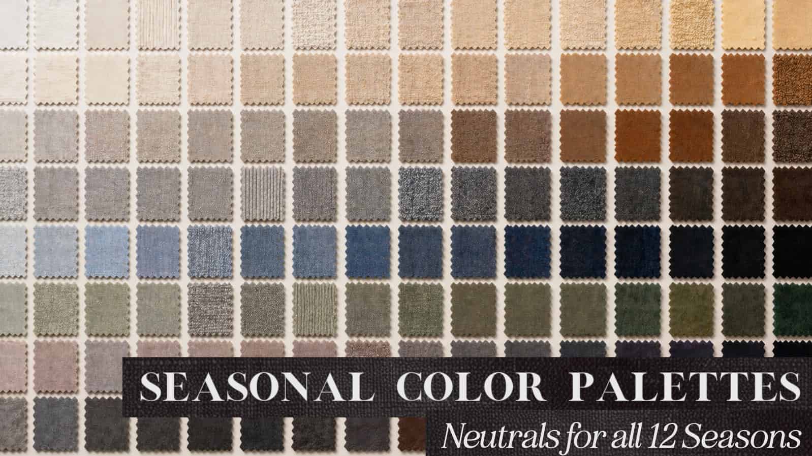
The Ultimate Guide to Seasonal Color Neutrals (All 12 Seasons)
The first thing people ask me after I’ve determined their season is something along the lines of:
“Can I wear black?”
“What does my white look like?”
“I only like to wear neutrals! I don’t know what to do with XYZ colors!”
Neutrals in our wardrobe become the default. The safe starting point, the thing you’ve likely done for years without much friction…
And while color analysis is often discussed in terms of bold or “wow” colors, I think one of its biggest shifts is this: it shows that you don’t have to rely so heavily on neutrals in the first place. It opens the door to more color, more dimension, more interest. It’s like a permission slip to say, “Try THIS color, it’ll be ok!”
But that doesn’t make neutrals unimportant.
They’re still your anchors. The colors that hold everything together and give your palette structure. When they’re right, your entire wardrobe feels more cohesive and intentional. And when your neutrals are in-season, they transform your wardrobe’s ability to mix and match. And I’m not saying a “mix-and-match” wardrobe is essential, but boy is it helpful when those charcoal gray leggings mix seamlessly with your dusty blue sweater because everything else is in the wash.
The catch is that neutrals are often the hardest colors to get right. They’re subtle, and small shifts in undertone, depth, or softness can completely change what season they fall into.
So, I often recommend people really familiarize themselves with their fans and their palettes before attempting to find their perfect neutrals.
Now, a BIG disclaimer. Seasonal color analysis has many, many forms and systems. Every system decides the “boundaries” of a season. How far they push the brights, the lights, the darks, and what colors fall within that specific season. If you’ve spent any time searching for color analysis content, you’ve probably already found many versions of each palette.
I am trained in the 12-season, Sci\Art-based system. I have chosen these neutrals based on those boundaries. Some of the colors might feel “surprising” to you. That could be because you have studied or preferred a different seasonal system. That could also be because palettes are WILDLY stereotyped. So… before you say “that color is NOT part of that season”- consider leaving a constructive question-based comment, and I will do my best to explain (in color theory terms!) why I have placed it there.
Also, each section aims to show the range of your neutrals. It does not encompass every single color you can wear. Use it as a visual to understand the expanse of your palette, but do not take things too literally- like ” I guess this navy that is one pixel away from this color isn’t in my palette”….
Without further ado, let’s get into your neutrals!
The Winter Seasons
Precision and power seem to encapsulate the Winter season energy. If you’d like an overview of the Winter family, check out this article.
Winters are defined by contrast and chroma. Their neutrals are never “muddied”, they are intentional, sharp, and authoritative. While a lot of Winter neutrals are pretty easy to find, you do get a bigger range than black and white, so consider this an expansion of your neutrals.
True Winter
Midnight Ice

True Winter is the most extreme season, characterized by absolute cold and superlative contrasts. Imagine a silent iceberg under a midnight sky. There are darks and lights; this is the only season that technically gets the full value spectrum (pure white to pure black). There is no warmth here; the colors are as clear as a bell.
The Vibe: Frosted glass and starlight. It is the ice cave where air feels fresh against your cheeks, and light reflects a blue-hued clarity.
The Light Anchor: Igloo White. This is a stark, “bleached” white. Think of a fresh snowdrift or a Styrofoam cup. It is pure, clean, and “frozen.” Your whites are pretty easy to find out in the wild, so you probably already feel some competence with your lighter neutrals.
The Dark Anchor (Your “Black”): Jet Black. You are the only season that gets pure black (which may reveal subtle blue or green reflections). You also own Oreo-Cookie Brown, a purplish black-brown, Indigo, and blue-black. It gives you a lot of flexibility, and they can all work for your “dark” wardrobe neutrals.
The Navy: Inky Navy & Midnight Navy. These are exceptional substitutes for black. Think of the ocean at its deepest point or the sky just before full night. They feel almost black, but their base hue is actually blue. You also get a deeper sapphire blue that can be used as a neutral if you lean toward a more colorful wardrobe.
The Gray: Steel, platinum, graphie, and clear charcoal. These are “hard,” steely grays composed strictly of black and white. Think of a steel blade, polished chrome, wet pavement, or the body of a luxury car. Avoid anything that feels foggy, dusty, or diffused- those are summer grays! Your grays feel more like metals; they have some edge and sharpness!
Deep Neutral: Cool Purple Espresso. A dark brown with a violet undertone is really the only “brown” you get. Make sure it doesn’t get too warm!
Texture Tip: Mirror-Like Shine. Your colors are so clear they demand a surface that doesn’t “break up” the light. Think polished leathers, crisp silk, and high-shine metals. Avoid anything marled, overly textured, or heathered. Texture allows the clarity of the color to be at its highest. Want more information on color and texture? Check out this article.
Bright Winter
Crystal Brilliance
Bright Winter is Winter’s glamour mixed with Spring’s optimism. It is an ice palace catching the first ray of dawn. It is the visual of a diamond catching the light or an Orca whale breaching in a sunlit glacier. You have shine, brilliance, and a touch of Spring’s warmth,but your neutrals still exist in a range.
The Vibe: Bright Winter is marshino cherries, satin flowers on black velvet, and the blue sparkle of sunlight on ice. You are shining and sparkling!
The Light Anchor: Angel White. A pure white with a drop of yellow-green. It’s just a hair warmer than True Winter’s starkness (it has that spring influence!), but still crisp and clean. Think of plain Greek yogurt under bright light or the smooth surface of glossy white ceramic.
The Dark Anchor (Your “Black”): Vinyl Black. Your black should have a “glaze” or “shine” to it. You also have Black-Turquoise, a black so deep it has a hidden teal heart, and Jackdaw Black (a charcoal one step lighter than jet, but still clean and not dusty). Jackdaw black is also a border Bright Spring color, so if you lean more towards the True Winter side, it may be too warm for you. But for your “blacks,” think of patent leather catching light, a glossy black car finish, or a vinyl record with a visible sheen.
The Navy: This is deep Sapphire or royal blue. It’s more saturated and energized than a standard navy, with a high-clarity, almost lit-from-within quality. Think navy satin catching the light or a polished enamel surface that feels smooth and luminous, never flat. For bright seasons, shine and reflective textures can be a great choice! Just look at the color swatches in the palette versus the textured/fabric swatches; they really come alive with those textures!
The Gray: Mercury. Bright Winter grays are crisp, bright, and reflective, with the cool sheen of polished metal. Think titanium, chrome, brushed aluminum, and the silvery edge of a mirror catching light. Even the deeper grays retain that same clarity and sleekness, reading more like shadow on metal than charcoal, smoke, or stone.
The Brown: Bright Winter browns are cool, saturated, and slightly polished rather than earthy or muted. They tend to sit in the black-brown, violet-brown, and deep espresso range, with a clarity that keeps them feeling sharp rather than rustic. Think dark varnished wood, black coffee with a plum cast, or the deep purple-brown of a chocolate lily.
Texture Tip: Patent & High-Gloss. You thrive on shine! Materials that look wet or glassy—like vinyl, patent leather, smooth satin, or reflective metal—help bring your colors to life!
Never underestimate the power of texture to influence your color and style, read more about it here.
Dark Winter
The Shadowed Forest
Dark Winter combines the cool regal air of Winter with a warm touch of Autumn. Think of a spruce forest against a dark mountain reservoir. It has depth and moodiness, but lacks the pure coolness of the True Winter Ice Queen. Instead, it feels more grounded and natural, and can even have a bit of a seductive quality. Your palette is dark and enchanting!
The Vibe: Black Forest cake, black coffee, gunmetal, and smoked berries deep in the forest. It is opulent but grounded.
The Light Anchor: Snow just before nightfall. A softened white that replaces stark optic white (that’s True Winters white!). It may carry a faint warmth deep within it, but never enough to appear creamy or yellow. Think natural fleece, soft bone, or weathered ivory. Now, when I say “soft,” I mean in comparison to the other Winter’s whites. Dark Winters whites are still high contrast!
The Dark Anchor (Your “Black”): Your black has been aged by time and shadow. Think vintage black, or matte fabric that absorbs light rather than reflecting it. It is deep, but settled into the ground. It often feels more organic or aged.
You see this most clearly in variations like black-brown and black-navy. Black-brown echoes something like the dense layers of a chocolate fudge cake with dark chocolate ganache. Very rich! Black-navy, by contrast, feels like the sky just before full night, where blue is still present but barely (in an outfit, it might almost look like black, only when you compare it to a true black will the blue hue base reveal itself). In Dark Winter, your darks are always integrated, grounded, and slightly lived-in.
The Navy: Blackened Blue. Dark Winter navy has depth, but not the sharp, almost-electric quality of the cooler Winters. These blues feel heavier, moodier, and slightly smokier. Think dark indigo denim before it fades, Prussian blue paint, deep reservoir water, or navy wool in low light. Even when the color shifts more slate or charcoal-blue, it still holds that grounded richness that makes Dark Winter feel powerful.
The Gray: Dense Gray / Steel / Stone. Grays in the Dark Winter palette are cool, dense, and structured, carrying a quiet sense of weight without becoming flat or lifeless. These are not airy or misty grays, but tones that feel grounded and intentional. Think of brushed steel, graphite, or dark slate. There is a subtle saturation to them, and depth that keeps the gray from appearing washed out or faded. Even at their lightest, they maintain presence, reading as solid and controlled rather than soft or diffused.
The Brown: Black-Brown / Red-Purple Brown. Dark Winter, because it borders Autumn, tends to have a bit more flexibility with browns than the other two Winter seasons. These browns are deep, cool-leaning, and controlled, sitting close to black with either a neutral or subtle red-purple undertone. They never read warm, golden, or earthy. Think mahogany in shadow, weathered bark, or a deep plum-brown.
The Neutral Greens: The Greens of the Deep Forest. Dark Winter greens are deep, shadowed, and saturated, ranging from black spruce and dark teal to intense evergreen. While fundamentally cool, some greens carry a slight Autumn warmth that feels more leafy or even olive-based. These greens can be a great neutral base for your wardrobe.
Texture Tip: Controlled Weight. Textures should feel substantial and structured. Smooth, polished, and grounded surfaces work best. While they have some natural autumn influence, they are still predominantly a Winter, which means textures should have some polish. The palette supports a look that is minimal, dense, and purposeful, with color used in a restrained and deliberate way.
Get a better understanding on how texture affects color and style lines from this article.
The Autumn Season
Grounded Storytellers
Autumn neutrals feel rich, grounded, and naturally weathered. Think woodsmoke, leather, dried grasses, moss, clay, spice, and sunlight turning everything gold at the end of the day. They are the colors of the harvest. If you’d like an overview of the Autumn family, you’ll find this article helpful.
True Autumn
Golden Hour
True Autumn is the fall harvest. It is unpretentious, forthright, and genuine. It is the smell of dried leaves, woodsmoke, and old books. It’s the feeling of a log cabin and a cup of spiced chocolate.
If you can imagine, your neutrals feel like colors at golden hour. The setting sun cascading over each hue, giving it a warmth and radiance that makes you shine.
The Vibe: Savanna animals, freshly baked rye bread, and golden hour sunlight.
The Light Anchor: Cream Liqueur White. No optic white for you! Think of Oyster, Brown Rice, Oak, or Honey. You want a softened warmth seeping through any whites you choose. Notice how the above colors don’t feel overly “bright” or “light”, they main quality is a subtle warmth.
The Dark Anchor (Your Browns): Mahogany Brown. You don’t wear traditional black. Instead, use this dark, reddish-chocolate brown, which brings you to life instead of draining it from you. You also get browns that are Turkish Coffee, Dark Ale, and Spiced Rum. When people think of Autumn, they assume it’s all browns. But that is not the case- they have a large range of neutrals and some of the browns more frequently associated with True Autumn actually belong in spring. So use your fan and try not to overdo the stereotypes for the seasons!
The Neutral Blues: Marine Blue. True blues are not abundant in this palette, but when they appear, they’re warm, muted, and grounded. This ranges from a slightly teal-leaning marine—like deep water at dusk where blue is softened by green—to a deeper, more earth-infused navy that feels worn into its surroundings, like a weathered leather-bound book. Neither reads bright nor crisp.
The Gray: Wildebeest. This is a “browned gray.” It looks like the hide of an elephant, a Clouded Leopard, or a river stone. And yes, one might say it’s a stretch to call these “grays”, however, we must look at the entire palette and how these colors will function within your wardrobe. While you do not get the chrome gray or the foggy gray of the cool seasons, these warmed grays, when paired with other colors from your palette, will serve the same function.
The Black: True Autumn does not do pure black or anything quite close to it. Instead its a softened, brown-based depth that feels grounded rather than stark. Think of charred wood that’s been left out in the elements, with just a trace of muted warmth.
The Neutral Greens: While not every season has a plethora of greens to choose from, autumn certainly does, which is why I’ve added neutral greens for them. Greens are a great option for your neutral bases and are relatively easy to find when shopping. Your greens range from grass to moss, olive, golden jade, and deep forest tones, lit by late-afternoon sun. They echo grasslands, forest canopies in October light, and the softened yellow-greens of sunlit hillsides, with the same golden warmth that runs through the entire palette.
Texture Tip: Richly Textured & Raw. Think of the “natural wealth” of the earth. Nubby wools, hammered metals, wood, and distressed leather. Your clothes should have a tactile quality.
Texture is important. Did you know that you can get the right style lines in your best colors, but still feel it all wrong if the fabric is wildly off? Learn more here.
Soft Autumn
Tuscan Fields in the Afternoon
Soft Autumn is a Tuscan garden in mid-afternoon; it is benevolent, nurturing, and frictionless. It is the color of red clay flowerpots, cashews, and casitas. It is the “peacekeeper” of the palettes. There is a gentle beauty and softness about this palette that is captivating and, in my draping experience, not especially common! Or at least not as common as the internet might have you believe…
The Vibe: Shortbread cookies and cashews. It is mellow, toasty, and meditative.
The Light Anchor: Buttermilk. A very soft, “parchment” white. Sometimes it resembles steamed milk on a cappuccino or a delicate seashell. You also wear Sahara Yellow which can be a nice light neutral option.
The Dark Anchor (Your “Black”): Bitter Chocolate. You also wear Soft Port Wine, Raisin, and Fudge. Your darkest shade leans a bit more gray and is reminiscent of dark poppy seeds.
The Neutral Blues: Soft Autumn blues are quiet, hazy, and gently grounded. They are more like something you’d stumble across in nature than something freshly dyed. Think weathered denim that’s softened over time (the aging quality is a bit of a theme with autumns), a dusty slate stone with a muted blue-gray cast, or an overcast sky just before evening when the light fades. Now, some of you may be thinking, those look like summer blues! Well, Soft Autumn has a summer influence, and when you take a naturally cool hue (like blue) there is going to be some very close colors!
The Gray: Putty & Sage-Toned Grays. These grays are warm and grounded, often carrying a subtle green or beige influence. Instead of feeling cool or metallic, they read as softened and natural. Think putty clay, weathered timber, river stones, and French limestone.
The Taupes: Soft autumn doesn’t have an abundance of “browns”. Because they are softened and have that summer influence, we see more tans and taupes popping up. They are softly sun-warmed and blended, like latte foam, macadamia nuts, weathered wood, and mocha coffees.
The Neutral Greens: Soft Autumn greens range from soft sage and aloe to soft olive, and smoky pine. They feel muted and gently warmed, with the softened quality of leaves that have dried slightly in the late summer sun. Even the darker greens stay approachable and natural rather than sharp or heavily saturated. Not every season will get a “green” neutral section, but greens for a Soft Autumn can be a huge wardrobe asset. Finding pants and outerwear in these colors should be easy!
Texture Tip: Velvety & Opaque. You are the queen of “brushed” surfaces. Suede, soft cashmere, brushed cotton, and matte gold. Shine and intensity pull the attention away from your gentle beauty. Did you know that texture would have that much effect? Learn more about textures in this article.
Dark Autumn
The Spice Market
Dark Autumn is glamorous, fiery, and opulent. It is the smoldering ember, the color of volcanic rock, Middle Eastern spice markets, and old books. It is opulent and mysterious.
The Vibe: Dark chocolate-dipped pears and burnished brass.
The Light Anchor: Dark Autumn whites are deeper and more grounded than traditional ivory, sitting in a warm light beige range. Think buff, parchment paper, the softly browned tones of natural grains like quinoa or millet, and white as it appears in candlelight.
The Dark Anchor (Your “Black”): Dark Autumn doesn’t wear true black. Instead, your deepest neutrals are warm, softened darks. Think of black coffee, espresso, molasses, clove, and deeply charred wood. These shades read as nearly black, but always carry a subtle warmth that keeps them grounded and wearable. And when you compare them to true black, their warmth is evident!
Your darkest option (closest to black) is like a warmed charcoal color, but it will have the same effect as black on you (without draining the color from your face and making you look frozen)
The Navy: Dark Autumn navies are deep, earthy, and slightly smoked, often appearing as Prussian blue, peacock blue, or blackened navy rather than a crisp classic navy. Dark autumn is richer than a lot of people expect, and brighter. In fact they are the brightest of the Autumn family, and some of the mid-neutral blues really display their opulence beautifully!
The Gray/Taupe Neutrals: Dark Autumn has some lighter gray and taupe neutrals that are warm, dense, and grounded, with the earthiness of tweed, barn wood, gravel, and warm stone. Their taupes lean greige rather than mauve, while the deepest shades move into espresso, charcoal brown, and softened licorice.
The Browns: Espresso & Dark Chocolate. Your browns are rich, spiced, and deeply grounded. Similar to Dark Winter think of espresso, dark chocolate, and coffee, but often warmed with red and amber influence. Instead of reading flat, they feel layered and organic, like cinnamon sticks, burnt brick, star anise, and polished chestnut. There’s often a textured quality to your colors, where they feel very multi-dimensional.
The Neutral Greens: Again, Dark Autumn is a season with loads of great neutral green options. And while one thinks that Dark Autumn is all brown, they actually don’t have as many browns as the internet would have you believe. Because of this, I recommend greens as a great staple neutral. Warmed moss green, olive green, and shaded leaf green are all great options.
Texture Tip: Ornate & Gilded. Think of a library with plush velvet and burnished brass. You handle “weight” beautifully! Your vibe is heavy brocades, thick knits, and stones with a deep patina. Learn how fabric influences the look of color and style lines in this article.
The Spring Seasons
Radiant Optimists
Spring neutrals must have “lift” and “bounce.” They are built on clarity and are closer to “dessert than desert.” That should give a hint at what a lot of my reference images are going to be 😉 If you’d like an overview of the Spring family, check out this article.
True Spring
A Sunlit Flower Field
True Spring is buoyant and youthful, full of anticipation and delight. It is juicy fruit salad, clear honey, and daffodils. It is all about warmth and vitality. True Spring is a season that I think can be heavily stereotyped, and the neutrals (or outer edges of the palette) are not really well understood. So while some of these colors may be “pushing” to the outer limits of the palette, they are still within it, and great options for most true springs!
The Vibe: Clear honey and caramelized peach slices. It is “bliss” and sunny summer energy.
The Light Anchor: Ivory Buttercream. Your “white” should look delicious, like sweet cream, vanilla bean ice cream, or soft buttercream frosting. These shades are warm and lightly golden, but still fresh and clear, never toasted or heavy, which leans more into Autumn. When you compare white neutrals to different seasons, the differences are often very subtle. But for True spring, you can see these “whites” have warm clarity to them, that is key!
The Dark Anchor (Your “Black”): Instead of black, depth comes from shades like Admiral Blue and warm, golden-leaning browns that feel sunlit rather than roasted. Think chocolate ganache or a polished Bosc pear. Even the deeper neutrals, like vanilla bean, stay soft and clear. While your palette doesn’t have an abundance of “darks”, you will find workable options!
The Navy: TBright Sailor Blue. True Spring blues are sunlit and full of movement, ranging from azure and blue-green ocean tones to admiral blue and clear cobalt. Even the deeper blues feel warm and lively rather than stormy or severe, like harbor water reflecting yellow sunlight, painted enamel, delphiniums, or tropical water beneath a bright sky. These can get great neutrals for blouses, coats, and even handbags.
The Gray: French Gray & Warm Greige. True Spring grays are warm and lightly yellowed, often reading as French gray or soft greige rather than a true cool gray. They may carry a subtle beige or green cast, but should always feel fresh and clear. They will never be smoky, blue-based, or heavy. And while these don’t automatically scream TRUE SPRING- they are, in fact, in the palette.
The Browns: Honey, Camel & Golden Tan. True Spring browns are warm, golden, and clear. If they feel woodsy or roasted, they likely belong in Autumn. Instead of deep or earthy tones, these browns have a natural glow, like soft caramel candies, warm pastries, and glossy toffee. If they feel sweet and light, you’re probably on the right track!
Texture Tip: Sheen & Buoyancy. Your textures should have “lift.” Look for a light “glow”, like the reflection on the sugar topping of a Crème Brulée. Polished cotton and light, warm-toned satins work beautifully. See how texture impacts your overall style in this article.
Light Spring
The Morning Dew
Light Spring is Spring’s energy meeting Summer’s softness. It’s airy, delicate, charming, and a little playful. It is mid-morning light through a woodland glade, with the sun just kissing your skin.
Light Spring neutrals don’t get a lot of airtime when people talk about the season as a whole. They tend to focus on the yellows, peaches, corals, turquoises, and warm-lit blues. However, you get some beautiful “neutral” blues and your own array of light-based neutrals. While these might not be the easiest to find, and there is a lot of nuance in some of your darker colors, you do not just get pastels!
The Vibe: Dinner mints, pastel icing on a cake, sherbert, and anything sweet and light!
The Light Anchor: Vanilla Yogurt White. Soft, creamy, and “thin.” Think of Chantilly Cream, or light Chamomile Tea. These colors have a more thin or diluted quality than True Springs whites.
The Dark Anchor (Your “Black”): Soft Warmed Pewter & Brazil Nut. Light Spring has a gentle, softened depth rather than true darks. Its deepest neutrals sit in warm pewter, taupe, and Brazil nut tones. Your “darks” are not expansive, but they do exist. Even at their darkest, these shades remain light-ish (compared to other seasons) and warm/neutral. Colors like sun-warmed stone, milk chocolate, or a softened sailor blue are all options. While these “darks” may appear not so dark when you think about true black or deep shades, they function as “darks” in YOUR wardrobe. So when paired with your neutrals, brights, and lights, they will serve as a grounding piece for your wardrobe.
The Neutral Blues: Light Spring blues are fresh, light, and gently luminous rather than deep or dramatic. They are clearer than traditional navies or neutral blues, think softened cornflower, airy periwinkle, and sunlit hydrangea. These blues act as excellent neutrals, offering color while still maintaining the lightness you shine in. You might be thinking these almost look like Light Summer colors!? But, they are Light Spring. They are slightly lighter in value (more white) than Light Summer (although these are on the border!). And when we consider that blue is an inherently cool color, the nuance between the sister seasons gets trickier.
The Grays: Light Spring gray has warmth and a slight softness to it. Instead of true gray, your grays often read as warm stone, light taupe, or gray leaning seaglass , typically carrying a subtle yellowed or greened cast. This warmth keeps them feeling light rather than industrial.
The Browns: Coconut Shell & Brazil Nut. Light Spring browns are warm and lightly sweet, like sugar cookies, marzipan, coconut shell, and the soft brown of Brazil nuts. Even the deeper shades stay creamy and sunlit rather than roasted or earthy.
Texture Tip: Airy & Transparent. Think of a “dandelion puff.” Fine-gauge knits, chiffon, and lightweight linens. Anything too heavy or stiff will overwhelm your delicate, “morning dew” vibe. Texture has a huge impact on how we perceive a color, and its “strength,” so don’t discount it!
Bright Spring
Tropical Paradise
Bright Spring is glossy, high-contrast, and full of life, merging Spring’s warmth with a touch of Winter’s clarity. It is tropical light hitting polished surfaces. Bright Spring colors are vivid, energized, and reflective. And having been on the newly confirmed Bright Spring side, I understand you may be freaking out at all the bright colors, wondering “do I get any NORMAL colors!?” You do, I promise. But also, I found myself loving, even craving, my brights after the shock eventually wore off.
The Vibe: Tropical paradise with a little electric crispness. During my seasonal color training, Christine Scaman called me the Queen of the Fairies- which felt very Bright Spring!
The Light Anchor: Yogurt White. A clean, bright white with a soft warmth. Think vanilla yogurt, light frozen custard, or banana cheesecake. They’re clear and lightly creamy, never chalky or peachy. And they feel as though a spotlight shines behind the fabric, allowing the glow to filter through.
The Dark Anchor: Clear Deeps.TBright Spring darks are vivid, glossy, and full of movement rather than heavy or shadowed. Think coal black, dark charcoal, navy blue, and deep green lit by tropical light, with the clarity of polished lacquer or wet stone after rain. Even the deepest colors in this palette stay energized and “awake,” never grayed.
The Navy: Royal Navy. A clear, saturated blue that feels bold and energized rather than muted. Think vivid, high-chroma navy that feels alive and momentous. These blues might feel close to Bright Winters, but they have a touch more warmth.
The Gray: Jackdaw Black. A near-black with visible life and reflection. Like jackdaw feathers in the sun, it carries a subtle blue-green sheen rather than reading flat. Your grays are slightly warmer and lighter than true black. You also have darker grays that are not the chromes of Bright Winter. Instead, they lean more toward the dark, slick gray of a seal’s skin, or the middle of sunflower seeds.
If you look at my sweater above (I am a Bright-Spring), you can see the gray I’m wearing looks like it’s on the same “plane” as the fan. We can also see how my gray sweater blends seamlessly with the shiny gold buttons- this is a good indicator that it’s a good gray for me!
The Browns: Syrup, Caramel & Lacquered Wood. Bright Spring browns are warm, clear, and slightly glossy. Think syrup, caramelized sugar, and the lacquered finish of a guitar body. They have a reflective quality about them!
Texture Tip: Glossy & Polished. Bright Spring colors respond beautifully to smooth, light-reactive textures like patent leather, crisp silk, polished cotton, translucent beads, slick nylon, and glossy lip finishes. The palette has a naturally energized quality, so overly dusty, weathered, or heavily matte fabrics can make the colors feel dulled down. Learn how to choose fabric and texture that’s right for you in this article.
The Summer Seasons
Summer neutrals are cool, “watery,” and “shady.” They should feel like a watercolor wash of gray or violet, with a soft blue-gray or mauve-gray veil over everything. Nothing is sharp; everything feels slightly diffused, like color seen through mist.
If you’re curious about the Summer family, check out this article.
True Summer
The Lake at Dawn
True Summer is the pinnacle of gentle coolness. It is calm, refined, and reflective. It is a midsummer lake at dawn, with cygnets (newborn swans) and softly grayed light.
The Vibe: Cotton white and storm cloud gray. It is languid grace, quiet clarity, and complete composure. Your elegance shines through when you wear your colors!
The Light Anchor: Pearl White. A soft, “misted” white reminiscent of tissue paper or sugar cubes. It sits slightly away from pure white with a gentle gray cast, so it never looks starched, bleached, or icy. Cottonball white is also in your palette.
The Dark Anchor (Your “Black”): Dark Rosewood. You don’t wear black as it’s too heavy and feels like a weight around your neck. Your darkest anchor is a deep, gray-softened wine, cool cocoa brown, muted plum, a black mission fig, or dusty blue-based charcoal. These will all have a blended, softened quality. They will appear “dark” on you and function as black, and only when compared to Winter darks will you really see their dusty quality.
The Neutral Blues: A dusty, grayish navy that feels softened and slightly faded. Think of washed chambray, blue calcite, Delft porcelain, the variegated blues within a mussel shell, or denim halfway between saturated and faded. These blues carry that signature True Summer veil of blue-gray softness, allowing them to function effortlessly as neutrals without ever feeling too heavy on you.
The Gray: Storm Cloud & Pewter. Mid-toned grays that carry visible hue, often with a subtle mauve, blue, or teal cast. They should feel like weathered silver or rain clouds rather than flat, industrial gray.
The Brown: Rose-Tinted Taupes. True Summer browns are never golden or earthy. They are softened, cool, and slightly pink or plum-infused, like cocoa powder, mushroom taupe, or a duckling fur diluted with a rosy cast. These browns replace traditional orange in the palette and feel refined rather than rich or rustic. If a brown starts to look caramel, chestnut, or golden, it’s drifting into Autumn and will feel too heavy against your natural coloring.
Texture Tip: Brushed & Watery. Your textures should feel softly reflective and diffused, like brushed silver, matte silk, or gently draping fabric. Think of tissue paper, fog, or cloud; nothing should feel hard, glossy, or dramatic. Think texture is only texture? You should read this article, then.
Light Summer
Ethereal Seaside
Light Summer is the sunny side of Summer—softened, breezy, with a refined, ethereal presence. It feels like color seen through light: beach glass, wildflowers, and a sky just after rain with the sun behind the clouds.
The vibe: Fresh air, softened sunlight, and color seen through water. It’s frosted lemonade, lupines, marshmallow whites, washed linen, and summer drinks served in a cool glass. Everything feels light and quietly serene without ever becoming loud or sugary.
The Light Anchor: Your light anchor is a softened white with a soft glow. Think natural marshmallow, angel food cake, or magnolia petals. It’s as if there is always a gentle veil over it, keeping it from ever feeling crisp or high-contrast.
The Dark Anchor: Your darks sit in that softened middle range where depth feels calm and atmospheric rather than dramatic. Taupe-brown carries a cool rose cast, like weathered wood or pink granite. Blue-gray ink brings the feeling of storm clouds over water, while soft teal and sky navy add depth through haze and watercolor softness. Even the deepest shades still feel light-filtered and airy.
The Neutral Blues: Your blues feel airy, watery, and lightly sunlit, ranging from cornflower and regatta blue to softened sailor navy. They carry the haze of Summer, like lupines beside the water, blue seen through frosted glass, or sunlight reflecting across gentle waves. Even the darker blues feel lifted and light-filled.
The Grays:: Your grays feel light-filled and atmospheric, with soft blue, lavender, and pearl undertones drifting through them. They resemble sea mist, frosted glass, weathered silver, and cloudy water reflecting the sky. If they feel too shaded, they likely belong to soft summer and will appear a bit heavier on you.
The “Browns”: Your browns stay cool, muted, and often slightly rose-influenced. They never lean orange or earthy. Instead, they show up as cocoa dust, softened cinnamon rose, rose taupe, or sun-bleached wood. There’s a diffused softness to them.
Texture Tip: Texture is where Light Summer really comes alive. Everything should feel luminous but softened, like light moving through something rather than bouncing off of it. Think frosted glass, pearl, washed linen, soft knits, and lightly textured cotton. Shine should be gentle and diffused, never glossy or sharp, and nothing should feel dense or overly matte. Some iridescent textures are also amazing on you! Learn how texture might be the missing piece in your style in this article.
Soft Summer
Foggy Morning near the River
Soft Summer is moody, sophisticated, and quietly assertive. It is the Great Smoky Mountains after a downpour, where mist settles into the valleys and everything softens into layered blues, mauves, and grays. Nothing screams in your palette; instead, it holds a very gentle, assuredness and introspective quality. You are like a serene goddess from the river.
The Vibe: Weathered elegance. Think softened silver, aged lace, and quiet, inherited refinement.
The Light Anchor: Vintage White. Your whites are soft and mineral, like oyster, clamshell, and tea with milk. They are gently grayed and lightly warmed (that slight autumn influence). They feel quiet and settled, not stark like winter’s white. They have a gentle elegance.
The Dark Anchor (Your “Black”): Softened Charcoal. Your version of black is softened into foggy charcoal. These are shades that feel diffused, matte, and gently grayed. In your palette, this depth carries a subtle softness, sometimes leaning slightly plum or cool brown, but always filtered through a veil of smoke.
The Navy: Shadow Blue. Your navy is not inky or deep, but softened (with gray) into a shadowed blue. Again, try to think of the color slightly filtered through fog. In your palette, this shows up as a heavily grayed blue, sometimes reading like slate blue. Think of a river at dawn under mist, deep lake water on an overcast day, or blue-toned slate stone, colors that feel quiet and mysterious. Blues are a great neutral for many Soft Summers, your quiet goddess energy can really come though!
The Grays: Mineral Grays. Grays form the backbone of the Soft Summer palette, moving through fog, weathered stone, and softened charcoal. These are blended, atmospheric neutrals with blue, violet, and smoky undertones that blur gently together like rain clouds fading into mist.
The Browns. Weathered Taupes. Soft Summer browns are so muted that they almost lose their identity as “brown.” They appear as taupe, softened bark, or muted wood tones, carrying a cool, dusty quality rather than warmth or richness.
Texture Tip: Moody & Interwoven. Soft Summer textures work best when they feel softened, layered, and gently complex. Think brushed knits, washed silk, antique lace, burnished metals, feathered prints, and fabrics where colors diffuse softly into one another. The overall effect should feel quiet and atmospheric, with softness carrying through both the fabric and the color transitions.
+
Once you start seeing the difference between your neutrals, it becomes very hard to unsee. Two grays can technically be “cool,” but one may feel watery and diffused while another feels icy and sharp. A brown can feel rosy and softened, or dense and spice-filled. Even black shifts depending on the season.
You stop asking, “Is this technically blue?” and start asking better questions:
Does this feel smoky or crisp?
Sunlit or shadowed?
Dry or reflective?
Earthy or mineral?
Heavy or airy?
That’s the level where seasonal color analysis becomes useful beyond theory.
The goal is not to build a restrictive wardrobe or obsess over perfection. It’s to recognize the visual language your features already speak naturally, and to create harmony around it with a little more ease and intention.
I self-identify as a Soft Summer, and I would make an argument that soft, shimmery black can also work as a flattering neutral color for us. Something like knitwear with a subtle metallic thread pattern mixed in. The light diffraction turns the overall color into something that looks like charcoal.
I’m adding a some links that hopefully illustrate what I’m talking about in the photos.
https://www.eileenfisher.com/wool-shimmer-crew-neck-top/198895001186.html
https://paige.com/products/women-adela-sweater-black-1
https://www.belladahl.com/products/b2729-j70-304-fitted-waist-sweater
https://fancyfrocksfabrics.com/products/designer-shimmer-black-sweater-knit-fancy-this
i think you might enjoy this article: https://gabriellearruda.com/fabric-texture-color-personal-style/
it’s all about the impact of texture, so ya if the black is softened into charcoal, i could absolutely see that working
I’m new to your work, Gabrielle, and I’ve read and learned from a lot of your posts, but you really pulled out all of the stops on this one! It is just chocked full of useful and enlightening information.
I’m a 71 year old who is still interested in color and style, although none of my friends or family seem to be. I live just an hour outside of Boston, but I feel like I’m in the hinterlands. People in my area just don’t care to dress well. And those of my age group seem to have just given up on their looks. No wonder women my age feel invisible!
No matter, I’m just going to try to dress my style, to express who I am through my clothing. FWIW, I identify as FN, with natural and creative essences. My coloring is Deep Summer (I don’t look good in black, but I can wear some other winter colors). I’m six feet tall, and have spent my life struggling to feel stylish, but you have inspired me to stick with it and do my best to say who I am through the way I dress.
Thank you for sharing the breadth and depth of your knowledge. You’ve made me happy!
This is amazing! The descriptions and imagery make it click