There’s this moment after you’ve started diving into seasonal color analysis, where it goes from this foreign concept that makes zero sense to this all-encompassing topic that you can’t escape from.
Watching your favorite TV show? Oh, that character’s shirt does not go with their undertone.
Becoming a bridesmaid? No… not a soft autumn palette when I’m a true winter!
Shopping online? Well… this one has pluses and minuses. You kind of know what colors you’re looking for, but can you find them? And can you build a cohesive wardrobe?
Well, I’m here to help you do just that. Building a wardrobe based on your seasonal color palette is an amazing way to not only look better but also invest in pieces you know will flatter you for the long haul.
I mean… knowing I was not bright and not warm will save me from future mistakes like this one:

Who knew you could look both chalky and dead at the same time?
We may earn a commission from you clicking a link below. And as an amazon associate, we earn on qualifying purchases. Full affiliate policy, here.
Seasonal Color Palette Capsules { Spring 2024}
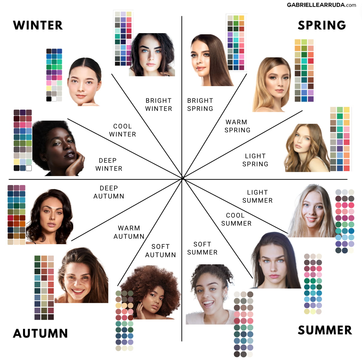
Now, I used to put out a general capsule wardrobe guide for each season, and I still do. But a common question among my color-savvy readers was, how do I make this work for _insert season here_?
So to better serve you all, I decided to design some spring capsule wardrobes for each of the 12 seasonal color palettes.
These spring capsules are by no means meant to inhibit you or confine you to colors you might not want to wear or that don’t fit with other elements of your style toolbox. Rather, they are here to give you some ideas on how to balance your colors, and how to coherently build a wardrobe that mixes and matches easily.
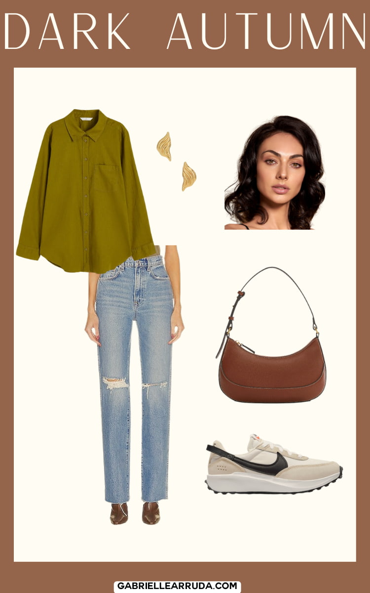
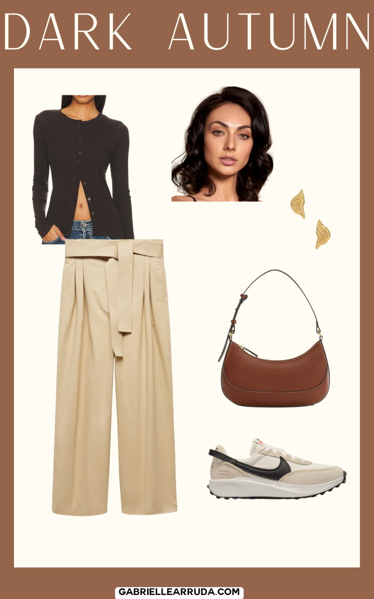
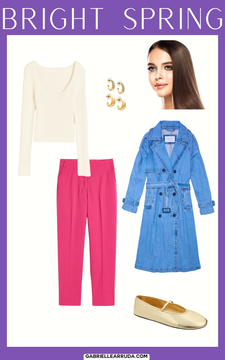
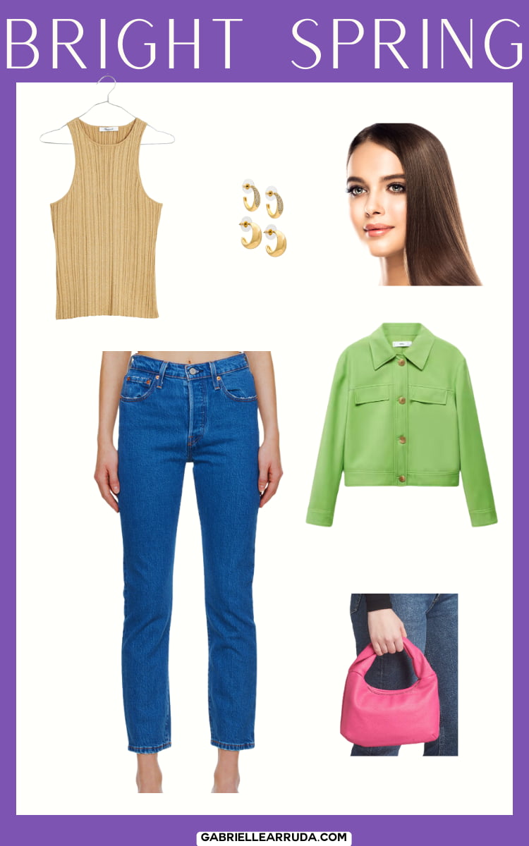
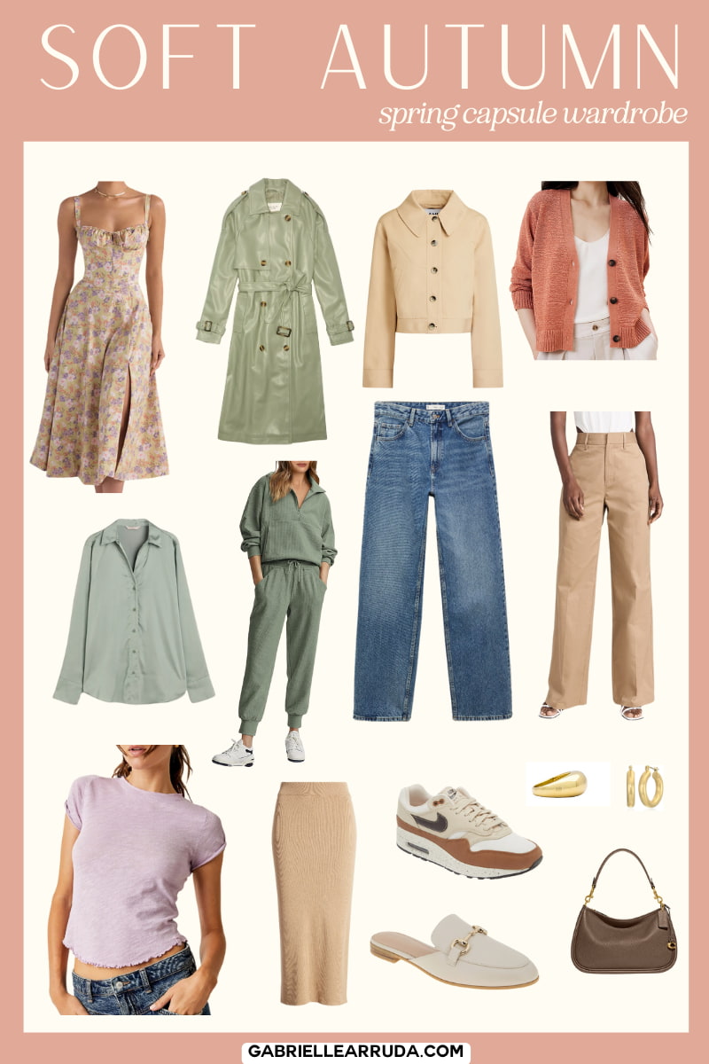
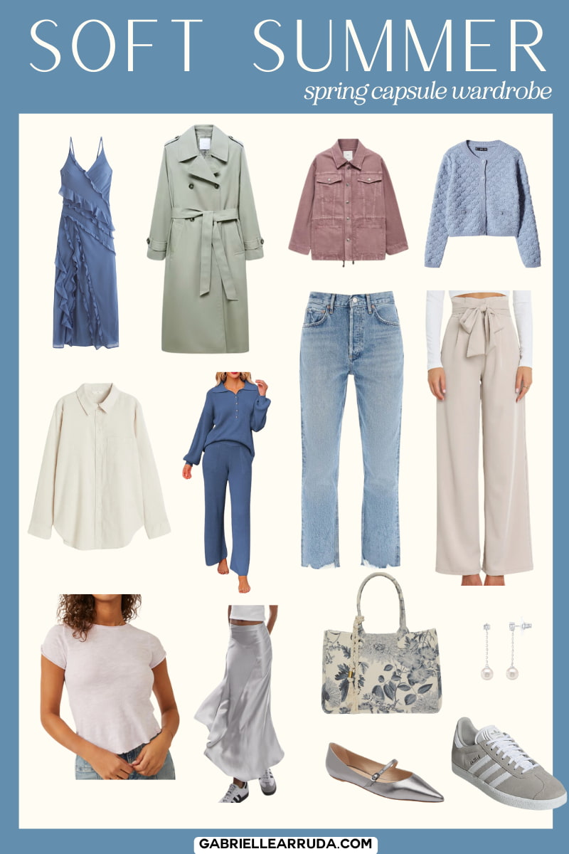
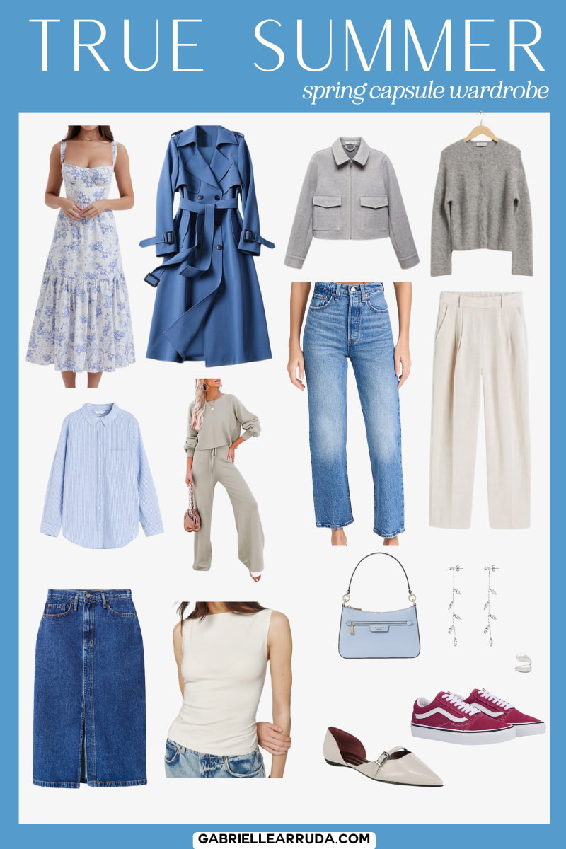
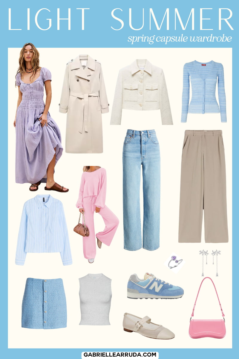
You may first look at these capsules and think “Oh, wow that’s bright” or “That’s very one-color”… But I want you to then start imagining what it might look like if you broke them up into some outfits, this is why I added few example outfits for each capsule as well.
I also want you to notice the color balance and the number of colors used. I tried to include some of each season’s neutrals and a selection of hues that would work easily together. If you glance at the image quickly, it shouldn’t feel like any one color sticks out or doesn’t match. And this is a good trick for you to try at home as well.
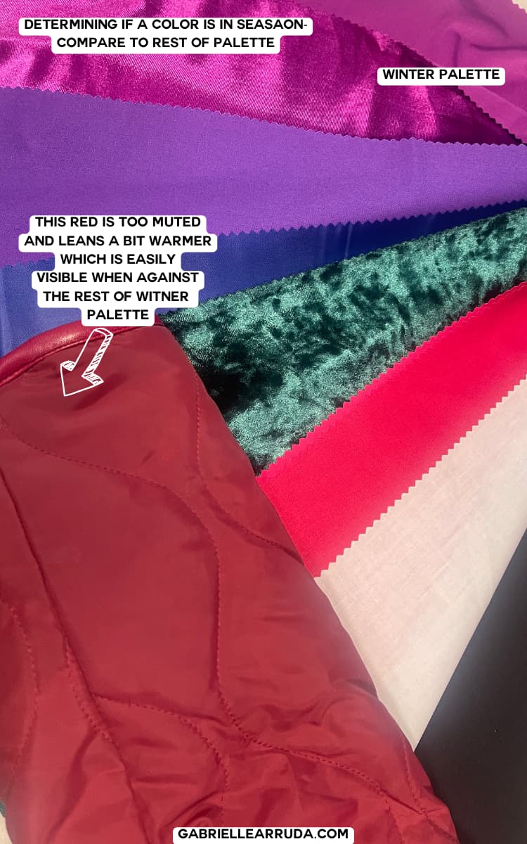
Glance at your closet or at a color you’re testing and compare it to other colors within that palette. It should generally feel like it “fits in” with the other colors. This can help you confirm if the color is workable, or if it’s leaning too cool or warm for you (or any other color qualities you want to check).
Now, I don’t want you to use these capsules as a stopping point, or as a box that constrains your creativity. These should be used to jumpstart your imagination.
And if you’re thinking now you don’t need to know what chroma, value, and undertones actually mean…. Think again.
Whether you’ve DIYed your season or been professionally draped, going out into the real world and shopping for your season is a whole different ball game. The more in-depth you learn your palette’s color qualities the easier shopping will become and the fewer expensive mistakes you’ll make.
This isn’t about developing color mastery, but rather personal color understanding and how those colors work with your essence, body type, and overall style statement.
But this capsule doesn’t fit my style needs or my favorite colors from my palette…
I get it! To make cohesive capsules that are based on easy mixing and matching I choose select colors from each palette.
I tried to include more items in that palette in the shopping links, but ultimately, your style should fit your preferences. And this can be good data on what you don’t want your wardrobe to look like.
NOTE: I have not purchased these pieces and verified them to be within the assigned palette. I am using my best judgment based on the online photos. Internet images can be inaccurate at times, so make sure you check the return policy before you purchase.
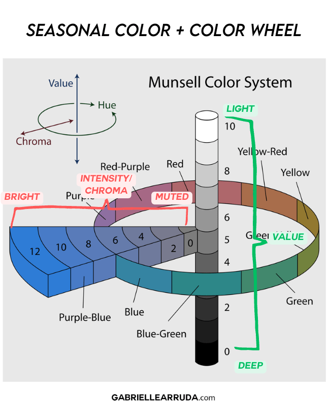
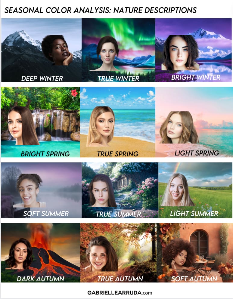
And just because I find these images helpful in understanding seasonal color, here are a few images that might help you understand why certain colors are placed in your palette.
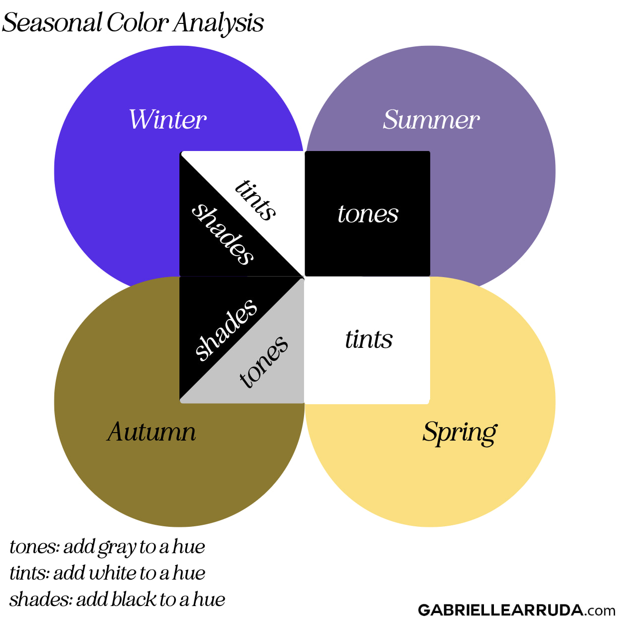
12 Seasonal Color Palette Capsule Wardrobes: Spring 2024
Now, certain seasons are going to have an easier time following traditional colors for the actual weather season. I mean Spring seasons obviously do well with spring weather. And summer season can easily accomplish a “spring” weather look as well.
With the darker palettes and higher contrast seasons, I did try to add some of the lighter and/or brighter shades in the palette. And remember to visualize some of the outfits you can piece together. This should help you visualize where I was going with each capsule.
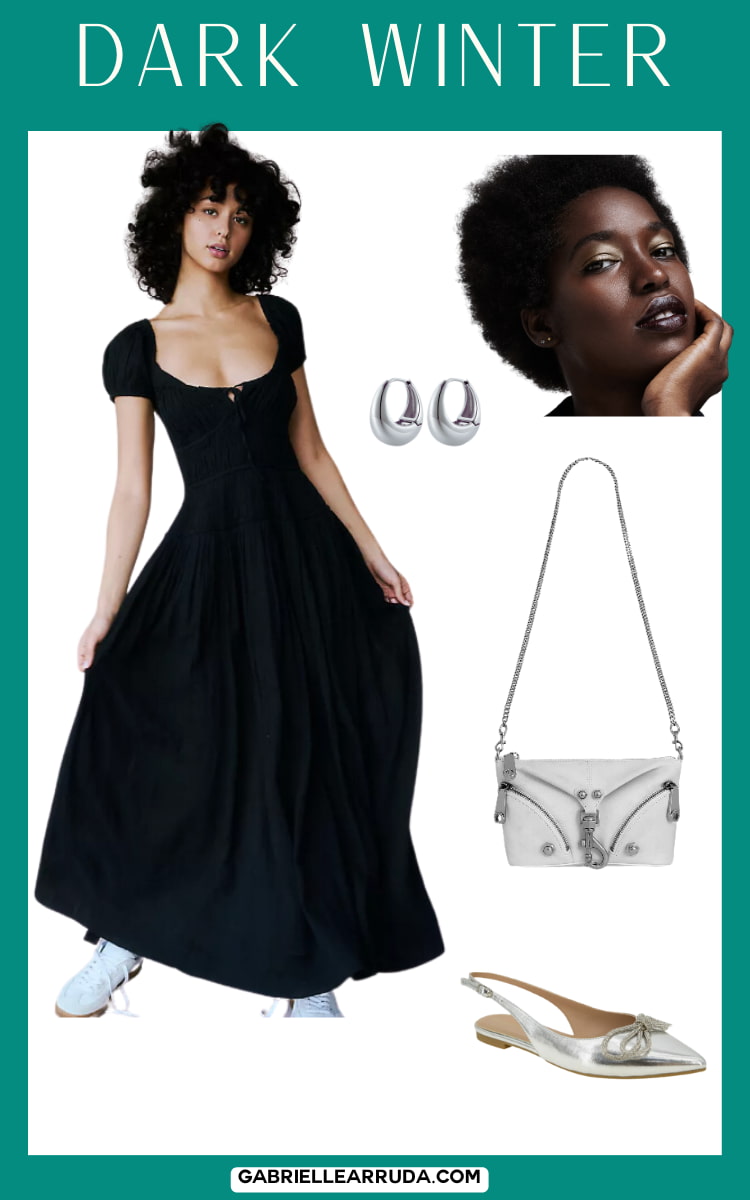
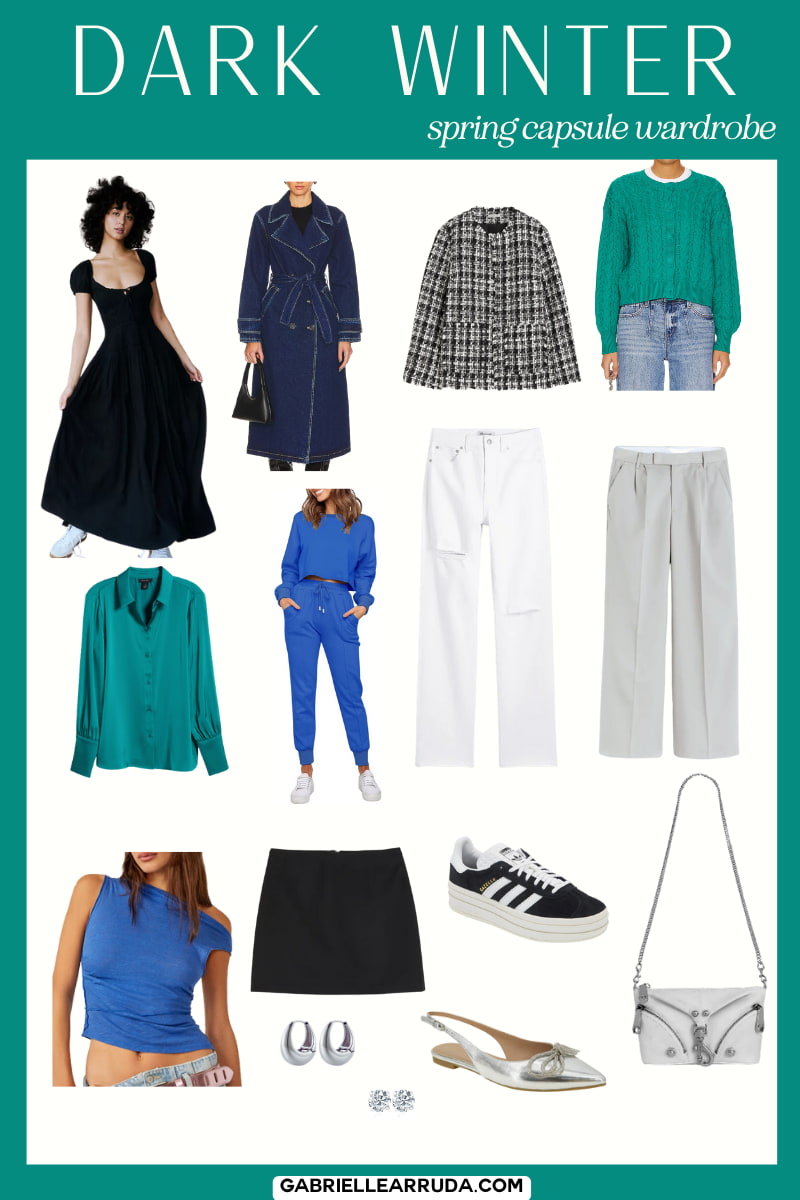
But, I’m sorry Dark Winter, you just don’t get a lot of typical spring colors 😂.
NOTE: Please note that the face examples given are general stereotypes for each season, but do not narrowly define the season. Draping is the only sure way to determine your placement.
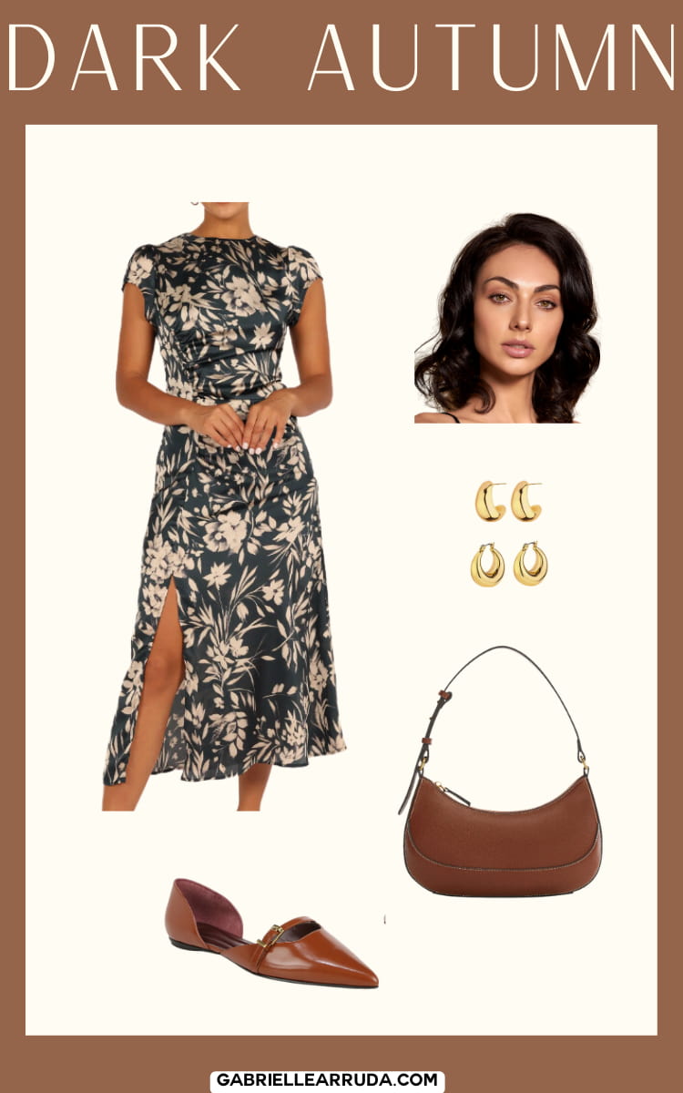
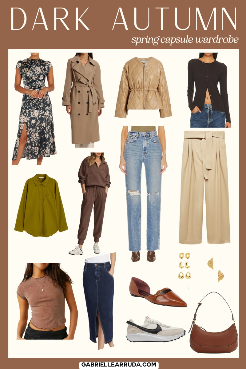
Dark Autumn
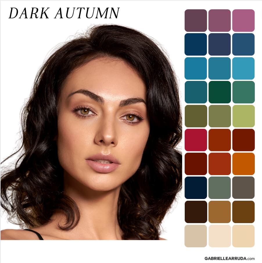
Undertone: Neutral/Warm
Hues: You mostly lean towards warm undertones in colors, but can sometimes borrow from Deep Winter (your sister season)
Value: You lean towards darker value colors (this does not mean you don’t have “light colors” in your palette, but that your colors have more gray/black added to them. You have more shades and tones in your palette.
Chroma/Intensity: You lean slightly muted.
Sometimes the exact colorway I choose is not shown in the preview, but if you click through, the color should be available.
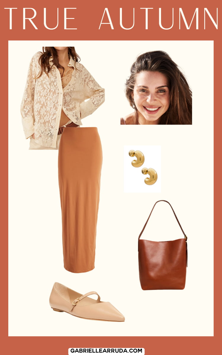
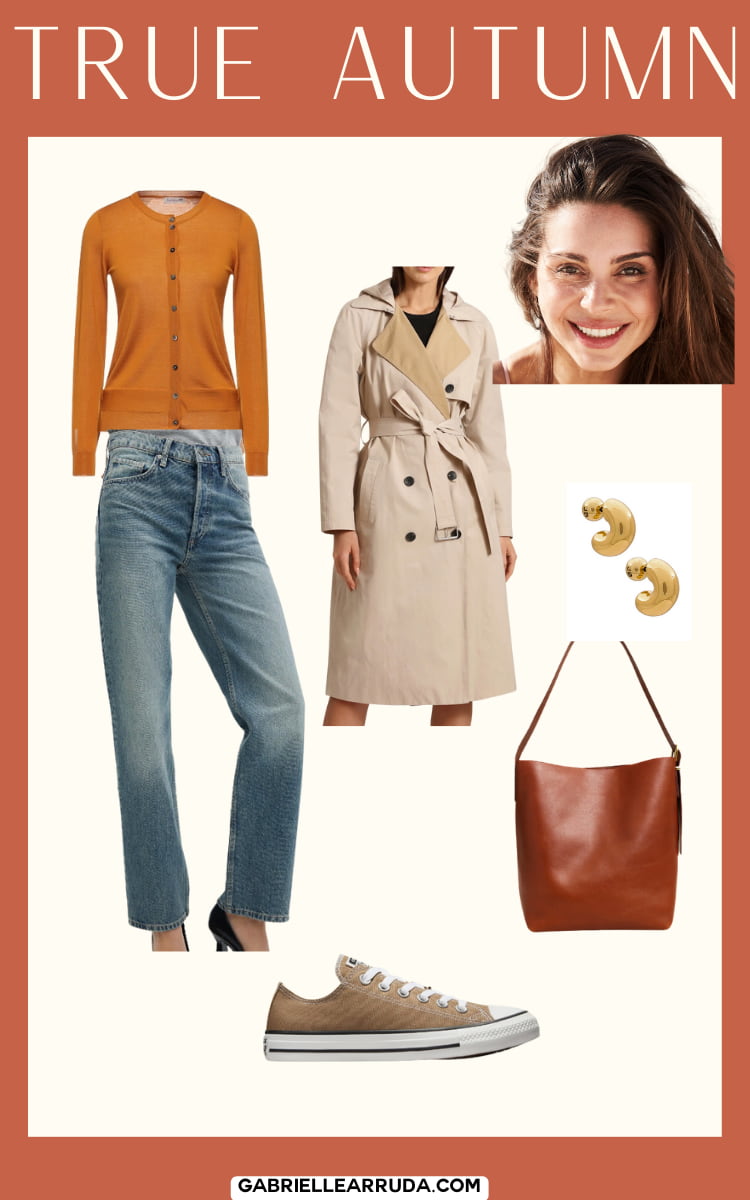
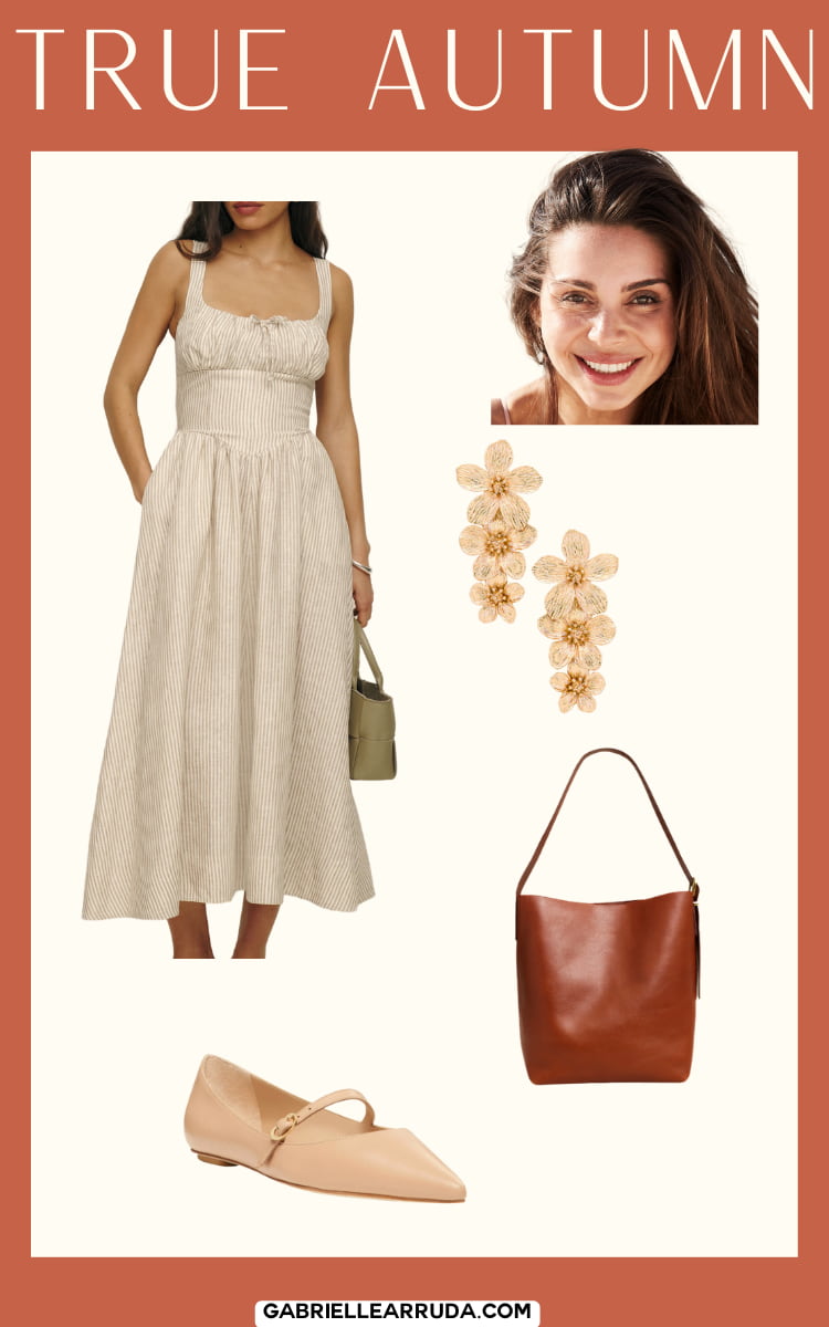
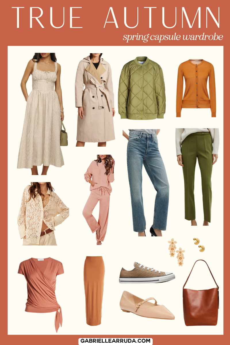
True Autumn
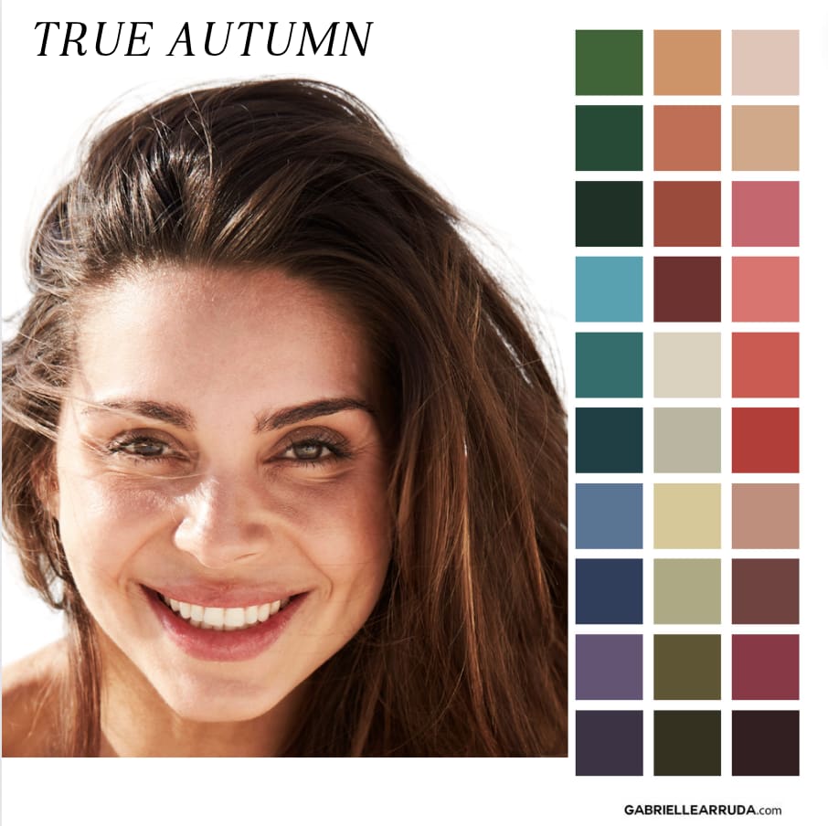
Undertone: Warm
Hues: Your hues are warm. Your sister seasons are Dark Autumn and Soft Autumn, so you may be able to borrow hues from them and make them work. If you are working with a system that has more flows than the traditional 12 season, you may find the “warm” flow works for you as well, and can sometimes feel like a few spring colors have been made available. It’s all about testing what works for you!
Value: Medium. You’ll mostly be working with those 4-7 value ranges on the Munsell wheel. And
Chroma: Muted
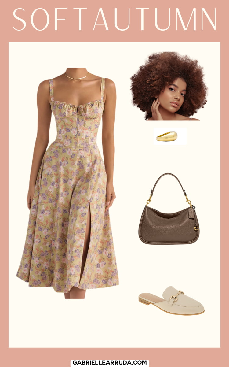
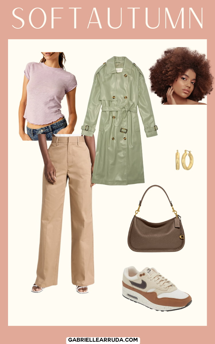
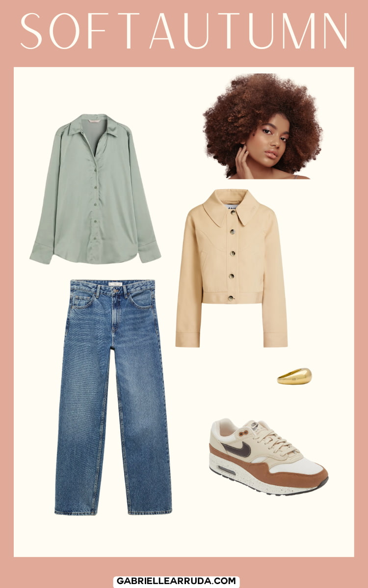
Soft Autumn
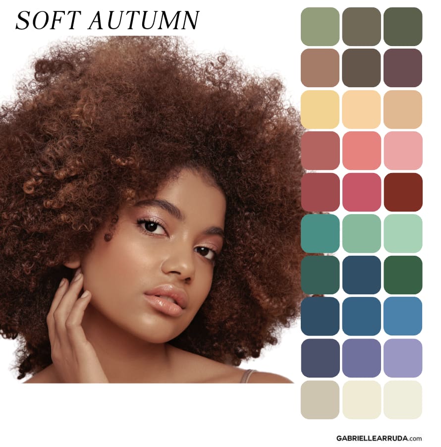
Undertone: Neutral/Warm
Hues: Warm hues but you can borrow some of the Soft Summer colors as they are your sister season
Value: Soft Autumn value is going to be medium, leaning slightly towards the lighter end of the scale. So we aren’t looking for colors that have black added to them, that would add depth to them.
Chroma: Muted. Autumns in general lean muted (which means they are looking for tones, e.g. gray added to the color).
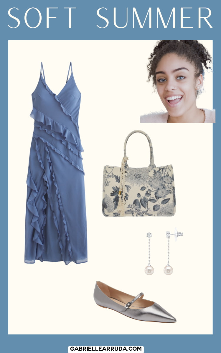
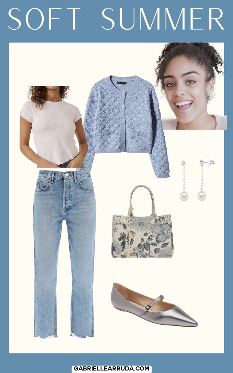
Soft Summer
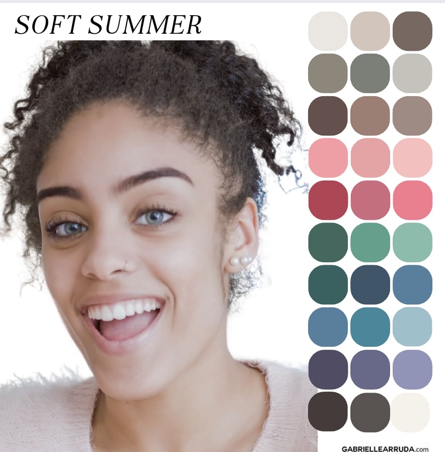
Undertone: Neutral/Cool
Hues: You’re looking for cool hues but you can borrow some of the warmer hues from Soft Autumn since they are your sister season.
Value: Your value levels are in the middle, and can sometimes lean slightly lighter or slightly darker but not extremely so. Value is measuring how much white is added (tint) or how much black is added (shade). Soft summer thrives in the middle of this scale.
Chroma: You shine in soft/muted colors on the chroma/intensity scale. This means you are looking for tones (gray added to the color).
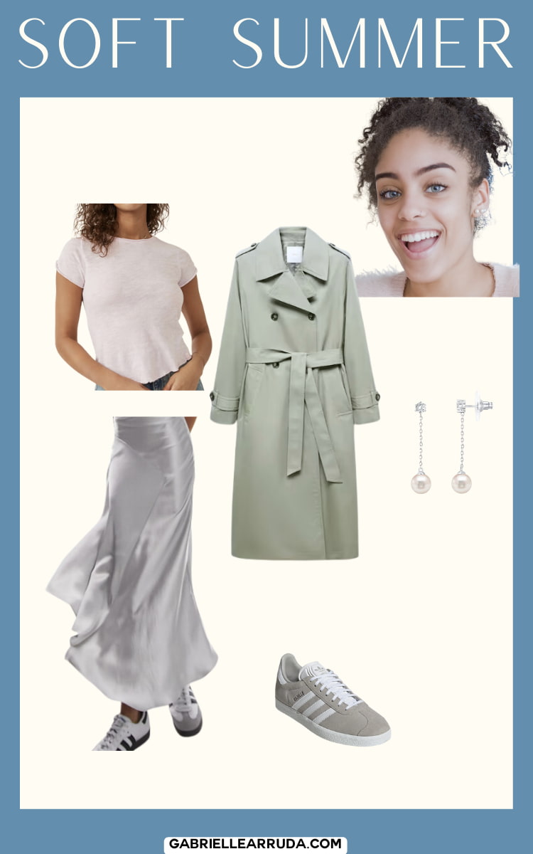
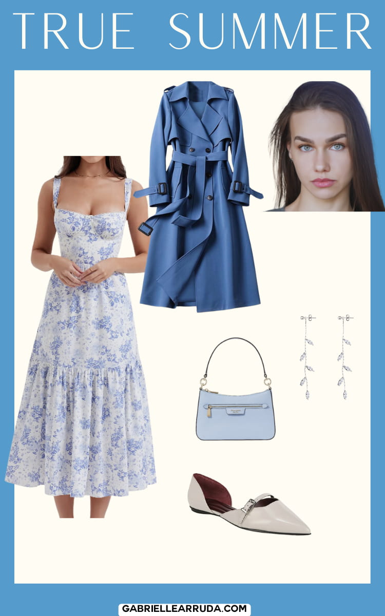
True Summer
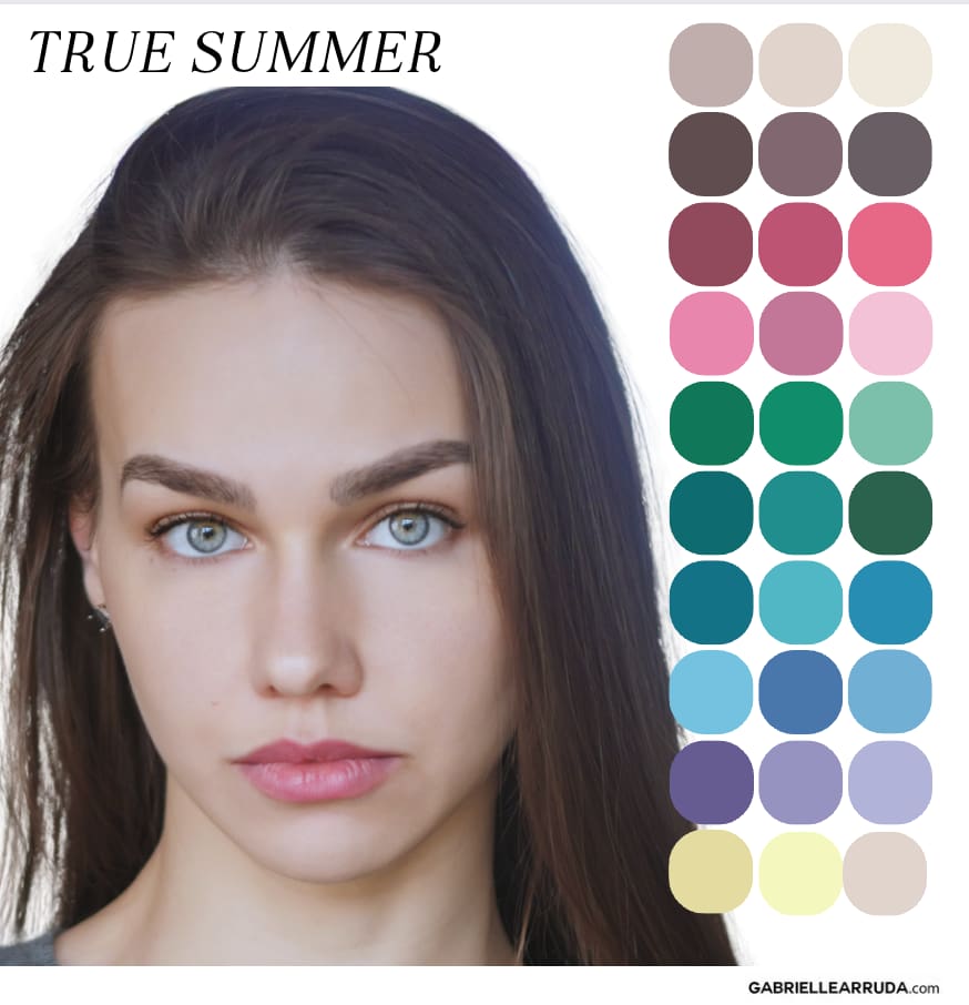
Undertone: Cool
Hues: You’re looking for cool hues. You can sometimes borrow from your sister summer seasons (soft and light), and some True Summer may even be able to handle certain Winter colors. But you don’t shine in warm colors.
Value: You are medium value. You typically don’t have super light tints (lots of white) or super dark shades (lots of black added).
Chroma: You lean slightly soft/muted on the chroma/intensity scale. But you are not quite as muted as Soft Summer. You will still have tones (gray added) in your palette though.
If you go to the shop links, please be sure to check the colorways as sometimes the ones I chose are not shown until you go to the site.
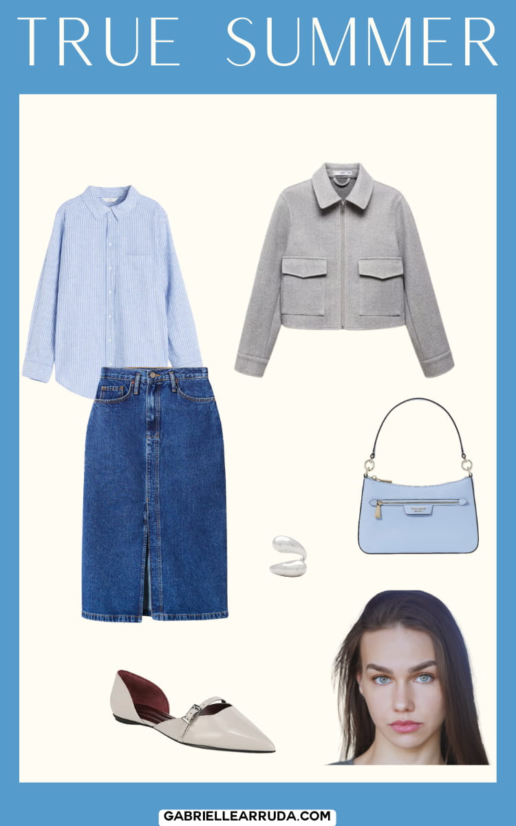
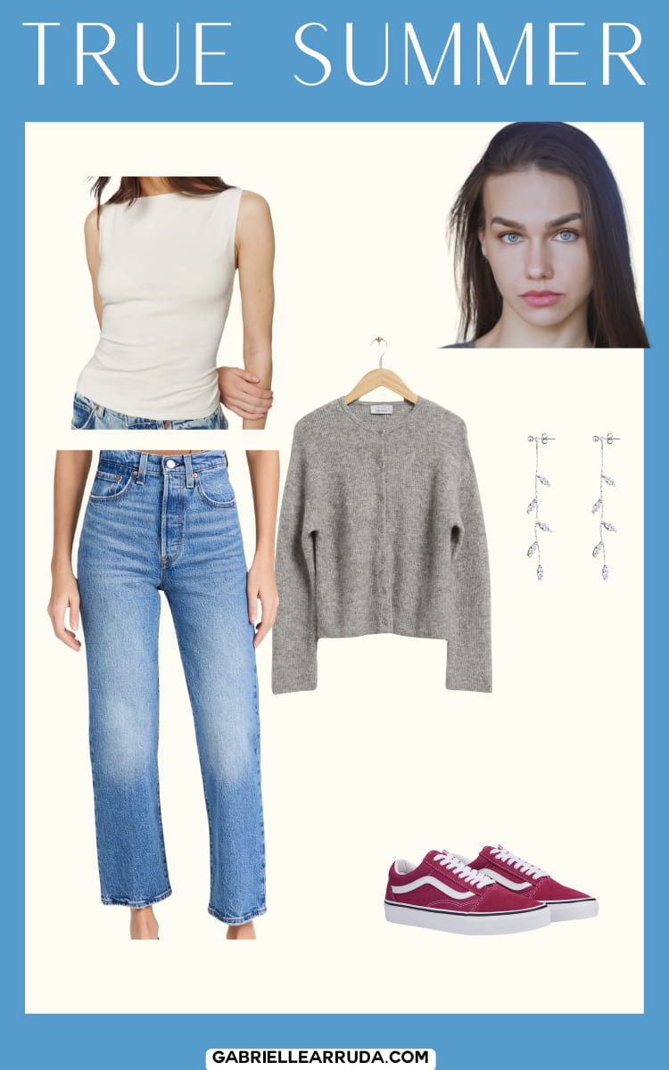
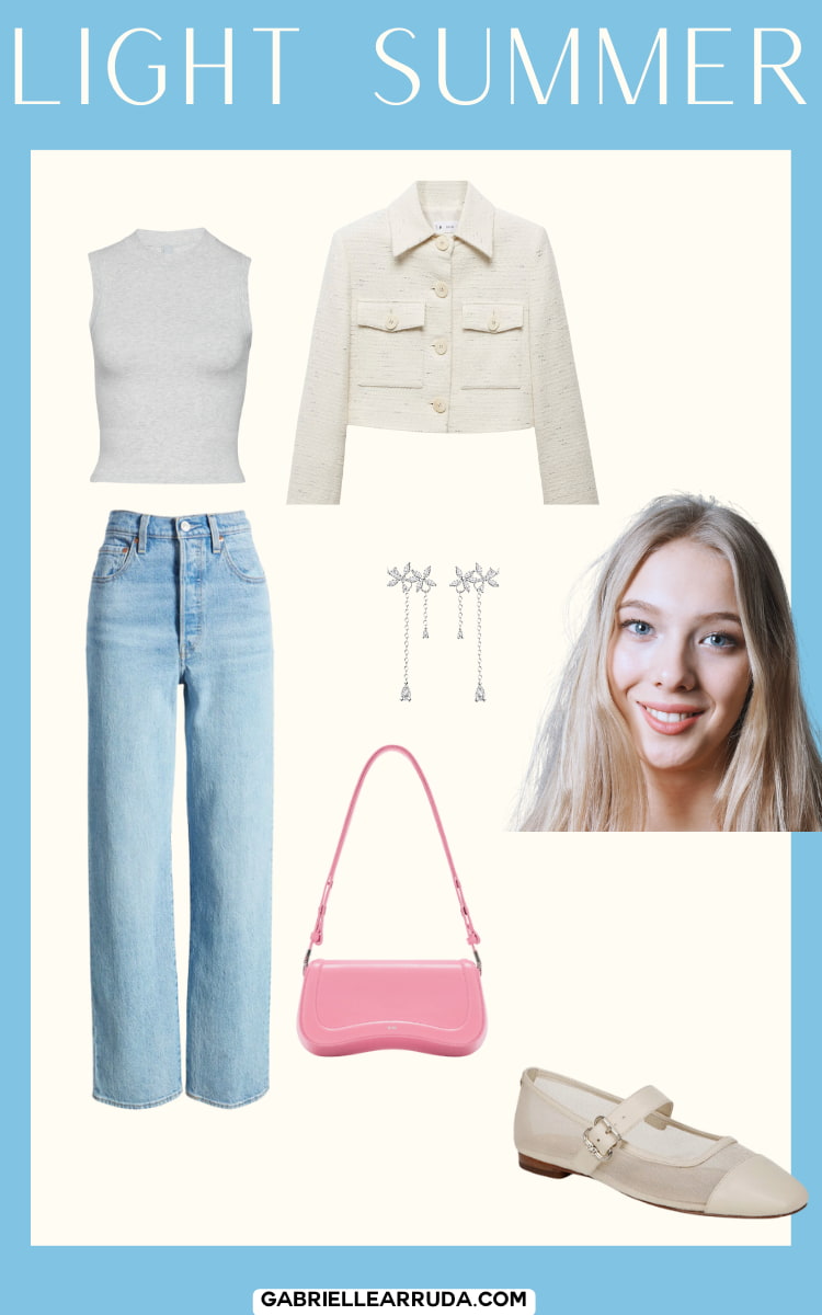
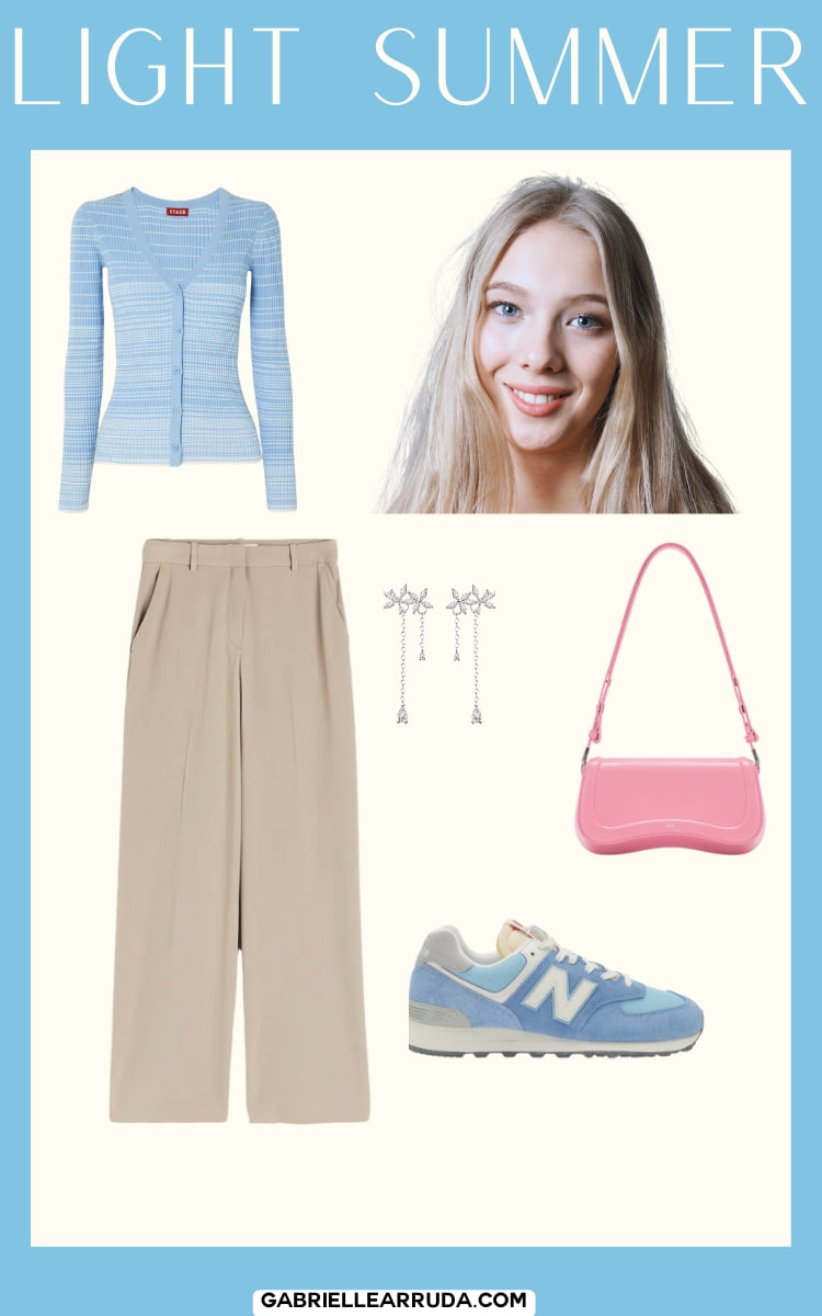
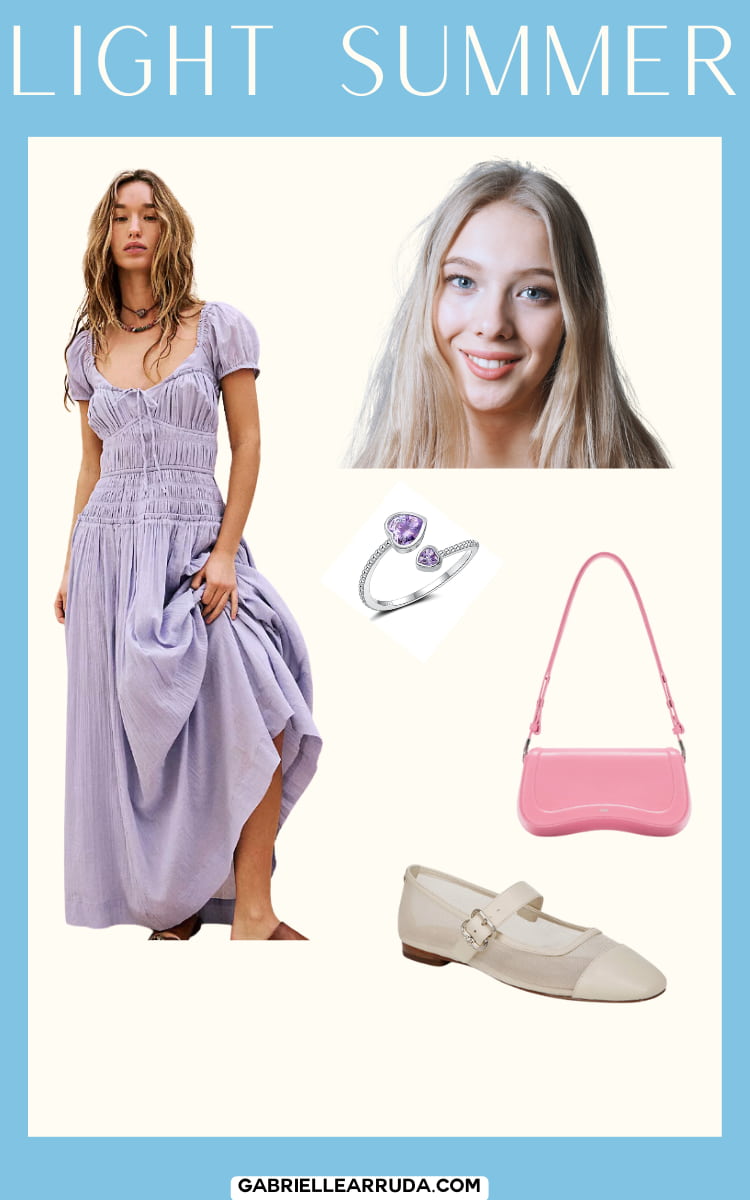
Light Summer
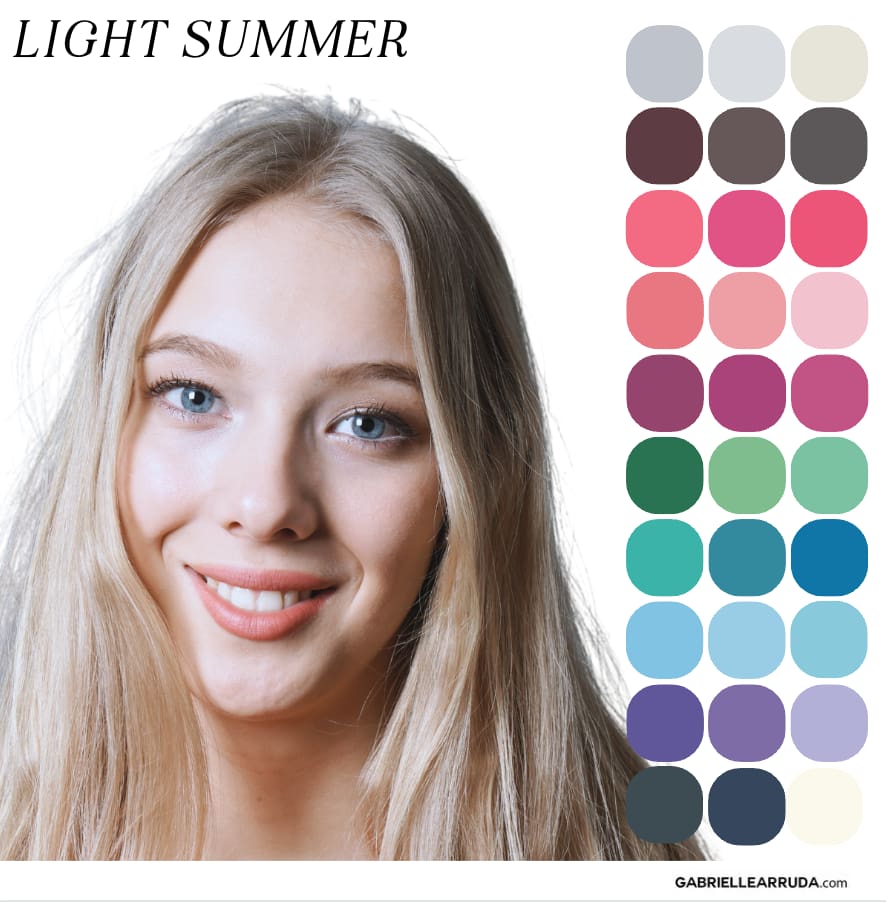
Undertone: Neutral/Cool
Hues: You typically lean towards cool hues but can borrow some warmth from your sister season light spring.
Value: Your palette has light values. This means you have a palette with a lot of tints (white added to the color). But because you are still somewhat muted in chroma, we will see some slight tones in your palette as opposed to the truly icy colors of winter. You do have the highest level of value in the summer family though!
Chroma: Your chroma level is medium. Your palette is still composed of tones (gray added) but all together they can appear energetic. When you compare them to the spring seasons though they will feel less bright.
Please check colorways, as sometimes the links do not direct to the exact color I am using in this wardrobe.
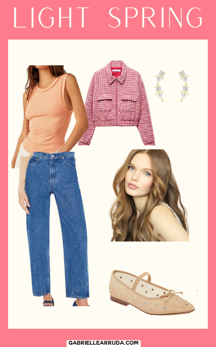
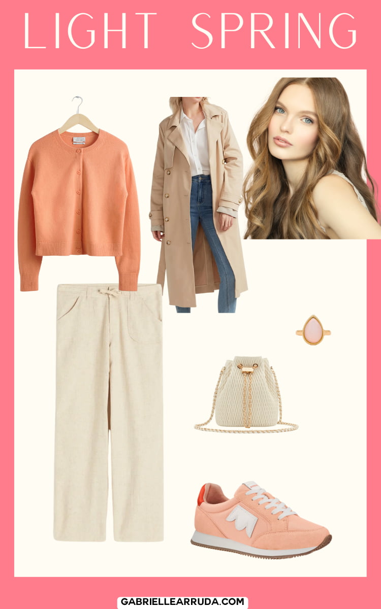
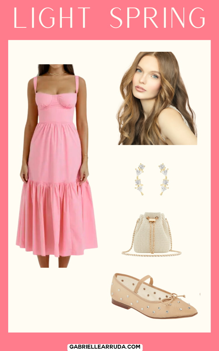
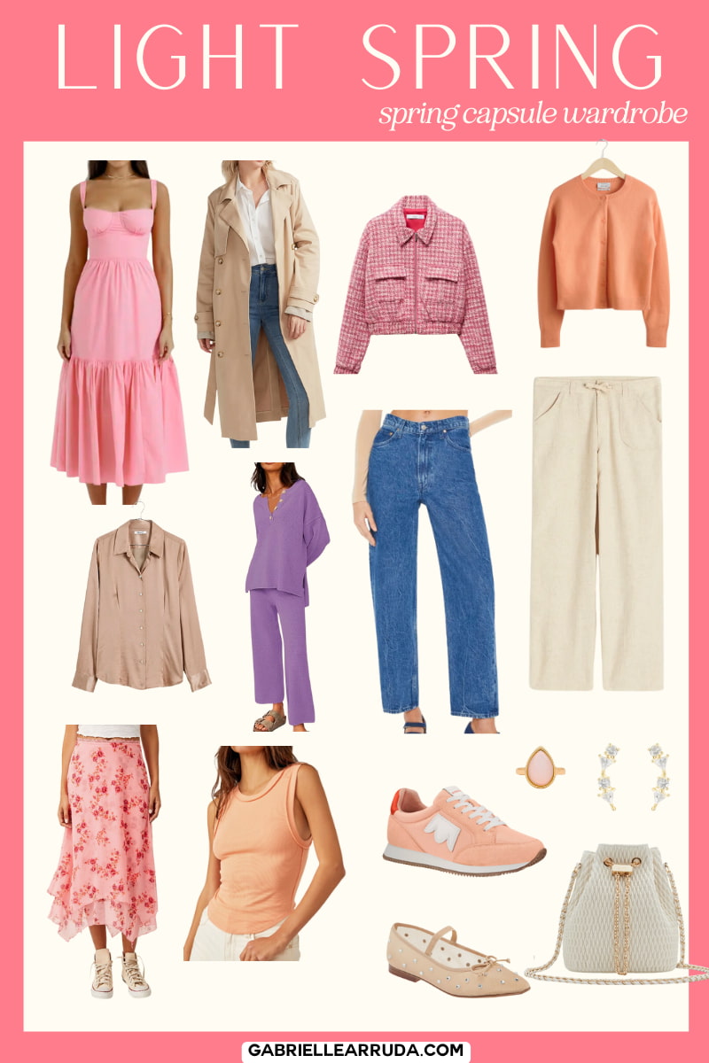
Light Spring
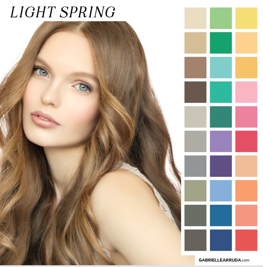
Undertone: Neutral/Warm
Hues: You typically lean towards warm hues, but can borrow some cooler colors from your sister season Soft Summer. When you’re a neutral leaning season it may take a little experimenting to find how much coolness you can integrate. We want to lean into slightly cool colors, but not go too far we extinguish our natural warmth. Your colors feel as if they have been warmed up with yellow, so don’t go too far with the summer tones.
Value: Light (lots of tints, white added). This does not mean you don’t have darker colors in your palette, but that you don’t have true black or deep shades in your palette.
Chroma: You lean medium to slightly bright. You have more clarity in your overall coloring, but not as much brightness in palette as True Spring and Bright Spring.
A quick tip: LIght Springs are a rare season overall (according to many analysts, including Christine Scaman of Sci-Art). This can make it difficult to find your colors “out in the wild” shopping, so it is useful to get to know your palette well so you can spot them. However, during the actual spring season, you might find these colors easier to find, so now is your time to shine!
Please check the links carefully as they don’t always show the colorway I’ve chosen.
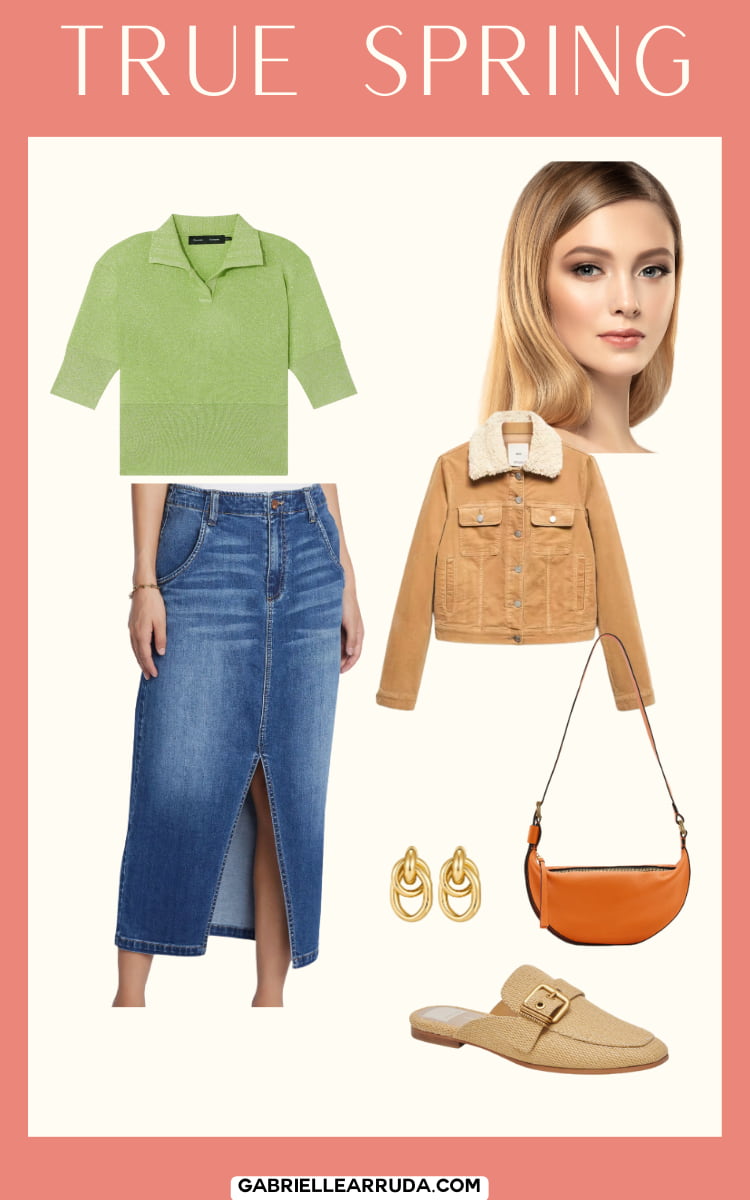
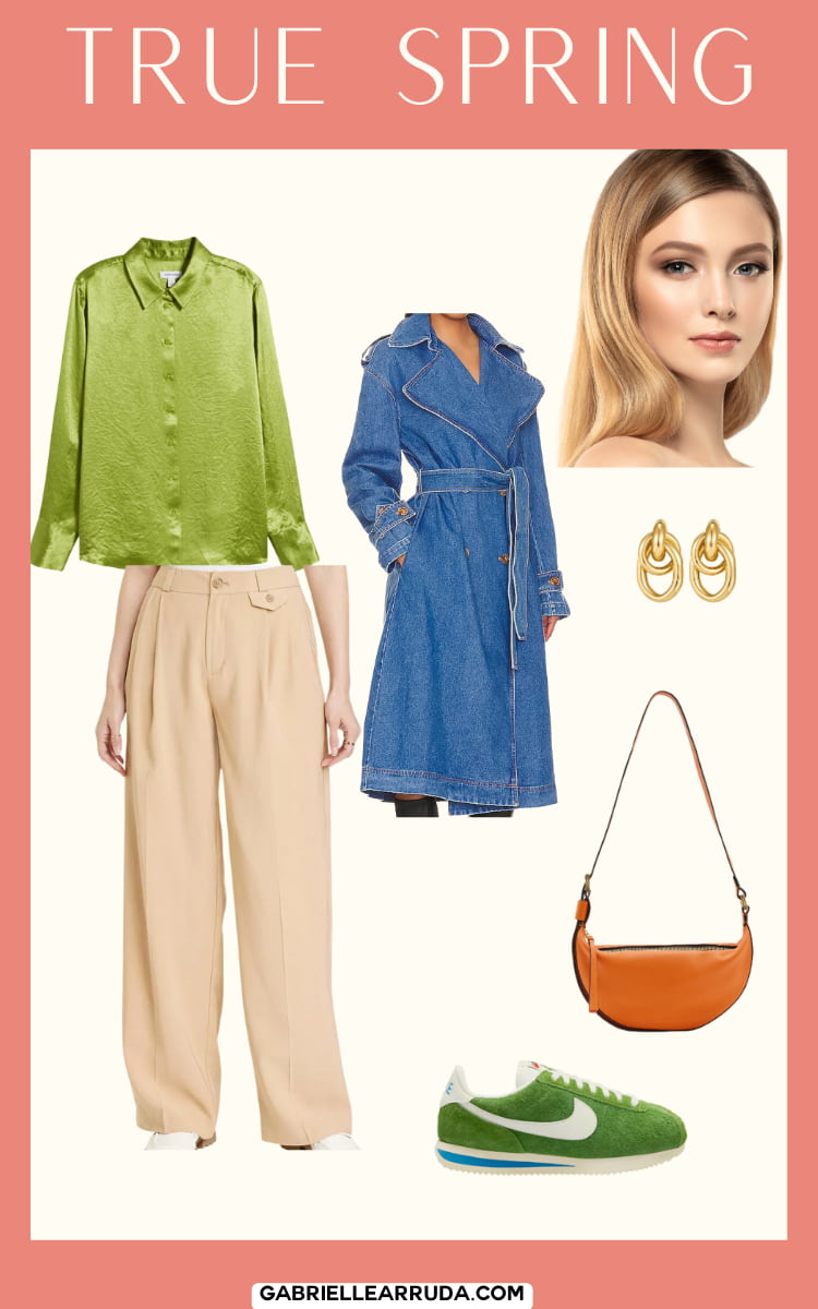
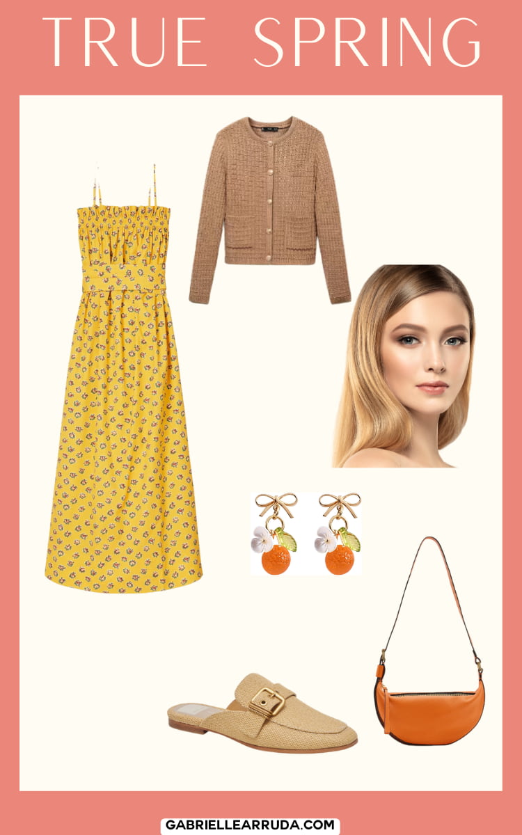
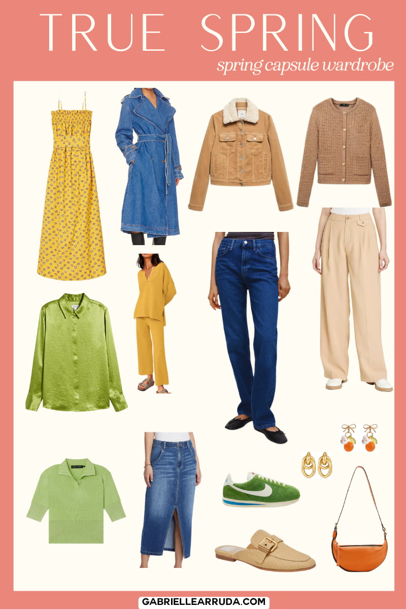
True Spring
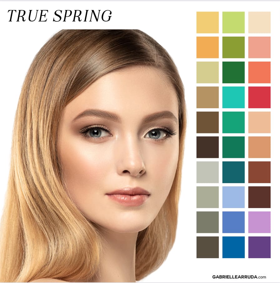
Undertone: Warm
Hues: Your hues are warm, and while you might be able to borrow other warm colors from Bright Spring or Light Spring, you cannot borrow any cool colors. In some larger systems you can have a flow of “warm” which can borrow some autumn colors, but this will be something you need to narrow down slowly and methodically.
Value: Your palette leans towards light values. This means you have a lot of tints (white added) and colors warmed up with yellow. Overall your palette doesn’t get too dark.
Chroma: You lean towards the brighter side of the spectrum. You don’t have the muted quality or palette like True Autumn. Because your colors are warmed up with yellow, they will feel less “bright” than Bright Spring.
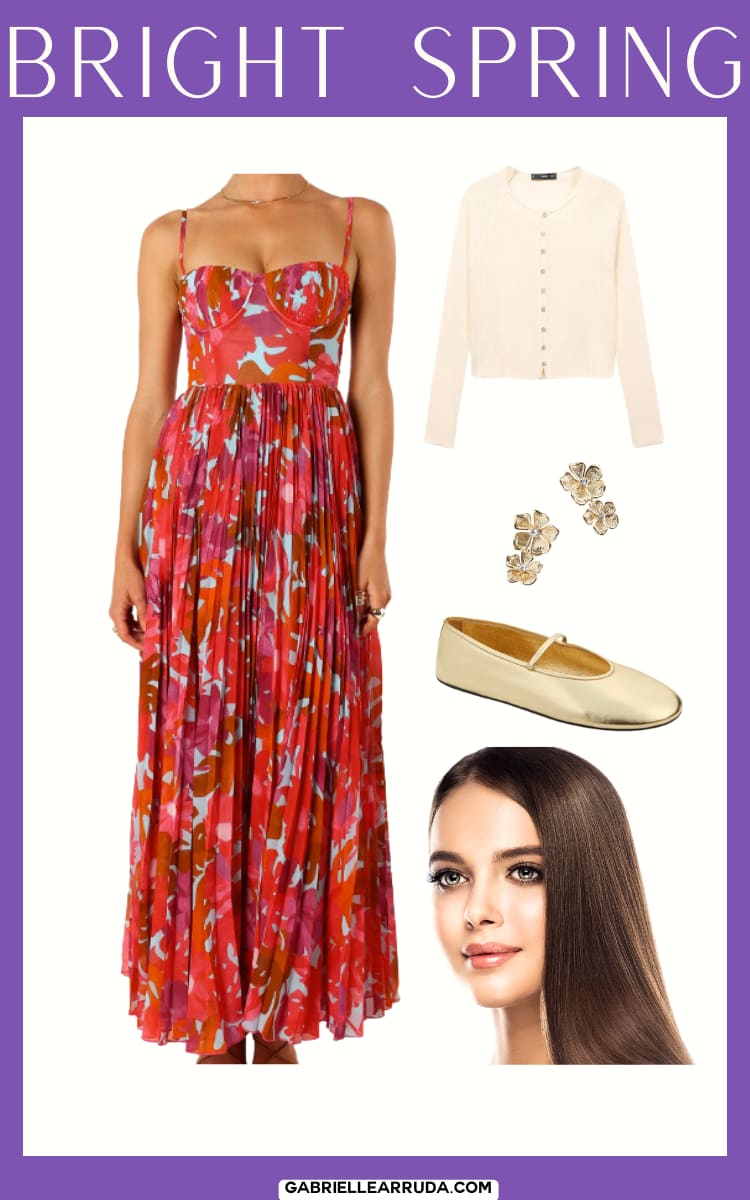
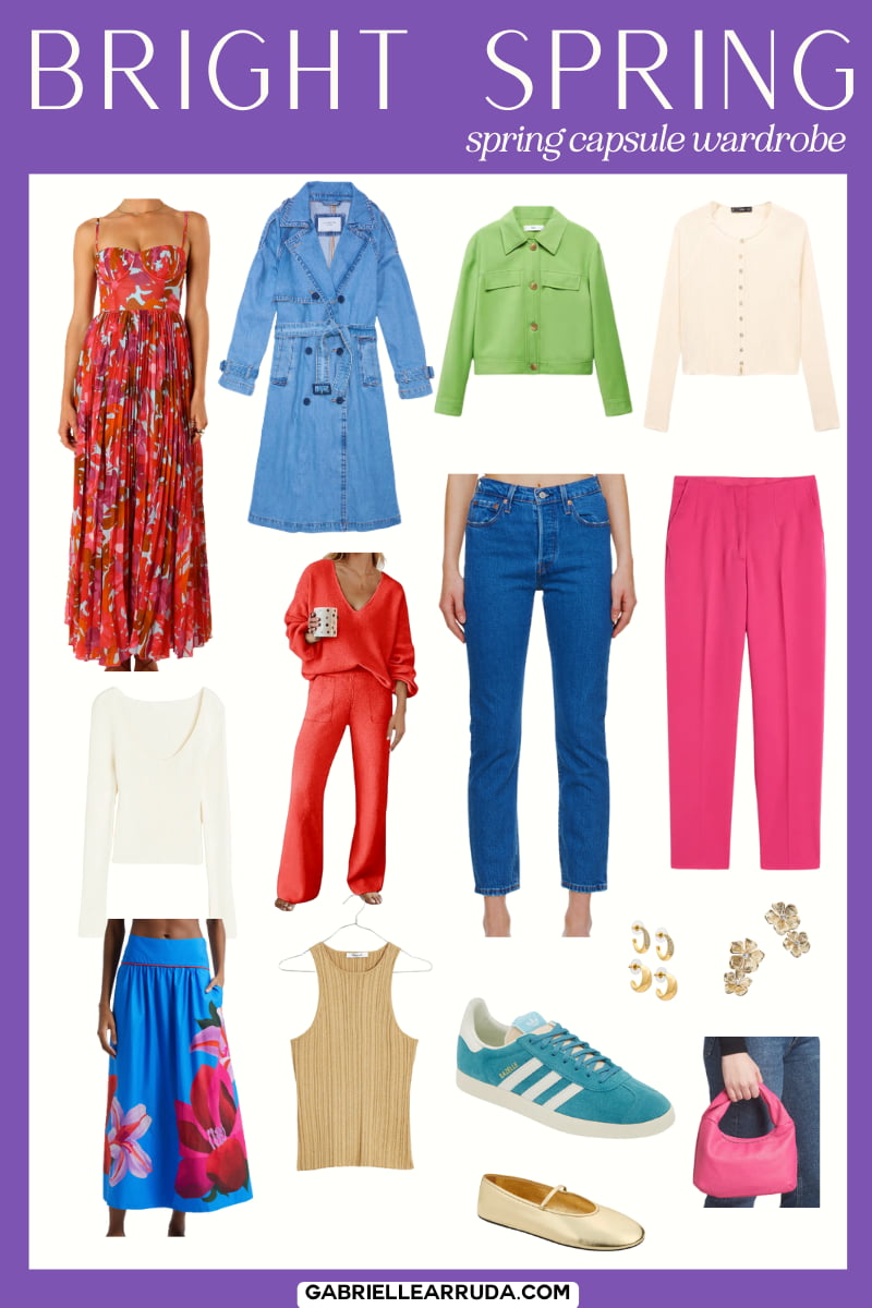
Bright Spring
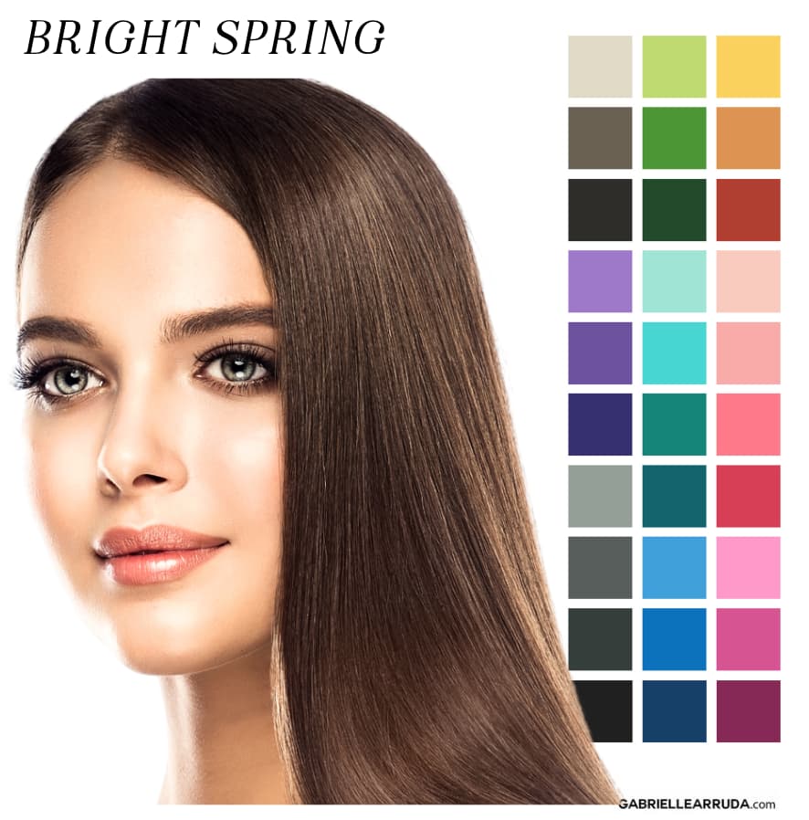
Undertone: Neutral/Warm
Hues: Your hues are warm or neutral but you can lean into some cooler colors from your sister season Bright Winter.
Value: Your values are medium leaning slightly towards the lighter side of the spectrum. You have more tints (white added) and fewer shades (black added) in your palette.
Chroma: You are bright and clear! Think of the flavors of jello and you’ve got a good palette to start with 😉
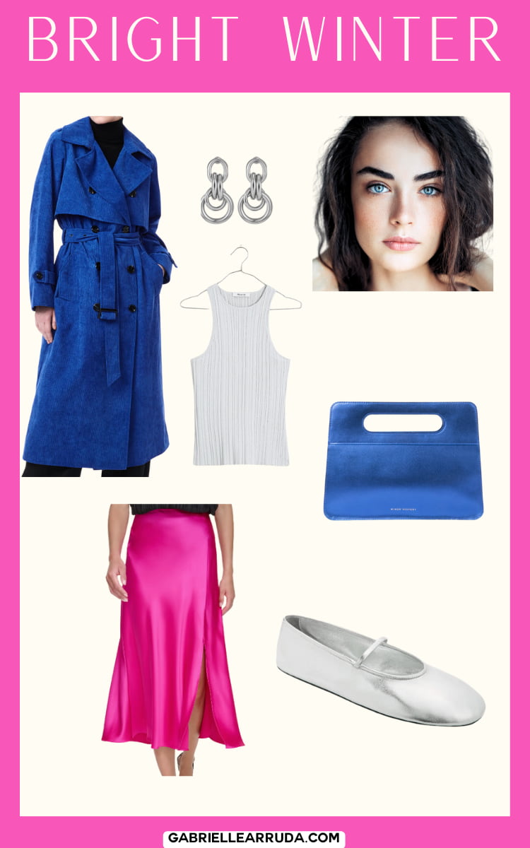
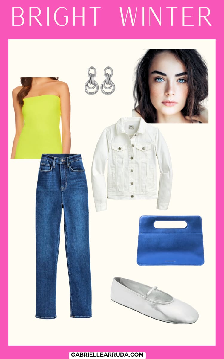
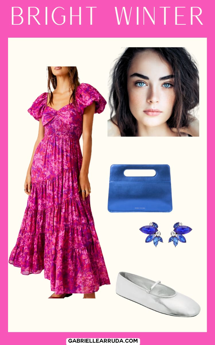
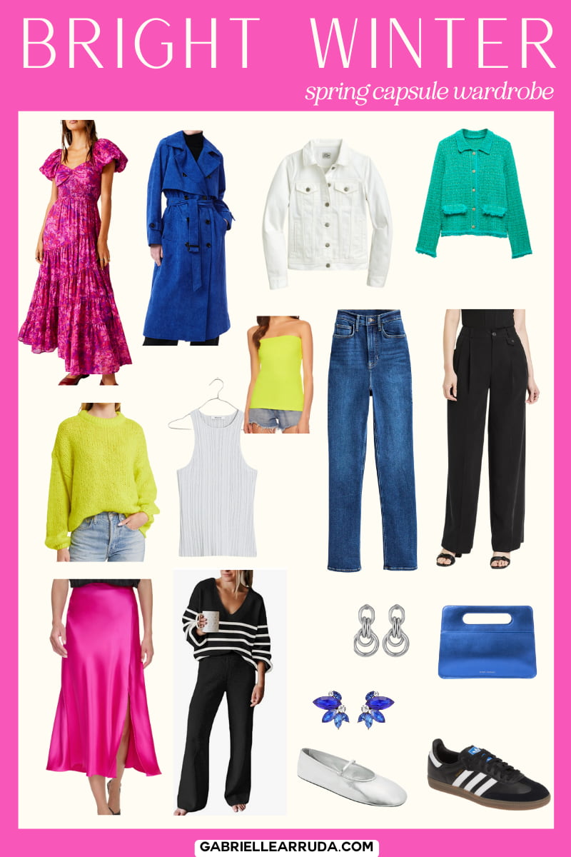
Bright Winter
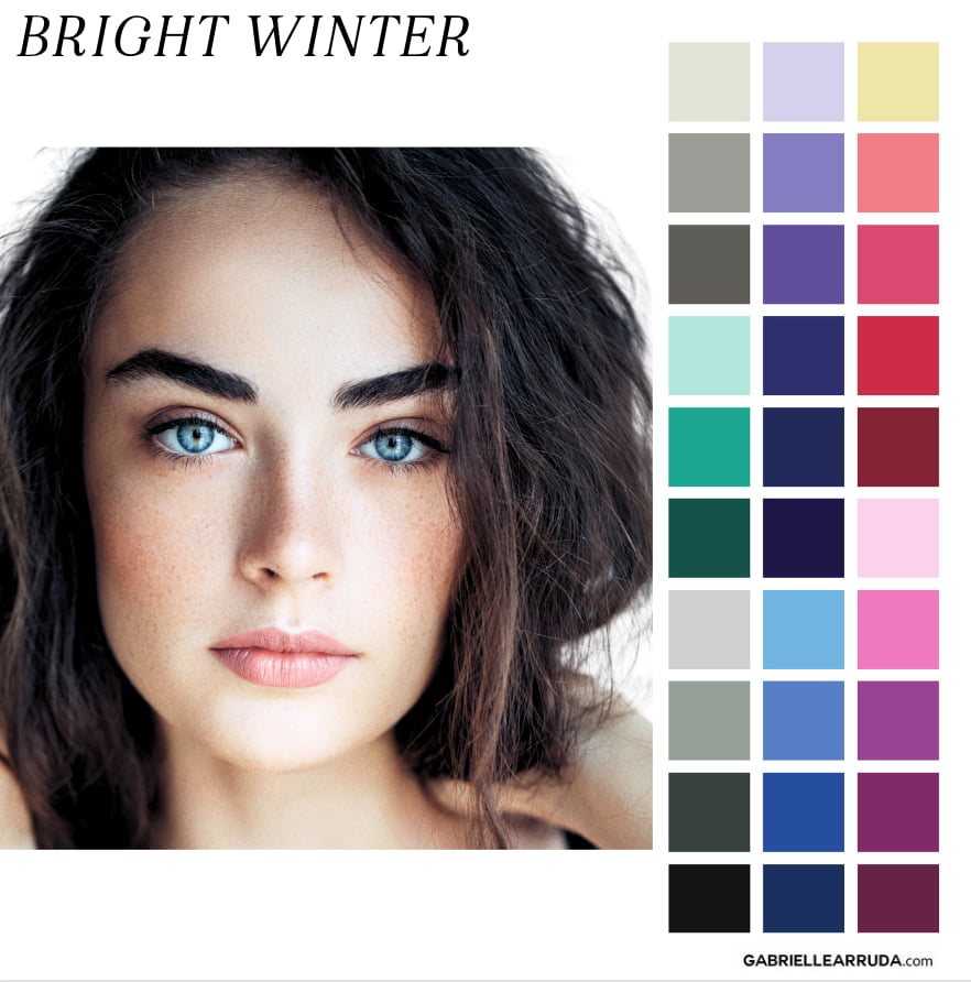
Undertone: Neutral/Cool
Hues: Your hues are primarily cool but you can let some warmth in with your sister season Bright Spring.
Value: You have a wide range of values in your palette with true white and true black, but most fall in the medium value range.
Chroma: Bright!! Your chroma is bright (no tones, no gray added to the colors), just pure saturation! Your palette overall will feel very vibrant.
It can be really hard to tell if those “neon” or electric colors are vibrant enough online. I couldn’t help but include them, but you’ll want to try them on before you commit! (Or be ok with returning!)
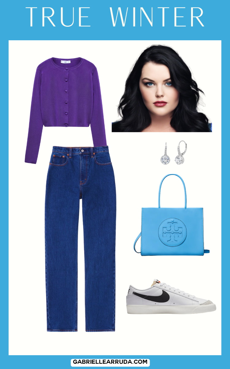
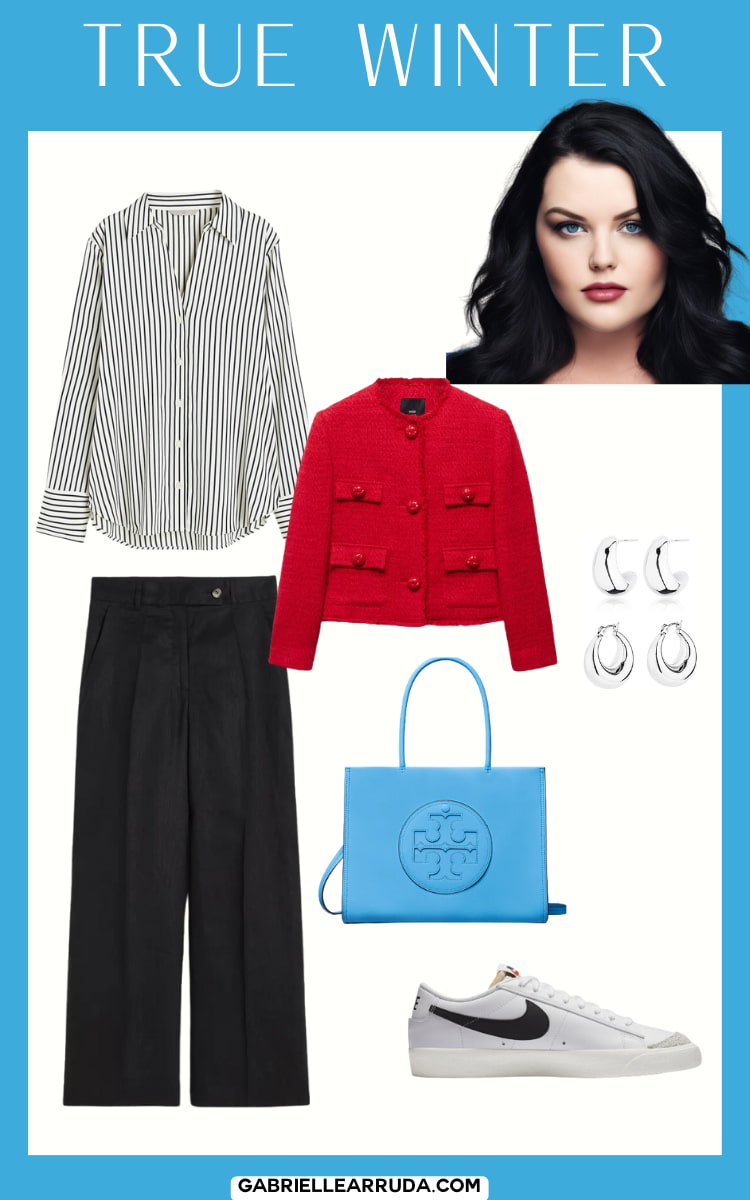
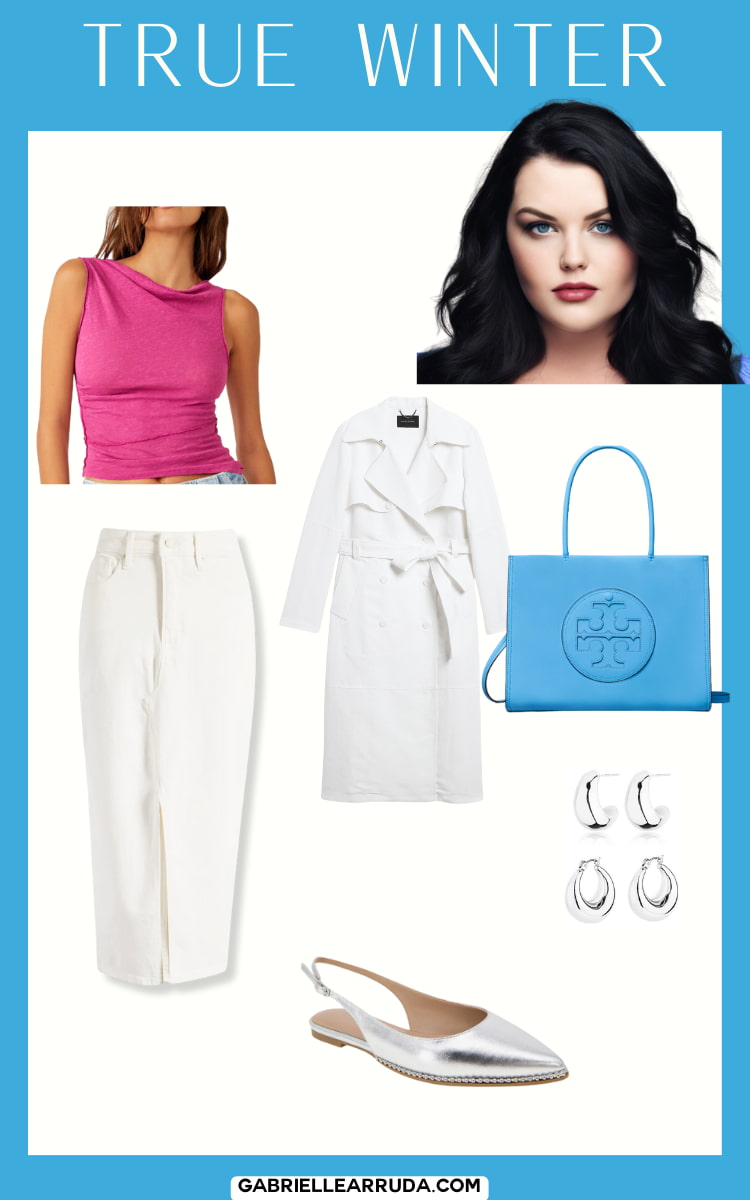
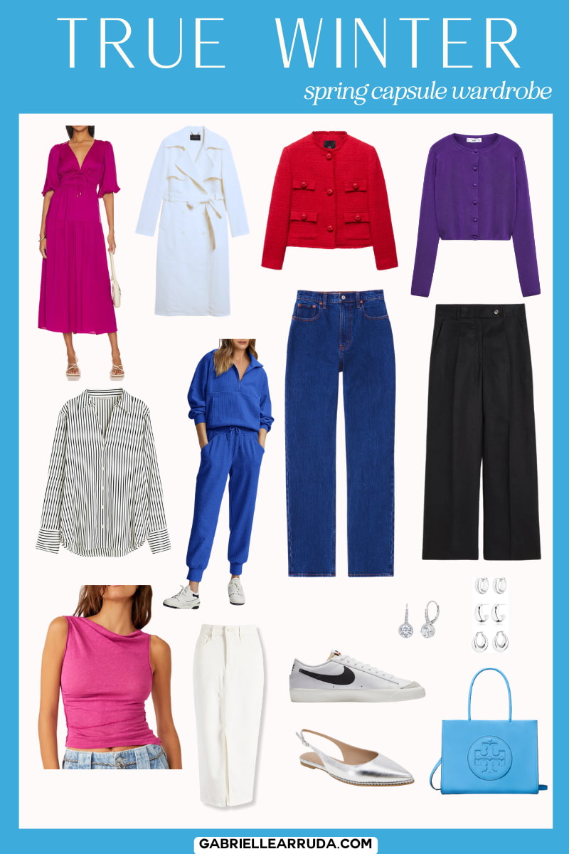
True Winter
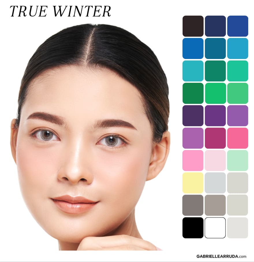
Undertone: Cool
Hues: Your hues are all cool. Your sister seasons are your fellow winters, so you won’t have any warmth bleeding into your palette. However, that does not mean you don’t have yellow in your palette, in fact yellow is found in every palette (and is part of our skin!). You’re going to find a lot of similarities to the three primary colors (true red, yellow, blue) in your palette. Remember that with True Winter, coolness is your priority overall!
Value: Usually medium leaning slightly dark.
Chroma: Typically leans slightly bright.
It’s important to remember that True Winters often have coolness as their most dominant trait. However, depending on the individual they may prioritize their chroma or their value second. This can be evaluated through draping.
Dark Winter
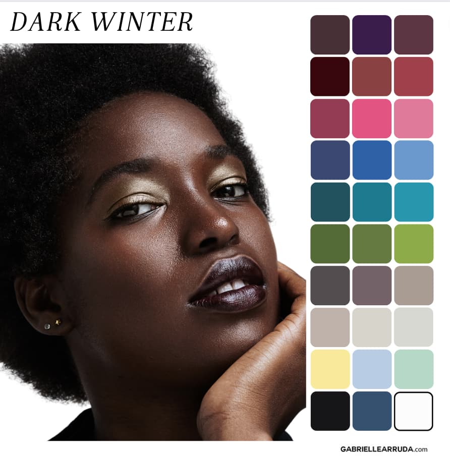
Undertone: Neutral/Cool
Hues; Your hues will be cool but you can find some warmth seaping in with your sister Season Dark Autumn.
Value: Dark. This is one of your primary focuses, making sure your color palette has enough depth/darkness (shades mixed with black!). Any light colors will be “icy” (added white, no gray).
Chroma: In terms of intensity you in the middle leaning slightly towards bright. You don’t have the muted quality of Dark Autumn, but you also don’t have the brightness of True or Bright Winter.
If you don’t see the colorway I used when you click the shopping link, click the item to see all available colorway options.
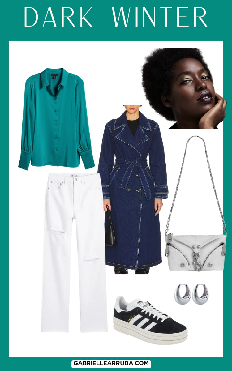
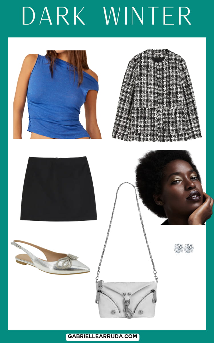

Now, I hope this has been helpful. And if you’re a part of my newsletter you will be receiving the general Spring Capsule Wardrobe Outfit Guide for 2024, and guess what? It has a lot of similar pieces within it. So you could use it as a reference guide and just swap out the items for your color-appropriate option.
I’d love to hear feedback on this formula so that I can improve it for next season (summer 2024!).
And please remember that these are just examples and they shouldn’t make you feel dismayed if you don’t like what I chose for your season. Each individual is unique and you should explore and exude your authentic style preferences.
{level up your style with this one habit}
Don’t be afraid to express your unique style expression!
Now, bring on the rain… I mean slightly more tolerable weather!



Ro
Saturday 9th of March 2024
The dark autumn's Spring capsule looks drab and too neutral; how do I incorporate more brightness? I want to be able to reflect the actual season while having the foundations of my season.
Ro
Tuesday 9th of April 2024
@Gabrielle Arruda, Thank you for your suggestions. I appreciate you for the work you have put into doing this.
Gabrielle Arruda
Saturday 9th of March 2024
There's tons of brighter colors within the palette, this was just my choice. Try checking out the full dark autumn guide for more ideas. There are some beautiful teals, golds, blues, and oranges that could be more suited to your preferences
Berith
Wednesday 6th of March 2024
Thank you so much!
Haley
Wednesday 6th of March 2024
I've used your website to curate my wardrobe and personal style for a few years now. Your dedication to helping others find their style is so inspiring and admirable! I feel like I know myself so much better because I have a handle on my self-expression through my outfits. Please know your work is appreciated!
Gabrielle Arruda
Wednesday 6th of March 2024
Thank you! Hearing this is so so meaningful to me.
Terry
Monday 4th of March 2024
I think you could have done better for Dark Winter. I am a draped Dark Winter and my palette has taupes, greys, brown, white, pink, purple, icy colors, and a yellow. There’s more to the palette than black as a neutral.
Gabrielle Arruda
Monday 4th of March 2024
Yes definitely, thanks for the feedback. I'll try to improve this for the summer palette
Carolyn
Sunday 3rd of March 2024
Thank you Gabrielle! I am fully inspired and ready to have fun assembling my spring outfits!