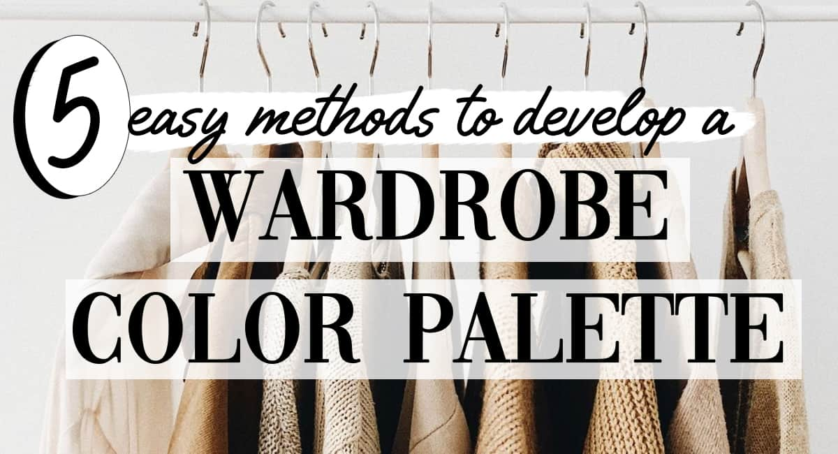
Create a Perfect Wardrobe Color Palette: 5 easy methods
Have you ever peered into your wardrobe only to be hit with a sense of utter despair? Your closet’s color palette just doesn’t work. You have neon tops, muted pants, seemingly few neutrals, and it all… just doesn’t work. Well, it’s time to use one of these five methods to develop your perfect wardrobe color palette.
Examine what your wardrobe needs to do for you, and develop a closet of clothes that can actually mix and match seamlessly.
Building a Wardrobe Color Palette: 5 Basic Methods
Color can say a lot about you, and it can even evoke certain emotional responses. So choosing a color palette to live and breathe by is something that should be prioritized.
That being said, everything regarding your style and closet should be a journey. This means that you need to start today knowing that your style and color palette will evolve with time.
Method 1: Universal Colors

So, this may be the quickest and least efficient way to develop your wardrobe color palette. The universal colors are colors that are said to look good on just about anyone. And while these colors can be a good starting point, they may not highlight or enhance your look as well as a more customized palette.
That being said, if you are short on time, and just want a starting point, these are the universal colors that can jumpstart your palette:
- True black
- Pure White
- Teal
- Pastel Pink (this one is debated)
- Turquoise
- Periwinkle
- Navy Blue
- Taupe
- Red (neutral, not overly warm or cool)
- Eggplant
These colors are considered universal because they don’t have a strong emphasis on cool or warm undertones. This means they generally work with most skin tones. However, depending on your skin tone, some of these shades may not work best for you.
For instance, taupe might be more flattering on those that don’t fall in the extremely warm or cool undertone seasons.
Universal colors are often used for bridesmaid’s dresses and uniforms because they work well with a lot of different skin tones.
So if any of these colors are prominent in your wardrobe, the universal color palette might be a good place to start when determining a color capsule wardrobe.
Method 2: Examining Undertone and Skin tone color palettes
Skin Tone vs. Undertone
What is your skin tone?
Your skin tone is the surface color of your skin and can be affected by different periods of your life. Everything from tanning, sun exposure, hormones, and age (skin changes) can affect how your skin tone appears.
But generally, skin tone can be broken up into 6 options:
Fair: You are very pale and most likely burn easily or don’t tan at all
Light: Your skin is more in the beige family, and has some color to it. You may tan slightly or freckle
Medium: You have some pigment to your skin and tan easily.
Tan: You have an olive complexion or a light brown complexion, and probably either tan very easily or always look naturally tan.
Rich: Natural brown tone ( either dark olive or medium brown).
Dark (or deep): You have a dark, rich complexion, and tanning only subtly affects the look of your skin.
What is undertone?
Your undertone is most broadly categorized into warm or cool hues and more specifically into 4 main undertone options.
Your undertones will not change and is a crucial element to determining what accent colors and tones of colors create a cohesive color palette for you.
So here are some warm-colored faces:
Here are some cool colored faces:
Here are the 4 main undertones:
Now, generally, olive tones are put into the cool family because they are green based and green is a cool color. However, when skin undertone is broken up into 4 main categories, they get identified as olive because certain cool color palettes will not work for them.
Please note- your undertone is not determined by your ethnicity. Just because you are Asian, does not mean you are automatically warm because of the “yellow” in your skin. And it is best to refrain from general (often hurtful) stereotypes about color and ethnicity.
So, when we think about the undertone, no matter your race, you need to do the following to determine it.
How to determine your undertone
Your undertone can be difficult to pinpoint, and there are few different methods you can try to help you clarify it.
The Metal test: In natural sunlight put both gold and silver jewelry up to your skin. Evaluate which piece looks best on you and which one draws out a more even tone to your skin. If gold jewelry is most flattering, then you are most likely warm-toned. If silver jewelry looks best then you most likely have cool undertones.
The Paper test: For this test, you can use a true white (not off-white!) paper or towel next to your face. Avoid wearing any makeup and use natural sunlight for the best results. If your skin looks more blue, red, or pink then you have cool undertones. And if your skin looks more peachy, golden, or yellow then you have warm undertones.
The Vein Test: In natural sunlight, look at the veins on the inside of your wrist. If they are predominantly purple or blue, then you are cool-toned. If they are mostly green you are warm-toned. However, this test can be confusing when you have multiple colored veins. So, use with caution. Also, it is possible if you have both blue and greenish veins to be in the neutral family.
related: more undertone tests and how to figure out your seasonal color analysis
If none of these tests have yielded obvious results then it is possible you are neutral-toned. While everyone is a mix of warm and cool tones, most people have a dominant family. Neutral-toned people have an even mix of warm and cool tones.
Here are some examples of the color palettes for each undertone.
Warm Undertone Color Palette Example
Neutral Undertone Color Palette Example
Cool Undertone Color Palette Example
Olive Undertone (considered cool) Color Palette Example
However, for more detailed and personal color analysis, I suggest you determine your season, here.
Method 3: Honing colors from your current style and color analyze your wardrobe
Before you begin, this one requires you to do a closet cleanout. So if your closet is a jumbled mess full of items you need to donate or toss, read these closet clean-out hacks, first.
Ah, so now you have a clean closet and you’re ready to start analyzing.
The first thing you want to do is open your closet and get a good view of all of your clothing. Snap a pic of it. If your closet doesn’t have an easy viewpoint to collect all of your clothes at once, take several photos of your clothes and group them together.
Here is mine:
Notice how I’ve cropped out any extraneous background so that my palette is more accurate. It is also easiest if you combine all your photos into one collage, you can do this with the free version of Canva.
Also, if you have a speciality piece or obvious outlier (like a formal dress, or one bold print in your closet that you don’t wear often), remove those items before you snap pics.
Now that you have your collage, you can download the app Color Tone Maker. Upload your collage and allow it to generate a color palette for you.
Here is my personal palette:
If you feel a color that is auto-generated is incorrect, you can use the manual mode here to swap out a color yourself.
NOTE: Do not download your image until you are satisfied with the color palette. The app limits how many “free downloads” you get and will ask you to purchase the app if you do too many within a day.
You can also do this technique by taking photos of your outfits every day for 30 days and use that data to determine what colors you really wear in your closet. This is recommended if your closet is very broad and scattered. But you’ll want to manually adjust the colors so you don’t get your skin tone, background, and other extraneous colors in your palette.
I did this process for my Start a Capsule Wardrobe article, here. And you can see the results are very similar to the above closet color palette generator.
And if you struggle with your personal style, here’s how you find it.
Method 4: Systematic Color Palette Building
This method is the one I use when dealing with capsule wardrobe palettes, and you can learn how to start a capsule wardrobe, here.
If your wardrobe is capsule-based, or you are building a wardrobe from scratch, then this will probably be the easiest method for you.
I will give your some more color options in the following categories, as the above chart is more of an overview.
Neutral Colors and Base Colors
The mark of a well-balanced closet is one that can mix and match easily. In order to achieve this, you need to have some neutral and base colors (even if you generally veer towards colorful outfits, which we will get to in this post).
Your Base Neutral Colors could be: black, navy, tan, or (sometimes) white.
Your supplemental neutral colors could be browns, tans, taupes, olives, or grays. These can also be referred to as “secondary neutrals”.
Accent Colors
Your accent colors will be the additional set of colors you add to your wardrobe. You can see some example colors below. In my closet, you can see I have accent colors of blue, rust, and a saturated brown.
Patterns & Textures
When picking patterns and textures you obviously have a lot of options. However, I find it easiest to stick to a few styles of prints and a few textures for the majority of your wardrobe.
Here are some examples of patterns and textures to pick from:
For my wardrobe, I stick to vintage-inspired prints, gingham, and some florals. These all “feel” similar and work well with my personal style.
If you add too many patterns into your closet it will likely create a non-cohesive feel and your wardrobe color palette will suffer (because you’re adding in too many extra colors).
While textures may not directly impact your closet color palette, they can affect the cohesiveness of your closet. So it’s best to hone your textures down a bit as well. For instance, in my closet, I have predominantly the following textures: denim, leather, cotton, and sweater knits. (note this is based on my fall/winter capsule wardrobe).
related: the capsule wardrobes hub
But where do metallics fit in?
Metallics should be used sparingly and would be used as finishing touches to an outfit. The metallics you choose should fall in line with your overall color palette (see some examples at the end), and they are considered an outfit “highlight” similar to an accent color.
They are more often used in the form of jewelry or in a metallic accessory. Metallics would include: gold, silver, platinum, copper, rose gold, gunmetal, and bronze.
Method 5: Take inspiration and develop a unique color palette
So while your closet may be a great source of inspiration for your colour palette, it can be confusing to use if your closet is a hodgepodge of items. Or if your personal style is in the middle of an evolution phase.
If that’s the case then finding outside style inspiration and using a color generator is a good place to start.
Here’s a video on how to do just that:
- Create a new Pinterest board, or go to your style Pinterest board and download images of outfits and colors you like (see video for how to do this if you don’t know already)
- Collect some images of outfits you’ve worn and loved
- Download those images to desktop
- Compile all images into a single collage image (I used the free version of Canva to do this, but any app or site you like will suffice). Again you will want to crop the images so you don’t get too much background.
- Go to this website
- Upload your collage image
- Tweak or shuffle your color palette until you are satisfied. See the video for how to manually change a color.
- Download color palette (and shades) for reference
Now, you have a great starter color palette to build off of and an idea of what colors you might want to add to your existing wardrobe.
Help, my color palette still isn’t there yet!
Now, if you only do one of these methods you may not have enough data to create a full wardrobe color palette. However, that is why there are 5 distinct methods. You can start with one method to get an idea of your colors, and then expand and try another method to help round it out.
For instance, I did method 3 (honing my colors from my wardrobe and personal style), but I could also do systematic color building to see if I’m missing any accent colors or neutral tones to my palette. And that also gives me an opportunity to audit some of the prints in my wardrobe.
Just like your style journey, your wardrobe color palette will be refined over time, and it will evolve with your personal style transitions.
related: how to have timeless style
Considerations for building your wardrobe color palette
Now, there are a few other things to consider when building a capsule wardrobe color palette or closet color theme.
Depending on your color preferences and style you may want to consider how often you use the following styles in your outfits and adjust your color palette accordingly.
For instance, if you mix prints frequently, and are skilled at doing so, you will have more than 2-3 print styles in your closet color palette.
Monochromatic Dressing
Monochromatic dressing is when you wear one color from head to toe. A similar option is tonal dressing, which means you wear different shades of one color like this:
We may earn a commission from you clicking a link below. And as an amazon associate, we earn on qualifying purchases. Full affiliate policy, here.
Color Block Dressing
Color blocking is composed of solid colors with around 2 colors (not including black or white). It’s a way to have a colorful outfit that seems intentional and is great for people who want vivid color palettes for their wardrobe. It can also be done within a single garment, like the dresses above.
This is also a great option if you tend to have some outlier colors or pieces in your wardrobe. Just make sure the colors are in the same family, brights paired with brights, muted colors paired with muted, etc…
Print Mixing
Print mixing is a fun way to spice up your style but should be done sparingly if you’re new to it.
This can also be used to integrate outlier print pieces into your wardrobe.
If you’re new to print mixing, here are a few tips.
Building a wardrobe color palette when you like to wear colors over neutrals:
So you love colors and prints but you don’t know why your capsule wardrobe or closet isn’t cohesive? Check out the above video for some guidance on strategizing a colorful wardrobe so that it actually works!
Example Wardrobe Color Palettes
If you’re stuck on where to start or you just want some colour palettes to take inspiration from, here are some examples:
How many colors should I have in my wardrobe?
If you’re just beginning your wardrobe color palette, it is best to have one base color, 2-3 secondary neutrals, and 2-3 accents colors. With 2 “go-to” prints.
But this can expand as your style changes and your color palette becomes more refined.
What should I do with extra pieces in my wardrobe that don’t fit my color palette?
If you have pieces in your wardrobe that you don’t wear and that doesn’t fit your color palette, it is time to donate them, toss them (if they are in bad shape), or sell them. No reason to hang on to items you don’t wear! Be ruthless!
If you have a few items that are outliers to your color palette but you DO still wear them, consider putting them all together in a separate section of your closet. This can be good data for what colors or prints you may add in the future. But, it is also ok if you have a few lone pieces that are outside your main closet color scheme. This is a general guide, and fashion can color outside those lines 😉
Is my color palette wearable?
It is possible to do all that work and end up with a personal color palette that you hate or just isn’t wearable. That is why I included 5 different methods so that if one method produces an off result, you can tweak it with another method.
This is also a completely personal style experience. As you can see from my fall/winter color palette I don’t have a lot of bright colors, but I have accent colors that reflect my style goals. Someone else might prefer a wardrobe that includes bright colors.
With all the material in this post (including the colorful wardrobe video), you should absolutely be able to find a wearable palette that speaks to your style.
Now, if you’ve done all this and your wardrobe still doesn’t look like your ideal Pinterest-worthy style goals, then check out my Craft the Closet of Your Dreams Playbook for a guaranteed step-by-step to get the style you’ve always wanted.
Now, go embrace that uniquely you wardrobe you just refined.
Be sure to pin the below image so you always have a wardrobe color reference!
Most of my clothes are actually accent colors and I have very few neutrals because I like exciting clothes.?
Tiffany
I hardly ever comment on content I read about styling and wardrobe organization because most of it is basic and/or unoriginal. But yours is the first post I’ve read that actually proposes a system that makes sense. Thank you!
Thank you. These methods are in line with what I have being trying to do but are much more systematic. I shall use this article repeatedly.
I’m glad they were helpful!
Hi – this article was quite helpful with helping me decide I may be a winter. About every five years I’ve tried to figure out what Season I was and I have erroneously thought I was autumn until I read this article. However, you have one comparison that does not make any sense to me. Your two photos where you compare by holding up an orange garment and then a pinkish magenta garment. The pink is not a major recommended color according to your charts for a winter. And both pink and orange are warm colors. Wouldn’t it make more sense to compare that photo with an orange garment to one witn a deep blue, for instance a sapphire? Or at least a color that is clearly for the blue scale ? It would help my logical brain much more to see that difference. Although I agree that you look better with the pink garment then you do the orange. Any clarification appreciated. Thx:)
Hi Karla! So I think you are misunderstanding color analysis a bit. All pinks and oranges are not warm. That pink is magenta, and specifically a cool toned pink. A salmon color would be a warm-toned pink. So the orange ( a warm orange) against a (cool tone) pink is a good test to use. There are many warm and cool-toned blue shades as well. It just takes awhile to train your eyes to see them.
What program do you use to make the little circle graphics?
Canva, and photoshop, depending on the graphic
I have a lot of clothes I like they just aren’t organized, I’m a spring had my colors done in the 70’s I’m thinking I need to put the mitral basics together, I have them mixed with my pattern clothes , I do prefer dresses they are easy , I’m retired so don’t need a work wardrobe just day to day or if I go out or special occasion, I’m
In Washington state south of Seattle the last 8 years so we have seasons and a short summer
Hi Gabrielle,
thank you very much for this very detailed article !!
It is nice to read and the graphics are clean and easy to look at.
As a student I dont have unfortunately right now the money for your craft the closet-package.
But still its really nice to work with this article and getting an own idea how to reach the goal of a better wardrobe 🙂
Cheers, Alex
Hi Gabrielle,
I agree with Alex, your posts on how to start creating a wardrobe, are the first that really have enabled me to start understanding, my body, my style, what I like and a system to build something way better than I have ever dared to before – due to my confusion around fashion and particularly not understanding how to buy for the basics. Your methods to get me to understand my personal style, was such an aha moment – actually each section of your posts have been an aha moment – before I never could figure out why, elegance eluded me. Even though this was what I really wanted. Thank you so much – you have quite literally changed my life!
Wow, thank you so much for sharing! This means the world to me and makes me so happy to hear. I’m excited for your style journey!